Creating Wireframes for Mobile
Learn the essentials of creating mobile wireframes that effectively meet the unique needs and constraints of mobile devices
Mobile wireframes bridge the gap between rough ideas and functional products, helping teams validate layouts, navigation patterns, and content hierarchy without the cost of full development. Modern wireframing has evolved beyond static sketches. AI-powered tools now generate layouts from text prompts, convert hand-drawn concepts into digital wireframes, and even predict where users will focus their attention. Yet the fundamentals remain unchanged: understand your users, map their journeys, and test early.
The mobile context adds unique constraints. Screens are small, attention spans are shorter, and users often operate one-handed while multitasking. Successful mobile wireframes account for thumb reach zones, platform conventions, and the reality that people swipe, tap, and gesture their way through apps.
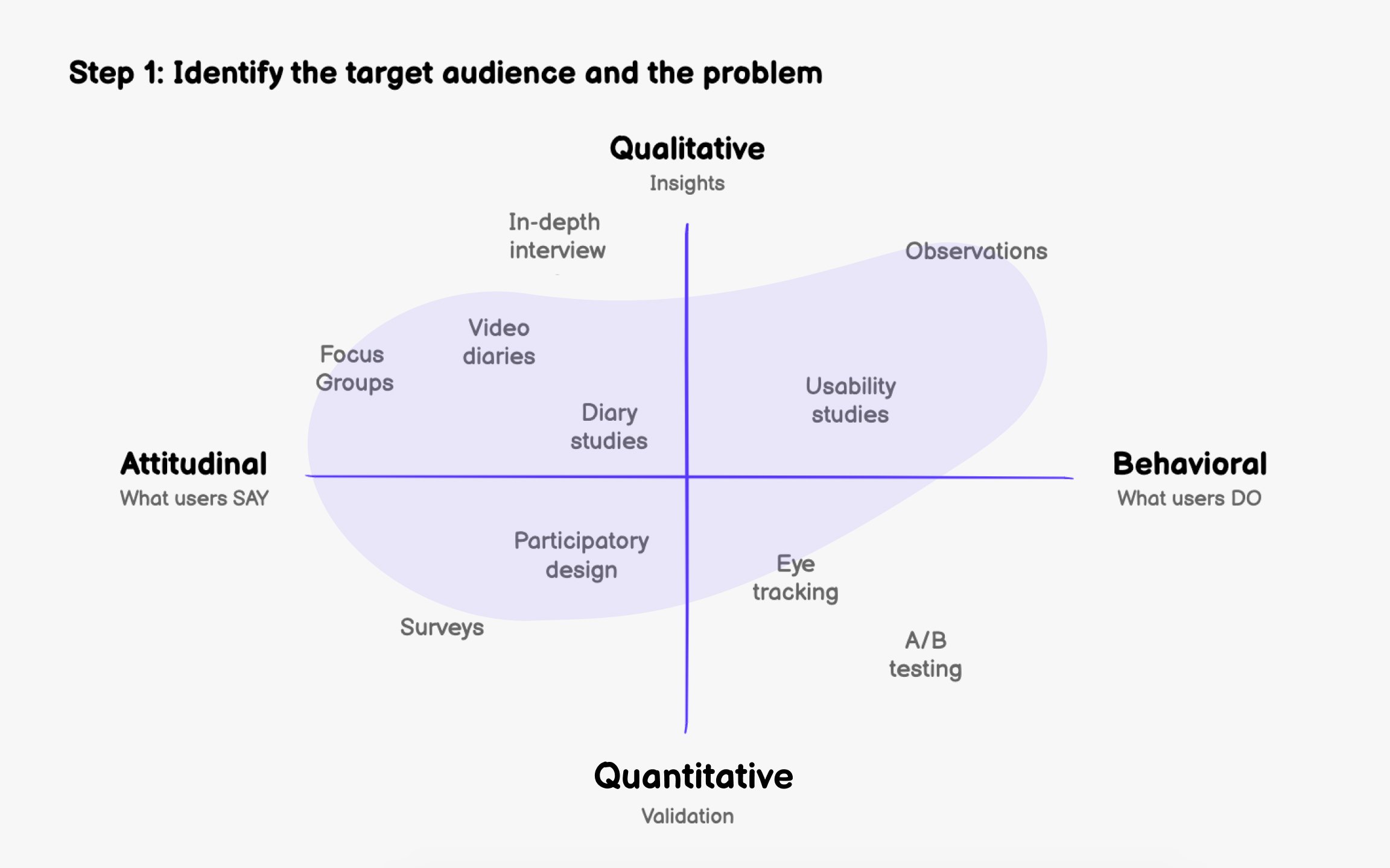
Creating effective mobile wireframes starts with clarity about who you're designing for and what problem you're solving. Without this foundation, even beautifully structured
Before sketching anything, answer these core questions:
- Who will be using this feature?
- What's the users' goal? What problem does this feature solve for them?
- What actions are users most likely to perform?
- What context will they be in when using the app (commuting, at home, multitasking)?[1]
If you can't answer these confidently, you need more research. Common methods include user interviews, surveys, contextual inquiry, and analyzing competitor apps. Tools like Hotjar or FullStory can reveal how users currently behave in similar products, while platforms like Maze help gather feedback at scale.
Modern research also means understanding device preferences. Check your analytics to see which screen sizes dominate your user base, as this shapes your
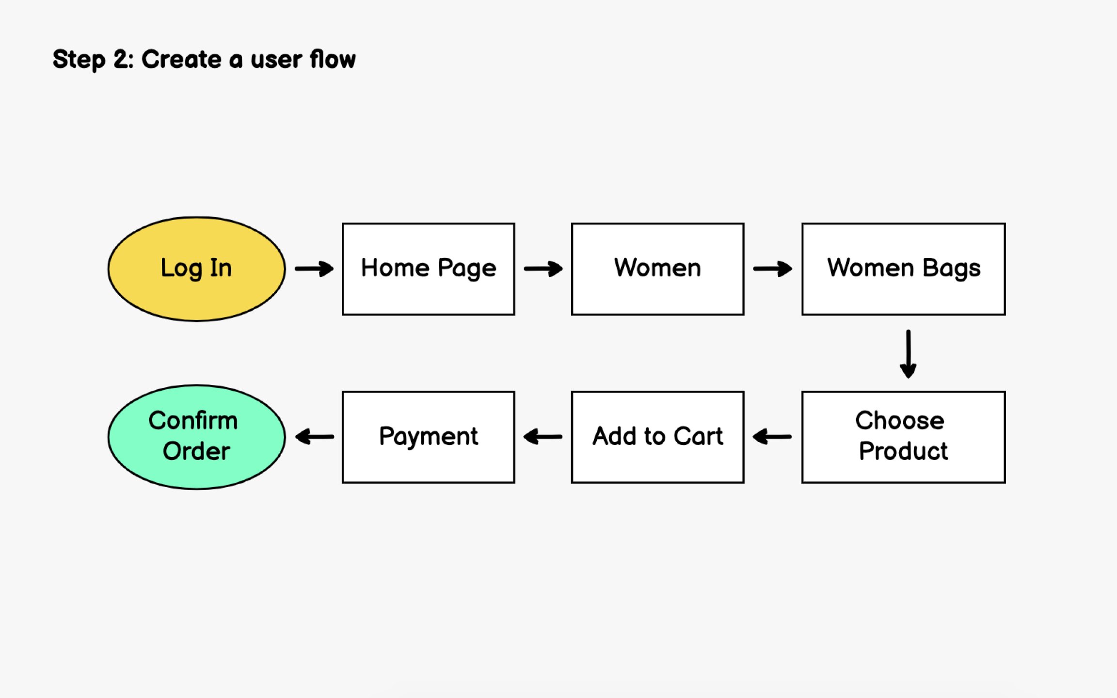
Before wireframing individual screens, map out how users will move through your app. A user flow visualizes the steps someone takes to accomplish a specific goal, revealing how many screens you'll need and how they connect.[1]
User flows aren't always linear. Someone might reach checkout through the homepage, search results, or a saved wishlist. Mapping these alternate paths ensures you don't miss critical screens or create dead ends.
Start simple. Sketch the happy path first, then layer in edge cases like error states, empty states, and what happens when users go back. Modern tools like Miro, FigJam, or Whimsical make collaborative flow mapping easy, but a whiteboard works just as well for initial exploration.
Consider microinteractions within flows too. Does tapping a product open a modal or navigate to a new screen? These decisions affect the
With your
Pen and paper remain powerful here. Physical sketching lets you iterate faster than any digital tool and removes the temptation to perfect details too early. However, AI-powered tools like Uizard can now convert photos of hand-drawn sketches into digital
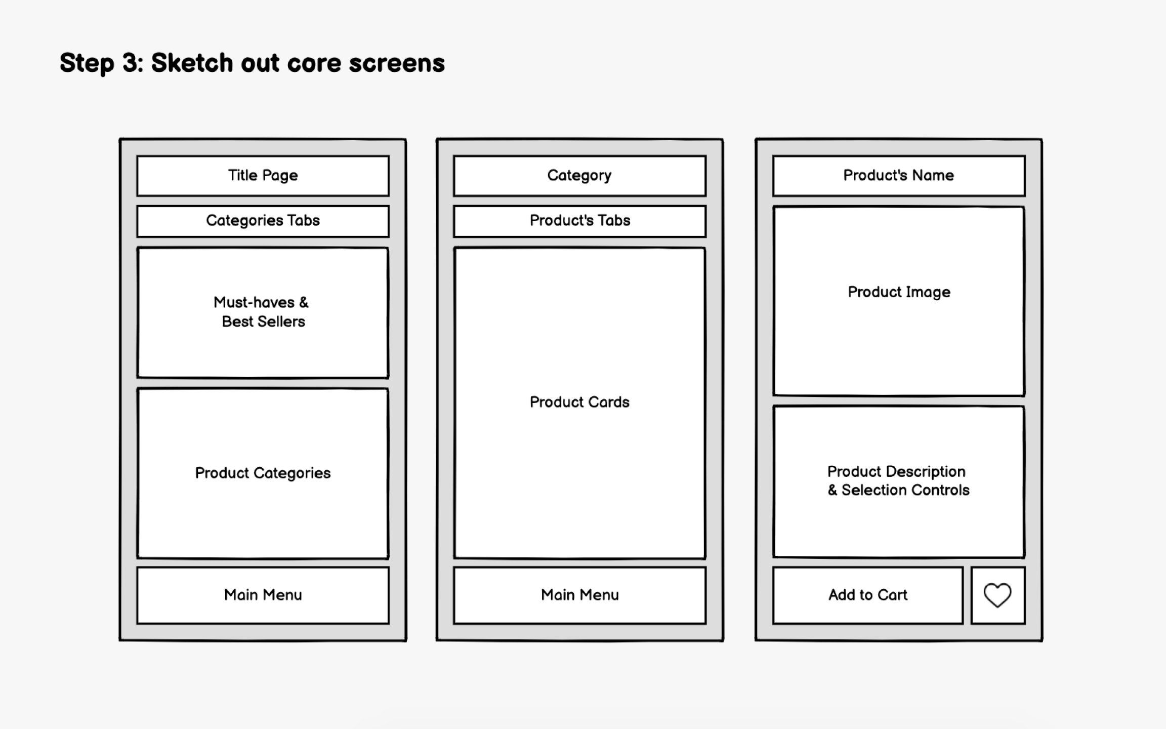
For every screen, keep asking:
- What's the purpose of this page?
- How does it help users achieve their goal?
- What's the single most important action here?
Create multiple versions of each core screen. Try different layouts for the same
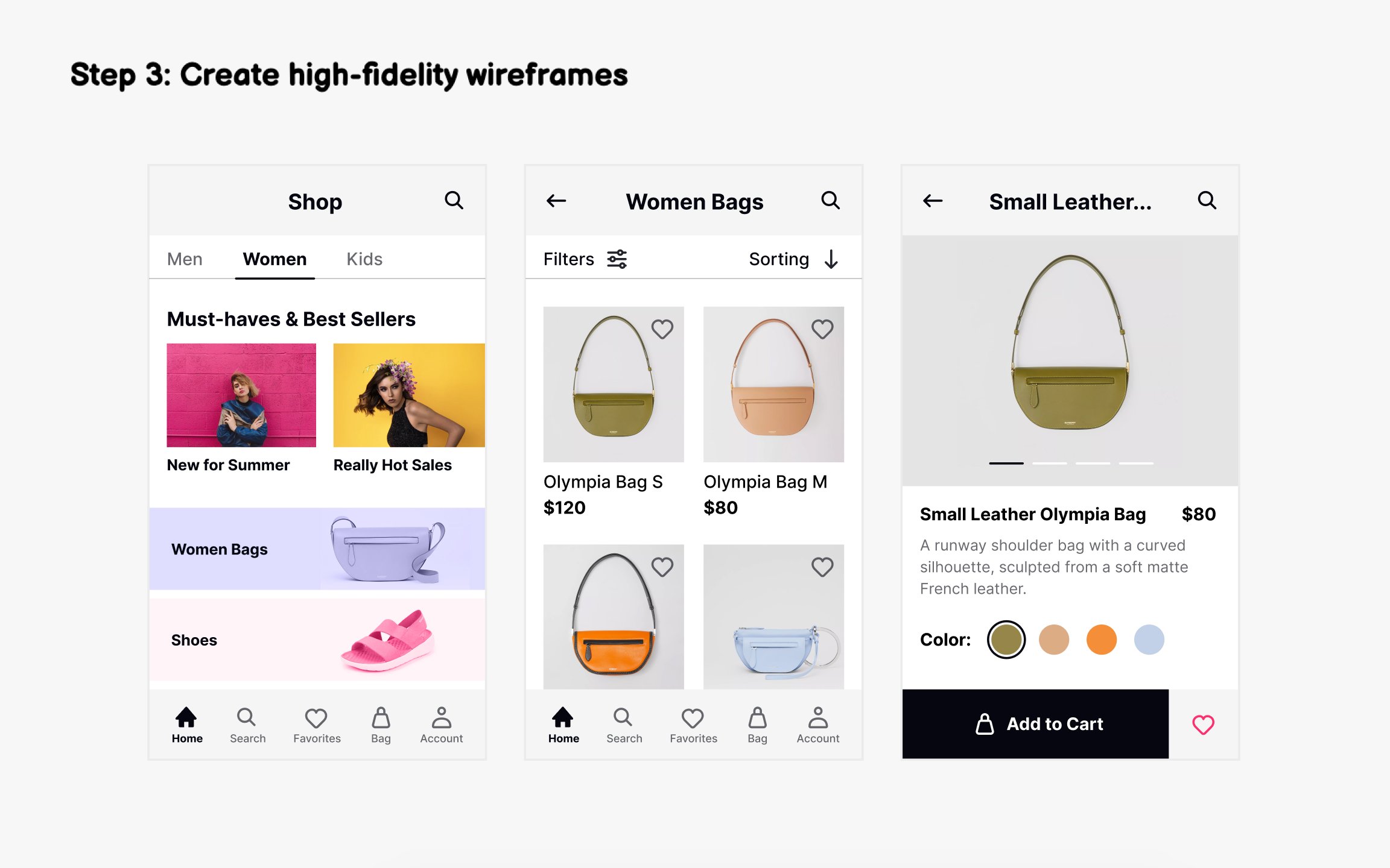
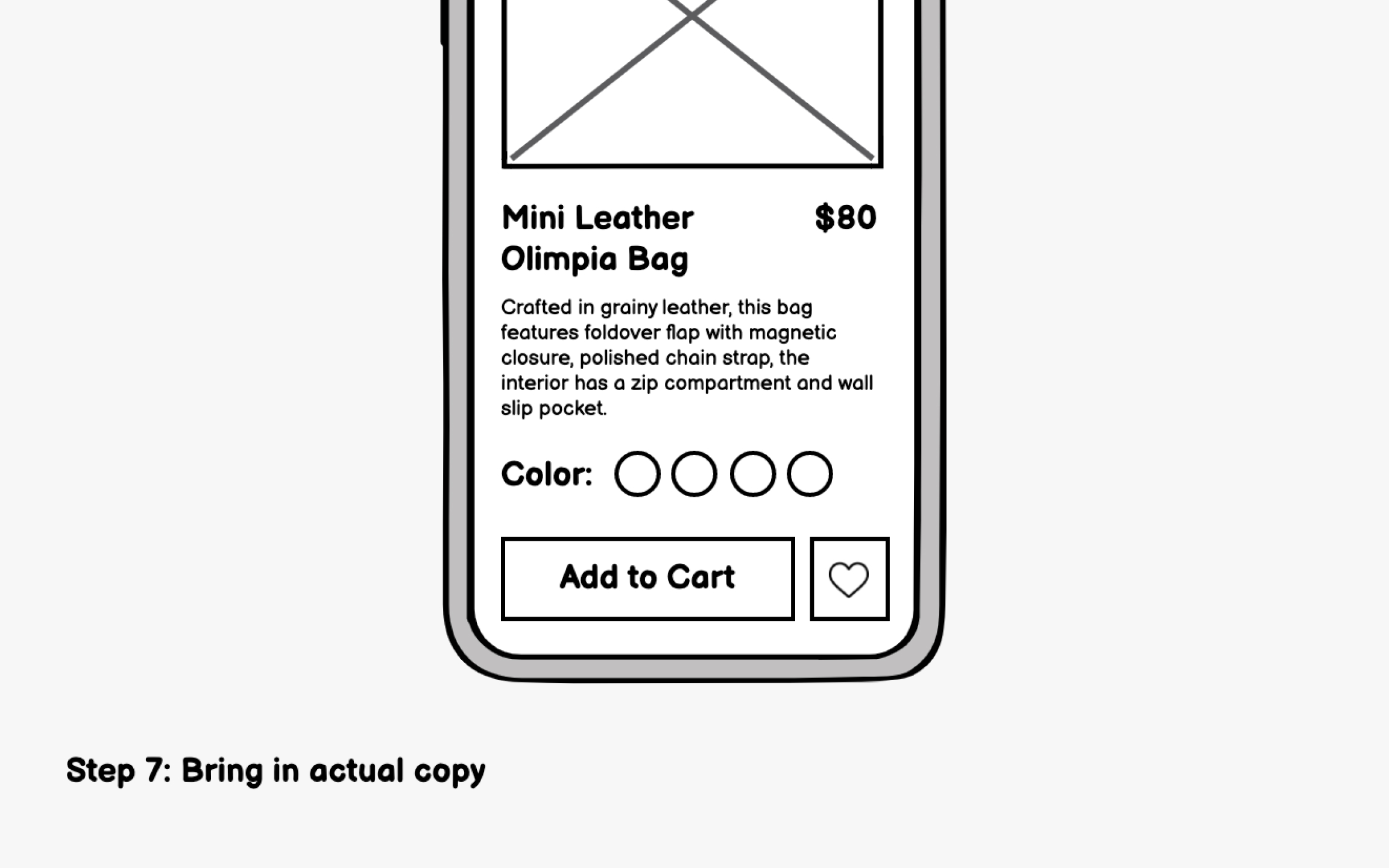
After testing low-fidelity sketches, move to medium-fidelity
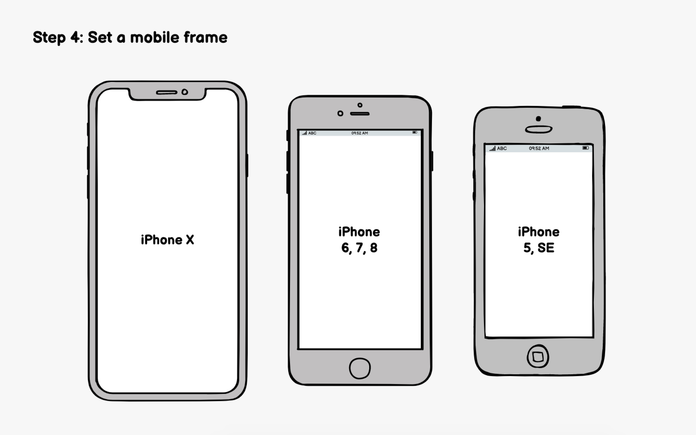
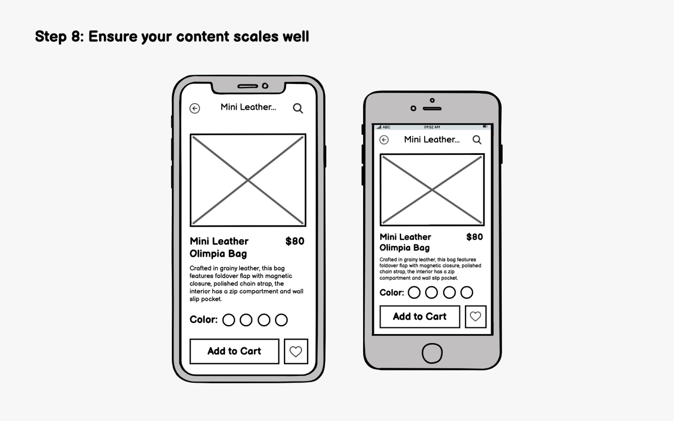
Start by setting up an appropriately sized mobile frame. This creates realistic constraints and prevents you from cramming too many elements onto screens. But which dimensions should you use when designing for multiple devices? The best practice is to design for the smallest device first.[2]
If your analytics show a dominant device, prioritize that. But avoid designing exclusively for flagship phones with massive screens, as your
Modern tools like Figma, Sketch, and Adobe XD offer device-specific frames. AI features in these tools can also suggest responsive adjustments, though you'll still need to verify layouts across sizes manually.
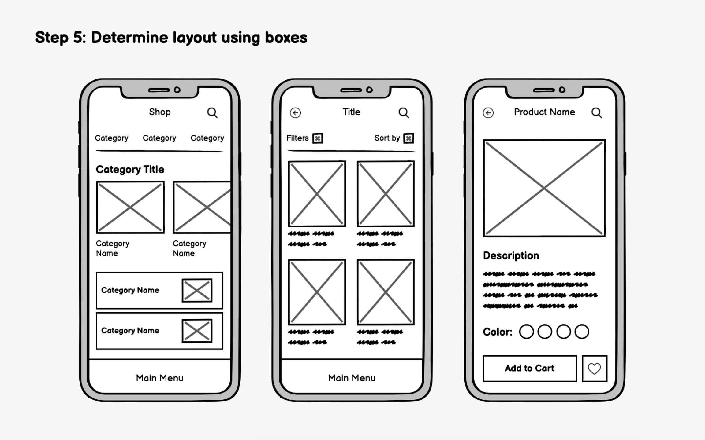
In early wireframing, focus on visual hierarchy rather than specific
The thumb zone matters significantly for mobile. Users hold phones in various ways, but one-handed use with the thumb is extremely common. Place critical interactive elements (
Reserve the top of the screen for information display (titles, status indicators) rather than frequent interactions. Content that users view but don't tap can live higher up, while actions they perform repeatedly should stay accessible.
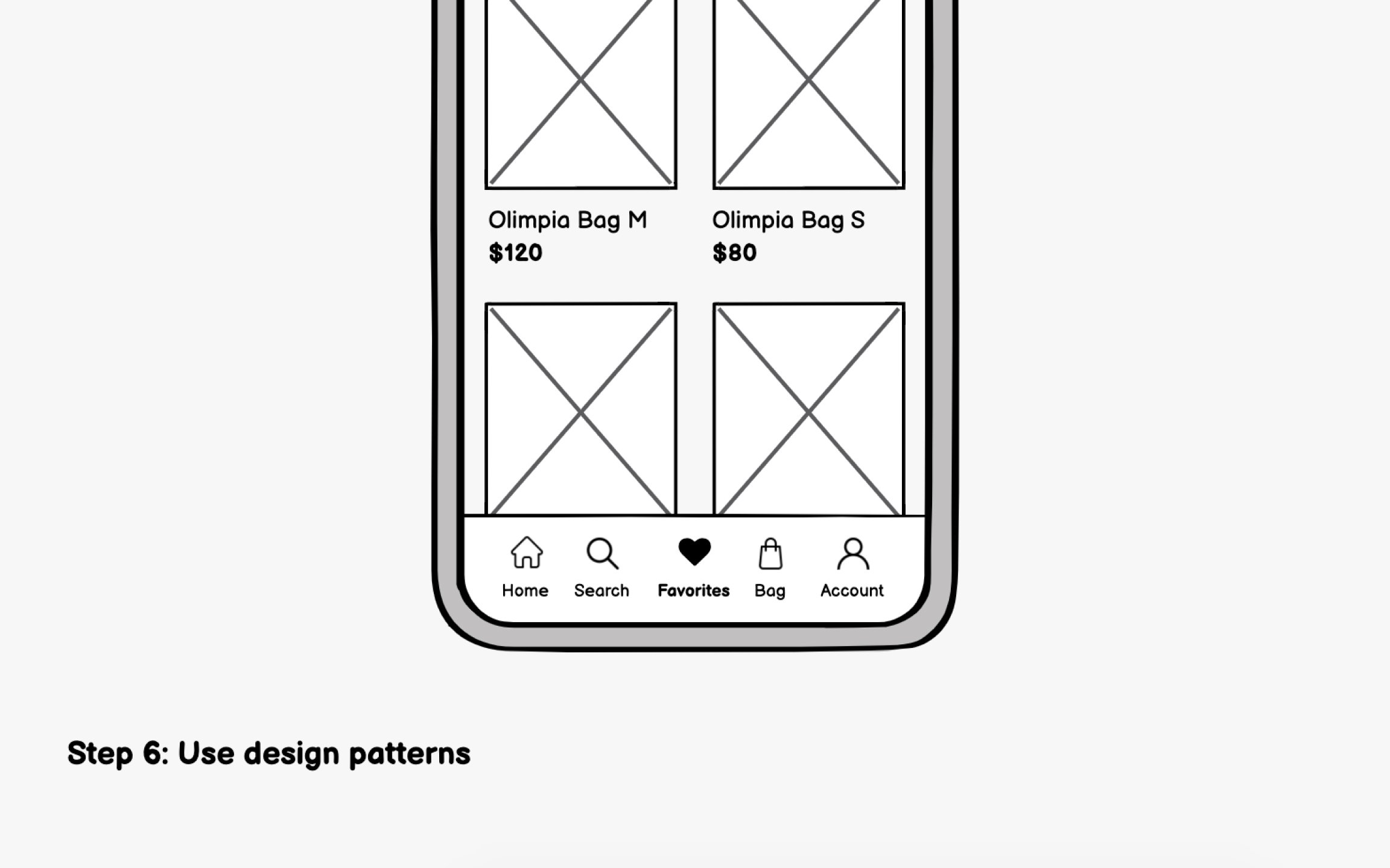
Familiarity drives good mobile UX. Users bring expectations from every app they've used before. Both iOS and Android have established design patterns that users instinctively understand, and leveraging these patterns reduces the learning curve for your app.[3]
Some examples of iOS patterns (Human Interface Guidelines) include:
- Bottom tab bar for primary
navigation , limited to 5 items maximum - Swipe from left edge to go back, a system-wide
gesture users expect everywhere - Large titles that shrink on scroll, creating clear hierarchy
Some examples of Android patterns (Material Design) include:
- Bottom navigation bar for top-level destinations, also limited to 3-5 items
- Floating Action Button (FAB) for the single most important action on a screen
- Top app bar with contextual actions that change based on screen
content
Pro Tip: Download top apps on both iOS and Android to feel the pattern differences firsthand.
Once
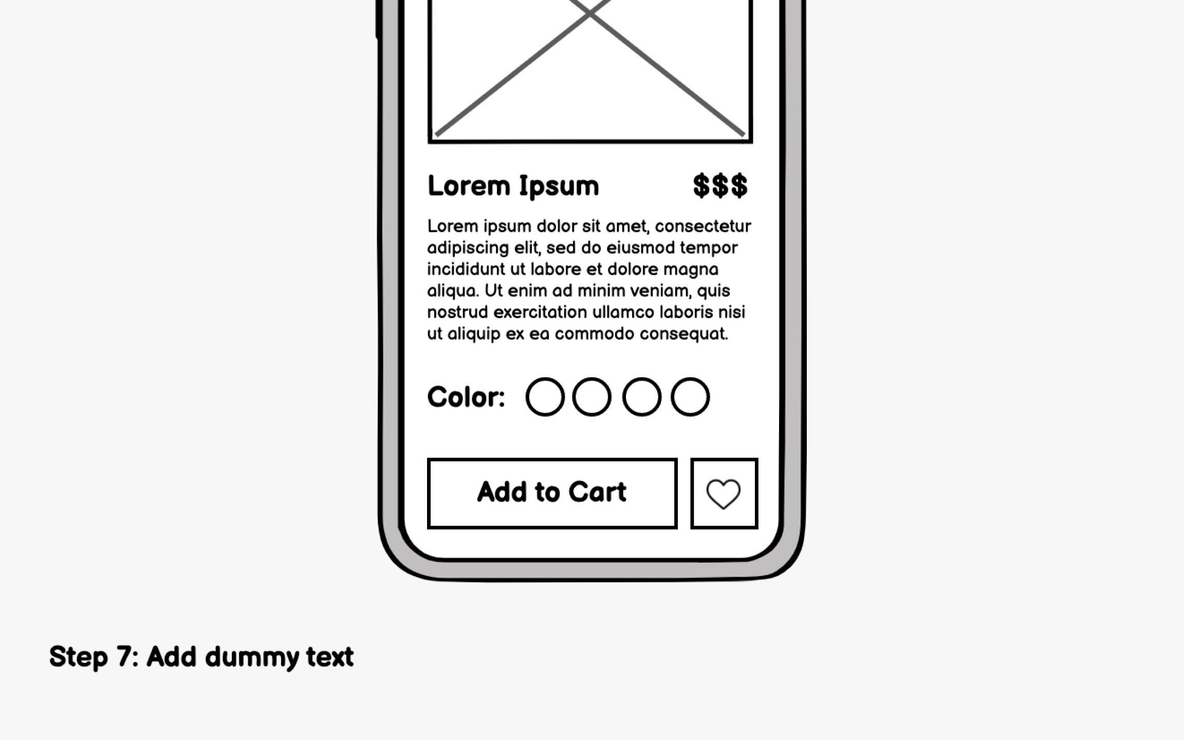
Content also shapes usability. Clear, action-oriented labels help users understand what tapping a
Pay attention to:
- Whether text truncates awkwardly or overflows containers
- If images work at the sizes you've allocated
- Whether calls-to-action are clear and compelling
- How empty states communicate what users should do next
A
Mobile screens vary significantly. Beyond width, aspect ratios differ too, with some phones offering nearly square displays while others stretch tall and narrow.
Check your wireframes against:
- Smaller screens: Does essential content still fit? Are tap targets large enough?
- Larger screens: Does the
layout use extra space well, or does it feel stretched? - Different aspect ratios: Does vertical content still make sense on shorter, wider screens?
If you're supporting both portrait and landscape (common for media apps), wireframe both orientations. Content may need to reflow entirely, with side-by-side layouts in landscape collapsing to stacked layouts in portrait.
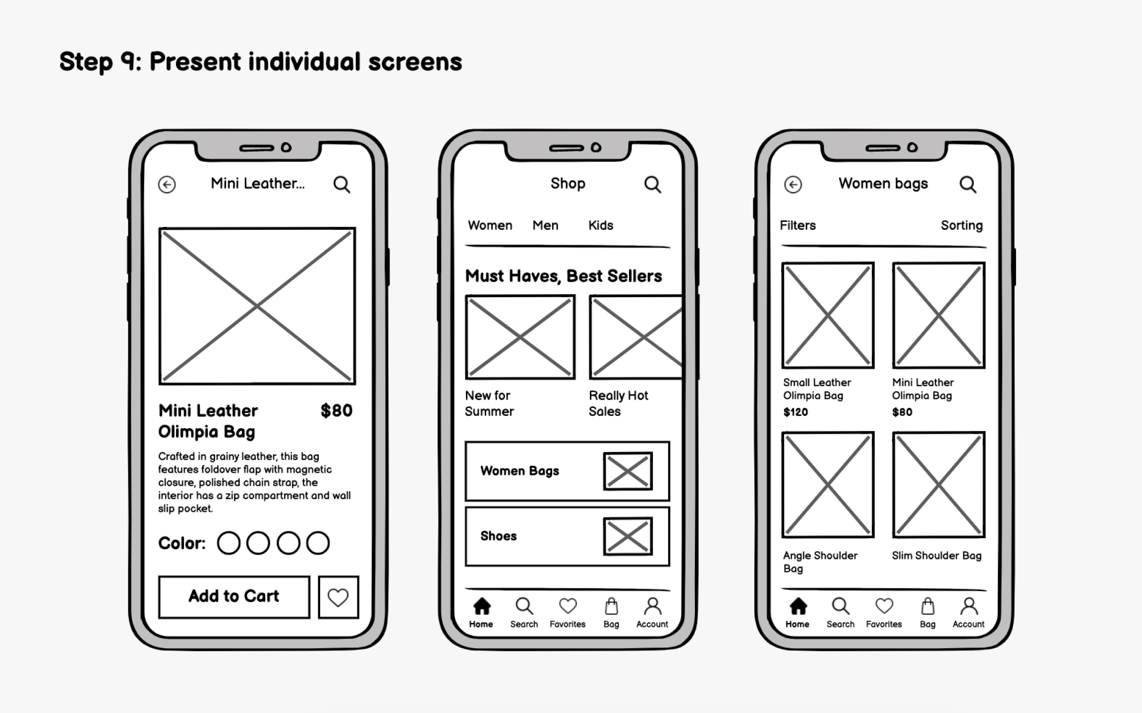
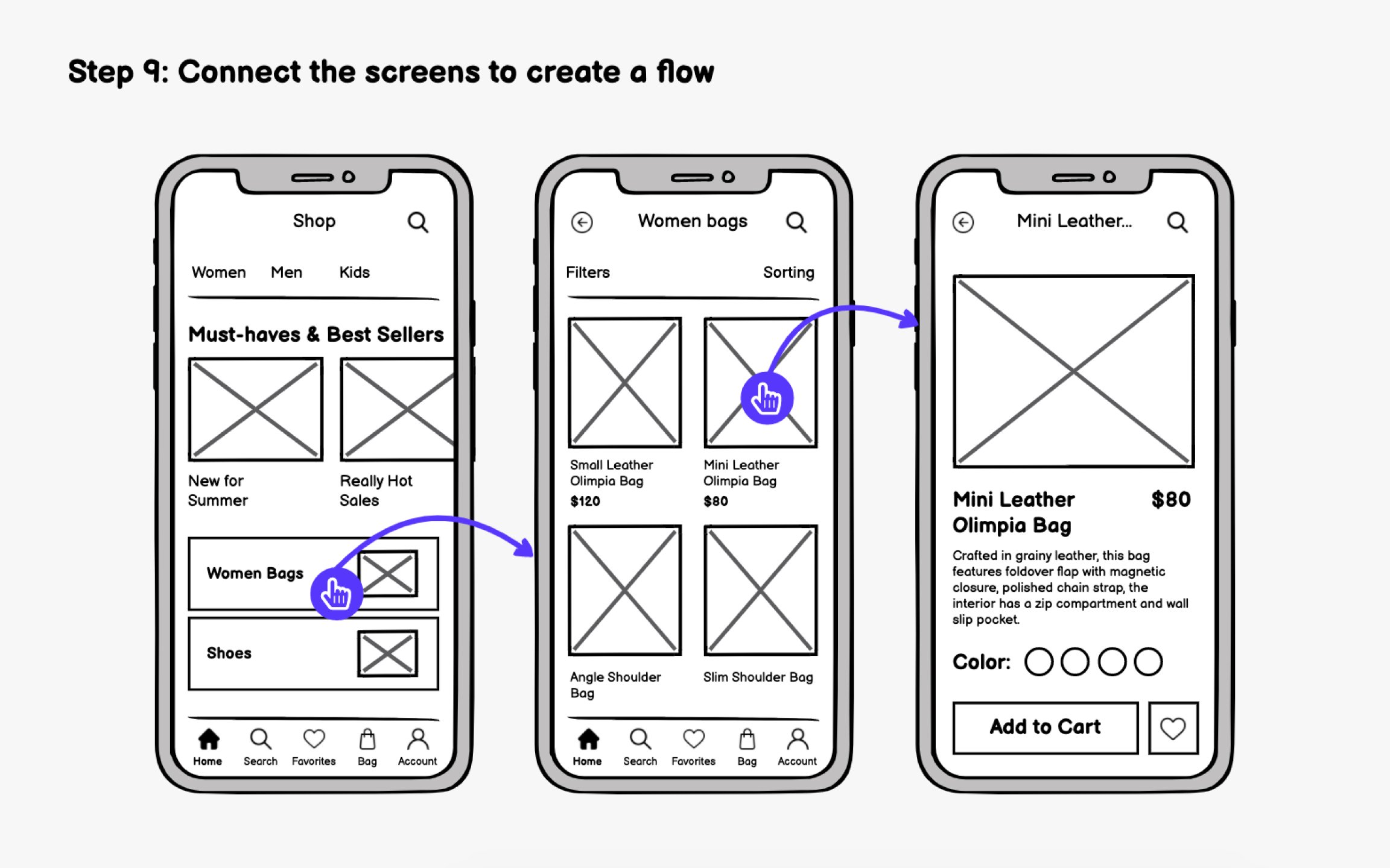
Individual screens tell part of the story. A wireflow, connecting your screens with arrows showing user paths, tells the complete narrative of how someone moves through your app.
Wireflows offer several advantages:
- Team alignment: Flows communicate
interactions visually, reducing lengthy written explanations - Gap identification: Connecting screens reveals missing states like loading screens, confirmation dialogs, or
error handling - Developer clarity: Engineers can see exactly how screens relate, speeding up implementation
When connecting screens, document the rules. What triggers the transition? Is it a tap, swipe, or automatic redirect? Does
Tools like Figma, Protopie, and InVision let you create clickable flows directly from
Pro Tip: Number each screen (e.g., 1.0, 1.1, 2.0) to make discussing specific flows easier.
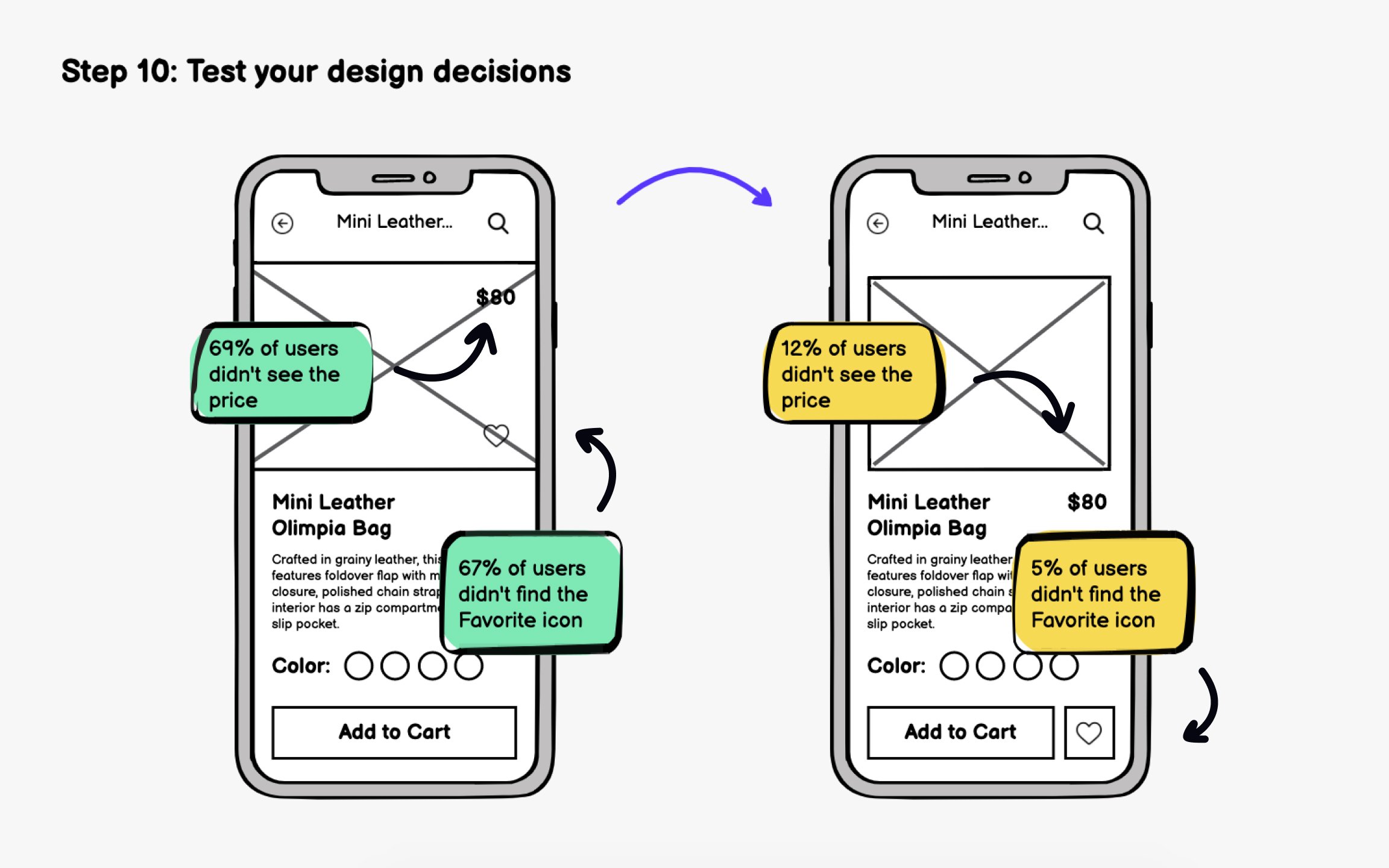
Testing wireframes validates ideas, uncovers
When planning tests:
- Define clear goals: What specific questions do you need answered?
- Create realistic tasks: Ask users to accomplish something, not just look around
- Focus narrowly: Test one flow or problem per session to maintain clarity
- Observe behavior: What users do matters more than what they say
Testing can be moderated (you guide the session) or unmoderated (users complete tasks independently). Unmoderated tests scale better, while moderated sessions let you dig deeper into why users struggle. After testing, analyze results and iterate. Then test again. This cycle of build-test-learn continues throughout development, but catching fundamental issues at the
References
- What is Mobile First? — updated 2025 | The Interaction Design Foundation
Top contributors


Topics
From Course

Share


Similar lessons

Intro to Wireframing

Wireframe Fidelity
