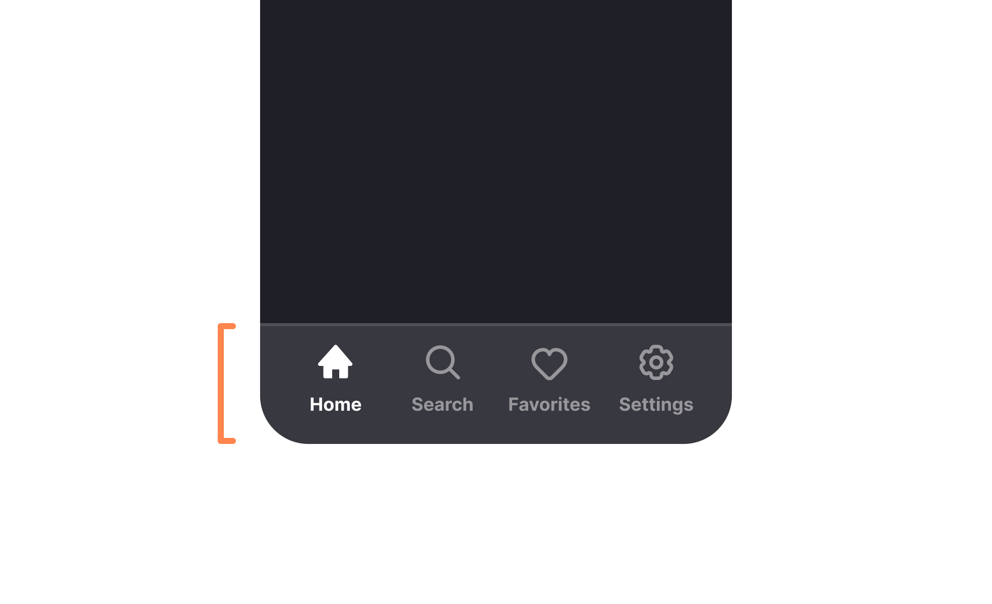
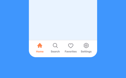
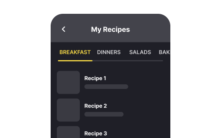
Tab Bar
A tab bar is a navigation element that lets users switch between different views or sections within an app or interface, usually located at the screen bottom.


TL;DR
- UI element for navigation across sections.
- Common in mobile apps and web interfaces.
- Uses icons, labels, or both for clarity.
- Keeps key areas accessible with one tap.
What is Tab Bar?
A tab bar is a user interface component that displays navigation options, allowing users to switch between primary sections of an application or website quickly and consistently.
Detailed Overview
A tab bar is a user interface element used to provide quick access to different sections of an application. It typically appears at the bottom of the screen on mobile devices or at the top in web and desktop applications. The tab bar displays a set of icons or text labels representing different views, allowing users to navigate between them with a single tap or click. It is a core navigation pattern in mobile UI design, especially in applications with clearly divided, primary content areas.
Tab bars are most often found in applications where users need to switch between major categories such as Home, Search, Notifications, and Profile. Each tab leads to a different part of the app but maintains persistent placement and function throughout the experience. This helps reinforce consistency and mental mapping, as users learn where key sections are and how to return to them.
Each item in a tab bar is a "tab" that usually includes an icon, a label, or both. Active tabs are typically highlighted with a visual cue such as a different color, underline, or filled icon, while inactive tabs are muted. This feedback lets users understand where they are in the application and what other options are available without disrupting the flow.
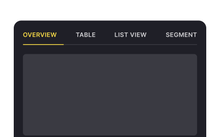
A key characteristic of the tab bar is that it allows non-hierarchical navigation; users can jump from one tab to another without following a sequential path. This distinguishes it from step-based navigation components like wizards or progress bars. Since it’s visible on every screen within its scope, the tab bar functions as a constant navigational anchor.
Tab bars should be used with care in applications with more than five sections. Overcrowding a tab bar can make it harder to use and lead to interaction errors. When more sections are needed, additional menus such as overflow or "More" options are used, but these reduce immediacy and should be limited to secondary actions.
Well-designed tab bars improve usability by keeping essential navigation accessible and intuitive. They support app discoverability, reduce the number of gestures required to access content, and maintain consistent structure throughout the user experience.
Learn more about Tab Bar component with Intro to UI Tab Navigation lesson, a part of the UI Components II Course.
Tab bars make navigation options immediately visible, reducing friction. Hamburger menus hide items behind an extra tap, which often lowers engagement.
Visible navigation encourages exploration, helping users access more areas of the app.
Four to five options are ideal. Too many tabs create clutter and make items hard to distinguish, while too few may limit functionality.
Overflow menus can supplement the tab bar for less critical options.
On mobile, tab bars are typically placed at the bottom for thumb reachability. On web or desktop, they often sit at the top of the interface.
Consistency with platform norms ensures intuitive navigation.
Icons with labels are most effective. Icons alone may confuse users if their meaning is unclear, while labels add clarity. Active states, such as highlights or underlines, further support usability.
This combination ensures users always know where they are and what each option does.
The items featured in a tab bar signal which areas are most important. For example, including “Cart” in an e-commerce app keeps purchasing highly accessible.
By structuring visibility around business priorities, tab bars serve both usability and strategy.
Recommended resources
Courses

UX Design Foundations


UI Components I


Design Terminology

Lessons


Exercises
Projects

Talent searching platform profile page concept

Blaze – Smart Fitness Tracking in Light & Dark Mode 🚀