Intro to UI Tab Navigation
Understand the basics and anatomy of tab navigation
Tab navigation offers an intuitive and organized way for users to interact with digital systems, websites, or applications. Tabs serve as a means to group related content or functionality, allowing users to switch between different sections or views effortlessly.
Whether you're designing a website, mobile app, or desktop software, understanding and implementing effective tab navigation can significantly enhance the user experience by providing clear and accessible access to diverse features and information.
Horizontal
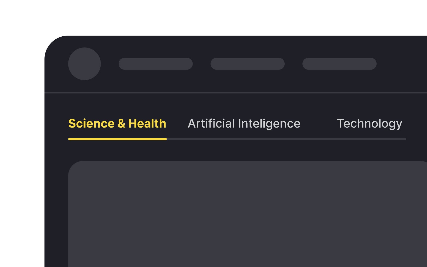
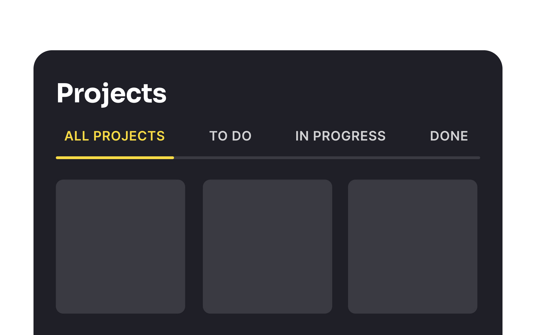
They are ideal for situations requiring a clean, accessible way to separate content. For example, a news website might use horizontal tabs to categorize news by type: Local, International, Sports, and Entertainment.
While
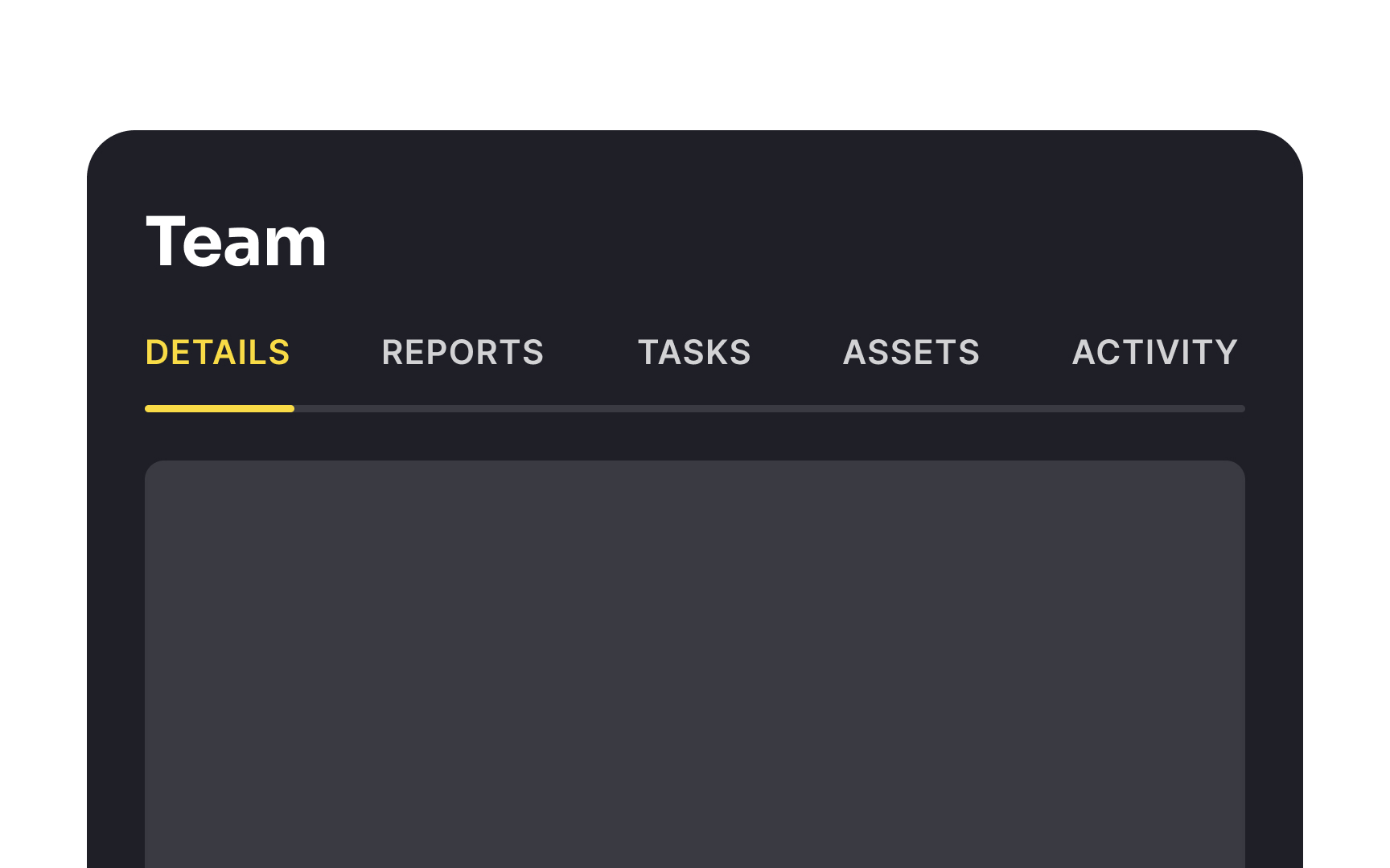
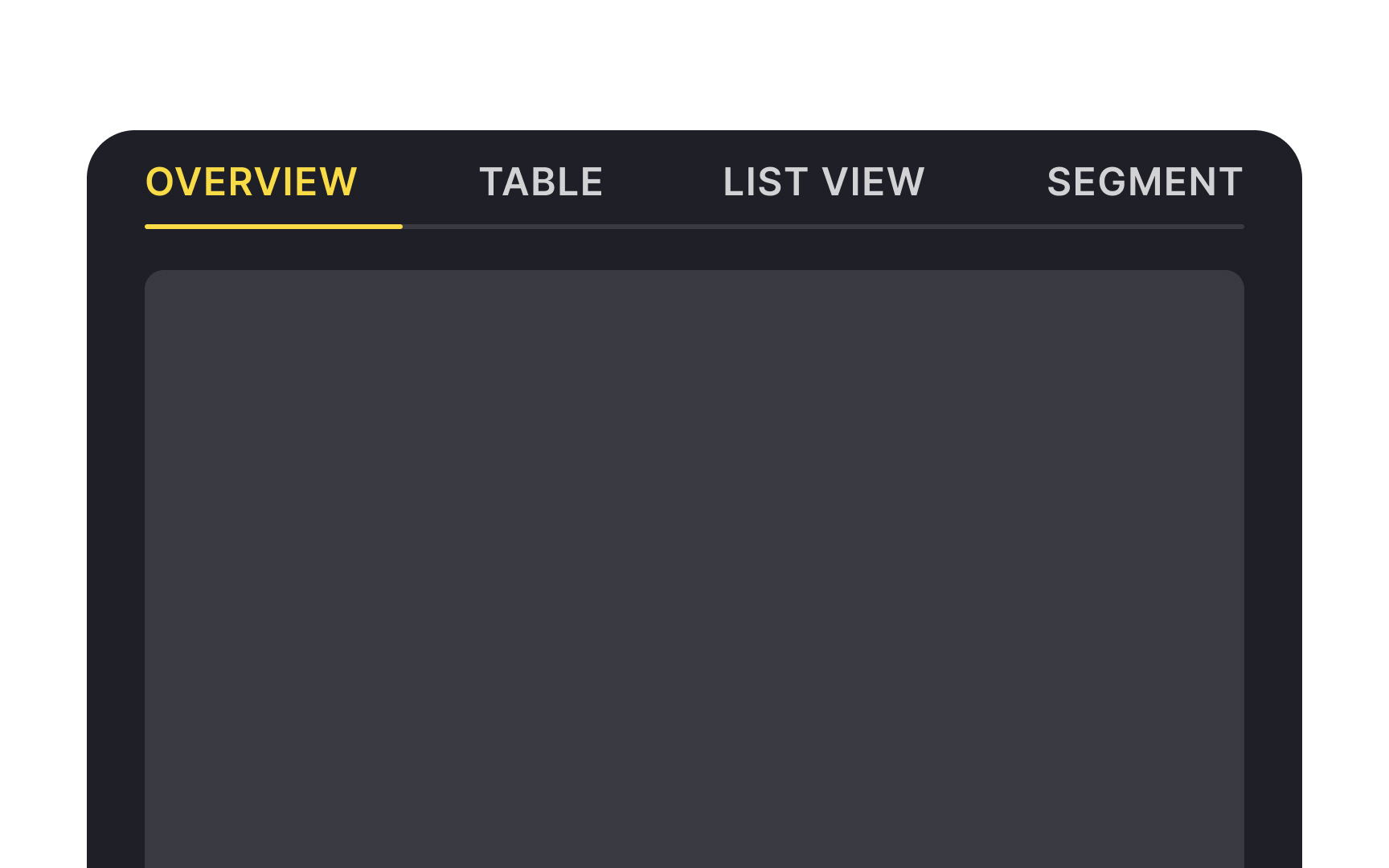
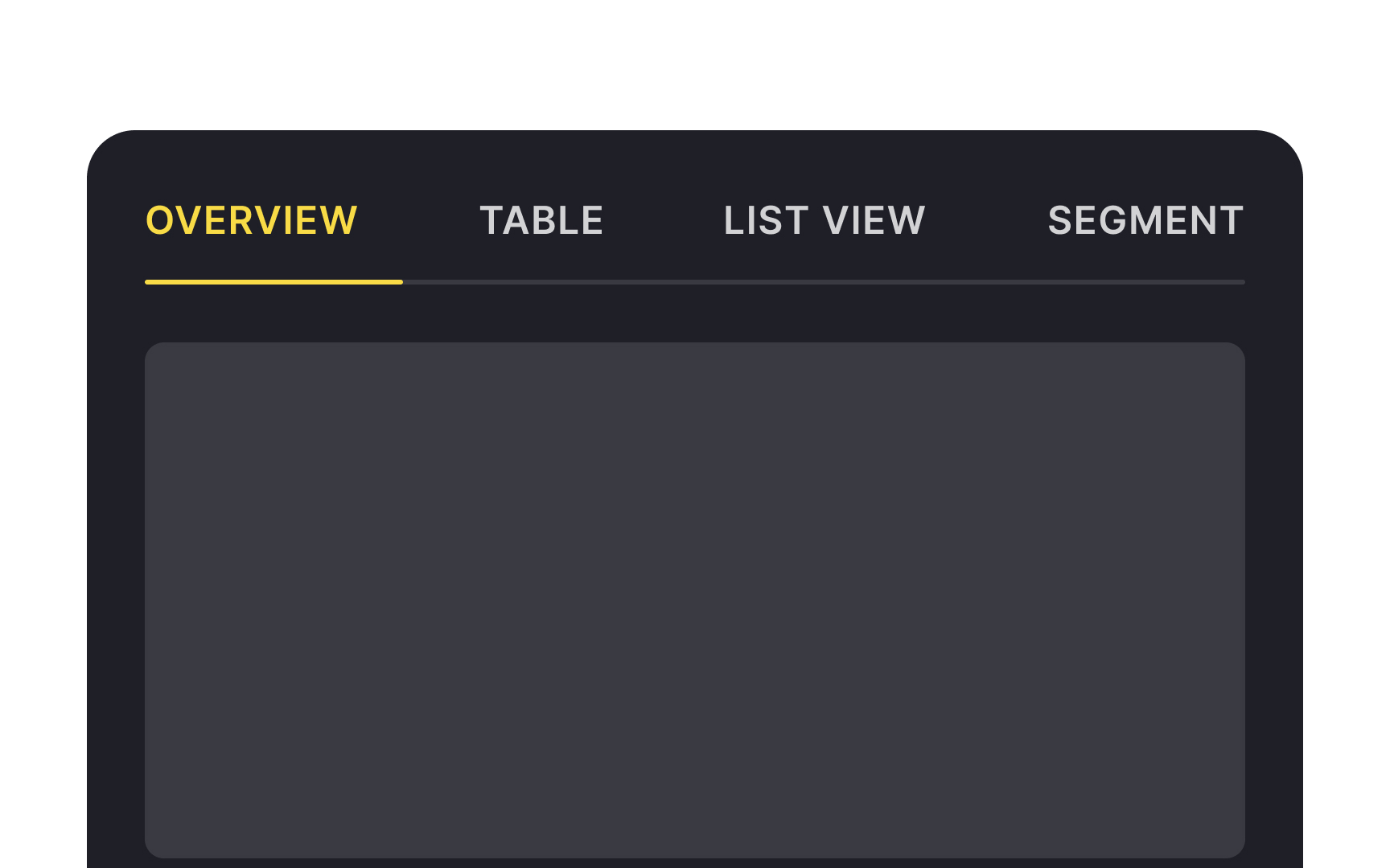
Horizontal
When implementing fixed tabs, limit the number of tabs to ensure each one is easily selectable, especially on smaller screens. The labels should be concise and clear.
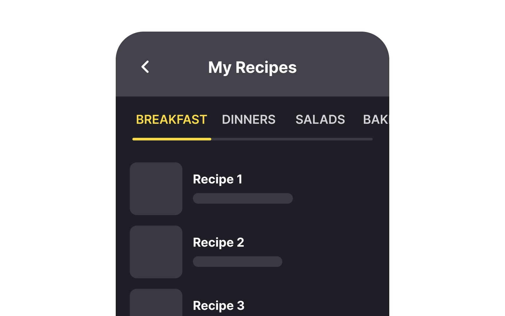
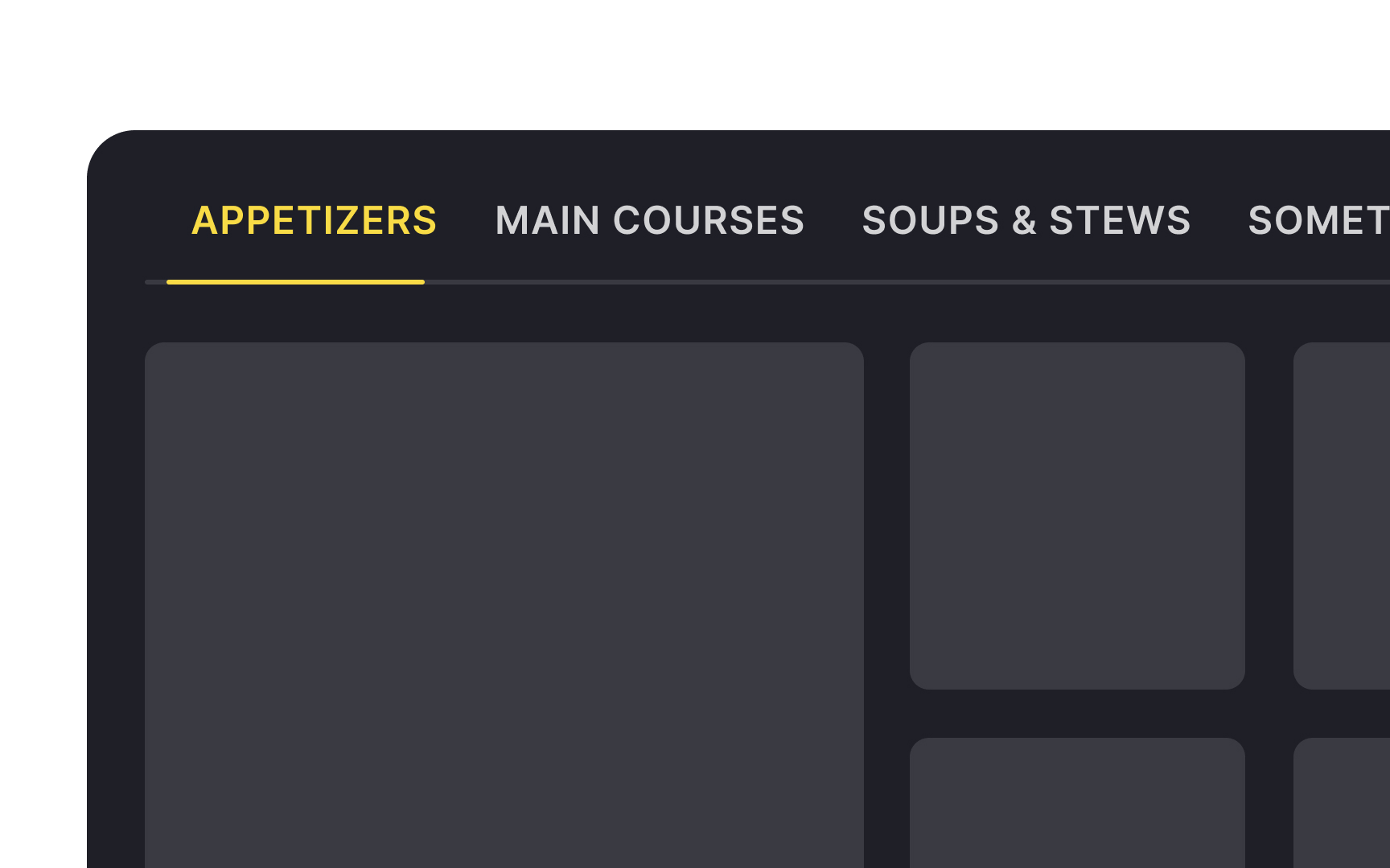
Scrollable
As the list of categories is extensive, scrollable tabs enable users to navigate through them by swiping left or right, and selecting the category they wish to explore without needing to navigate to a separate menu or
To indicate more options in scrollable tabs, show partial visibility of off-screen tabs and use a fading edge effect or scroll arrows at the sides.

Tab spacing is important for readability and making interfaces look clean and visually appealing. Spacing between
On mobile, each tab should have an adequate touch target area of at least 44 x 44px.[3] This ensures users have no trouble navigating between tabs and don't have to worry about accidentally switching between categories.
Tab height is also vital for maintaining pleasing visuals and aiding in readability. Insufficient height makes
If you want to give your users a little extra help when scanning your

Text
Here are a few recommendations on how to maintain effective tab labels:
- Keep labels concise: Use short, descriptive words. Ask yourself, "Does this word add to the meaning, or is the label clear without it?" For instance, use "Settings" instead of "User Settings" or "Orders" instead of "Order History." Ideally, check the viability of labels with user research.
- Avoid truncation: Truncated labels can confuse users. A label that cuts off to "Prod..." instead of "Product Details" can leave users guessing its meaning.
- Use scrollable tabs for longer titles: Scrollable tabs are a good alternative for accommodating longer titles without truncation. This approach ensures that each label remains fully visible, maintaining readability and comprehension.[5]
References
- Material Design | Material Design
- Material Design | Material Design
- Tabs – Material Design 3 | Material Design
Top contributors

Topics
From Course

Share


Similar lessons

Common UI Component Definitions I

Image Terminology
