Add enough padding for better readability
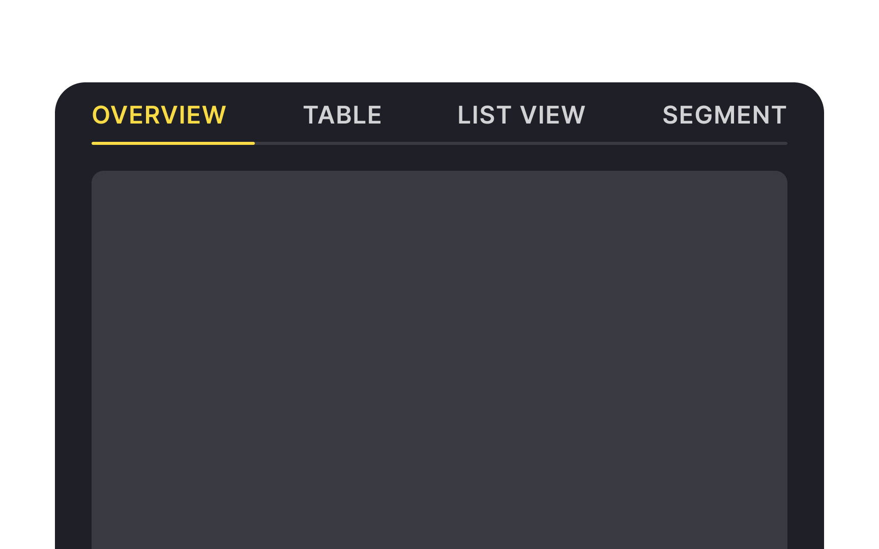
Tab height is also vital for maintaining pleasing visuals and aiding in readability. Insufficient height makes tabs look cluttered.
Material Design guidelines specify adding at least 12px of vertical padding to make labels easy to scan and identify.[1] On desktop, the padding may be a bit less but make sure labels have some breathing air.
