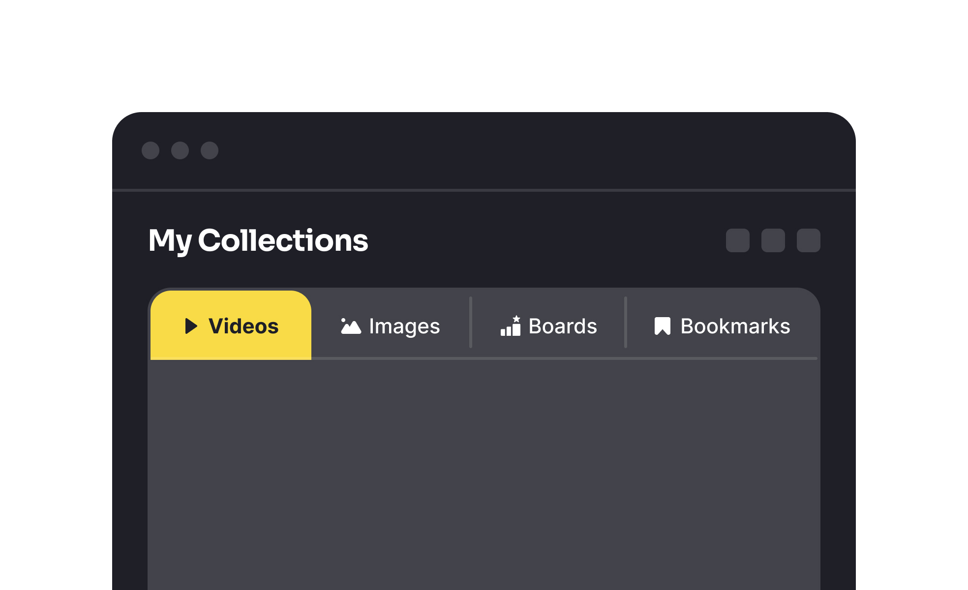
<?xml version="1.0" encoding="utf-8"?>

TL;DR

  • Divide related content into separate views.
  • Enable quick switching within a page or app.
  • Reduce clutter by avoiding multiple screens.
  • Common in browsers, apps, and dashboards.

Definition

A tab is a user interface element that groups content into labeled sections, allowing users to switch between them without navigating to entirely new pages or screens.

Detailed Overview

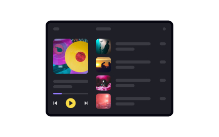
Tabs are one of the most familiar patterns in digital interfaces, allowing users to switch between sections of related content quickly. Whether in a web browser with multiple sites open or in an app with settings divided by category, tabs keep interfaces clean and structured.

A frequent question is how tabs differ from menus. Menus typically navigate to different areas or pages, while tabs organize closely related content within the same context. For example, a settings page may use tabs for “Account,” “Notifications,” and “Privacy,” keeping all options accessible without forcing users to leave the page.

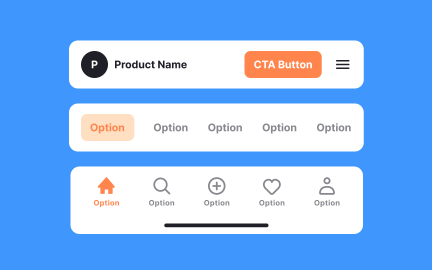
Another common query is about placement. Tabs are usually placed horizontally at the top of a section, though vertical tabs are sometimes used in complex applications. Placement depends on screen size and content density. Mobile apps often adapt tab layouts to fit small screens without overwhelming users.

Teams often ask about the number of tabs to include. Best practice is four to six tabs. Too many creates visual clutter and makes labels harder to scan. Overflow solutions like “more” menus can hold additional items without breaking usability.

Accessibility is another frequent topic. Tabs must be keyboard-operable, with clear focus indicators, so users relying on assistive technologies can switch sections easily. Labels should be descriptive and avoid ambiguity, since unclear tab names make navigation harder.

Finally, tabs support efficiency and continuity. They reduce context-switching by allowing users to compare or navigate content without loading new screens. This makes them particularly useful in productivity tools, dashboards, and browsers, where speed and organization are critical.

Learn more about this in the Tabs Exercise, taken from the Mobile Navigation & Input Components Lesson, a part of the Mobile Design Course.

Recommended resources

Courses

UX Design Foundations Course
Popular
Course

UX Design Foundations

Gene Kamenez
Gene Kamenez
Learn the essentials of UX design to build a strong foundation in core principles. Gain practical skills to support product development and create better user experiences.
Design Terminology Course
Course

Design Terminology

Alesya Dzenga
Alesya Dzenga
Learn UX terminology and key UX/UI terms that boost collaboration between designers, developers, and stakeholders for smoother, clearer communication.
UI Components I Course
Course

UI Components I

Colin Michael Pace
Colin Michael Pace
Learn to create user-friendly interfaces using core UI components, building a solid foundation for designing intuitive and efficient digital products.
Color Psychology Course
Course

Color Psychology

Cameron Chapman
Cameron Chapman
Learn how color influences perception, emotion, and behavior. Discover how to apply color psychology to design more impactful and engaging experiences.
Common Design Patterns Course
Course

Common Design Patterns

Gene Kamenez
Gene Kamenez
Learn design patterns most valued in product development to create intuitive, visually compelling experiences that seamlessly blend form and function.
Accessibility Foundations Course
Course

Accessibility Foundations

Ljubisa Kukulj
Ljubisa Kukulj
Learn the fundamentals of digital accessibility and how to create inclusive experiences for all users. Explore key principles, tools, and best practices.
Wireframing Course
Course

Wireframing

Colin Michael Pace
Colin Michael Pace
Learn to create effective wireframes that seamlessly integrate into your design workflows, improving communication and driving better design outcomes.
UI Components II Course
Course

UI Components II

Colin Michael Pace
Colin Michael Pace
Learn advanced techniques to design dynamic, scalable interfaces using optimized UI components and streamlined navigation for better user experiences.
UX Writing Course
Course

UX Writing

Alesya Dzenga
Alesya Dzenga
Learn to write microcopy that communicates clearly and concisely to improve user experience, build trust, and boost conversions across digital products.
Design Composition Course
Course

Design Composition

Gene Kamenez
Gene Kamenez
Learn the fundamental principles of visual layout, balance, and structure to create compelling and effective design compositions that engage and intrigue users.
Mobile Design Course
Course

Mobile Design

Denis Jeliazkov
Denis Jeliazkov
Learn mobile UI/UX patterns, workflows, and platform-specific strategies to create exceptional, user-friendly mobile experiences across different devices.
Typography Course
Course

Typography

Cameron Chapman
Cameron Chapman
Learn typography fundamentals, from typeface and font selection to layout and spatial arrangement, to create captivating designs that communicate powerfully.
UX Design Patterns with Checklist Design Course
Course

UX Design Patterns with Checklist Design

George Hatzis
George Hatzis
Learn common UX design patterns and how to apply them with practical checklists, ensuring the creation of intuitive, user-friendly, and exceptional interfaces.
HTML Foundations Course
Course

HTML Foundations

Yan Sokalau
Yan Sokalau
Learn the fundamentals of HTML, from basic formatting and structure to advanced elements and best practices, to create accessible and responsive web pages.
Enhancing UX Workflow with AI Course
Course

Enhancing UX Workflow with AI

Colin Michael Pace
Colin Michael Pace
Learn how to integrate AI into UX design to create smarter, more personalized user experiences. Explore tools, trends, and best practices in AI-driven design.
CSS Foundations Course
Course

CSS Foundations

Yan Sokalau
Yan Sokalau
Learn the basics of CSS, including the box model, element style, and content positioning, to improve communication, design handoff, and web decision-making.
Introduction to Figma Course
Course

Introduction to Figma

Gene Kamenez
Gene Kamenez
Learn essential Figma tools like layers, styling, typography, and images. Master the basics to create clean, user-friendly designs
3D Design Foundations Course
Course

3D Design Foundations

Learn essential 3D design principles, from spatial thinking and dimensional relationships to form, lighting, and texture, for a solid foundation in the field.
Information Architecture Course
Course

Information Architecture

Colin Michael Pace
Colin Michael Pace
Learn the basics of organizing, structuring, and labeling content to design clear, user-friendly information systems that enhance usability and navigation.
Apple Human Interface Guidelines Course
Course

Apple Human Interface Guidelines

Denis Jeliazkov
Denis Jeliazkov
Learn Apple’s Human Interface Guidelines to design modern, high-performing apps, focusing on UI principles and best practices for creating effective interfaces.
Introduction to Design Audits Course
Course

Introduction to Design Audits

Romina Kavcic
Romina Kavcic
Learn the art of systematic design evaluation to improve consistency, effectiveness, and create more user-centered products that meet user expectations.
Improve your UX & Product skills with interactive courses that actually work

FAQs

How are tabs different from menus?

Tabs keep users within the same context by dividing content into categories, while menus usually move users to entirely new pages. Tabs are best for related sections, menus for broader navigation.

This makes tabs more efficient when users need to compare or switch between closely related information.


How many tabs should be used in a layout?

Four to six is recommended for clarity. More than that risks cluttering the interface and overwhelming users. Overflow menus can accommodate additional sections without breaking usability.

Keeping the number small improves scanability and navigation speed.


Where should tabs be placed in an interface?

Tabs are commonly horizontal at the top of content areas. Vertical tabs are used in complex applications or dashboards. Mobile interfaces often adapt placement to fit screen sizes.

Consistency across the product is more important than the exact placement.


How should tabs be designed for accessibility?

Tabs must support keyboard navigation, have clear focus states, and use descriptive labels. Screen reader compatibility ensures inclusive use.

Accessible tab design ensures all users can navigate between sections effectively.


Why are tabs effective for usability?

Tabs reduce clutter and allow users to switch between related content without loading multiple pages. This minimizes context-switching and speeds up workflows.

They are particularly useful in dashboards, browsers, and apps where efficiency is key.