Breadcrumbs Best Practices
Explore the best practices for building intuitive breadcrumb trails
The term "breadcrumbs" originates from the fairytale about Hansel and Gretel. Although in the original story, Hansel dropped white pebbles, not breadcrumbs, to form a trail leading back home, the concept of breadcrumbs has taken root in the design vocabulary.[1]
In modern UI design, breadcrumbs are more than just a design element — they are a navigational tool that enhances user experience, particularly in complex websites. They should be a secondary navigation aid, complementing the main navigation without overshadowing it. This balance is key to maintaining a user-friendly interface.
Designers should focus on making breadcrumbs subtle yet noticeable, ensuring they integrate seamlessly into the website's layout. Neglecting these best practices can lead to breadcrumbs that are either too prominent, disrupting the website's visual flow, or too inconspicuous, rendering them ineffective.


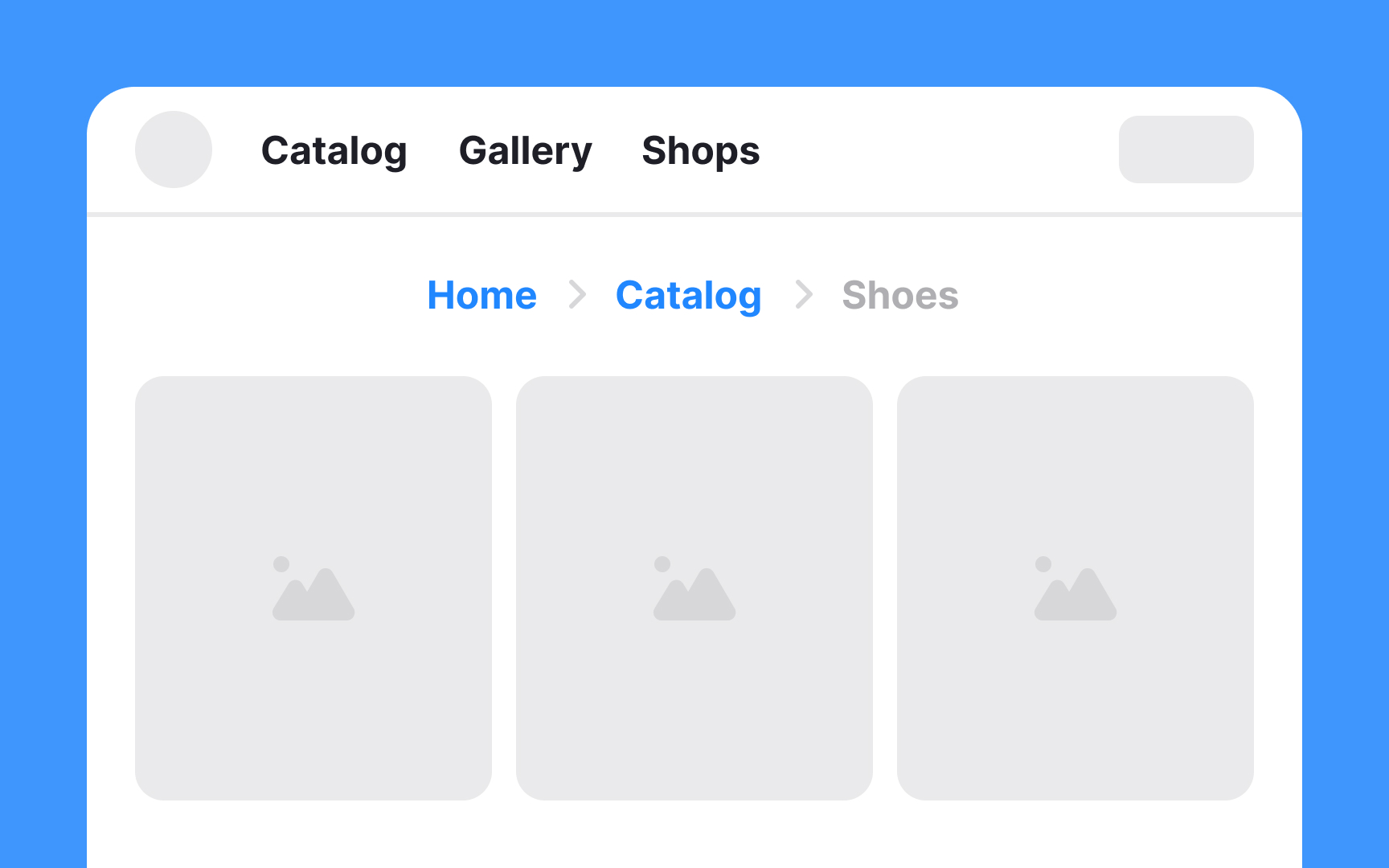
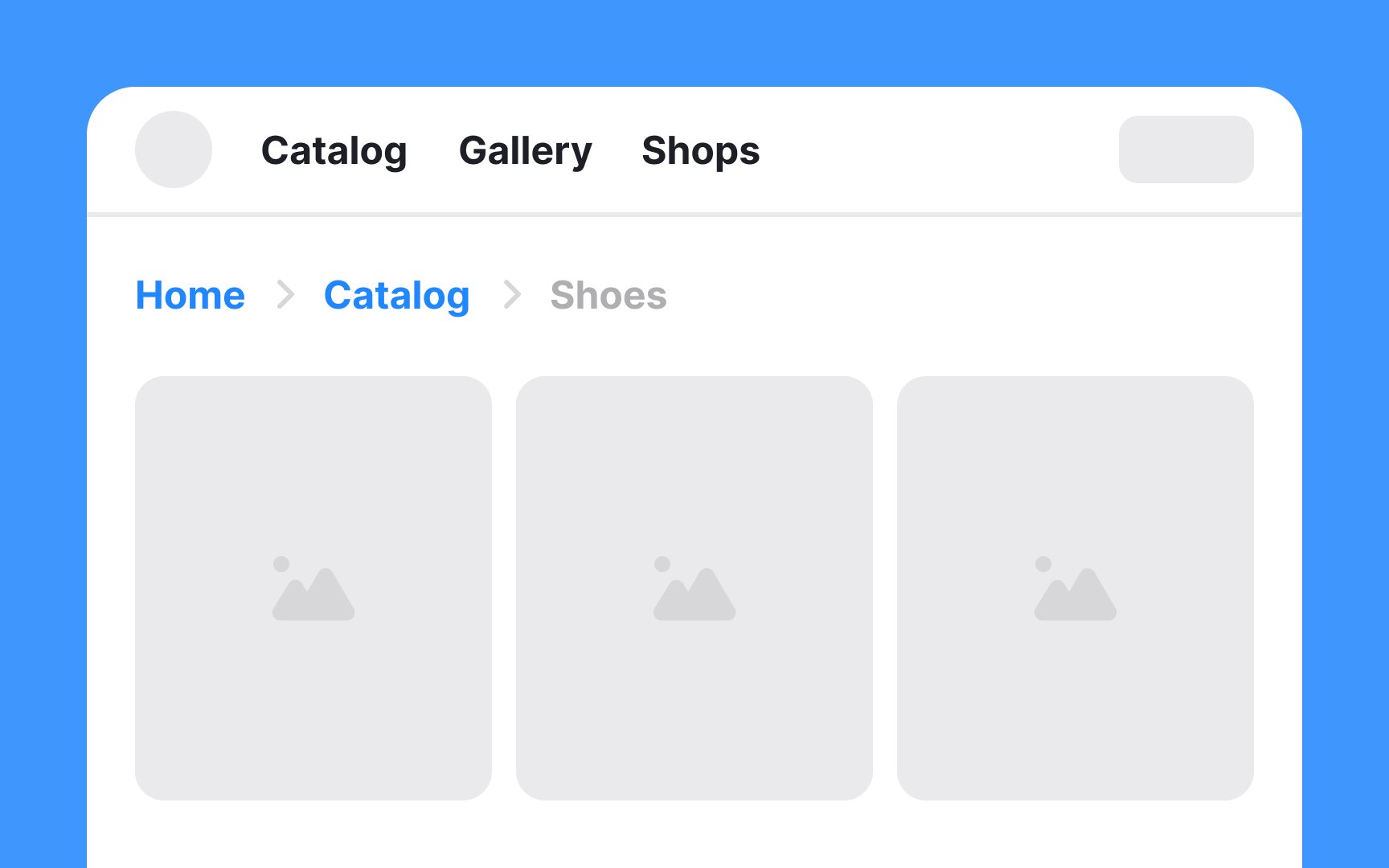
Also, limit breadcrumbs to key levels of the site, such as main sections or categories, known as ancestor pages. If a particular subcategory or item doesn’t have its own dedicated page, it shouldn’t be part of the breadcrumb trail. This keeps the breadcrumbs focused and useful, helping users understand where they are in the site’s structure without unnecessary details.


A crammed
To ensure ease of use, provide sufficient spacing around each breadcrumb link. This breathing space enhances readability and navigability. Additionally, on mobile devices, each link's touch target area should be at least 44 x 44px. This size is generally considered comfortable for fingertip


In breadcrumb


Additionally, consider accessibility standards, specifically the Web Content Accessibility Guidelines (WCAG). These guidelines include requirements for color contrast to ensure that content is accessible to all users, including those with visual impairments.[4]
For websites catering to audiences who read from left to right,
Conversely, for websites designed for right-to-left reading audiences, like those in Arabic or Hebrew, right-aligning the breadcrumbs is the most logical approach.
Center-aligned breadcrumbs can appear out of place and may disrupt the legibility and overall flow of the


Global navigation, on the other hand, is the primary way of navigating a website. It usually includes main menu items that
While breadcrumbs enhance navigability by showing the path taken, global navigation offers a comprehensive view of what the website has to offer. Therefore, both breadcrumbs and global navigation should coexist in a website's design, each serving its distinct purpose to ensure a smooth and intuitive

Breadcrumb trails should exclusively feature clickable
Including any non-navigable categories in


On mobile devices, it's important to use screen space wisely while keeping
This approach prevents clutter and saves mobile screen space, making the interface clean and easy to navigate. However, this method should only be used on mobile devices. On desktops, where there's more space, showing the full breadcrumb trail is better for comprehensive navigation.
References
- Breadcrumbs In Web Design: Examples And Best Practices — Smashing Magazine | Smashing Magazine
- Breadcrumbs: 11 Design Guidelines for Desktop and Mobile | Nielsen Norman Group
Top contributors


Topics
From Course

Share


Similar lessons

Intro to Information Architecture

Intro to Search Functionality in UI
