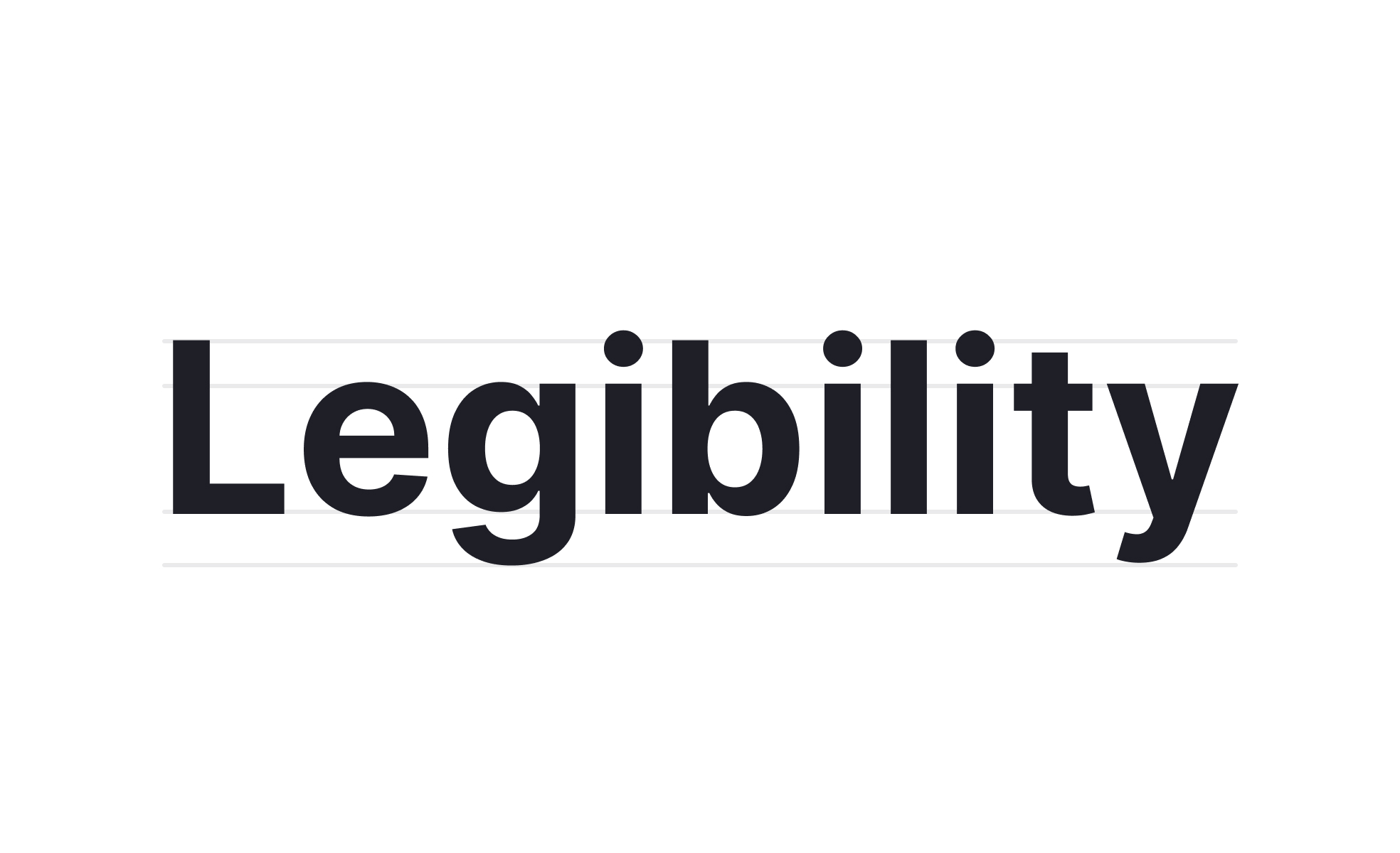
Legibility
Legibility refers to how easily individual characters and words can be read in a design, influenced by typography, spacing, contrast, and overall clarity.


TL;DR
- Focuses on clarity of individual characters and words.
- Shaped by typeface, spacing, and contrast choices.
- Essential for readability and user comprehension.
- Impacts accessibility across devices and contexts.
Definition
Legibility is the quality of text that makes characters, words, and symbols easy to recognize and distinguish, ensuring smooth reading and comprehension in design.
Detailed Overview
Legibility is one of the most fundamental concerns in typography and digital design. It defines whether users can immediately identify letters, numbers, and symbols without confusion. While broader readability focuses on entire blocks of text, legibility zeroes in on the smallest units of communication: characters and words.
A common question is what factors most directly influence legibility. Typeface selection is the starting point. Some fonts are designed for high legibility, with clear distinctions between characters like “I,” “l,” and “1.” Others may prioritize aesthetics, sacrificing clarity at small sizes or in challenging environments. Designers often weigh brand personality against functional legibility.
Another frequent query is how spacing affects legibility. Kerning, tracking, and line spacing all play significant roles. Overly tight spacing makes words blur together, while excessive spacing disrupts flow. Striking a balance ensures that letters feel distinct but connected. This is especially critical in interfaces where users scan quickly, such as mobile apps or dashboards.
Contrast is another critical factor. Black text on white backgrounds is the most legible in most cases, but many products use alternative color palettes. Poor color contrast reduces legibility, especially for users with low vision or when devices are used in bright sunlight. Adhering to accessibility standards, such as WCAG contrast ratios, helps ensure legibility for all.
Digital environments introduce additional challenges. Responsive design means text sizes and layouts adapt across screens. A typeface that looks crisp on a large monitor may appear cramped on a mobile screen. Designers must test across contexts to ensure consistent legibility. This includes considering pixel density, anti-aliasing, and rendering differences between browsers.
Learn more about this in the Legibility Exercise, taken from the Selecting Typefaces Lesson, a part of the Typography Course.
Legibility focuses on the clarity of individual characters and words, while readability is about how easily larger bodies of text can be consumed. A font may be legible in small bursts but tiring to read in long passages.
Both are essential: legibility ensures letters are distinct, and readability ensures users can process entire messages without strain.
Clear distinctions between similar characters, balanced proportions, and open counters all contribute. Sans-serif fonts often perform better on screens, while serif fonts may offer better recognition in print. Context determines the best choice.
Testing typefaces across sizes and platforms ensures legibility remains consistent where users actually encounter the design.
Tight kerning can cause letters to blur together, while overly loose spacing makes words harder to read fluidly. Line spacing that is too narrow creates crowding, and too wide breaks rhythm. Striking balance is critical.
Good spacing practices reduce strain and support quick scanning, which is especially important in interface design.
Without sufficient contrast between text and background, even the clearest typeface becomes difficult to read. Low contrast affects users in poor lighting and creates barriers for those with visual impairments.
Designers use accessibility guidelines to measure contrast, ensuring text remains clear in varied contexts.
Legibility directly influences whether people with dyslexia, low vision, or other impairments can use a product. Accessible design choices in typeface, size, and contrast create inclusive experiences.
Improving legibility helps all users, since clear, well-designed text reduces effort and frustration in everyday use.
Recommended resources
Courses

UX Design Foundations


UI Components I


Design Terminology

Lessons

Typographic Terms

Text Accessibility

Combining Typefaces

Projects

Placid Plastic Typography System Challange


Redesigning Signup Form for Zoho