Redesigning Signup Form for Zoho
Overview
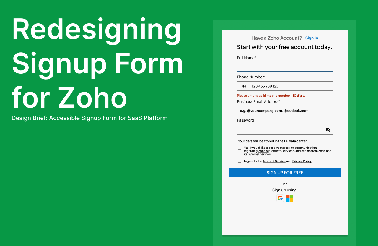
This project focused on improving the accessibility and user experience of the Zoho sign-up page for a free trial. The original design had several accessibility issues and usability flaws that hinders user experience and potentially impacted users with disabilities.
Key Issues
Accessibility: The design doesn't fully meet WCAG colour contrast standards. While it’s generally acceptable, ensuring it's not visually straining for users with high contrast needs would be beneficial.
Usability: Some fields lack clear placeholders, making it difficult for users to know what information they should input.
Visual Design: The typography hierarchy is mostly consistent, but bold text is overused in certain areas, making its readability challenging. Additionally, using a bright red for the CTA button may give users the wrong impression, as it can signal urgency rather than a sign-up interaction.
Solutions
Accessibility: Using a darker red for error messages created a suitable WCAG colour contrast 7.01:1 - >4:5:1 for font sizes lower then 18px.
Usability: Adding a place holder for business emails, avoid the risk of user putting a gmail email, making a better seamless sign up.
Visual Design: Using blue instead of red for the call to action button/ links to provide a sense of security and calmness.
Conclusion
This project highlights the significance of prioritizing accessibility and user experience throughout the design process. Through thoughtful and impactful adjustments, the sign-up page became more inclusive, intuitive, and considerate of users' interactions, enhancing overall usability.
Tools used
From brief
Topics
Share
Reviews
1 review
I can see you have put some thought into your design which you have explained in your case study and you are on the right path. However i have some suggestions which may help improve your design!
- Let it breathe! Everything feels very squashed together and you have a lot of white space at the bottom! You can space your text and fields while still retaining the correct proximity for related sections etc
- rephrasing some of the text might make the design more user friendly as I found some of it an overload!
- Good luck!
You might also like

Pulse — Music Streaming App with Accessible Light & Dark Mode

Islamic E-Learning Platfrom Dashboard
SiteScope - Progress Tracking App

Mobile Button System

FlexPay

CJM for Co-Working Space - WeWork
Visual Design Courses

UX Design Foundations

Introduction to Figma


