Legibility
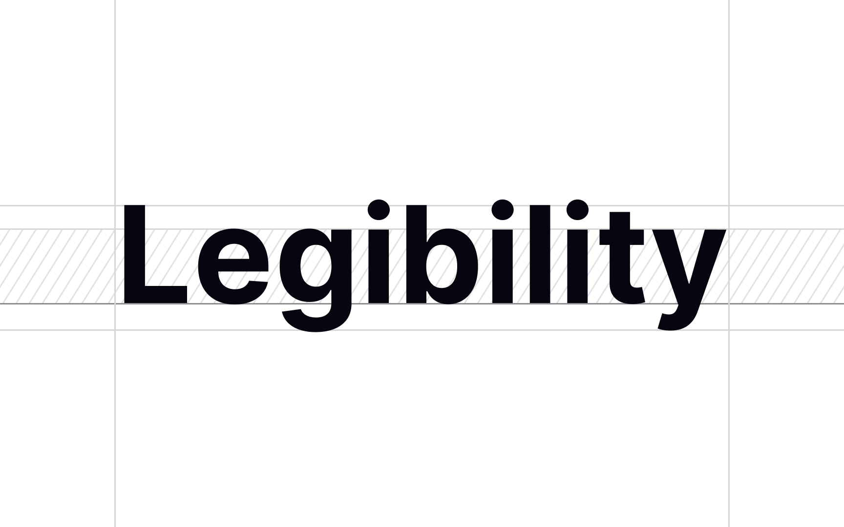
Legibility describes how easy it is to tell one letterform from the other. A typeface's legibility is determined by its design: stroke width, serifs, the presence of certain design elements, etc.
To choose the correct legibility level, think of the text function. For example, the typeface used for body text in a newspaper or book needs to be highly legible. On the other hand, high legibility is not a priority for decorative typefaces used for headings, as they are short and meant to be seen at a glance.
To achieve high legibility, choose typefaces with:
- Conventional letterforms: Readers are used to them and will easily recognize them.
- Generous spacing: Tight tracking makes it more difficult to make out individual letters, which slows readers.
- A tall x-height: It makes the difference between certain letters like c and e more clear.[1]
Pro Tip: Too high of an x-height can hurt the recognition of characters with descenders and diacritical marks. To avoid that, make sure to choose the right size, weight, and width for the chosen x-height.
