Visual Hierarchy
Visual hierarchy is the arrangement of elements in a design that guides user attention, making information clear, prioritized, and easier to process.


TL;DR
- Organizes content by importance and priority.
- Uses size, color, contrast, and spacing.
- Helps users process information quickly.
- Improves usability and comprehension.
Definition
Visual hierarchy is the structured arrangement of design elements to direct focus, establish importance, and guide users through information in a logical order.
Detailed Overview
Visual hierarchy helps users know where to look first and how to move through content. In digital products, hierarchy shapes how people process screens, forms, and layouts. Without it, interfaces feel cluttered and users struggle to identify what matters most. Strong hierarchy ensures the most important information stands out while supporting content remains visible but secondary.
A frequent question is what tools designers use to build hierarchy. Core techniques include size, color, contrast, spacing, and alignment. Larger headings attract attention before smaller text. Strong contrast highlights key actions such as buttons. Generous spacing separates groups of content into meaningful chunks. Alignment reinforces structure, reducing confusion.
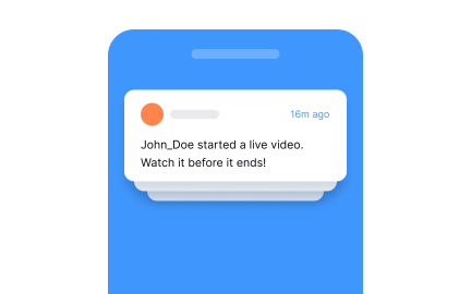
Another common query is how hierarchy affects usability. A well-structured layout allows users to process information without extra effort. For instance, in an e-commerce checkout page, bold labels and button placement make the purchase step obvious. Weak hierarchy forces users to hunt for critical actions, increasing errors and abandonment.
Teams also ask how hierarchy connects to brand identity. Fonts, colors, and imagery communicate not only order but also personality. A finance app may use restrained hierarchy to emphasize clarity and reliability, while a design portfolio site may employ bold typography and visual rhythm to inspire curiosity. In both cases, hierarchy balances usability with brand expression.
Accessibility plays an important role in visual hierarchy. If users rely on screen readers or keyboard navigation, the underlying structure must match visual cues. Headings, semantic HTML, and ARIA labels support logical navigation. Accessible hierarchy ensures clarity for all audiences, not just those who can see the design.
Finally, visual hierarchy links closely to information retention. Clear design helps users recall where content resides and how to return to it later. Consistent hierarchy across multiple screens or platforms builds familiarity, reducing learning curves and reinforcing trust in the product.
Learn more about this in the Establish Solid Visual Hierarchy Exercise, taken from the User Comments Lesson, a part of the Common Design Patterns Course.
Hierarchy makes information easier to process by highlighting what matters first. Without it, users waste effort searching for key elements, which can lead to frustration.
A clear hierarchy improves efficiency and reduces mistakes.
Designers use size, color, contrast, spacing, and alignment. Larger or bolder items naturally attract attention, while spacing organizes content into clear groups.
These techniques create order and guide user focus.
Hierarchy reflects brand personality through typography, color, and imagery. Subtle structures communicate professionalism, while bold layouts express creativity.
Balancing usability with branding strengthens recognition and trust.
Accessible hierarchy uses headings, semantic HTML, and contrast guidelines to match visual and structural order. This ensures users with assistive technologies can navigate effectively.
Consistency across screens reinforces clarity for everyone.
Consistent ordering helps users recall content placement and workflows. Over time, this reduces cognitive load and builds product familiarity.
Clear visual patterns make products easier to learn and re-use.
Recommended resources
Courses

UX Design Foundations


Typography


UI Components I

Lessons

13 Core Visual Design Principles

Intro to Information Architecture

Visual Design Principles in Practice
Exercises

Projects

TaskFlow – SaaS Pricing Page


Talent searching platform profile page concept


Type System for a Coding Community