How to Design Interactive Comment Sections
Build comment sections that make reading, responding, and engaging feel effortless
A comment section is an invitation. Whether users accept depends on how easy and rewarding participation feels. Can they quickly understand the conversation so far? Can they respond to specific points without losing context? Can they mention others to pull them in? Can they share comments worth spreading? Each capability removes a barrier between reading and contributing.
But participation also needs boundaries. Actions that clutter the interface overwhelm users. Comments that sprawl endlessly become unreadable. Discussions that nest too deep lose their thread. The balance is showing what users need exactly when they need it.
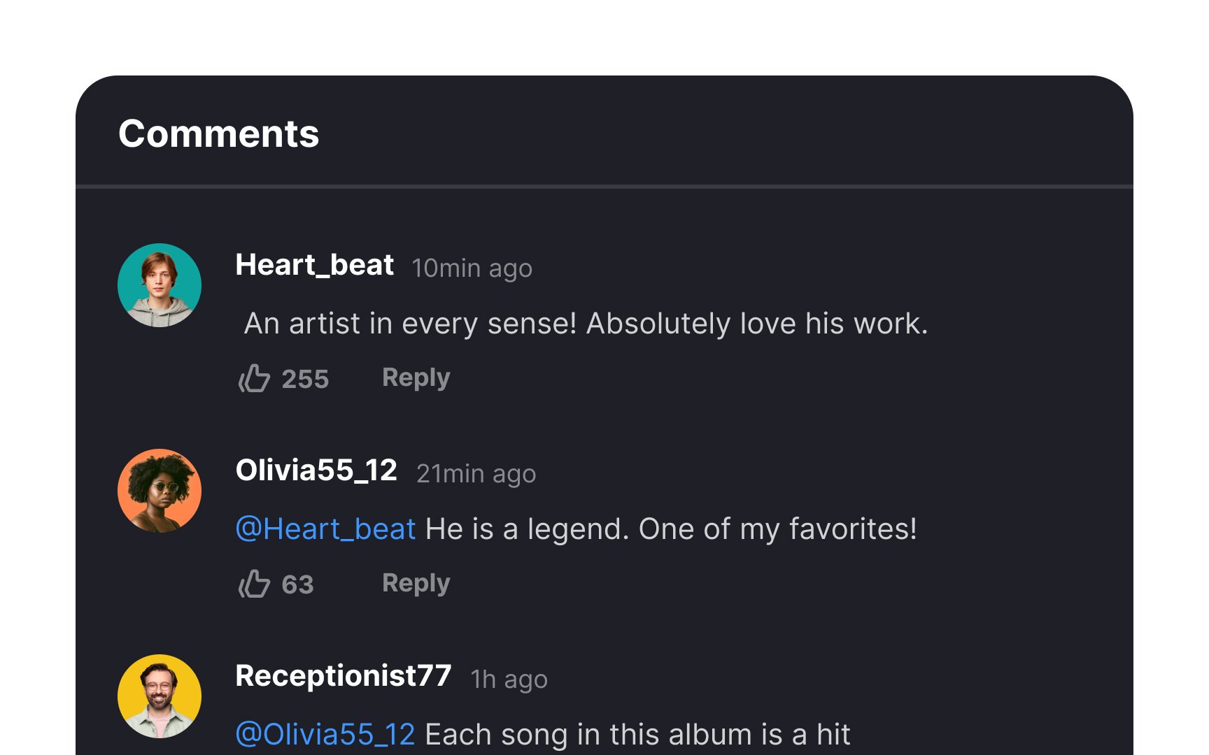
Comments online can be shown in two main styles: flat view and threaded view. Flat view lines up comments one after the other, in the order they’re posted. This makes it easier to follow a single line of thought without breaking it up. Flat view helps maintain focus when everyone’s talking about the same thing, because there are no side threads to distract or split attention. That’s why it’s a good fit for blogs or news articles, where the goal is to keep things short and on-topic.
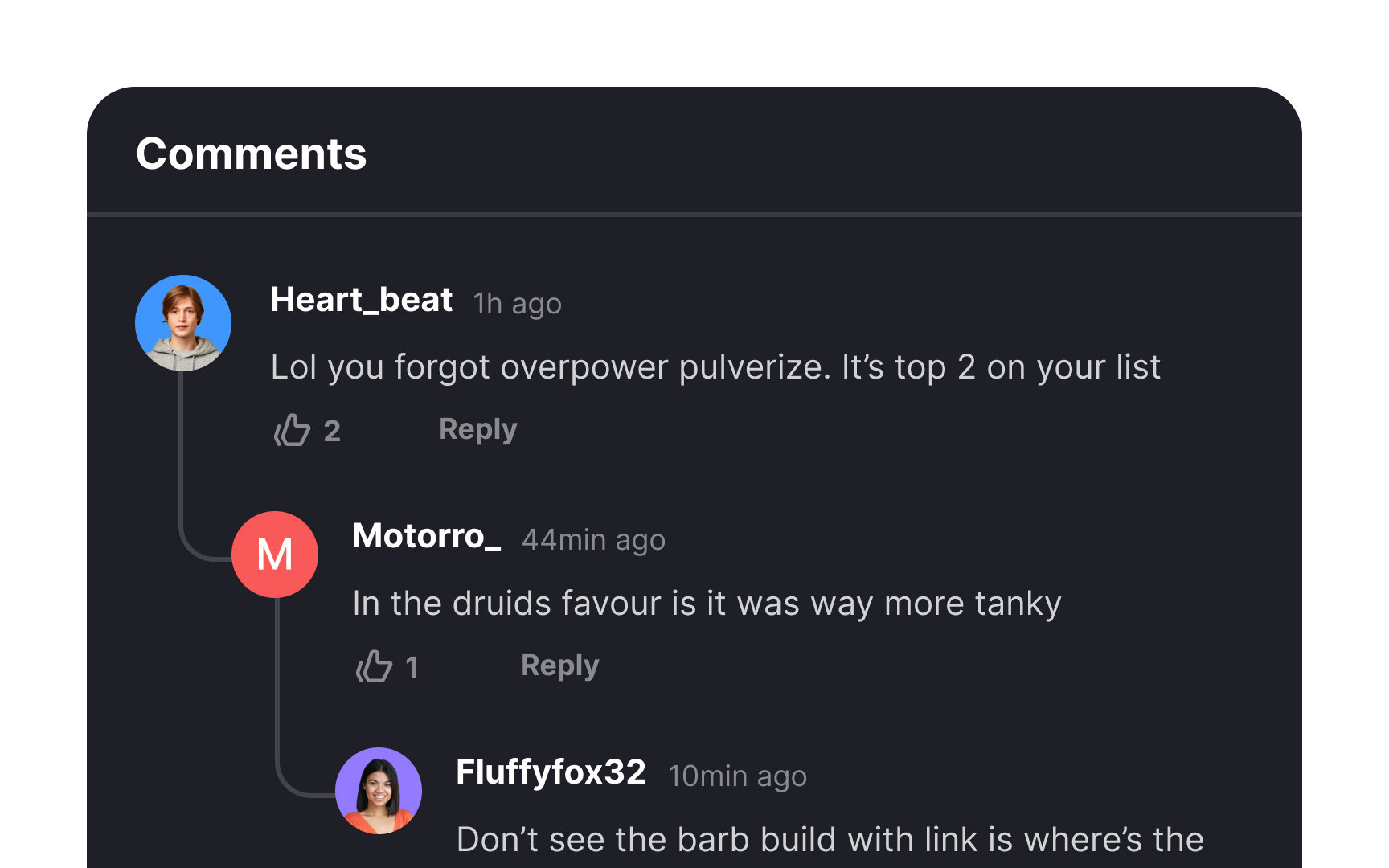
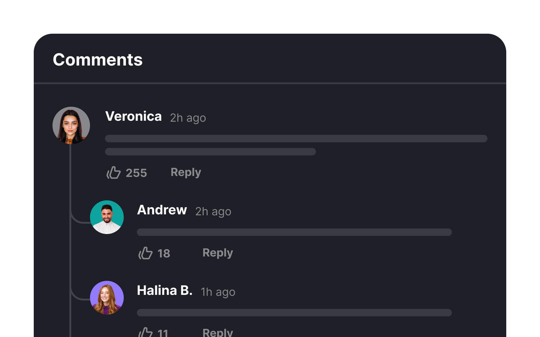
Threaded view organizes comments like a tree, with responses nested under their respective parent comments. It allows for clear, easy-to-follow conversations within a comment section, especially when there are many replies to different points. This format helps users track specific discussions and replies more effectively.
It is best used in situations where discussions involve multiple subtopics or when there are many responses to different points. It's particularly effective for managing complex conversations with numerous participants, as it helps users follow specific threads within a comment section more efficiently. So, it is commonly employed in forums, message boards, and platforms with in-depth discussions.


Designing a threaded view for mobile requires careful consideration, especially for smaller screens. Prioritize simplicity and clarity. Utilize clear visual cues, such as indentation or lines, to indicate the hierarchy of comments. Ensure that users can easily identify parent comments and their corresponding replies.
Limit the depth of threads to 2 or 3 levels for better mobile usability. If users need to explore further, offer an option to open the thread in a new window, maintaining a seamless browsing experience. Additionally, consider implementing collapsible threads to help users manage and navigate through longer discussions. This way, they can expand threads of interest while keeping the interface tidy.
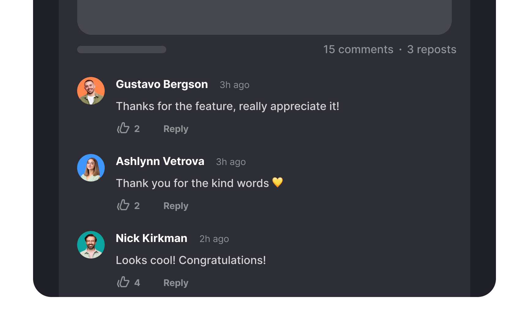
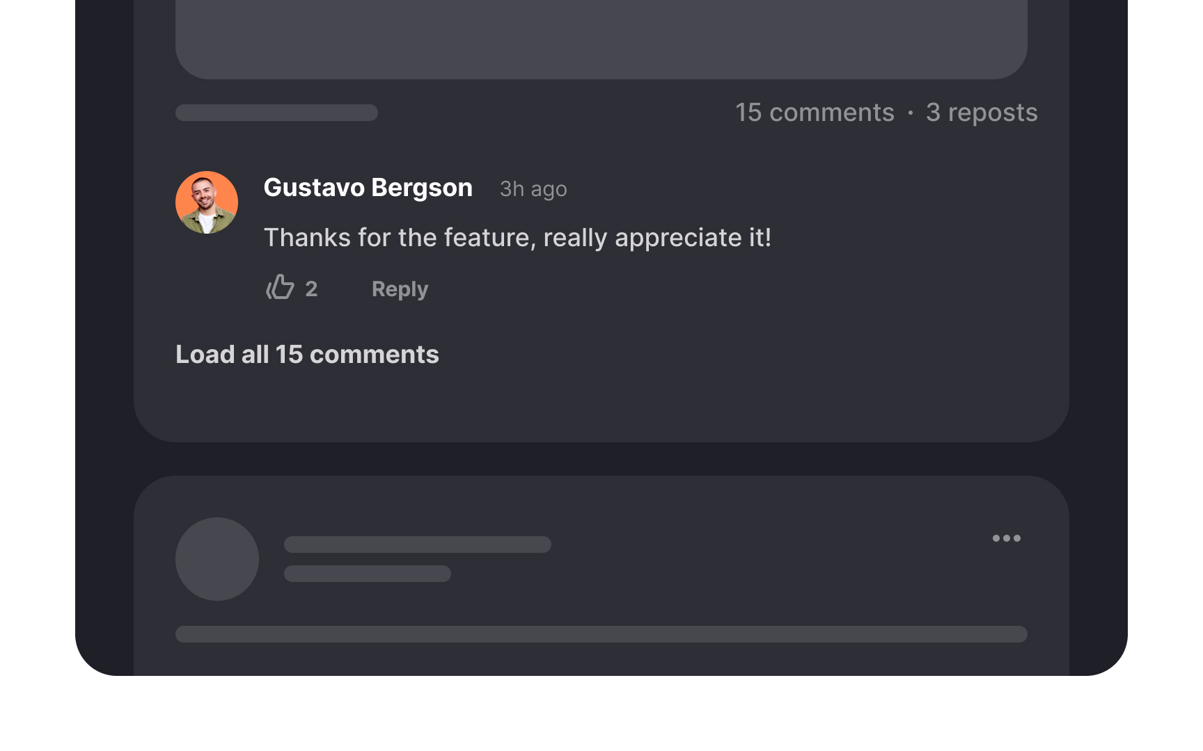
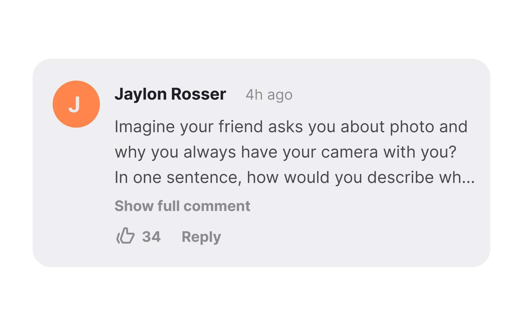
Refrain from displaying all comments simultaneously, as this can lead to page overload and divert users from more important content. Endless scrolling can also complicate navigation and test users' patience. Instead, consider an approach where comments are initially hidden, with only the most popular or recent ones visible.
You can either load the next portion automatically as users scroll down or on request when they press the "View More" option. It's up to you to decide how many comments to load upon each click. This allows users to focus on the most relevant discussions, improving their overall browsing experience.
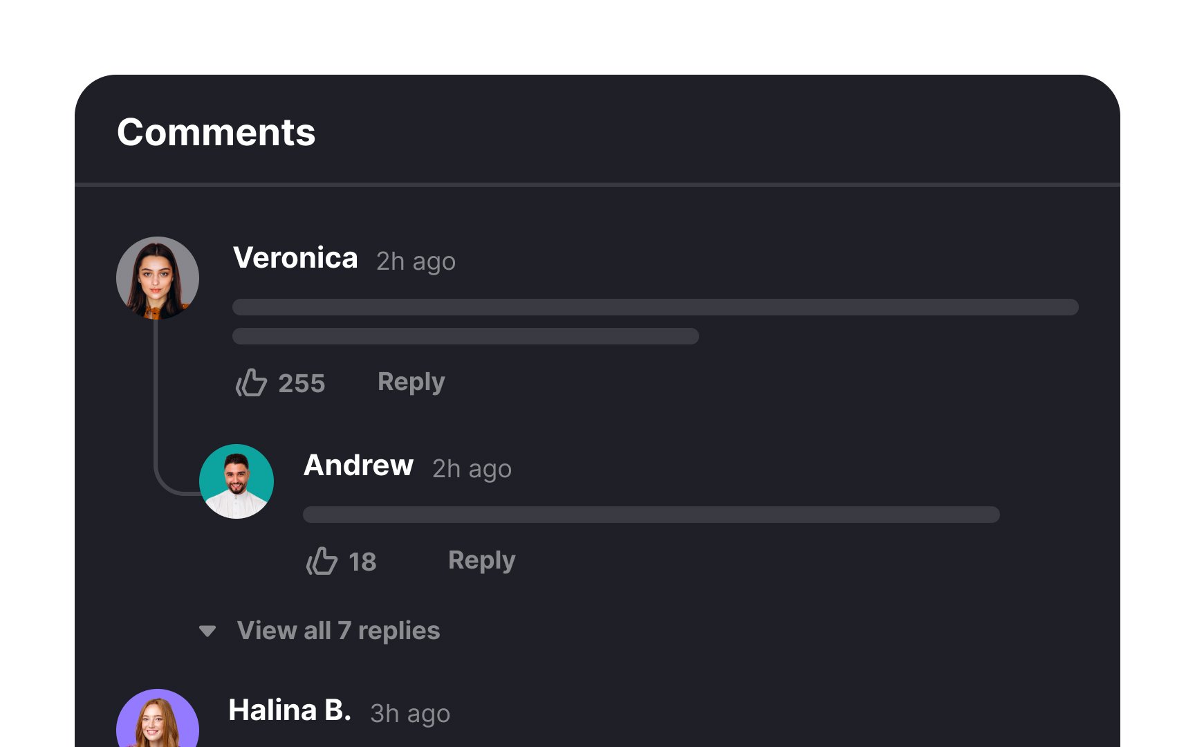
Avoid showing all threaded comments at once. Instead, display all first-level comments and one of the many second-level comments (perhaps the most popular or recent one). Hide the rest of the lower-level comments and let them unfurl on click or tap. This will allow users to quickly scan the discussion and decide what threads they want to participate in. Also, this will ensure a cleaner look of the comment section.
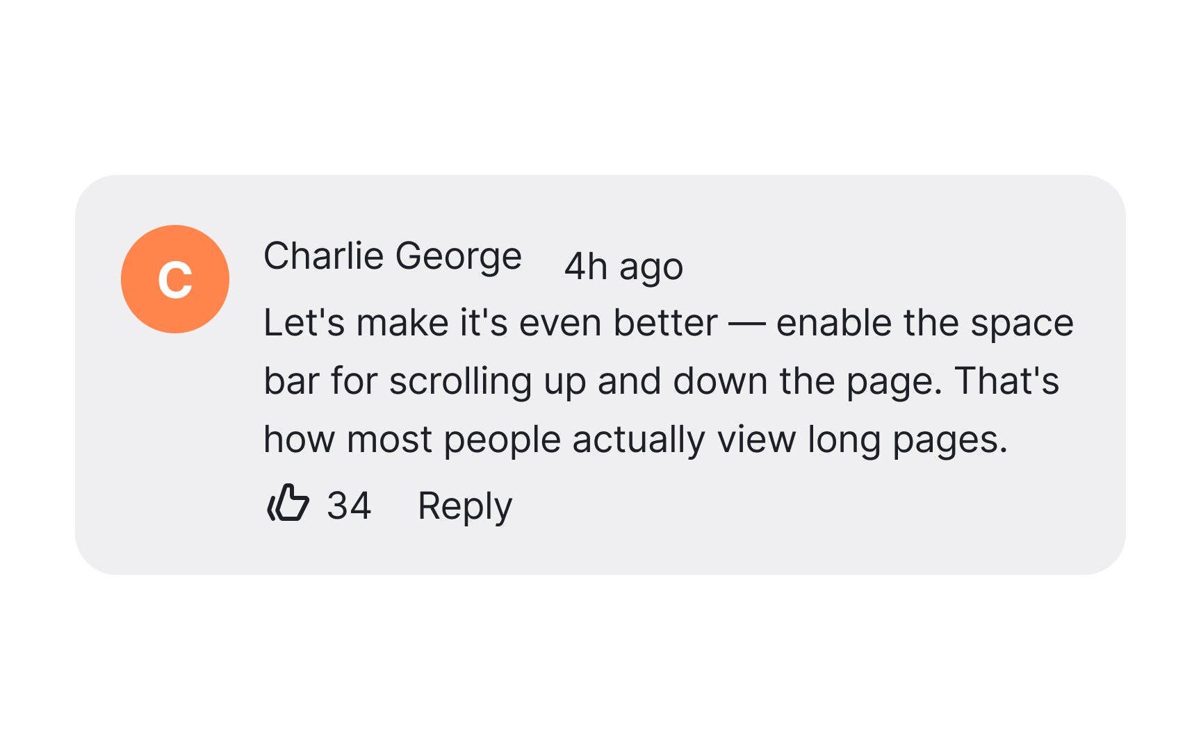
Reading comments can be overwhelming. Help users clearly distinguish the main elements, like usernames, from less essential ones, like timestamps. Establish visual hierarchy by using colors, contrast, scale, and the proximity principle.[1] A clear visual hierarchy will help your users perceive and navigate the
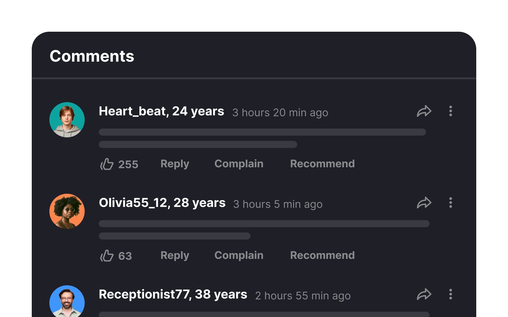
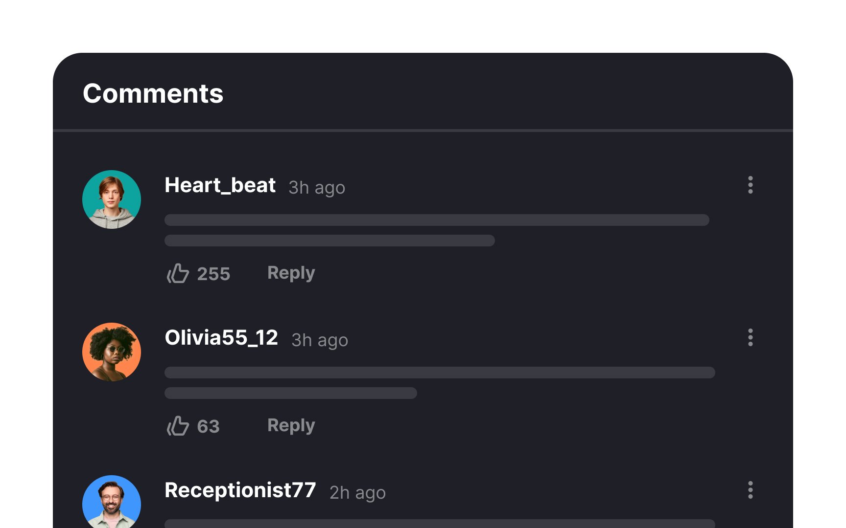
Simplicity is key when designing comment cards. Avoid clutter to ensure a clean and user-friendly interface that prioritizes the most important actions.
Present only essential options that users will regularly utilize. Determine these options through user research or by examining the designs of comparable products. Common comment choice options include features like "like", and "reply."
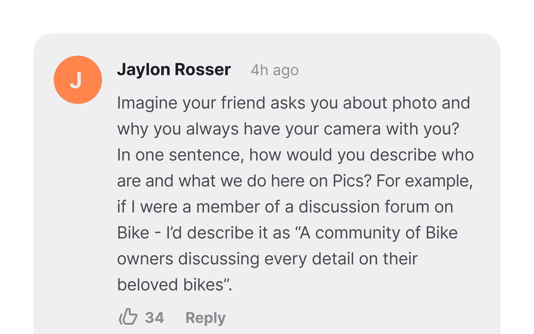
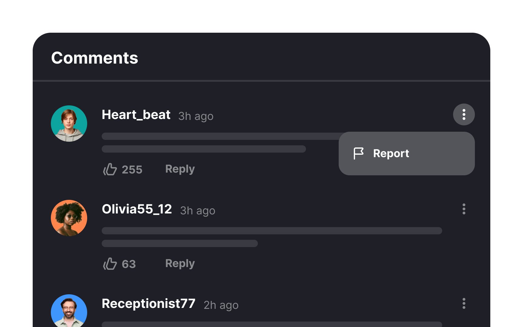
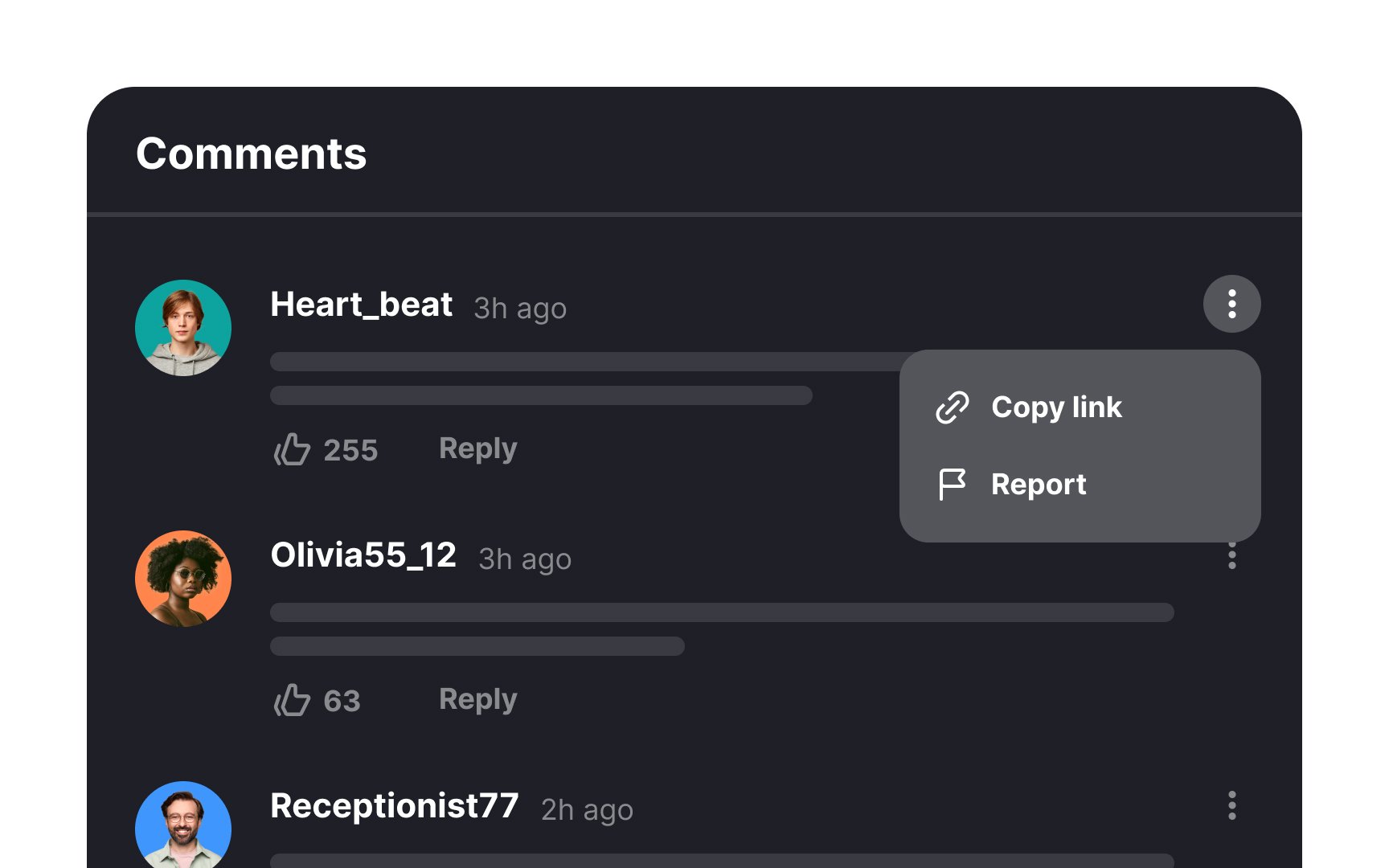
Comments can vary from benign to revolutionary, and it's important to allow users to share them beyond the platform. Allowing users to copy comment links facilitates easy sharing and invites others to participate in discussions with minimal friction. This feature not only promotes engagement but also expands the conversation's reach, enhancing the overall value of the discussion.
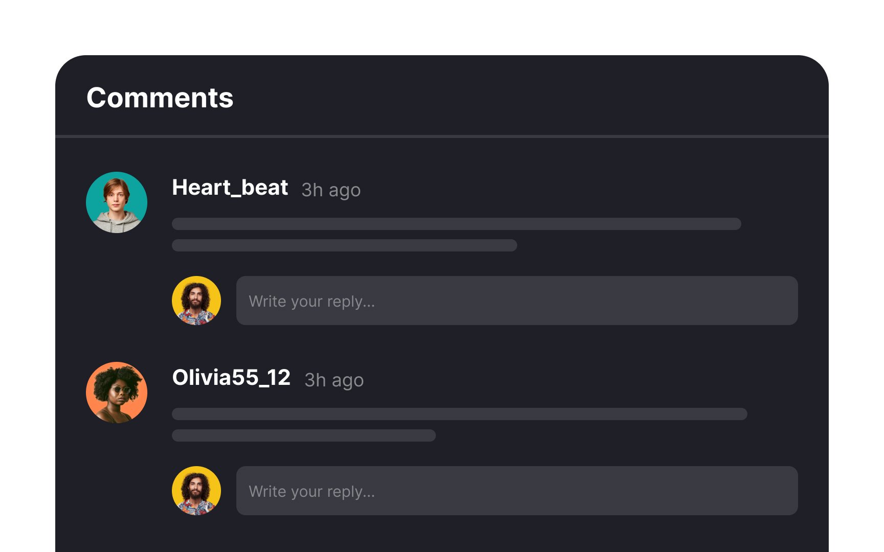
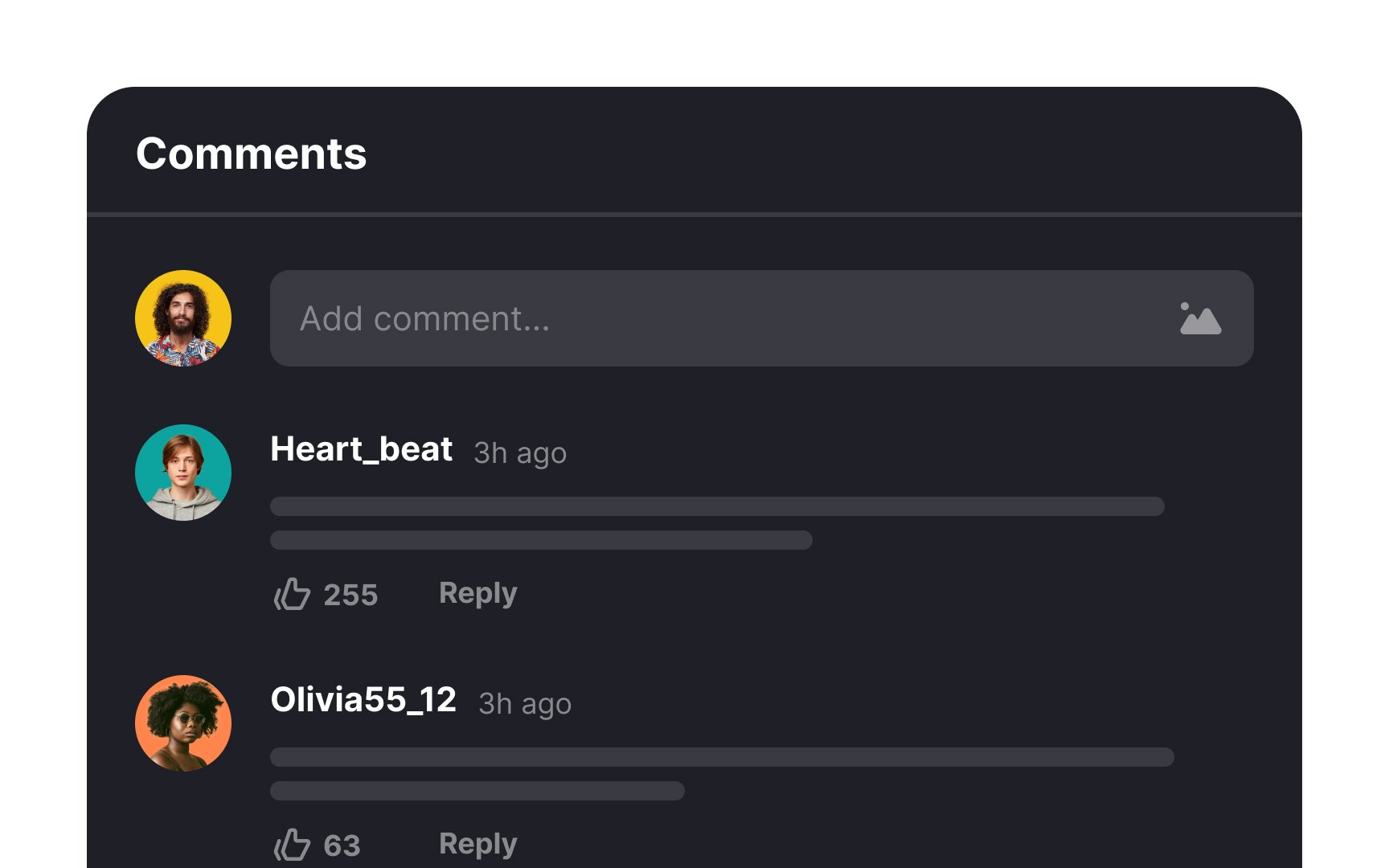
To encourage meaningful discussions and diverse viewpoints, make the first-level comment action the most evident and accessible. Position the comment input either at the top or bottom of the comment section, making it easy for users to contribute their thoughts. Treat replying to existing comments as a secondary action to further support a dynamic exchange of ideas.
Pro Tip: Find the right balance with the Reply button. Make it easy to find, but not too flashy.
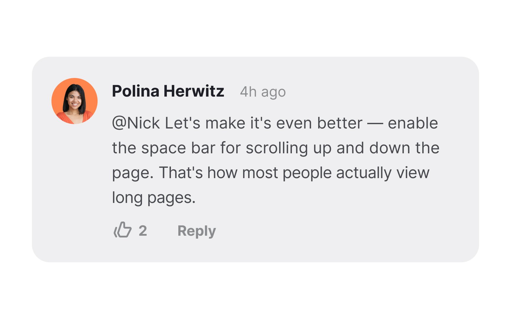
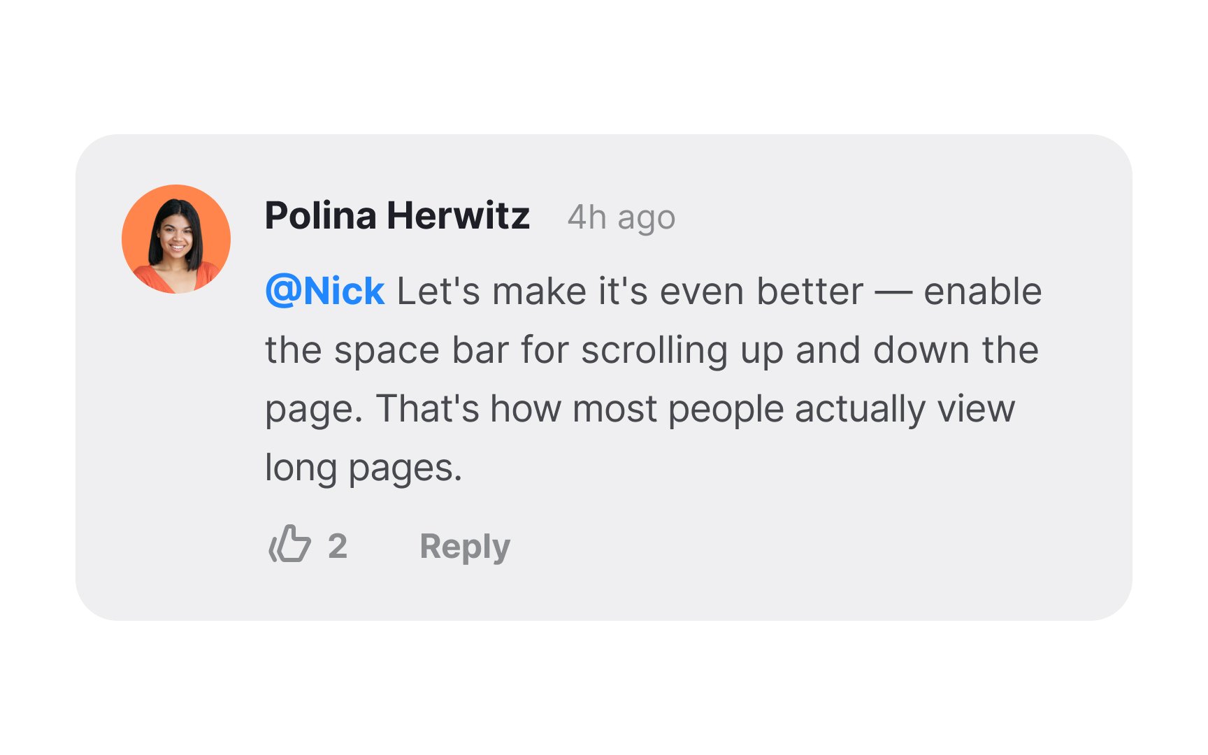
Mentions or tags, commonly denoted by the (@) symbol, serve to address or involve specific users in a discussion directly. Make sure you design a seamless notification system for when the mentioned person is alerted. Additionally, consider providing an option to disable these notifications for users who may prefer not to receive them.
To enhance clarity, set apart the mention, such as "@Nick," with a distinct
References
- Visual Hierarchy in UX: Definition | Nielsen Norman Group
- Break it until you make it | Medium
Top contributors


Topics
From Course

Share


Similar lessons

Best Practices for Designing Login & Signup Flows

Best Practices for User Onboarding Flow Design
