Contrast and distinction

Contrast refers to the distinct difference between two elements that are put together or closely associated. Contrast makes elements stand out on the page. It can be achieved through the use of color, alignment, size, fonts, shapes, and other design choices. Contrast goes beyond just aesthetics and is a vital aspect of accessibility.
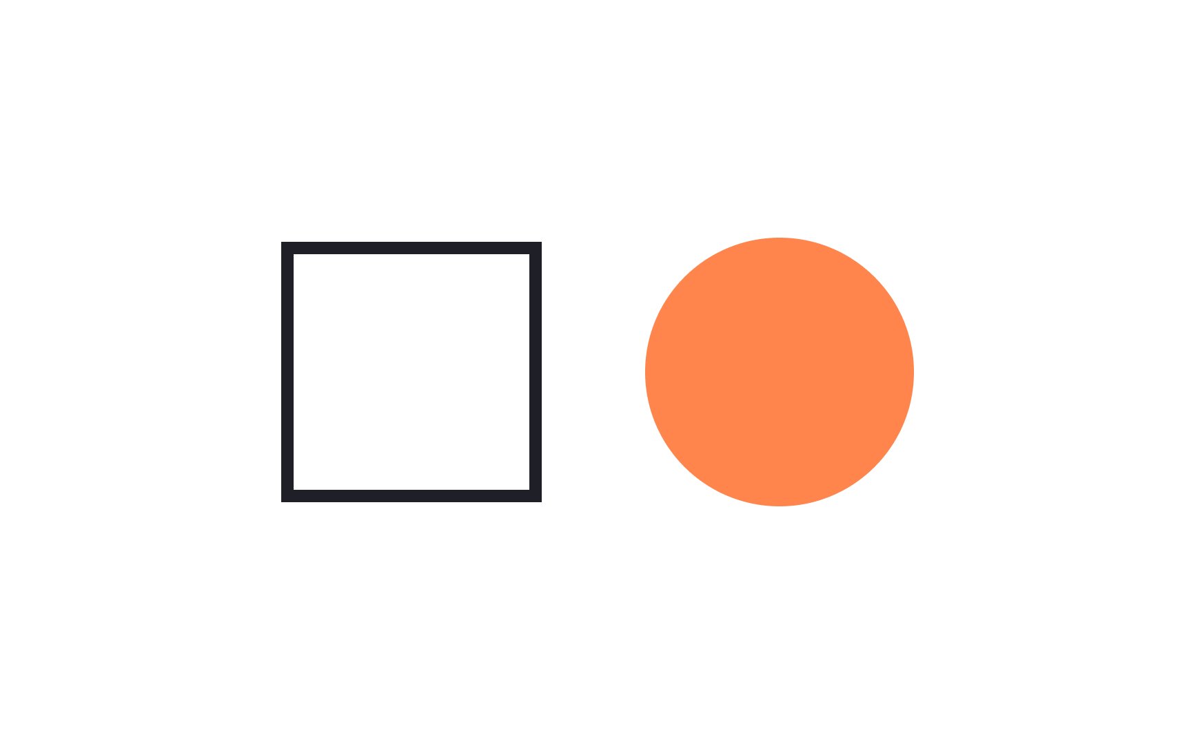
Always aim for more than one point of contrast between elements. Experiment with size, shape, color, typography, and other visual aspects to guide users to the most important information on the page.
