Golden Ratio
The Golden Ratio is a mathematical proportion often used in design to create balance, harmony, and visually pleasing layouts in digital and physical products.


What is a Golden Ratio in UX/UI design?
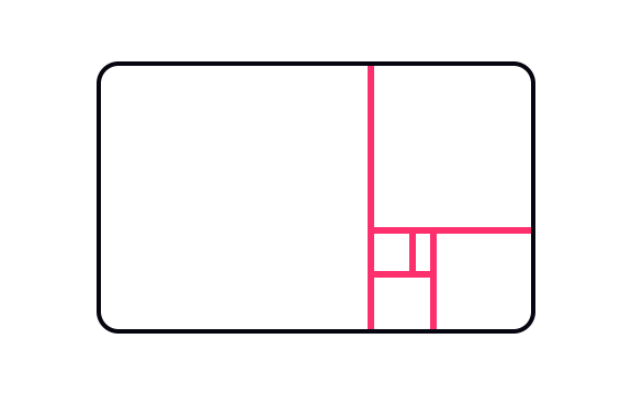
The Golden Ratio, expressed as approximately 1.618:1, is a mathematical proportion that has been applied to art, architecture, and design for centuries. It is derived from the Fibonacci sequence, where each number is the sum of the two preceding it. When applied to design, this ratio is believed to create a sense of natural balance and harmony that feels intuitively pleasing to the human eye.
How to use and apply Golden Ratio?
For UX and UI designers, the Golden Ratio provides a framework for structuring layouts, typography, and visual hierarchies. It can be used to determine column widths, image placement, or spacing between elements, ensuring that proportions feel balanced. For example, a designer might divide a screen using the ratio, assigning larger and smaller areas that guide user attention naturally without feeling forced.
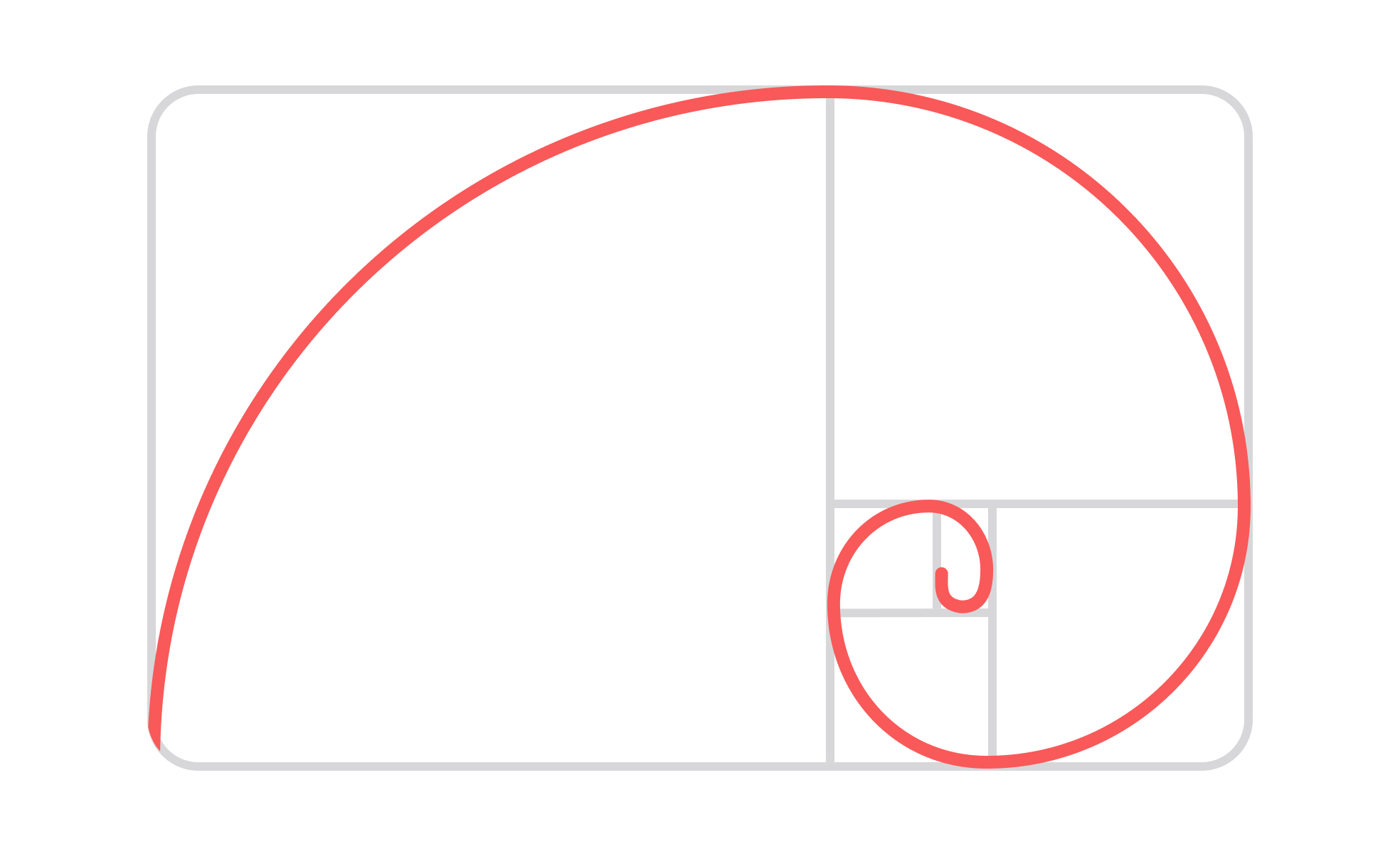
Real-world applications abound. Apple has famously applied proportional balance in many of its product designs, from the dimensions of the iPod to the layout of the iOS interface. Architects like Le Corbusier used the ratio to guide building designs, and even natural phenomena, such as the spirals of shells and sunflowers, often reflect Fibonacci proportions. In digital products, the Golden Ratio often shapes grid systems and image cropping, even when not explicitly acknowledged.
That said, the Golden Ratio is not a strict rule. Many effective designs do not use it, and applying it mechanically can result in forced or impractical layouts. It is best understood as a tool rather than a formula, offering inspiration and guidance rather than constraints. Designers often combine it with other principles, such as the rule of thirds, grid systems, and modern responsive design practices.
The Golden Ratio remains influential because it bridges mathematics, nature, and aesthetics. It provides designers and product managers with a shared reference point for creating balanced, pleasing designs. While not universally applied, it offers a timeless reminder that proportion and harmony matter deeply in how people perceive and interact with products.
Learn more about this in the Design Format Properties Lesson, a part of the Design Composition Course.
Key Takeaways
- The Golden Ratio is a proportion of approximately 1.618:1.
- Designers use it to create balanced layouts and hierarchies.
- Examples include Apple products, architecture, and natural patterns.
- Best used as a guide, not a rigid formula.
Designers often use the ratio to divide screen areas, establish typography scales, or guide spacing. For example, if a layout width is 960 pixels, dividing it into 594 pixels and 366 pixels aligns with the Golden Ratio. This creates a natural balance between main content and supporting elements.
Typography can also follow the ratio. Designers may size headings and body text according to proportional scales, creating a harmonious rhythm. These applications make interfaces easier to scan and more visually appealing, even if users are not consciously aware of the proportions.
Not necessarily. While the ratio often produces pleasing results, good design depends on usability, accessibility, and context. A perfectly proportioned layout can still fail if navigation is unclear or if accessibility standards are ignored. The Golden Ratio is a helpful tool, but not a substitute for user-centered design practices.
The most effective use of the Golden Ratio is as one of many guiding principles. When combined with user research, responsive grid systems, and testing, it contributes to products that are not only beautiful but also functional and inclusive.
The Golden Ratio appears naturally in shells, plants, and galaxies, which may explain why it feels harmonious to humans. Artists and architects have long applied it consciously, from the Parthenon to Renaissance paintings, embedding it into cultural heritage.
In modern design, its influence persists because it connects timeless aesthetic principles with digital needs. By bridging nature, mathematics, and technology, it provides a shared language for creating designs that feel balanced and familiar.
Recommended resources
Courses

UX Design Foundations


UI Components I


Design Terminology

Lessons

Design Format Properties

Typography in Page Design