Typography in Page Design
Learn how to effectively integrate typography to enhance the overall visual appeal and readability of your page design
Typography doesn't exist in a vacuum. Well-designed typography contributes to the overall user experience on a given page. Even the most beautiful typographic designs on the sentence or paragraph level can fall apart if they aren't well-integrated into the overall page composition.
Using typography to contribute to the overall page design is an important skill for all designers. Understanding how alignment, white space, consistency, and other typographic skills can create more dynamic and interesting pages that invite users to read content is critical for designers to master.
The golden ratio is a mathematical ratio commonly found in nature. The most famous sequence of numbers that follow the golden ratio is the Fibonacci sequence, where each subsequent number is equal to the sum of the 2 numbers preceding it. The golden ratio is approximately equal to 1:1.618.
The harmony of the golden ratio has been used for centuries in geometry, art, architecture, and
The golden ratio isn't the only way to define
Alignment helps create dynamic
Most European languages use left-to-right scripts, so the text is aligned to the left. Languages like Arabic and Hebrew are written right-to-left, and that's why their text is right-aligned.
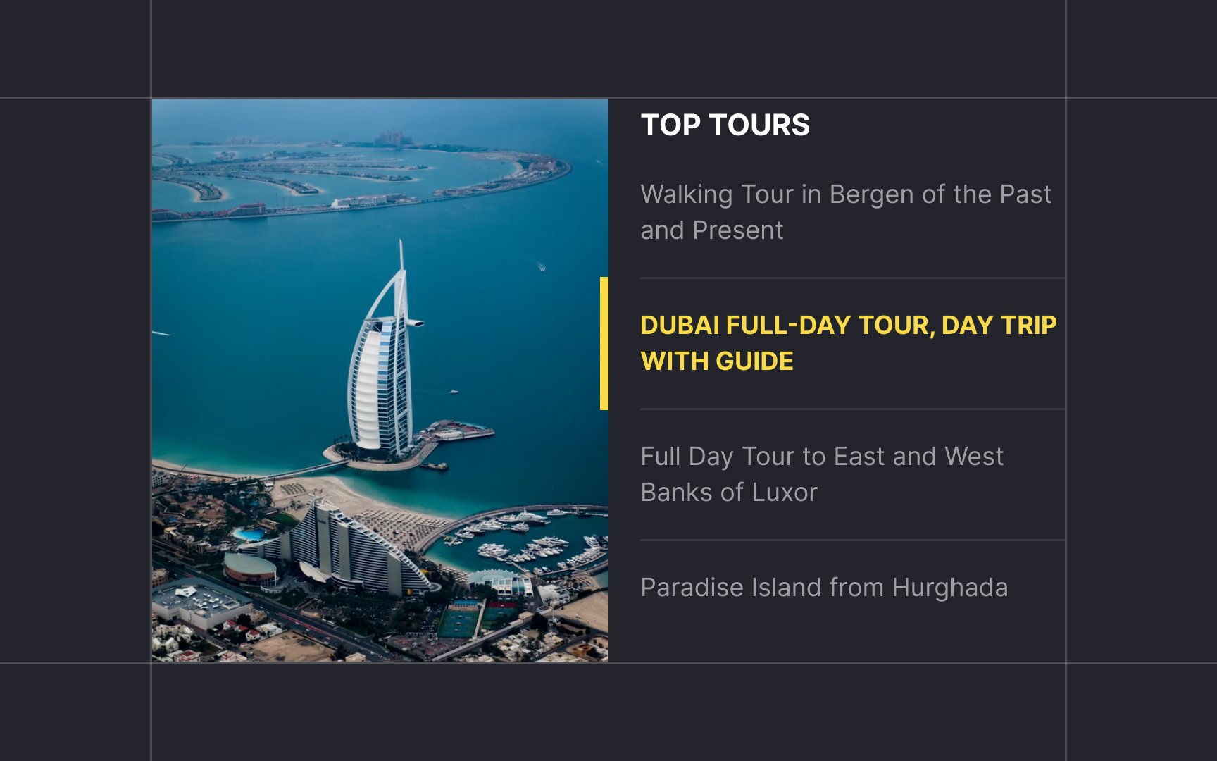
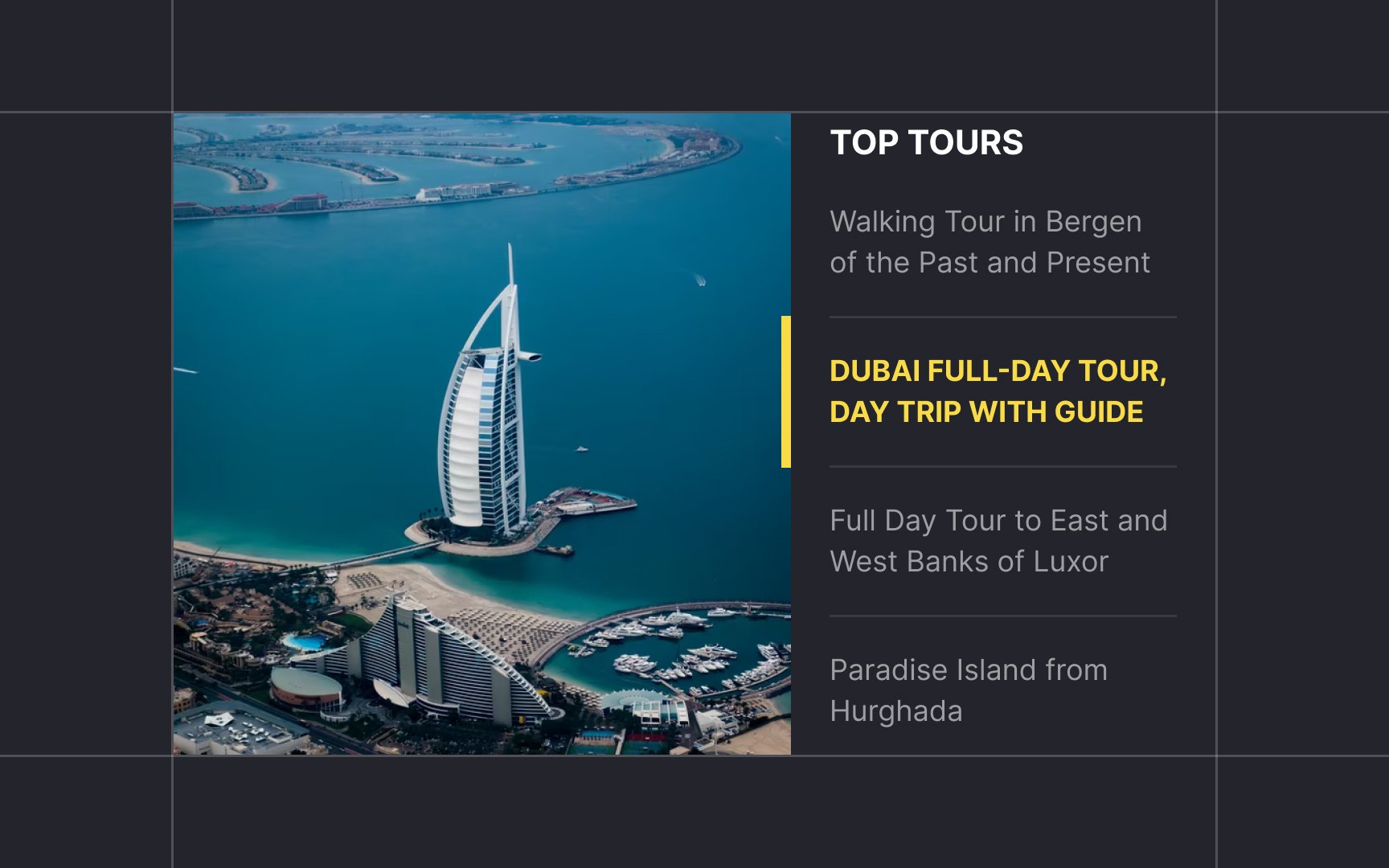
Mixed alignment refers to layouts where elements have different alignments. Misaligned elements contrast with the rest of the design, which breaks the reading flow. Using opposing alignment or centering titles, quotes, and subscripts helps text stand out. When done well, this can add a dynamic and energetic feel to your work.
Butterick's Practical Typography introduces the terms "foreground" and "background" in the context of
In the page layout context, the foreground is the area that contains essential page elements — mainly headings and the body text. The background contains everything else, like sidebars and navigation.
It's crucial to make the foreground elements more prominent than background elements. Use position, size, font, and color to communicate different levels of importance. For example, choose a larger type for the body text while reducing the weight and size of secondary elements. Using a more subdued color also communicates lesser importance.
Small changes in
Start by changing any of the following in the smallest visible increments:
Typography thrives on fine details. The difference between not enough and too much can be rather small.


Macro white space also surrounds the design layout and acts as a container. Google's homepage is a great example because its simple look has become iconic. Because there's no clutter, there's less work for the eyes and the mind. It also helps users focus on why they're there — i.e., to search for something.[3]
Clients and managers might consider white space wasted space, but filling it with more information or other visual elements can result in mediocre
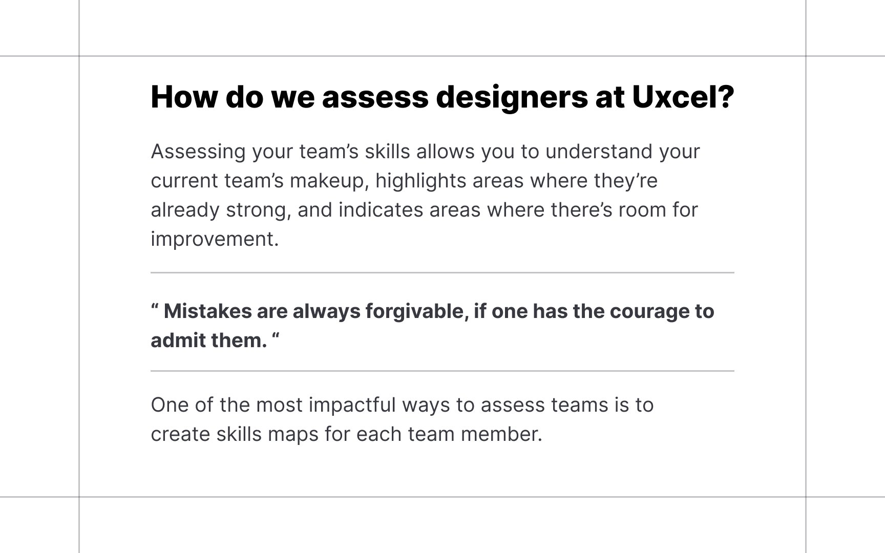
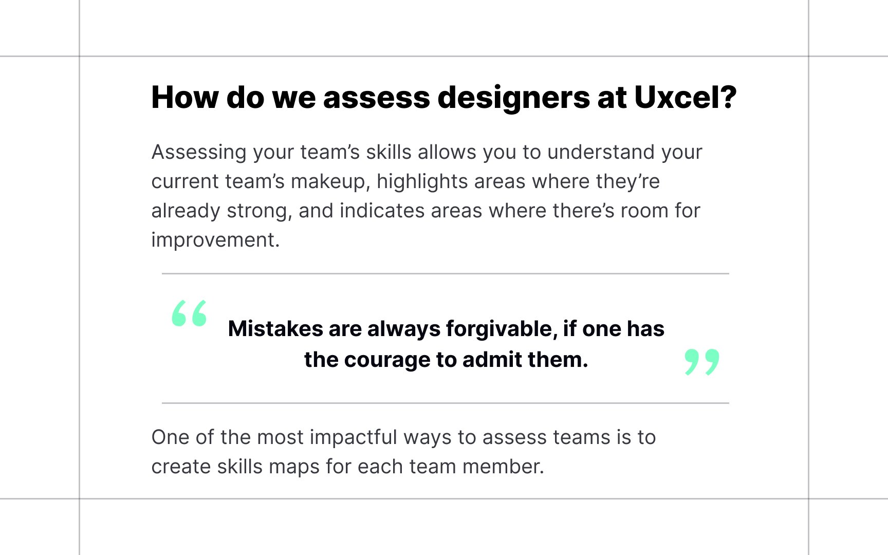
One of the main functions of typographic design is to create structure and hierarchy. A good hierarchy isn't possible without consistency, as it shows the relationship between typographic elements. This means that similar elements are similarly styled. For example, headings are bigger than the
Even though you may have many hierarchy levels, stick to an overall theme for the design. In the example, hierarchy is created mostly by size and
As Mark Twain once said, "All ideas are second-hand, consciously and unconsciously drawn from a million outside sources." There are a million successful
If you see
References
- What is the golden ratio | Canva | Learn
- Why Subtle Typographic Choices Make All The Difference — Smashing Magazine | Smashing Magazine
- The power of white space | The Interaction Design Foundation
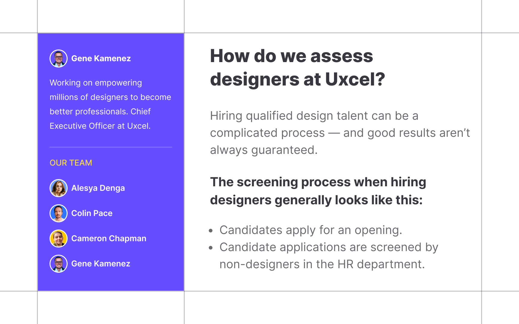
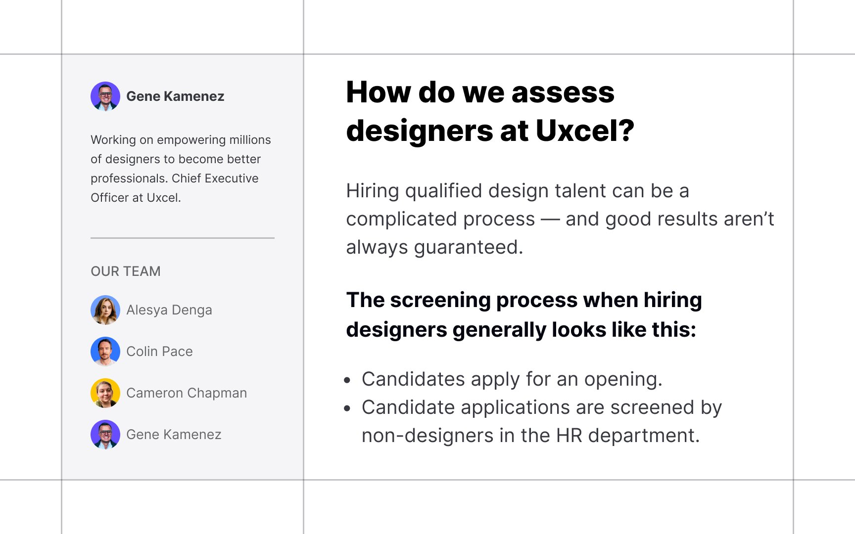
Top contributors

Topics
From Course

Share


