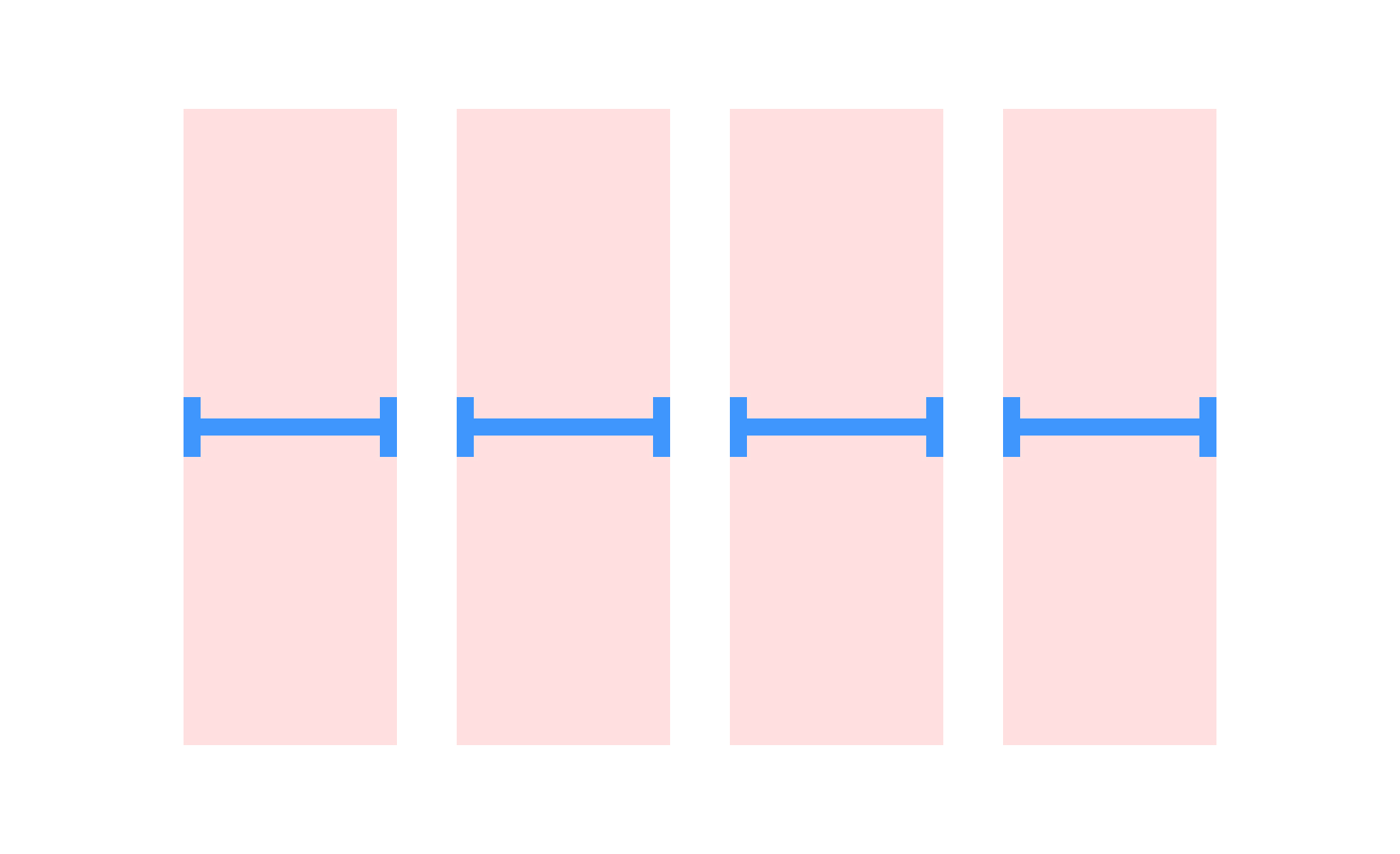
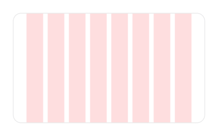
Columns
Columns are vertical divisions used in design and product layouts to organize content, support readability, create structure, and guide user flow.


Columns are a fundamental layout technique used in both UX/UI design and product management to structure information in a clear, digestible way. They divide content into vertical sections, ensuring that text, images, and interactive elements align visually and logically. Columns allow designers to create balance, establish hierarchy, and improve readability in both web and mobile interfaces.
In UX and UI design, columns are critical for creating responsive layouts. By breaking content into columns, designers can adapt structures for different screen sizes, from large desktops to narrow mobile devices. For example, a three-column design on desktop may collapse into a single column on mobile, ensuring users still receive the same information without losing clarity or flow.
Columns also provide rhythm and alignment, which are essential for creating professional, polished designs. Grids built with columns ensure that spacing between elements remains consistent, preventing interfaces from appearing cluttered. Users may not consciously notice this structure, but it significantly impacts their ability to focus and navigate content without friction.
Real-world applications highlight the flexibility of columns. News websites like The New York Times use multi-column layouts to present different types of articles while keeping the experience cohesive. Design tools like Figma or Sketch provide column grid systems so designers can plan layouts with precision and test responsiveness in real time. These practices show how columns serve as both creative and practical tools.
Accessibility is also tied to columns. Proper column structure helps users relying on screen readers interpret content in a logical order. Without consistent column layouts, content may be read in confusing sequences, lowering usability for individuals with visual impairments. This is why accessibility standards often recommend using true column structures rather than visual approximations created with text boxes.
Learn more about this in the Columns Exercise, taken from the Intro to Design Grids Lesson, a part of the UX Design Foundations Course.
Key Takeaways
- Columns divide content into vertical sections for clarity and structure.
- They support responsive design by adapting layouts across devices.
- Columns ensure rhythm, alignment, and consistency in visual design.
- Product managers rely on columns to organize data and features.
- Accessibility improves when true column structures are used..
Columns create a structure that makes content easier to read and navigate. They prevent clutter by enforcing alignment and spacing, giving users a smoother experience. When applied through a grid system, they also ensure balance, which improves visual appeal.
Columns also adapt to different devices. A design that looks clear in three columns on desktop can reflow into a single column on mobile, preserving both clarity and hierarchy. This flexibility ensures that content remains usable in multiple contexts.
Columns influence how information is prioritized and presented in products. Dashboards, for instance, use columns to show multiple metrics side by side, enabling quick comparisons. Product managers rely on these structures to help users focus on the right data at the right time.
In e-commerce or SaaS products, column design can directly impact revenue by improving browsing speed and reducing friction. By strategically placing content in column-based layouts, teams ensure that features align with business objectives.
Yes, accessibility depends on using columns correctly. Screen readers interpret content based on its underlying structure, not just visual appearance. If content is placed in pseudo-columns created with text boxes or images, users may hear information in a confusing sequence.
Designers should use semantic column structures supported by code, ensuring logical flow and accessibility. This approach benefits not only those with disabilities but all users, since structured layouts create more predictable and intuitive experiences.
Recommended resources
Courses

UX Design Foundations


UI Components I


Design Terminology


Projects

Bookshop check out flow


Graphic Design Website


Teach it - School management system - MVP