Columns
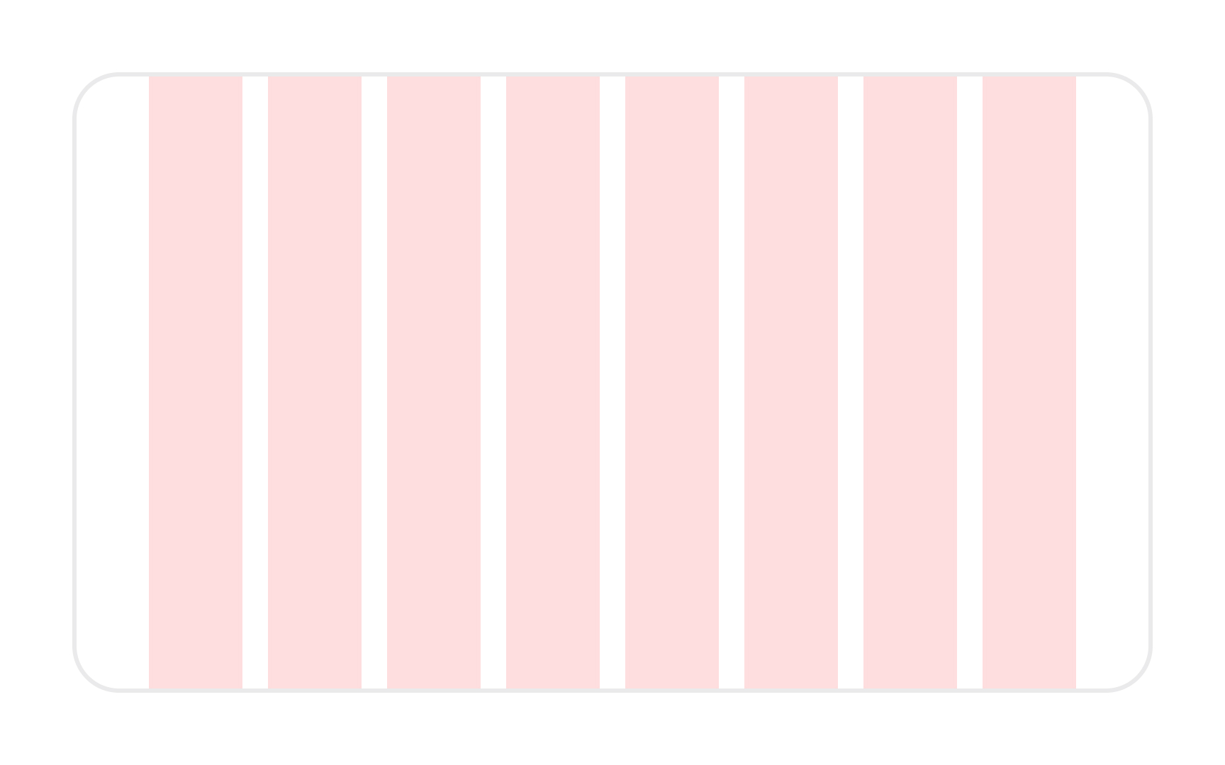
Columns are vertical spatial areas that hold content within the grid. They are the most basic building blocks of a grid. The number of columns is defined upfront and may vary based on the device's size — desktop, tablet, or mobile.
Depending on the grid's exact specs, the column's width scales proportionally to the available screen space. All content usually falls within the bounds of the columns (though content often bridges more than one column).[1] Some elements can "break the grid" to draw attention, but in most cases, try to align all of the grid's contents to a column.
A 12-column grid is common for large viewports, while smaller viewports use fewer columns.
References
Top contributors