Negative Space
Negative space, also known as white space, is the empty area between design elements that improves readability, creates balance, and emphasizes visual hierarchy


TL;DR
- Empty space between design elements.
- Improves clarity and readability.
- Guides attention and visual flow.
- Creates balance and focus in layouts.
Definition
Negative space is the unmarked area between or around elements in a design, used to separate, organize, and highlight content, improving readability and overall user experience.
Detailed Overview
Negative space is more than just empty areas on a page. It is an active design tool that shapes how people perceive and process visual information. By intentionally leaving room around text, images, and interface elements, designers prevent clutter and give the eye space to rest, which increases focus on important content.
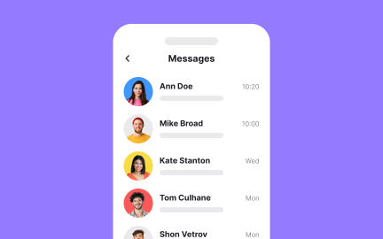
A frequent question is why negative space matters for readability. Dense layouts with no spacing force users to work harder to process information. By contrast, generous spacing between lines of text, margins, and paragraphs reduces strain and improves comprehension. Many digital interfaces, from news apps to e-commerce platforms, rely on negative space to guide the reader’s eye naturally through content.
Another common question concerns hierarchy. Negative space creates relationships between elements by grouping some together and separating others. For example, increasing the space between a heading and body text signals their connection while also making the heading stand out. In this way, negative space acts as a silent but powerful organizer of information.
Teams often ask how negative space contributes to aesthetics. Beyond function, spacing makes designs feel open, modern, and intentional. Luxury brands often use abundant white space to signal sophistication, while news websites may use tighter spacing to fit more content. Each choice communicates tone and impacts how users interpret the brand.
Accessibility also connects closely to negative space. Crowded layouts can overwhelm users with cognitive challenges or impairments. Thoughtful spacing makes interactions more intuitive, reducing the cognitive effort required to complete tasks.
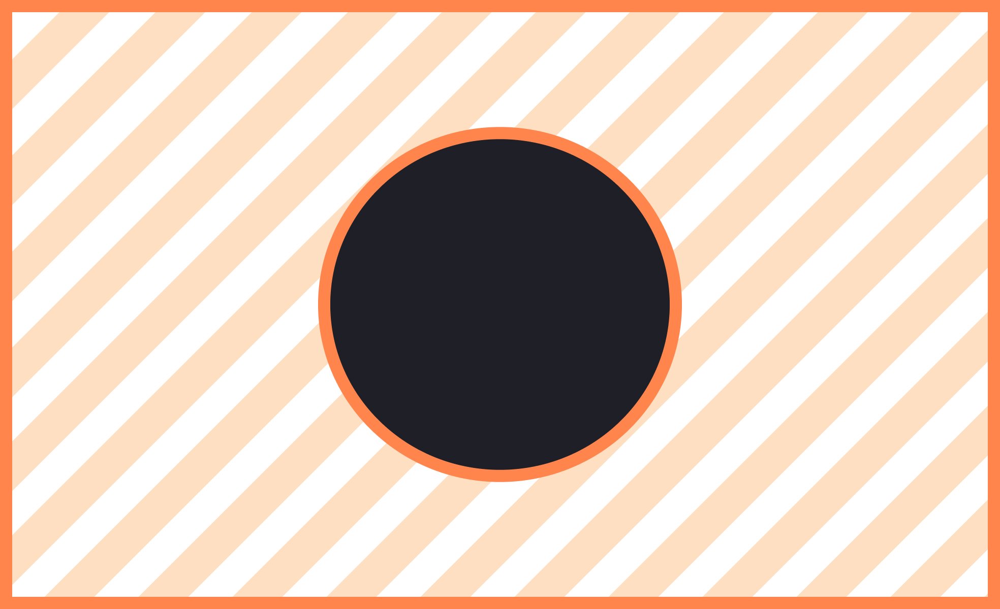
Finally, designers frequently experiment with the active use of negative space. Iconography and logos sometimes hide secondary images or symbols within unused areas, creating clever visual meaning. The classic example is the FedEx logo, where negative space between the letters forms an arrow, reinforcing the company’s identity around speed and direction.
Learn more about this in the Negative Space Design Principle Exercise, taken from the Theory of Design Principles Lesson, a part of the UX Design Foundations Course.
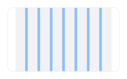
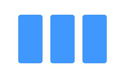
Negative space provides separation between lines of text, paragraphs, and sections, making content easier to scan. Without sufficient spacing, reading feels cramped and tiring, especially on small screens.
By balancing text and empty areas, designers create comfortable layouts that users can navigate effortlessly.
Negative space signals relationships and importance. Wider gaps around headings or calls to action make them stand out, while tighter spacing groups related elements together.
This silent structuring tool ensures users know where to look and how to move through information.
Yes. Minimalist designs that emphasize empty space often convey elegance or calm, while denser designs communicate energy and activity. Brands use spacing intentionally to align visual style with identity.
The amount of negative space directly affects how professional or approachable a product feels.
Users with cognitive or visual challenges benefit from layouts that avoid clutter. Proper spacing reduces cognitive load and improves navigation. By ensuring that text and controls are not crowded, designers make interfaces usable for a wider range of audiences.
Accessibility-friendly spacing creates both comfort and inclusivity.
Yes. Designers often embed shapes or symbols in unused areas, turning absence into presence. The hidden arrow in the FedEx logo is a well-known example.
This creative use shows that negative space is not only functional but also expressive.
Recommended resources
Courses

UX Design Foundations


UI Components I


Design Terminology

Lessons

Basics of Design Composition

Applying Negative Space in Design