Basics of Design Composition
Learn the art of arranging elements within a design for an aesthetically pleasing and engaging user experience
Design composition, also referred to as layout or just "design," refers to how elements on a page are arranged. It's both the simplest and one of the most complex parts of the design because the way elements are placed on the page strongly impacts how users interact with that page.
A well-thought-out composition makes it easy for users to find what they're looking for and encourages them to take the desired action. Learning the basics of good composition allows designers to create pages that accomplish their goals.
Design principles are universal guidelines that, when followed, help create a "good" design. Applying these principles helps designers make informed decisions about color, typography, spacing, and placement of elements. They contribute to creating designs that are aesthetically pleasing, functional, and communicate their intended message effectively to the audience.
Design principles include Gestalt principles (like proximity, continuity, and similarity), as well as other principles such as harmony, balance, and unity.

Design patterns are reusable solutions to design problems. Take a subscription form, for example. The problem presented is allowing users to sign up for a subscription. The most widely accepted design pattern is creating a form with an input for an email address and a submit button. Some designers build on that pattern by adding additional inputs, but the basic structure remains the same.
Patterns are found throughout digital design, aiding in usability. Users recognize the most common patterns and know how to use those functions intuitively. This makes your UI more user-friendly and easier to use.
There are also platform-specific patterns that make iOS or Android applications consistent and more recognizable.


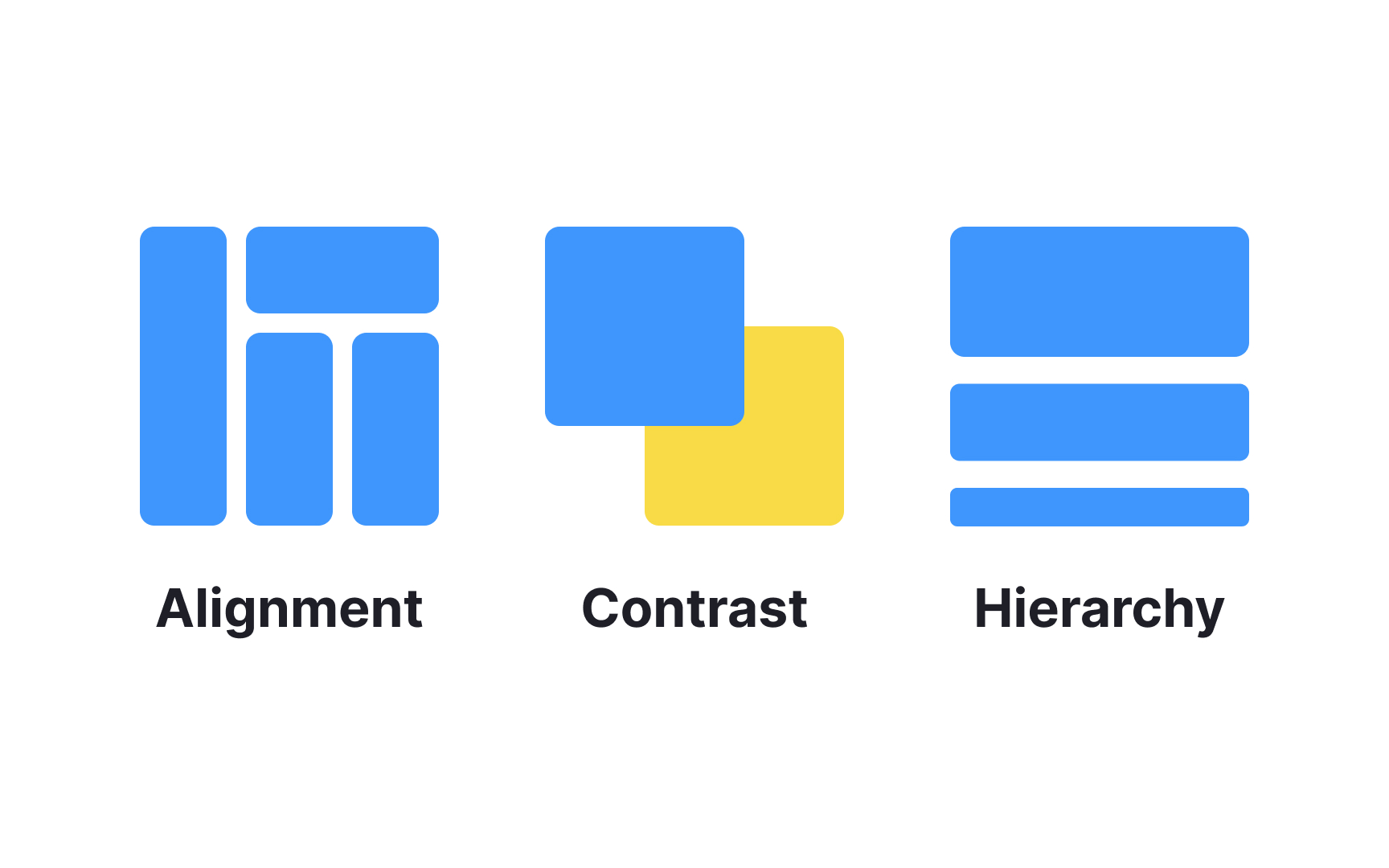
Visual hierarchy refers to arranging elements to show their order of importance. It's created using a scale (the relative size of elements),

Alignment refers to how elements on design formats are placed in relation to one another. Applying alignment means organizing, grouping, or connecting elements to establish a scannable and elegant
There are several types of alignment: center, bottom, top, left, and right alignment. When applied correctly, it helps create balanced compositions, improves readability, and reduces visual clutter.

White (or negative) space is the empty space around the elements in your design. It's not always strictly empty, as the page's background will fill the space.
White space allows elements room to breathe, helps them stand out, and makes it easier for users to scan the
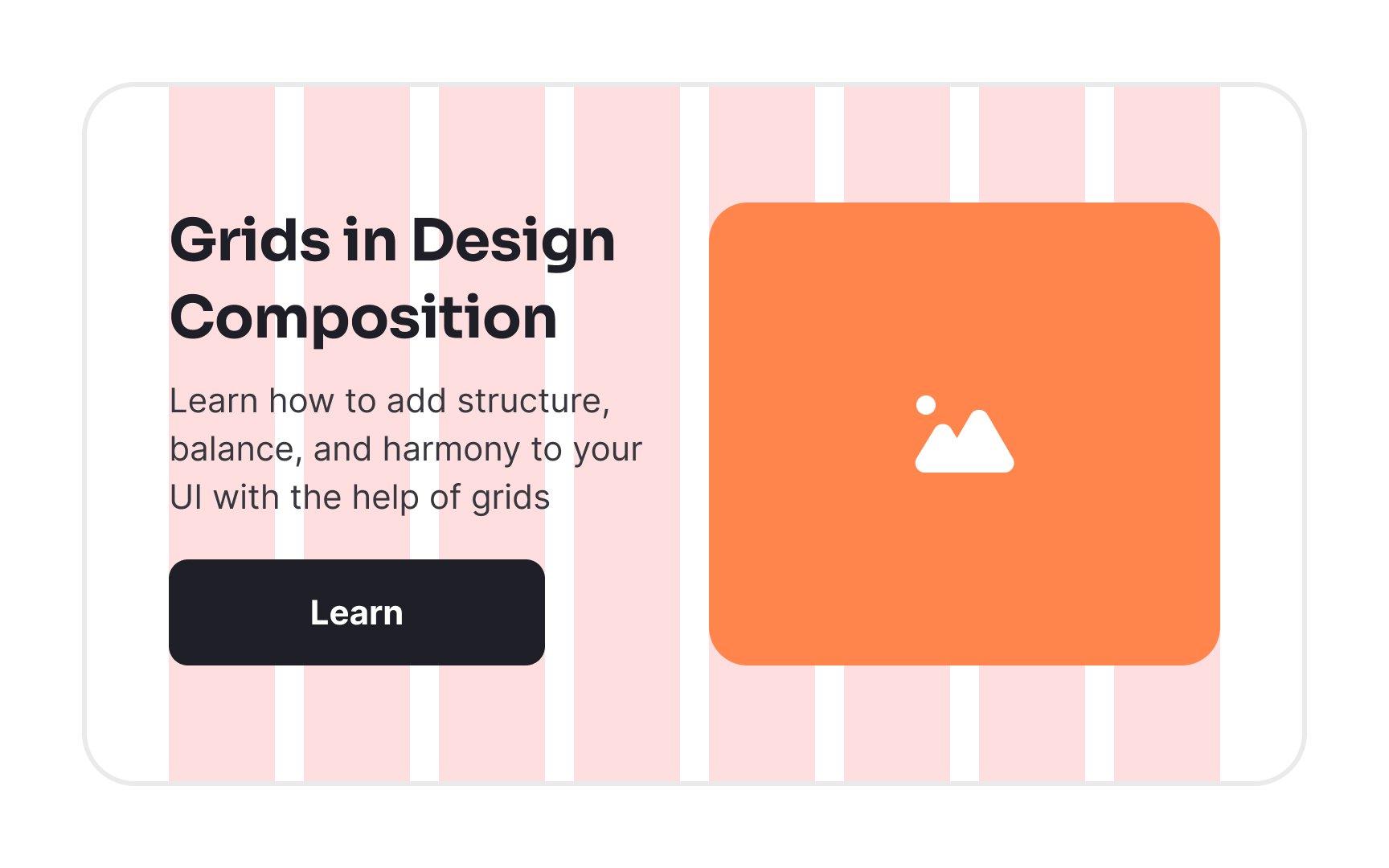
A grid system is a way to align
Some grids are made up of a set number of columns: 9 or 12 are fairly common. Modular grids, on the other hand, add a horizontal subdivision and consist of multiple cells. Most grids also contain gutters, empty spaces a few pixels wide, between each column to improve spacing and alignment.
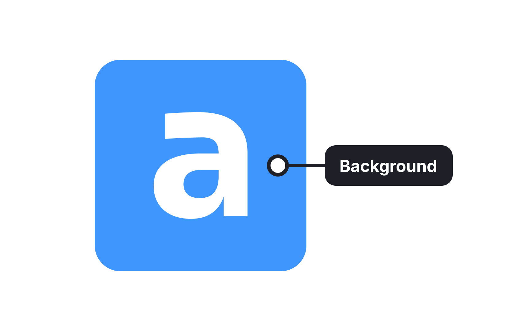
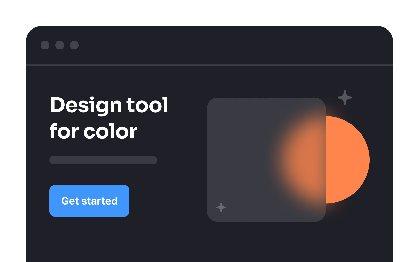
The background of a
The background is often used to create contrast, emphasis, and hierarchy within the design and can be adjusted to enhance the overall aesthetic appeal and readability of the composition.
Pro Tip: Be careful of using a background that is too "busy." It can detract attention from the more important elements.
Aspect ratio is the relationship between the width of an object and its height. A modern desktop digital display, for example, typically has an aspect ratio of 16:9. Older CRT displays usually had a ratio of 4:3.
When expressing an aspect ratio, the width is always the first number, and the height is always the second. This immediately tells you whether an element is in landscape or portrait format: if the first number is larger, it’s landscape; if the second number is larger, it’s portrait.
Top contributors


Topics
From Course

Share


Similar lessons

Intro to Design Layouts

Intro to Design Grids
