Texture
Texture in design refers to the surface quality of an element, visual or tactile, that adds depth, realism, and character to digital or physical experiences.

TL;DR
- Adds depth and realism to design elements.
- Can be tactile (physical) or visual (digital).
- Influences mood, tone, and perception.
- Enhances hierarchy and user engagement.
Definition
Texture is the perceived surface quality of an object or element in design, achieved through patterns, shading, or material effects that create a sense of depth and feel.
Detailed Overview
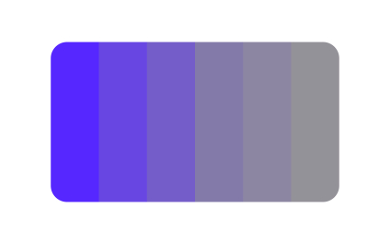
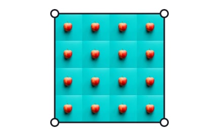
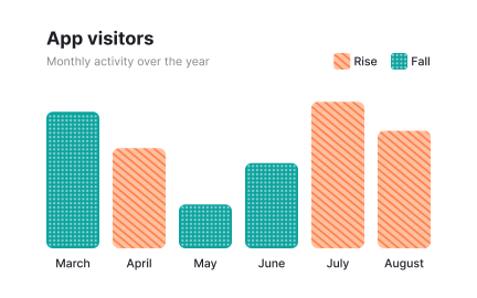
Texture is one of the most powerful yet often overlooked tools in design. It introduces surface qualities, such as smoothness, roughness, softness, or complexity, that impact how users perceive and interact with a product. In digital design, texture is primarily visual, achieved through shading, gradients, or imagery that simulates physical materials. In physical products, it extends to the tactile experience, influencing how something feels in a user’s hands.
A frequent question is why texture matters in digital products where users cannot physically touch elements. Visual texture adds realism and personality to interfaces. For example, skeuomorphic design once relied heavily on textures to mimic real-world objects, leather, metal, paper, helping users understand digital interactions by referencing physical counterparts. Even in flat design trends, subtle textures, such as grain or noise, bring warmth and prevent designs from appearing sterile.
Another common query is how texture influences usability. Excessive or distracting textures can harm readability and create visual clutter. When applied thoughtfully, texture enhances hierarchy by drawing attention to specific elements, such as buttons, cards, or backgrounds. For instance, a raised, textured button can signal interactivity more effectively than a flat shape.
Teams often ask about the balance between style and performance. High-resolution textured graphics can increase load times in digital products, so designers often use lightweight techniques like CSS patterns, SVGs, or compressed assets. Texture should serve function and aesthetic without harming performance.
Accessibility also comes into play. Overly complex textures or patterns can reduce contrast and harm readability, particularly for users with visual impairments. Designers should pair textures with strong color contrast and test across devices. In tactile products, accessible textures can guide navigation; for example, raised dots on keyboards or textured grips on devices.
Learn more about this in the Texture Exercise, taken from the Repetition & Contrast in Typography Lesson, a part of the Typography Course.
In design, texture refers to the visual or tactile quality of a surface or material represented through graphics, artwork, or physical objects. It adds depth, dimension, and a sense of touch to the design, even though it may only be a visual representation without actual physical texture.
Yes. Overly detailed textures can clutter interfaces and reduce readability. Subtle textures work best for enhancing depth without distracting from content.
When used purposefully, textures can guide attention and improve interaction cues.
Texture communicates mood and personality. A rough texture may suggest ruggedness, while a smooth, glossy texture conveys elegance.
Consistent use of textures across touchpoints reinforces brand character and recognition.
Keep textures subtle and purposeful, use lightweight assets to avoid performance issues, and pair them with clear contrast. Testing with users ensures they enhance, not hinder, usability.
Textures should support interaction cues rather than overwhelm them.
In physical products, textured elements can help users navigate by touch. In digital products, designers must ensure textures don’t reduce legibility or contrast.
Balancing aesthetics with inclusivity ensures textures improve experiences for all users.
Recommended resources
Courses

UX Design Foundations

UI Components I

Design Terminology
Lessons

Lighting & Materials


