Use textures to increase accessibility
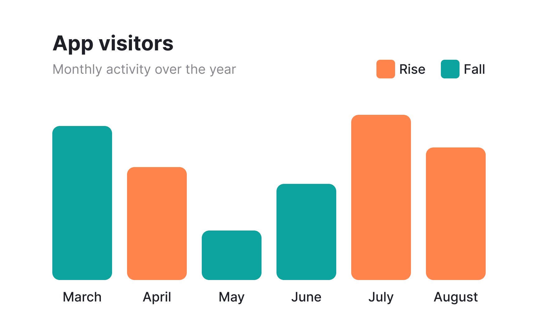
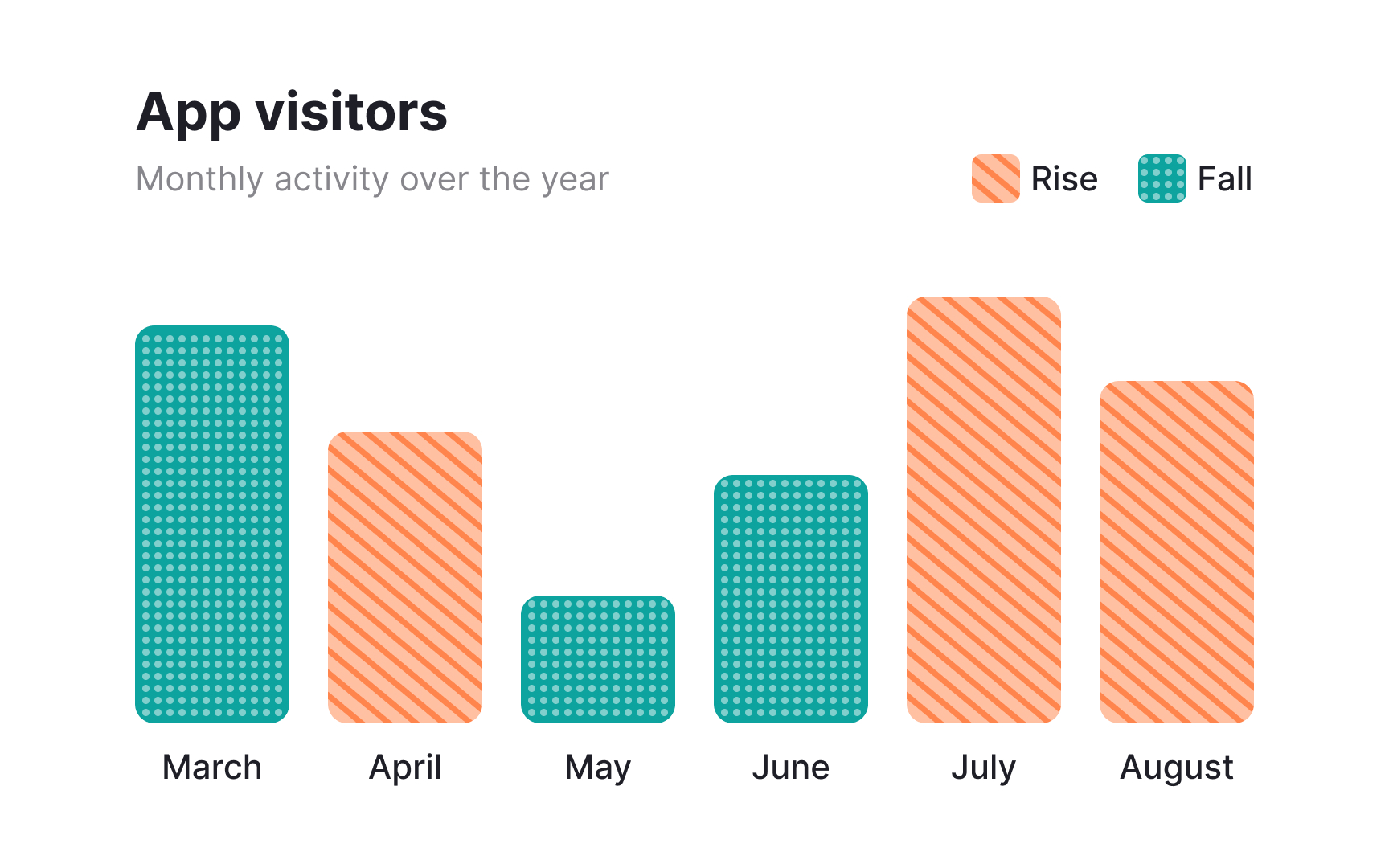
Distinguishing elements without relying on color is essential for accessibility. Color-blind users may have difficulty differentiating between certain hues, such as red and green or blue and yellow, making color-based indicators ineffective. Textures and patterns, like dots, stripes, or diagonals, provide a clear visual distinction that doesn’t rely on color perception.
Incorporating these elements benefits all users, not just those with color blindness. Patterns and textures improve readability in charts, infographics, and interactive elements by creating strong visual contrasts.
