<?xml version="1.0" encoding="utf-8"?>

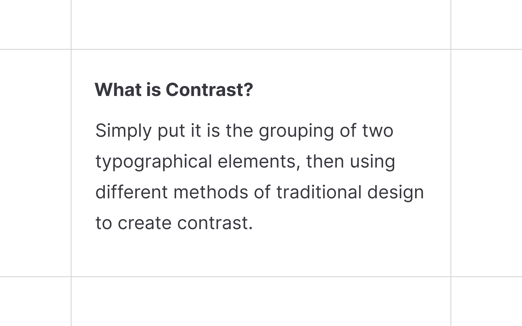
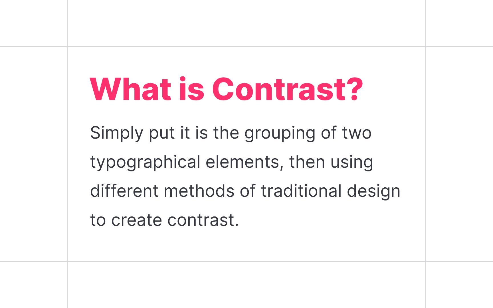
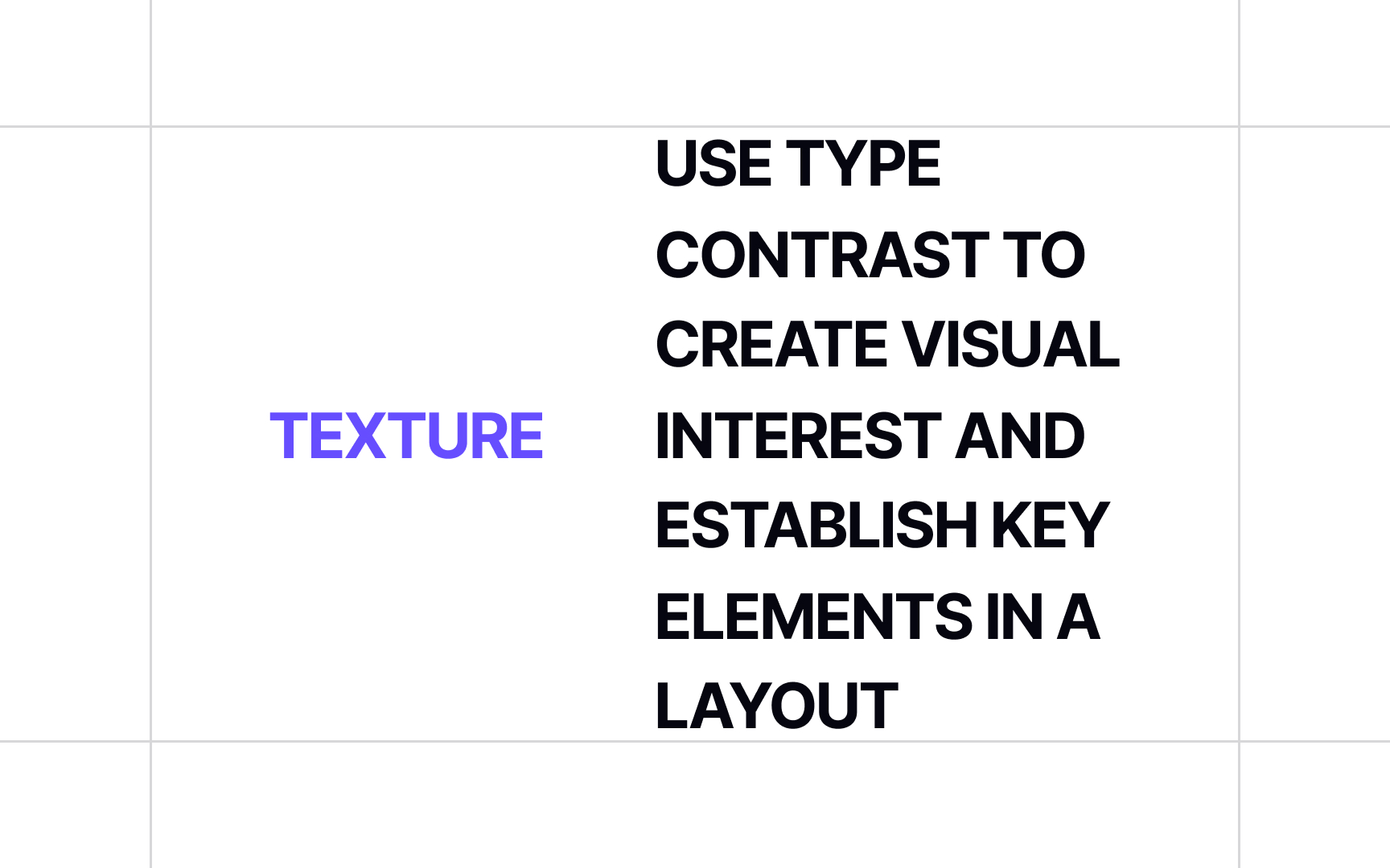
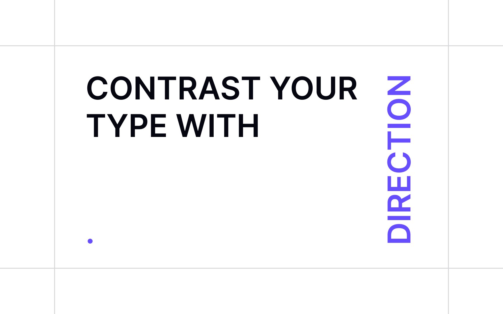
What is more exciting to look at: an interface with one primary color and one typeface or a balanced combination of matching colors and appropriate fonts? That's the benefit of contrast. Designers can use typography to reinforce visual interest through the use of contrasting elements. Size, font weight, color, form, texture, direction — you can combine these methods to create aesthetically pleasing type compositions. Good contrast adds to the visual hierarchy that tells users what's important on a page and where to look at.

Canadian graphic designer Carl Dair was also one of the most prominent typographic designers of the 1950s and 1960s and is considered the father of modern typography. In his book "Design With Type" (published in 1952; revised and expanded in 1967), he suggests 7 types of contrast in typography that modern designers continue using in their works.

Exercise #1

Contrast

We use contrast when we want a specific element to stand out and attract user attention, especially when a page is overflowing with information. Contrast is based on the juxtaposition of visually opposite elements and is closely tied to balance, harmony, and the overall aesthetic of a composition.

According to Carl Dair, a Canadian designer and author of the book Design With Type, there are 7 principles of contrast in typography: size, weight, form, structure, color, texture, and direction.[1] For a stronger effect, designers combine methods. For example, you can use a larger font size, heavier font weight, and a different color to separate a headline from other content.

Exercise #2

Size

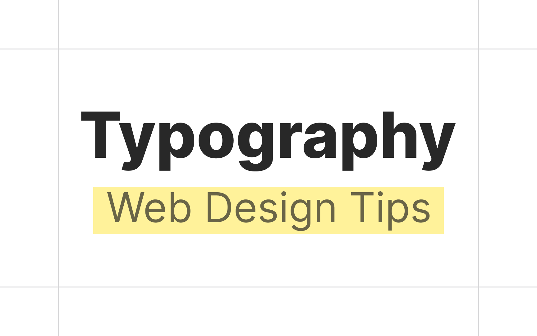
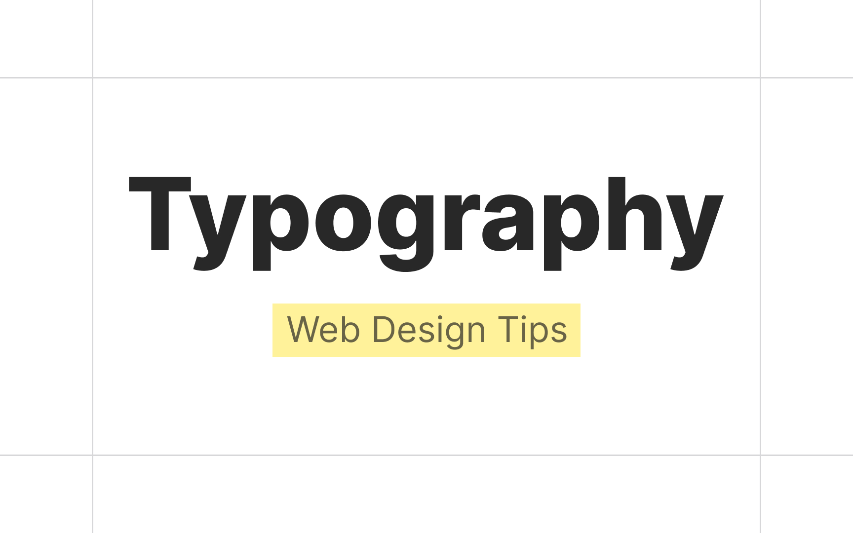
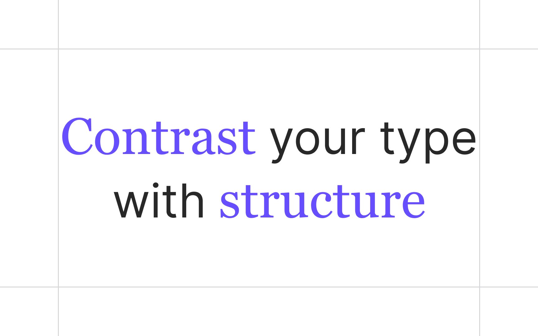
Size is one of the most common yet powerful methods of contrast. When you enlarge text, such as a headline, it usually becomes the focal point, making users notice it first. Reducing the type size also creates contrast but has the opposite effect, making it less noticeable.

Contrast in size contributes to the visual hierarchy that directs user attention, leading their eyes from the most critical information to the less important parts.

Exercise #3

Weight

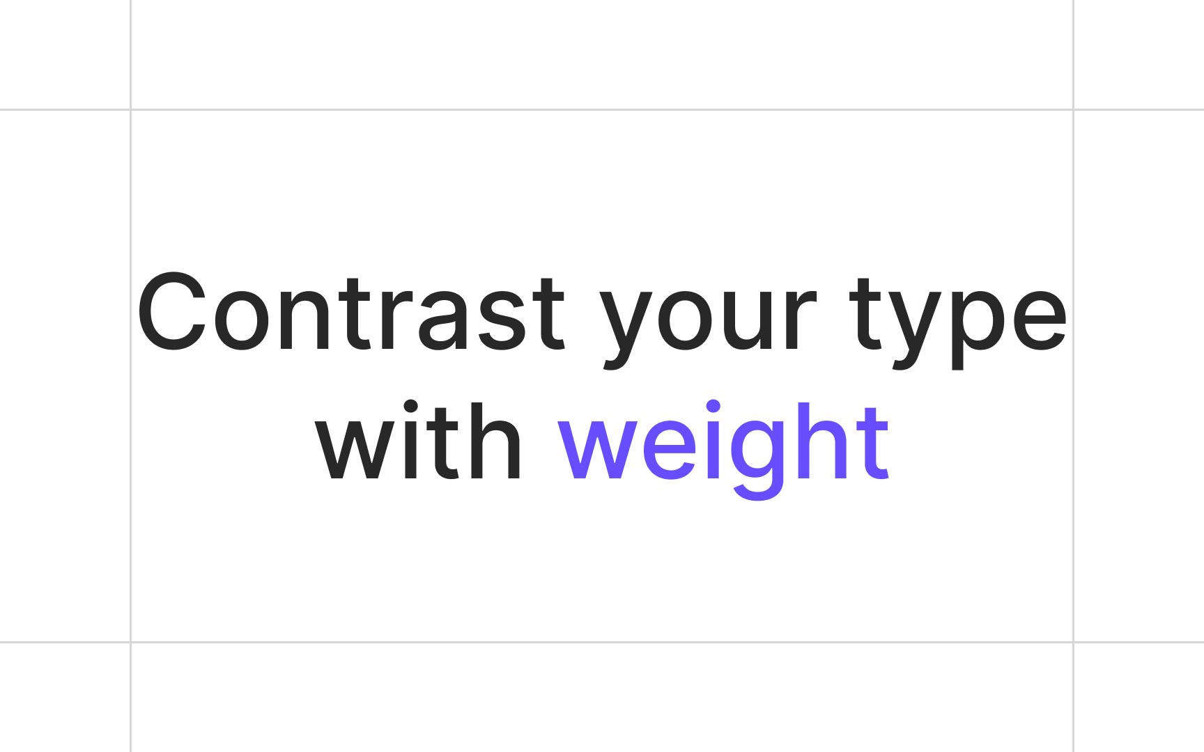
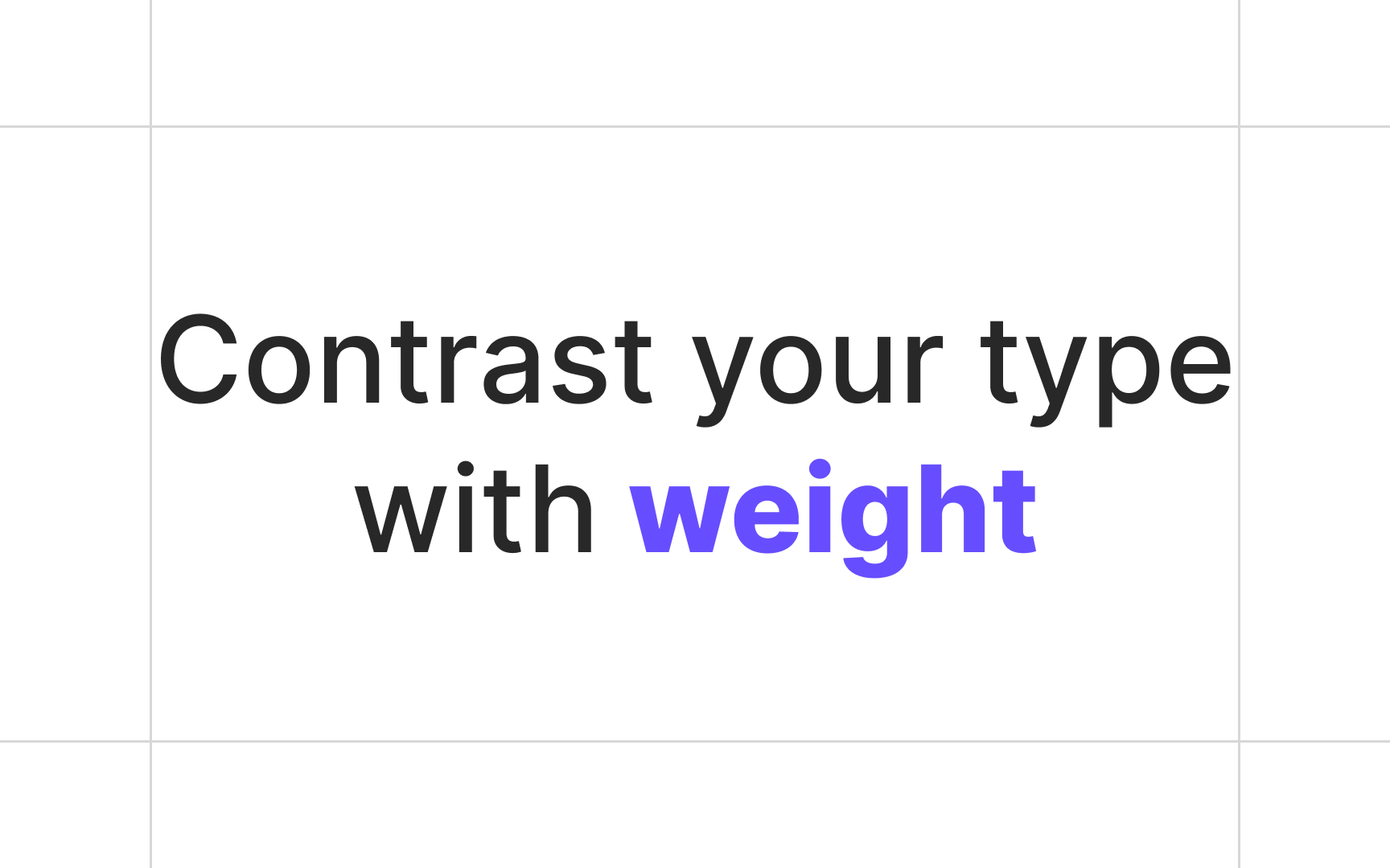
By making text bold — increasing its weight — you make it stand out among lighter and thinner type. Designers use heavier weights for headings, subheadings, keywords in the running text, or any type of text that requires special attention.

Weight can create a certain mood: heavy text appears more solid and impactful and is supposed to attract, alert, shock, or persuade. Use caution, though: too much weight can make type look too dramatic and even hurt text readability.

Weight is often used to strengthen the contrast in color

Exercise #4

Form

Contrast in form refers to the variation of basic shapes of letters. For example, the difference between capital and lowercase letters or between Roman letters and italics or obliques can create contrast. Just don't combine italics and obliques in one place. They both have a form similar to handwritten letters and would create conflict instead of contrast.

Exercise #5

Structure

Using contrast in structure, we create a juxtaposition of differences in typefaces. The most common way to do this is to contrast typefaces of different moods and aesthetics, for example, a straightforward and neutral sans serif typeface with elegant and traditional serifs or bold and authoritative slab serifs. In his book Design with Type, Carl Dair compares the contrast of structure to an orator who changes not only the volume of his voice but its very quality to suit his words. 

Exercise #6

Texture

When we talk about the contrast of texture, we imply the aesthetics of text as a mass or unit. The texture here means the arrangement of lines, the interaction between them, and how a block of text looks from a distance and up close. By combining contrasts of size, weight, form, and structure and applying them to a block of text, you create a contrast of texture against other written content and add more dynamics to the entire composition.

Exercise #7

Color

Color is an obvious but tricky method of creating contrast. Designers have to be very careful selecting the colors of fonts and the background and keep accessibility a priority. According to WCAG 2.0 level AA recommendations, the color contrast ratio should be at 4.5:1 for normal-sized text and 3:1 for larger text.

Also, if stepping away from the traditional dark font/white background formula, think carefully when selecting and combining colors. They should create the right mood, communicate the message, and reinforce brand identity, while maintaining readability.

Pro Tip: Avoid relying solely on color to create contrast and draw attention. Users with some visual impairments will have trouble spotting the difference and may overlook an error or warning.

Exercise #8

Direction

Contrast of direction is a rather rare method that involves opposing vertical, horizontal, and angular orientation of the text. Changing text direction creates a rather dramatic effect and immediately draws user attention. On the other hand, vertical and even angled text is notably hard to read and thus should be used only for headlines, subheads, or other short phrases.

Exercise #9

Rhythm

In typography, rhythm is composed of space intervals between letters, words, lines, and paragraphs. Rhythm can be of two types:

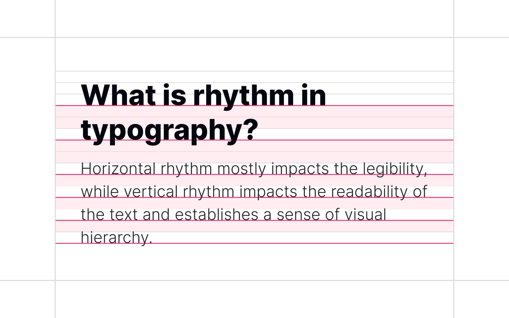
  • Horizontal rhythm: Horizontal rhythm refers to letter spacing (tracking) and kerning and mainly contributes to legibility.
  • Vertical rhythm: Vertical rhythm refers to space between paragraphs and line spacing.

Both types impact readability and create a sense of visual hierarchy. An example of rhythm contrast can be adding extra space between a headline and other content or reducing the letter spacing inside a headline and making it more compact.[2]

Complete this lesson and move one step closer to your course certificate