Background
Background in design refers to the visual layer behind content or elements, setting tone, focus, and hierarchy while supporting clarity and brand identity.


Background is a fundamental element in digital product design, yet it often works subtly in the shadows. It provides the canvas on which all other elements sit, establishing depth, mood, and emphasis. Whether plain or patterned, static or dynamic, backgrounds influence how users interpret and interact with an interface. They can reinforce branding, guide attention, and improve readability when handled thoughtfully.
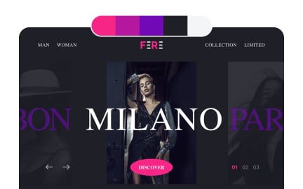
In UX/UI design, backgrounds are not only aesthetic but functional. A properly chosen background enhances contrast, ensuring that text and interactive components are legible. Designers must balance minimalism with personality, avoiding clutter while ensuring the interface feels alive. For example, a solid white or neutral background often supports productivity tools, while vibrant gradients or imagery might be more fitting for lifestyle or entertainment apps.
Real-world products highlight how background impacts usability. Google’s clean white background in Gmail emphasizes clarity, allowing users to focus on content rather than decoration. Conversely, platforms like Spotify use dark backgrounds to create contrast with vibrant album artwork, guiding users’ eyes toward visual content. These examples demonstrate how background selection directly influences behavior and focus.
Accessibility is one of the most important considerations. Backgrounds must provide adequate contrast with text and elements for users with visual impairments. The Web Content Accessibility Guidelines (WCAG) set measurable standards for contrast ratios, ensuring inclusive design. Beyond contrast, backgrounds should avoid patterns or animations that may trigger sensory issues, keeping interfaces welcoming for diverse audiences.
Designers also employ backgrounds strategically to create depth and hierarchy. Subtle shadows, gradients, or blurred images help separate layers, directing attention to primary content. When done well, this supports intuitive navigation.
Performance considerations also matter. Large, high-resolution images or complex animations used as backgrounds can slow down load times. This negatively impacts user experience and search ranking.
Learn more about this in the Background Exercise, from the Basics of Design Composition Lesson, a part of the Design Terminology Course.
Key Takeaways
- Background sets the tone and provides context in digital design.
- Impacts usability, focus, and brand recognition.
- Accessibility requires strong contrast and minimal sensory strain.
- Real-world products use backgrounds to guide attention strategically.
- Performance optimization is key when using images or animations.
Background design affects readability, focus, and comfort. A well-chosen background ensures that users can process information easily without distraction. For instance, a neutral background allows text to remain clear, while subtle gradients can guide attention without overwhelming the interface.
Poorly designed backgrounds, by contrast, can create strain, confusion, or accessibility barriers. By treating background as part of the overall user journey rather than decoration, designers strengthen usability and trust.
Backgrounds act as silent brand signals. A consistent palette reinforces recognition, while imagery or patterns tied to brand values deepen emotional connection. For example, financial services often use calm, muted backgrounds to suggest stability, whereas creative industries may lean on expressive colors or illustrations.
These choices influence user perception, making the background a strategic asset. A mismatch between brand message and background design risks undermining credibility.
Designers should ensure strong contrast between background and foreground elements, adhering to WCAG contrast ratios. Backgrounds should avoid excessive patterns or animations that could distract or cause discomfort for some users.
Testing with diverse users and assistive technologies further ensures inclusivity. By prioritizing clarity, designers make backgrounds not just visually appealing but functionally supportive for all audiences.
Recommended resources
Courses

UX Design Foundations


UI Components I


Design Terminology

Lessons

Creating a Color Palette

Color Accessibility

Visual Perception and Design Composition
Exercises


Projects

Clean.app - Effortless Cleaning for a Faster Phone


Free Gradient Asset Pack


Landing Page for Fashion website