Visual Perception and Design Composition
Learn how element placement can impact a user’s progression through your product
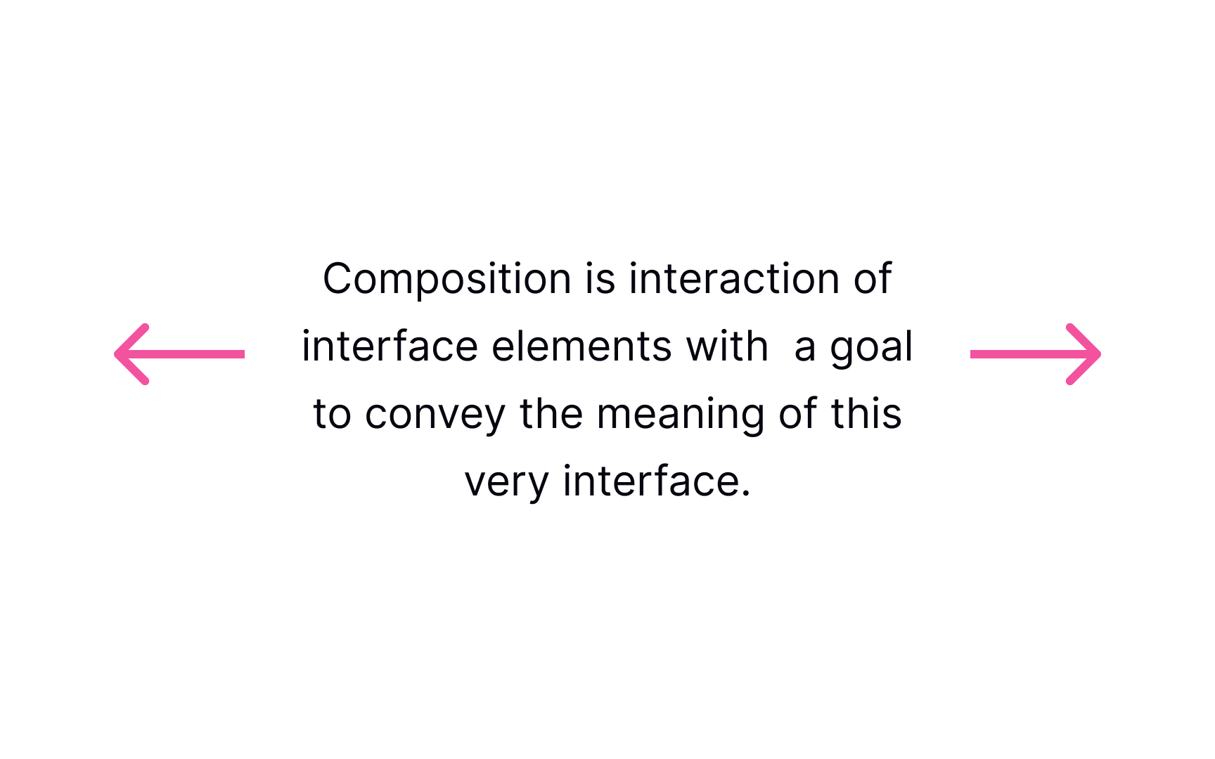
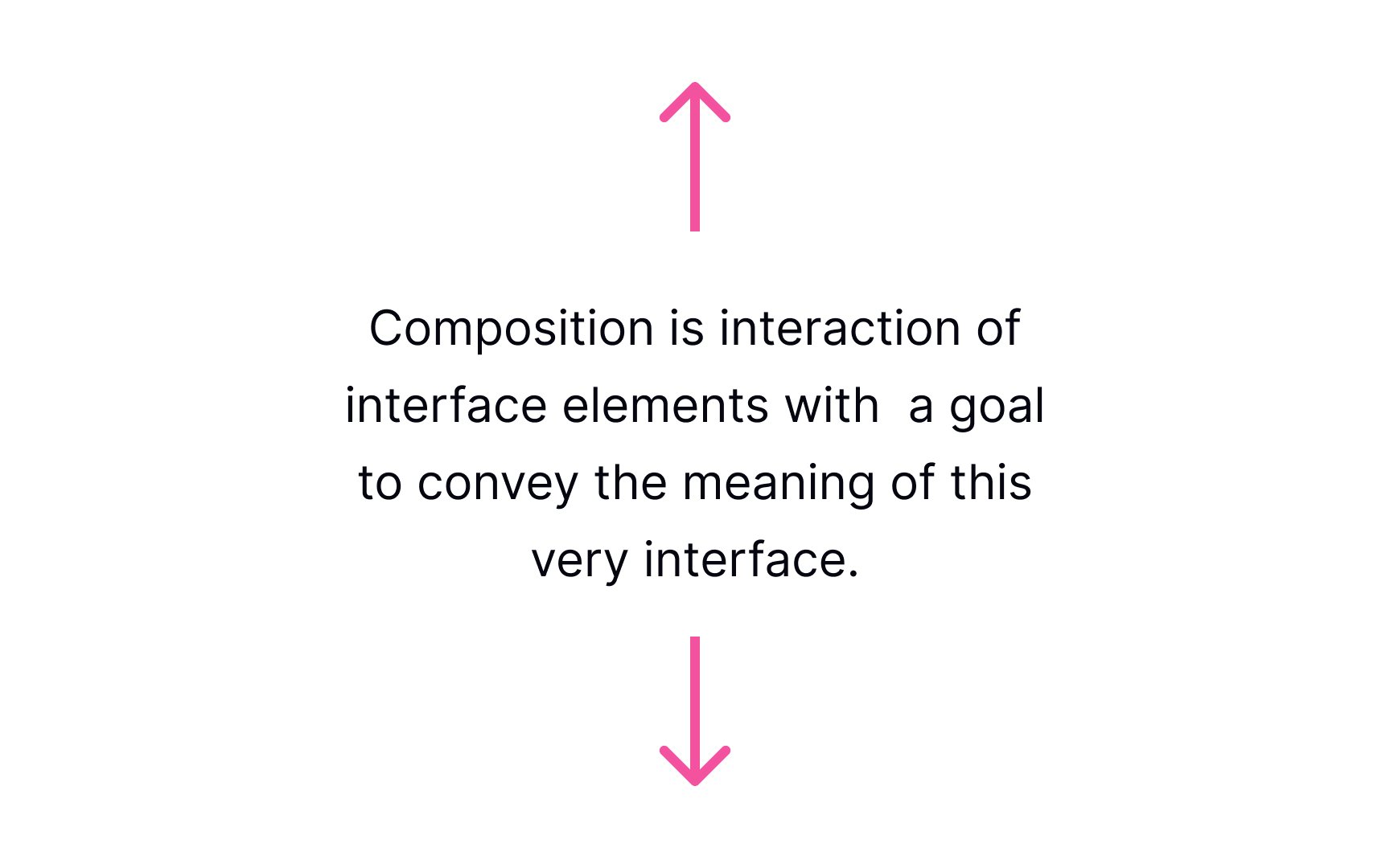
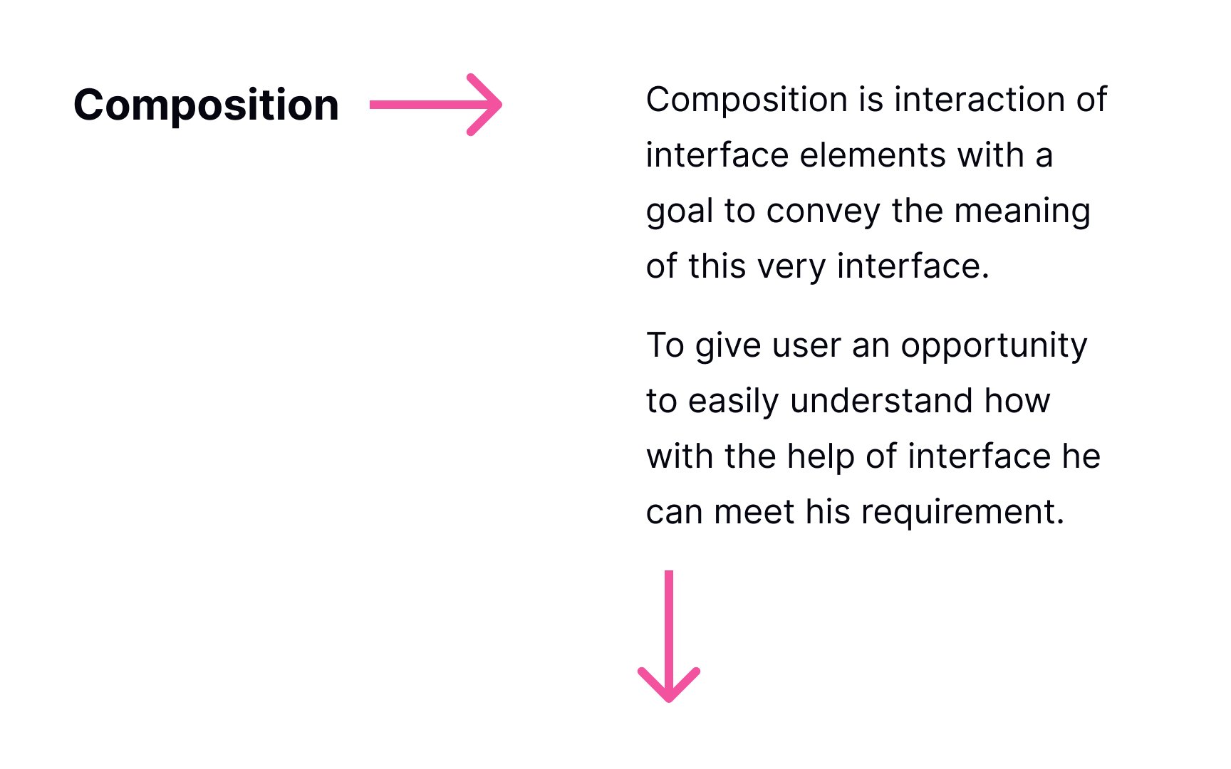
The placement of elements within a composition has a significant impact on the way users perceive the design. This visual perception is based heavily on Gestalt principles of psychology (Gestalt means “unified whole”) and can heavily influence user behavior and emotions.
Mastering how element placement can impact a user’s progression through your product allows you to control that progression much more effectively.
Design perception is entirely visual.[1] Our perception of a design is influenced by things like color, shape, patterns, typography, light, images, and organization of elements. Designers need to have a solid understanding of visual perception since graphical user interfaces are perceived entirely through a user’s vision.
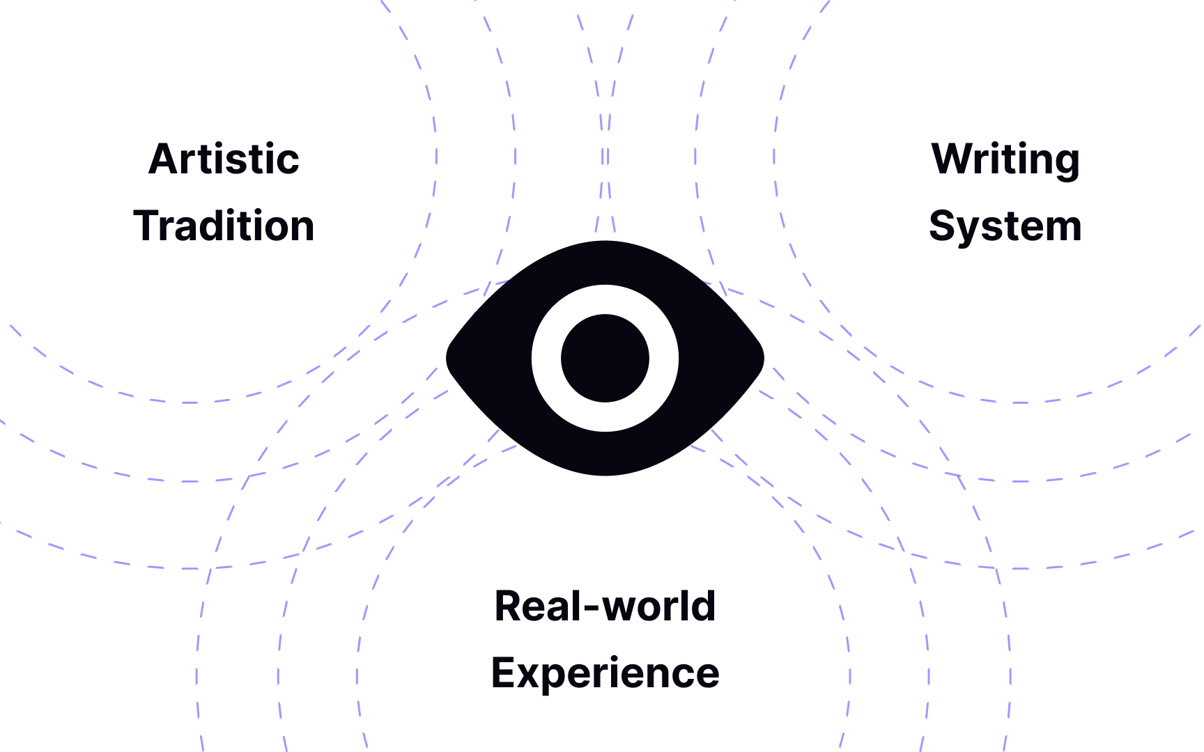
Gestalt theory forms the basic study of perception in design, and was developed in the 1920s.[2] Our perception of designs is heavily influenced by artistic tradition (which largely influences our perspective), our writing systems (which determines where we start looking on a page), and real-world experience (which influences things like our understanding of heavy and light elements).
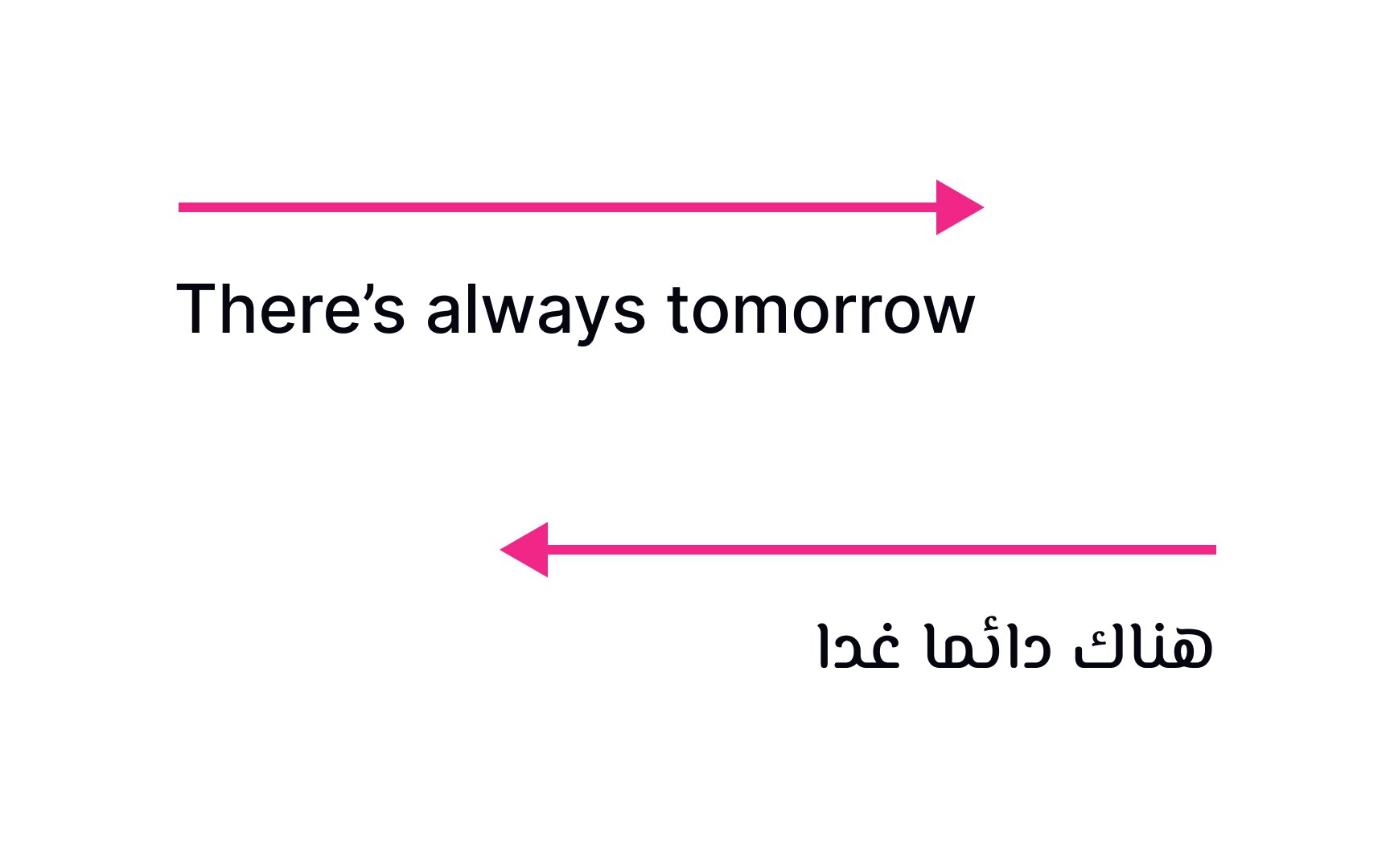
We tend to scan designs in the same way that we read, expecting to find the most important information at the beginning. Most modern writing systems use top-to-bottom writing patterns, which is why information at the top of a
Most languages are also written left-to-right, making the left-hand side of the page appear more valuable. However, for over 1.7 billion people, writing is done from right to left, meaning that they’ll perceive the right-hand side of the page as more important.[3]
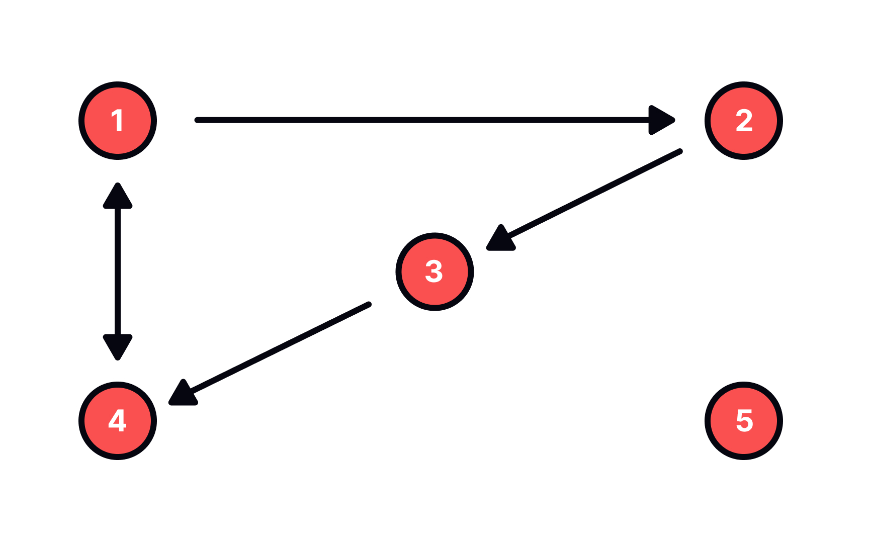
When studying an object, particularly one that’s very visual and not heavy on text, our eye movement follows a certain pattern. Usually, we start in the upper-left corner, slide across to the upper-right, and then pass through the center to the lower-left corner (generally referred to as a Z-pattern).[4] After that, the gaze becomes less focused and repeats the same trajectory, moving more chaotically and discerning more details each time.
Knowing this likely pattern allows designers to place the most important parts of a design along this path, making them more likely to be seen. Of course, in regions where the writing system is right-to-left, mirror this eye movement pattern for the same results.
The upper-left and center of a
When designing a product, be sure to place the most important parts in these active zones. Otherwise, they may be overlooked.
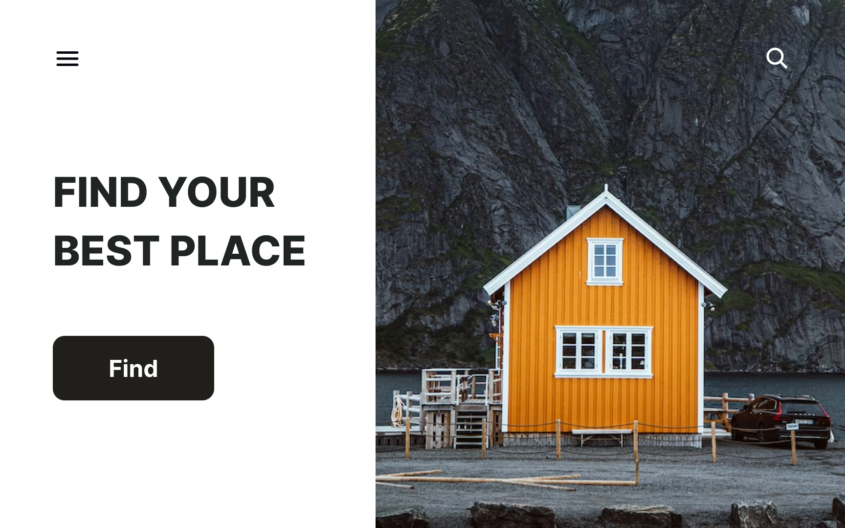
What we notice first seems more important to us. In cultures with left-to-right writing systems, people look at the left side of the

Objects on the left side feel closer to us than those in the center or right. There's a couple of factors contributing to this perception.
Things we look at first seem closer to us than things we notice later. Also, European art has been traditionally depicting closer objects on the left — like in Michelangelo's The Creation of Adam, where the earthly is on the left and the divine is on the right.

Italian Renaissance painters and architects discovered linear perspective to create the illusion of depth on a flat surface.[6] They achieved it by converging all parallel lines in a single vanishing point at the painting's horizon line. Generations of artworks with linear perspective taught us to perceive the center of the
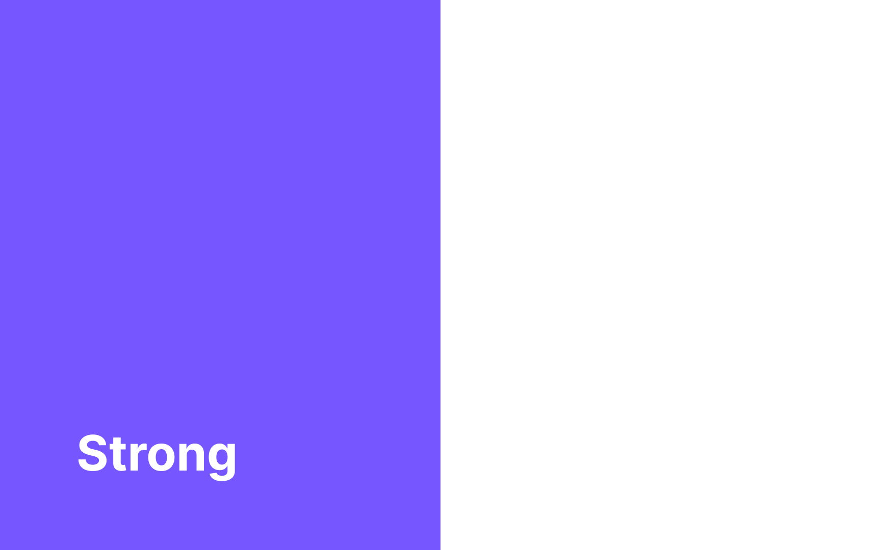
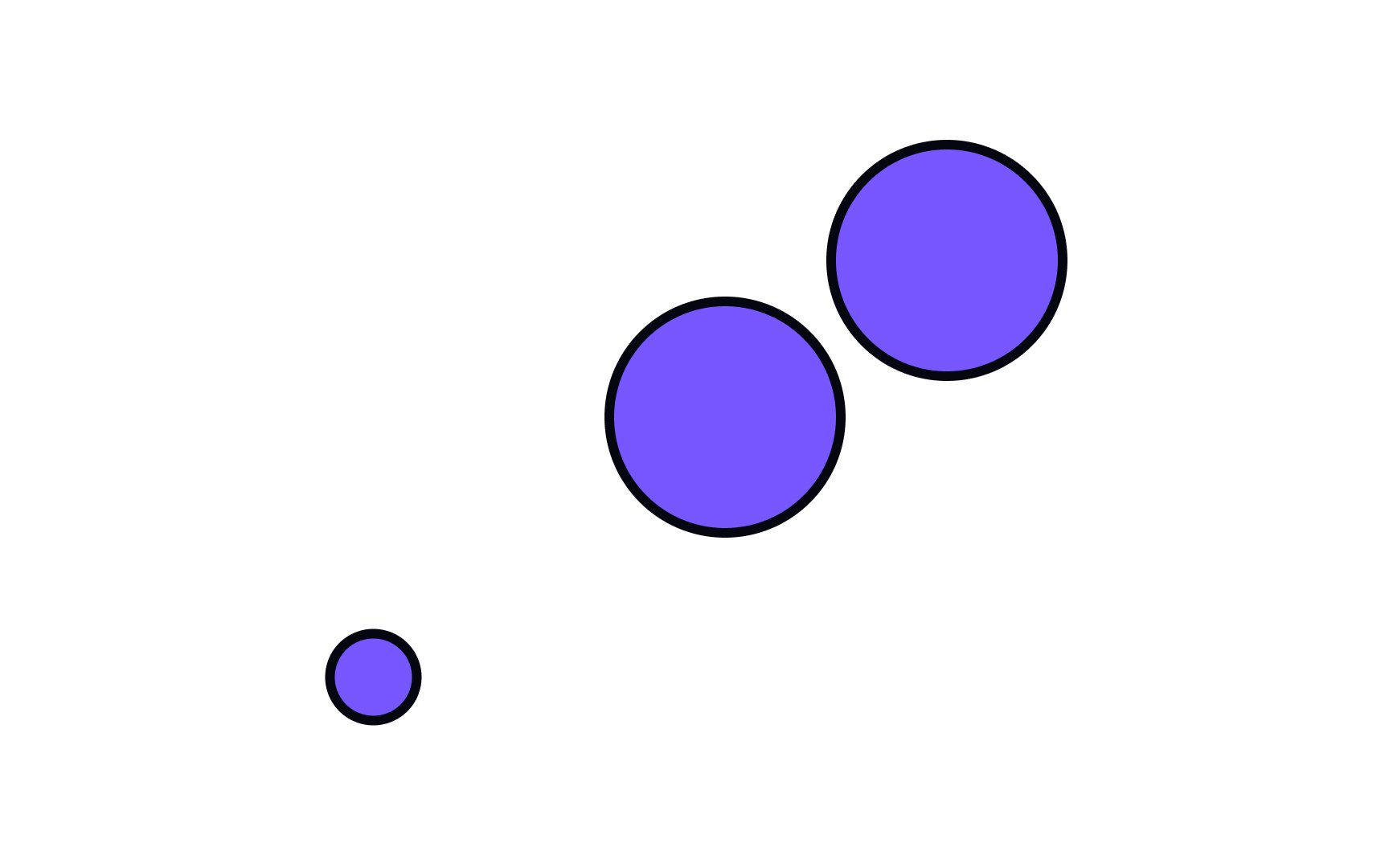
We perceive elements at the top to weigh less than those at the bottom. This perception of lighter objects is directly tied to our real-world experience with gravity. We know, for example, that helium balloons float in the air as do empty plastic bottles in water.
Our real-world experience with gravity strongly influences our visual perceptions. We know that in the real world, heavier objects will stay on the ground, so we naturally assume elements of design behave the same way. Placing an element lower within your

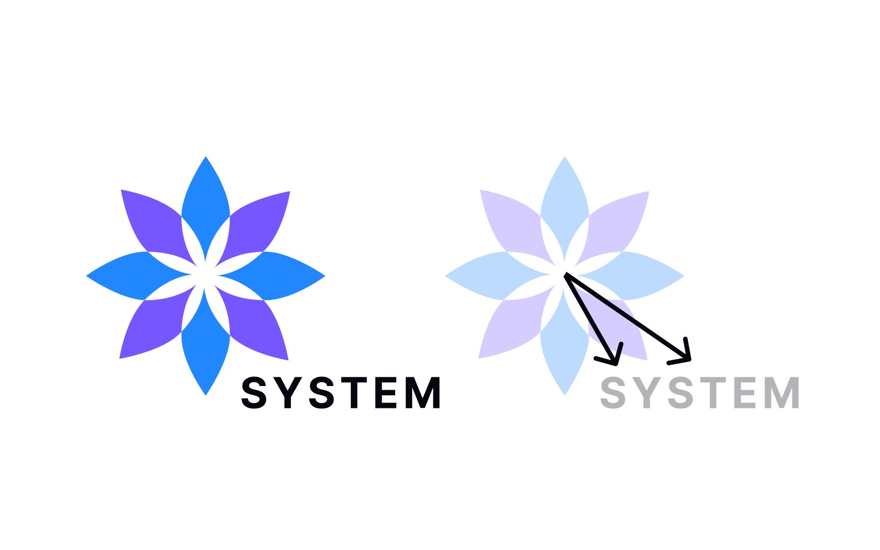
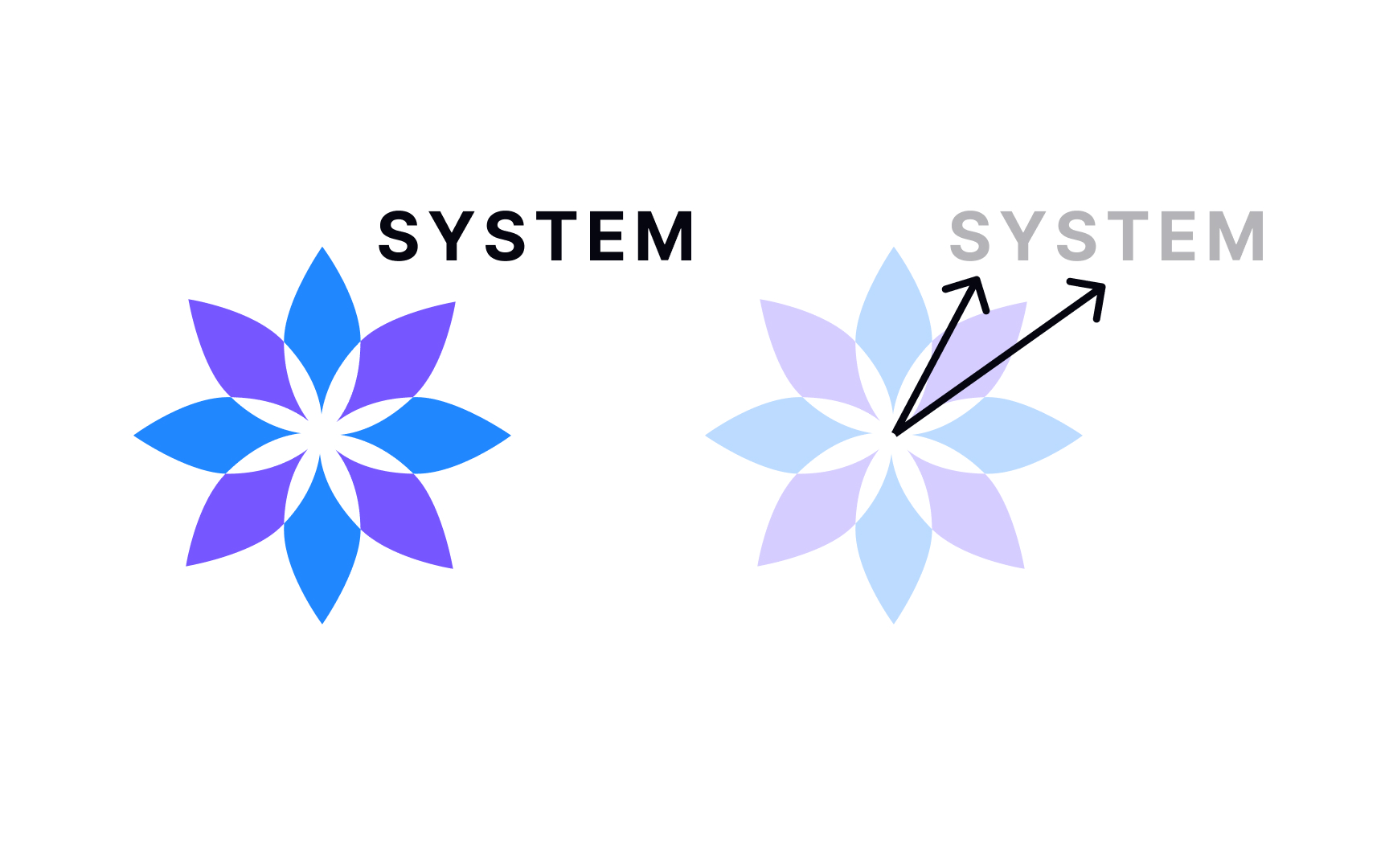
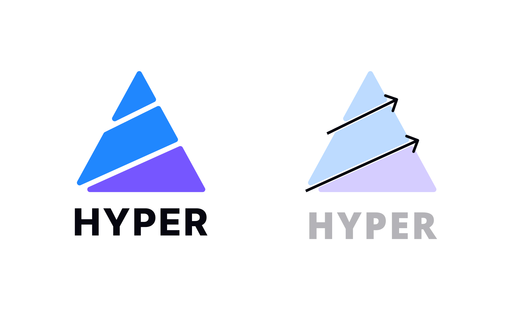
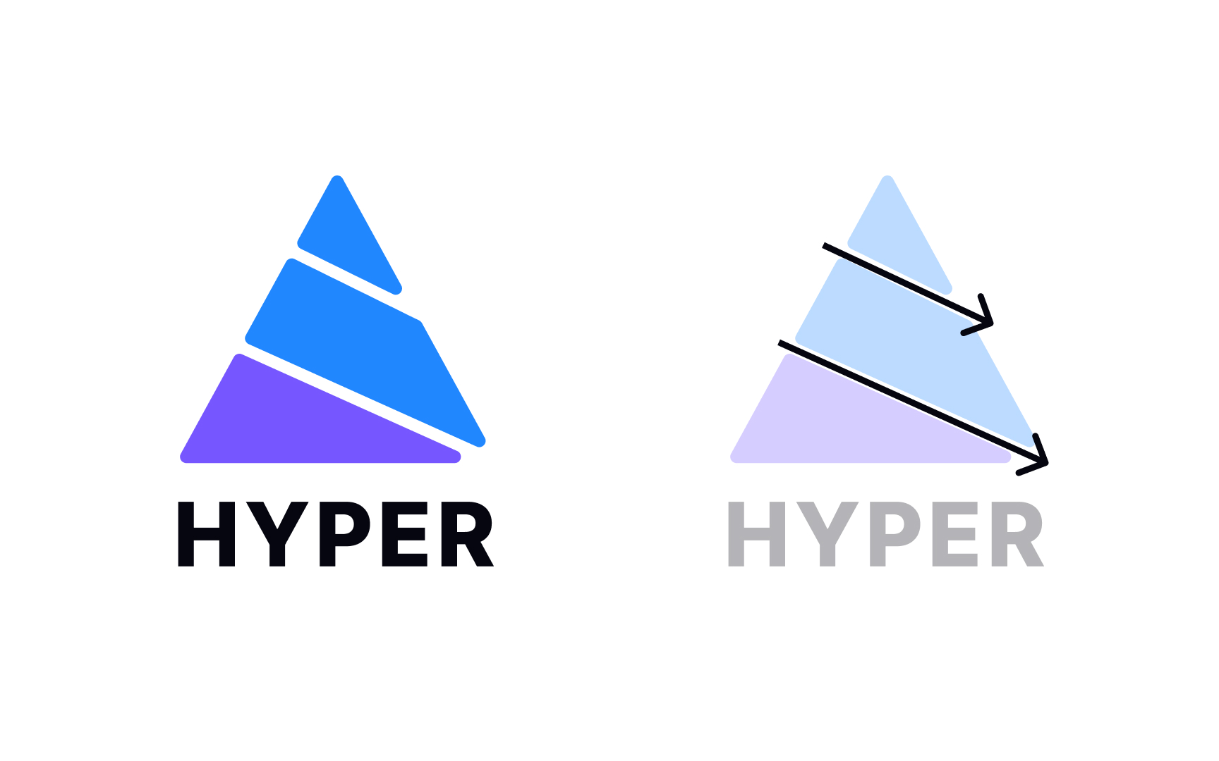
Any element that starts in the lower left corner and ends in the upper right one will appear to ascend. Ascending elements elicit emotions of success, growth, and development. It’s why many companies — Adidas is probably the best-known — use ascending logos.

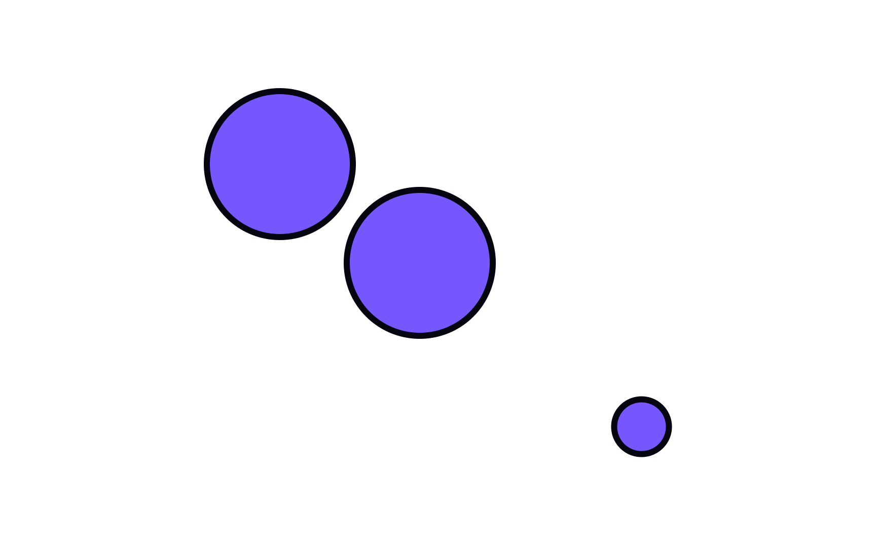
Generally, we perceive elements with left corners higher than their right as descending. This comes from the fact that we scan designs from left to right.
Sometimes, other factors can avert this effect. For example, Puma's feline logo is clearly leaping towards the left corner and doesn't appear to be falling backward.
User attention is dynamic — it doesn't stay in one place but follows a predetermined path, often conditioned by our writing system. While active zones attract attention, directional vectors determine how the attention moves. For example, wide text columns naturally direct us from left to right.
Changing the width of a column allows us to control the direction of users' attention. Narrower
Pro Tip: Play with the column width to find the right balance in directing users' attention.
The more we move through design, the more details we notice. To make users scan the
By positioning elements in a certain way, designers can direct users' attention wherever they want it, and even create custom paths for users' gaze to follow. For example, placing the title to the left will direct users' gaze leftward, and the narrow text column will then send it downward.


Positioning text on the left with left alignment creates a prominent visual element — it stands out in the design and immediately grabs users' attention.


Consider the importance of your elements when deciding where to position them. If the text carries more meaning than the
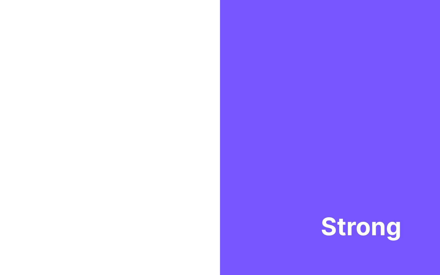
We usually look at the left side more, and, as a result, better remember the information we see there. Don't waste this space by placing less important elements there.
If you want users to pay more attention to the
Think of the style that better fits your brand personality. If the emotions you want to elicit are excitement, happiness, and a sense of ease, consider making your elements appear lighter. To do that, place them above the horizontal middle line.
If the impression you want to make is one of power, elegance, and solemnity, heavier elements may be the right choice for your
A well-designed
Ascending logos make people think of success and growth. They’ll associate your
The design characteristics of logos can considerably impact consumer behavior and
As a rule of thumb, avoid descending logos unless there's an excellent reason to use them. For example, if your brand is all about saving people money or getting rid of a problem, then a descending logo might be appropriate.
References
- What is Visual Perception? | The Interaction Design Foundation
- Which Languages Are Written From Right to Left? | WorldAtlas
- Visual Hierarchy: Organizing content to follow natural eye movement patterns | The Interaction Design Foundation
Top contributors


Topics
From Course

Share


Similar lessons

Intro to Design Layouts

Intro to Design Grids
