Active zones
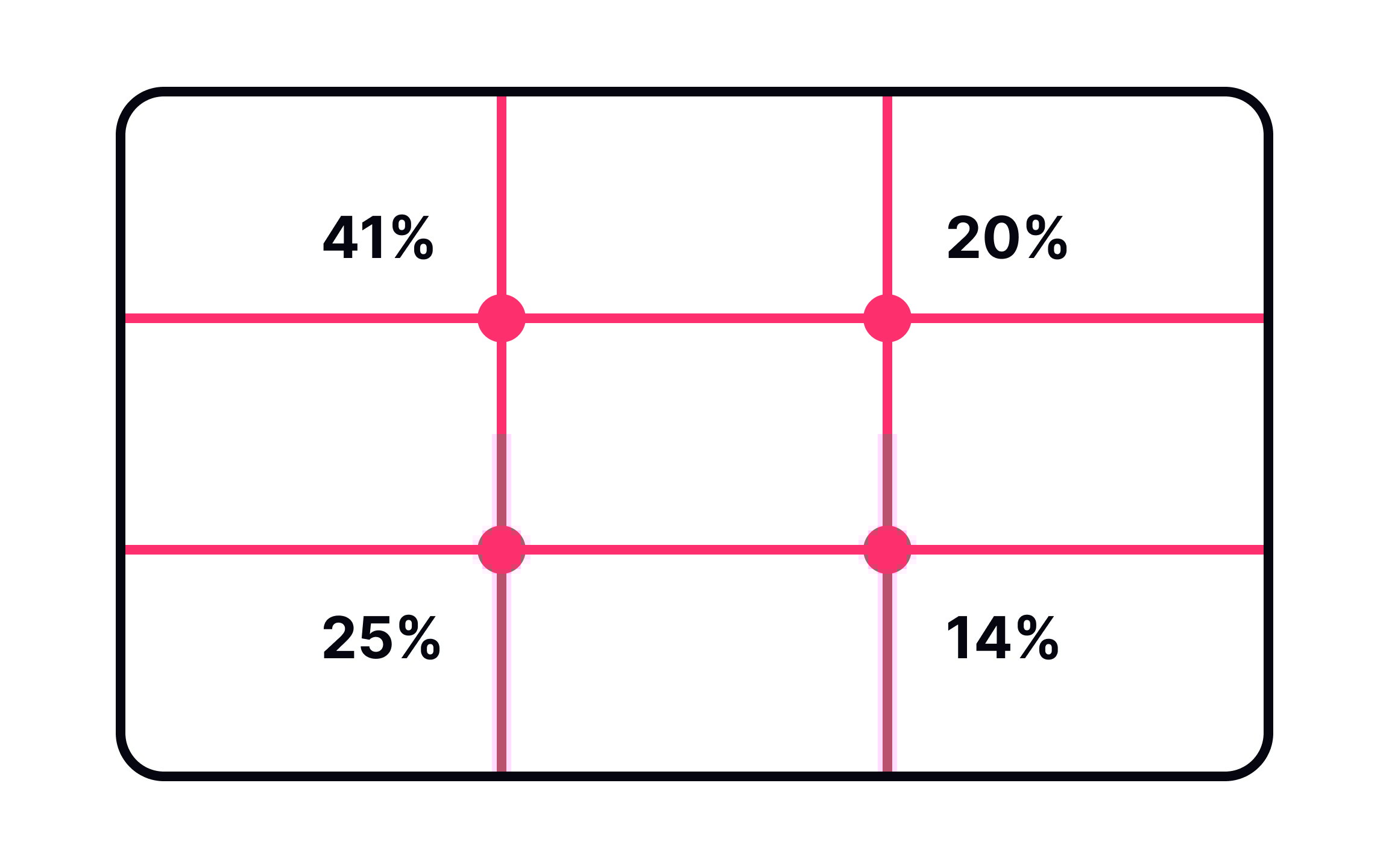
Create a grid of 2 equally spaced vertical and 2 equally spaced horizontal lines — dividing a rectangle into 9 equal parts — and you’ll have an example of the rule of thirds.[1] According to this rule, people tend to concentrate their attention along these lines and particularly at their intersections — the active zones of a composition.
Photographers are taught the rule of thirds early on in their studies, as it’s one of the easiest ways to create a visually appealing, balanced composition. Designers should pay careful attention to these intersections when placing important page elements.
Pro Tip: Not all intersections in the rule of thirds receive equal attention — it varies by culture — but the top always gets more attention than the bottom.
References
- The Rule of Thirds: Know your layout sweet spots | The Interaction Design Foundation
