Best Practices for Designing Pagination
Discover ways to design pagination controls that are clear, accessible, and easy to interact with
Pagination divides content into logical groups, but the controls that let users navigate between pages need just as much attention as the content organization itself. Poorly designed pagination frustrates users and can even impact conversion rates when people abandon their search before finding what they need.
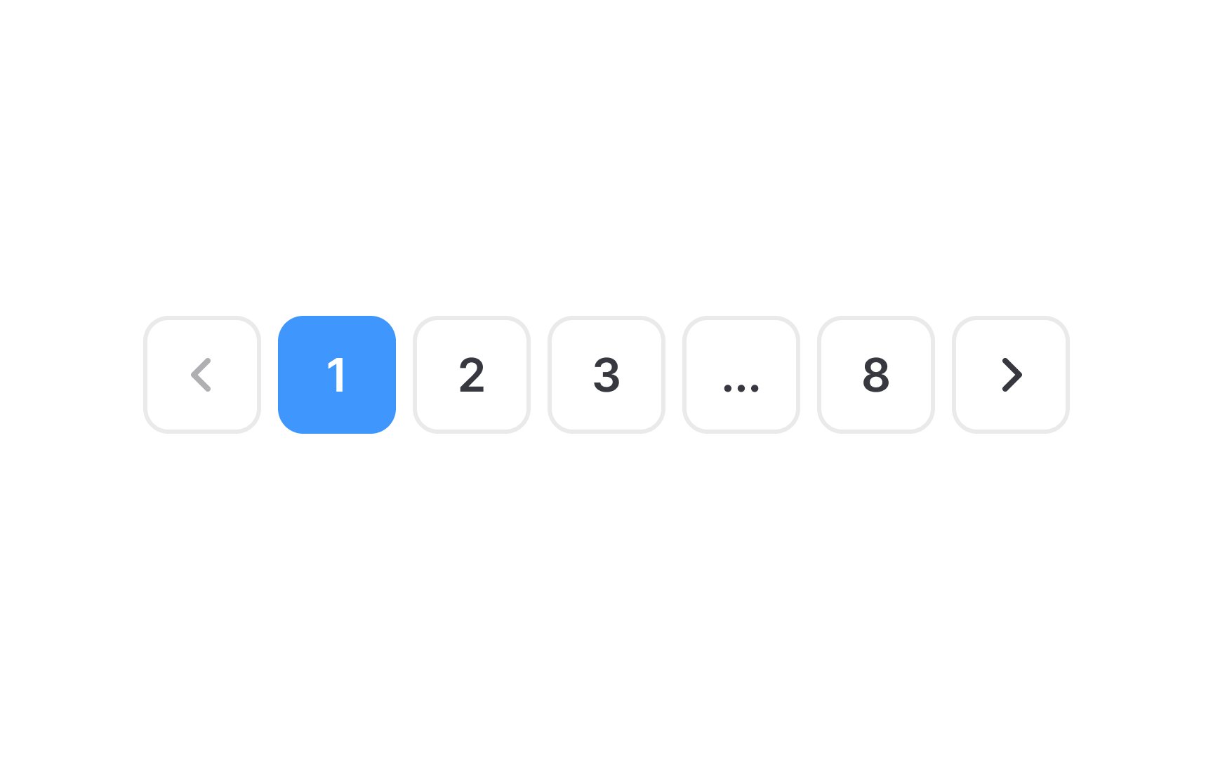
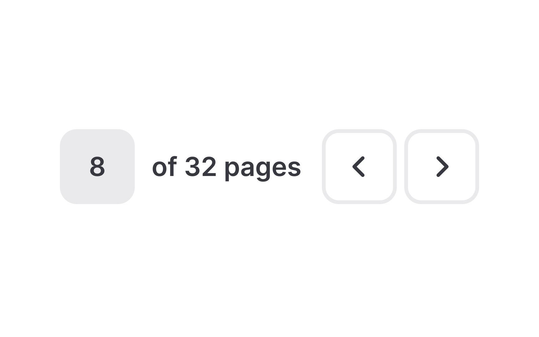
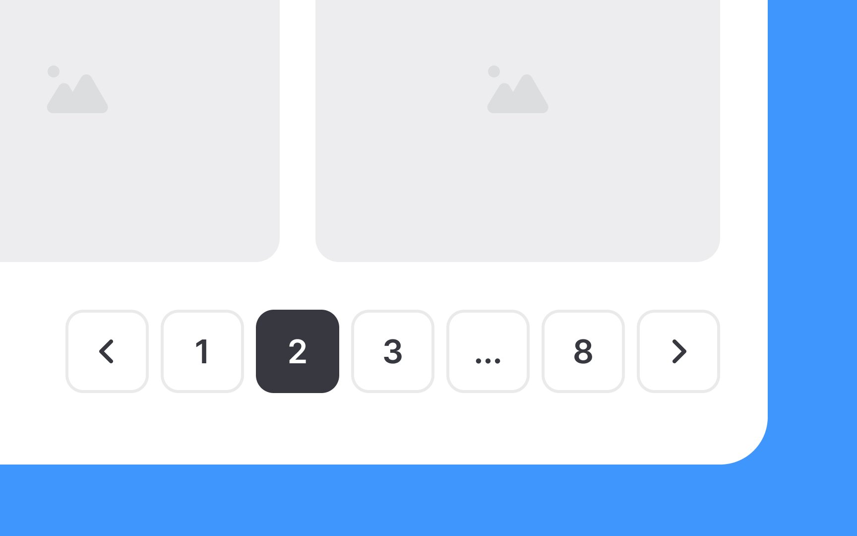
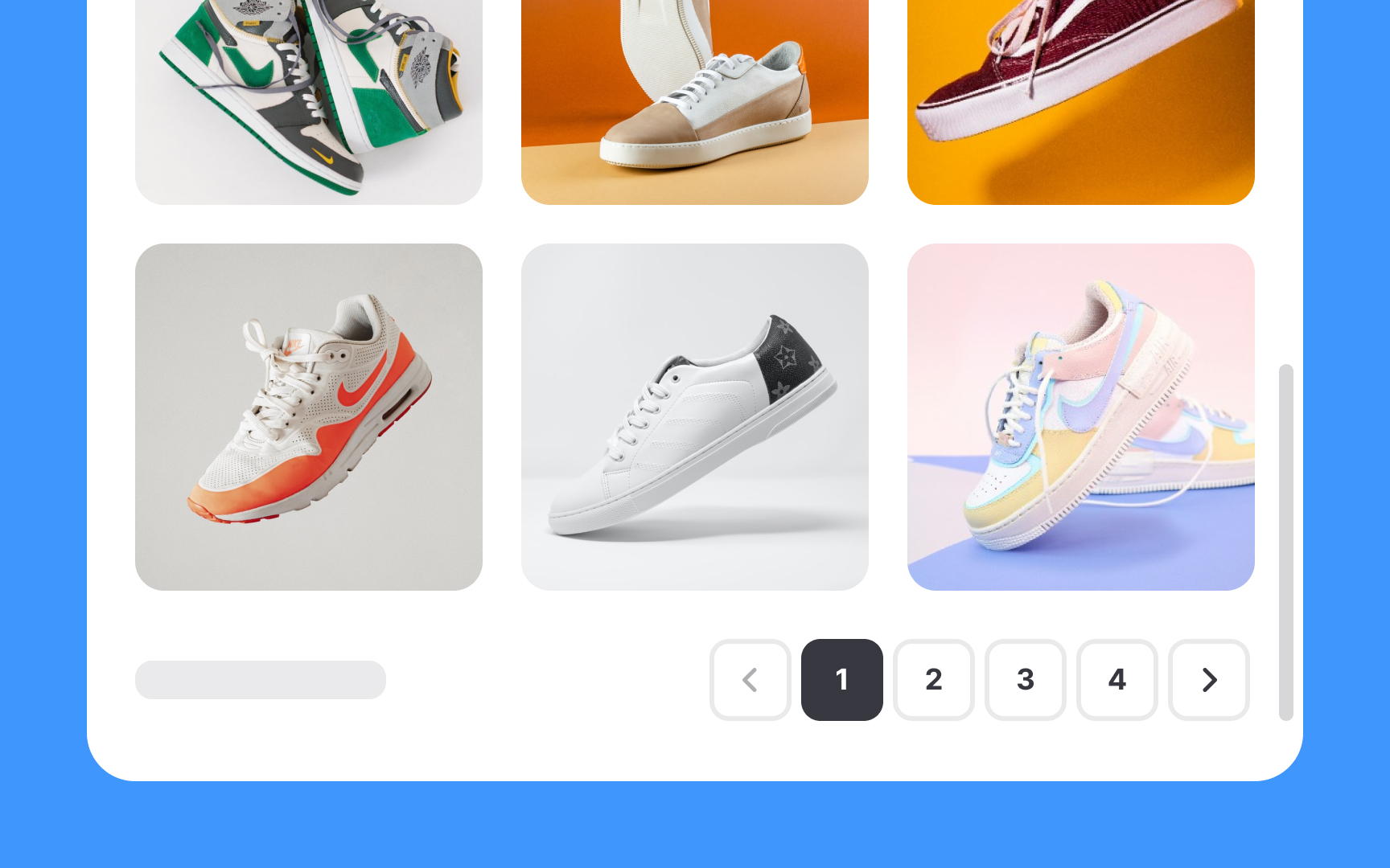
Visibility is essential. Pagination controls buried at the bottom of a long page may never be seen. Users need clear indication of which page they're currently viewing and how many pages exist. When page counts grow large, truncating the middle while showing first and last pages keeps the interface manageable. Interaction design affects usability directly. Buttons need sufficient size for easy clicking or tapping. Contrast between interactive elements and the background ensures controls don't fade into the page. Options to jump to the beginning or end of a list save users from clicking through dozens of pages sequentially.
Pagination also creates opportunities. Each page load is a moment to reinforce relevance, refine results, or present options that encourage users to take action rather than continue browsing indefinitely.
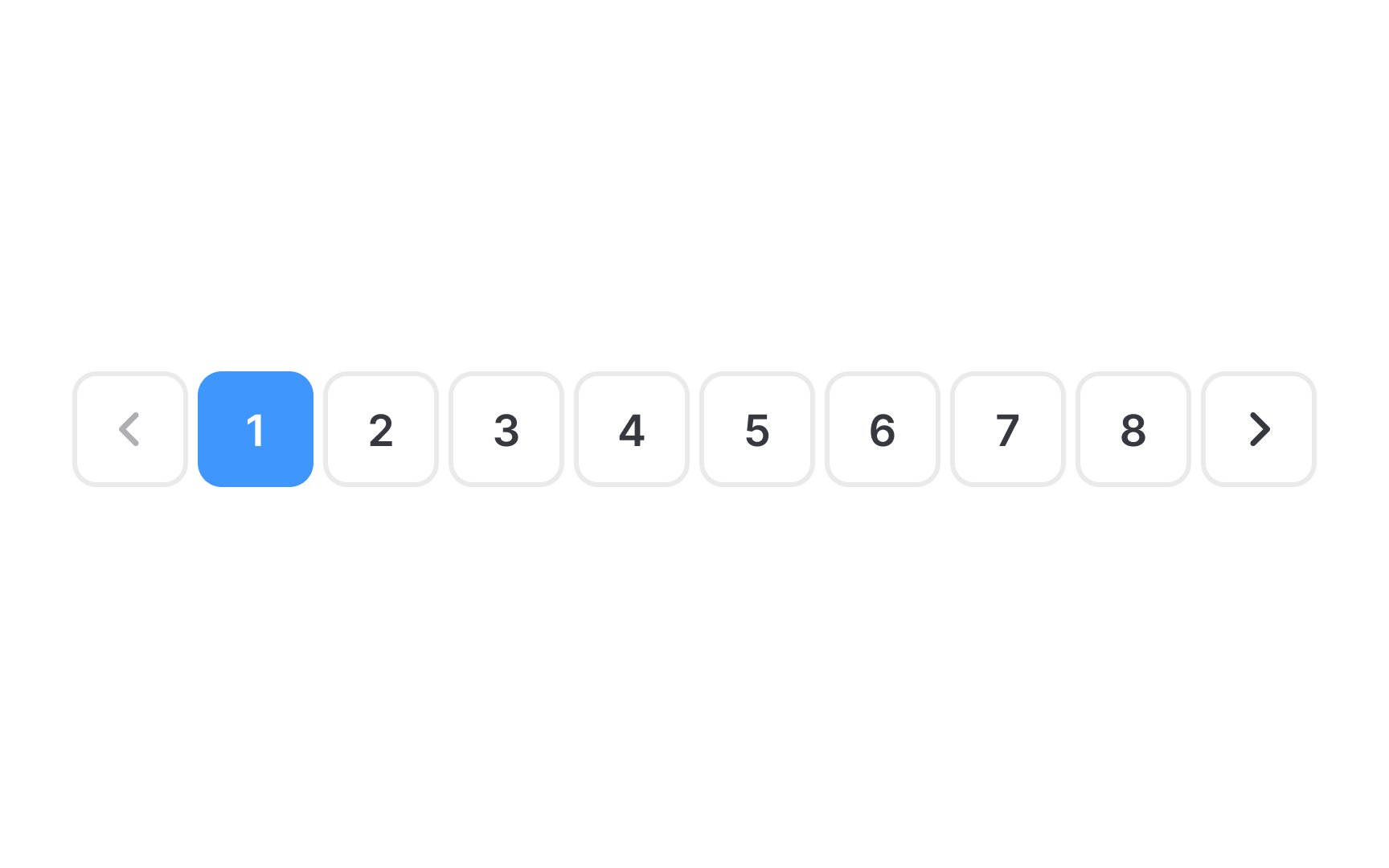
When there are numerous pages, a long
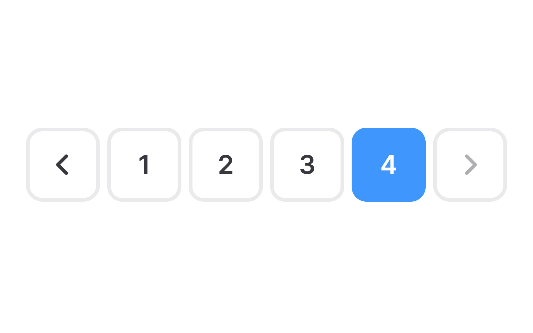
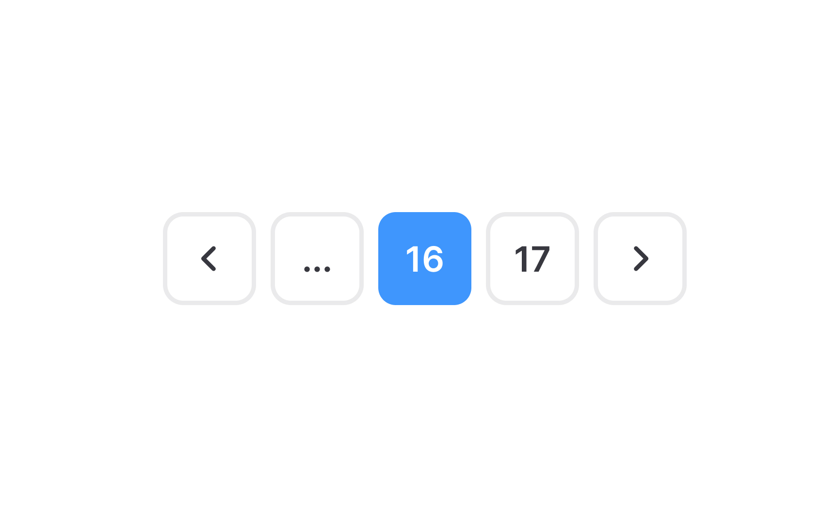
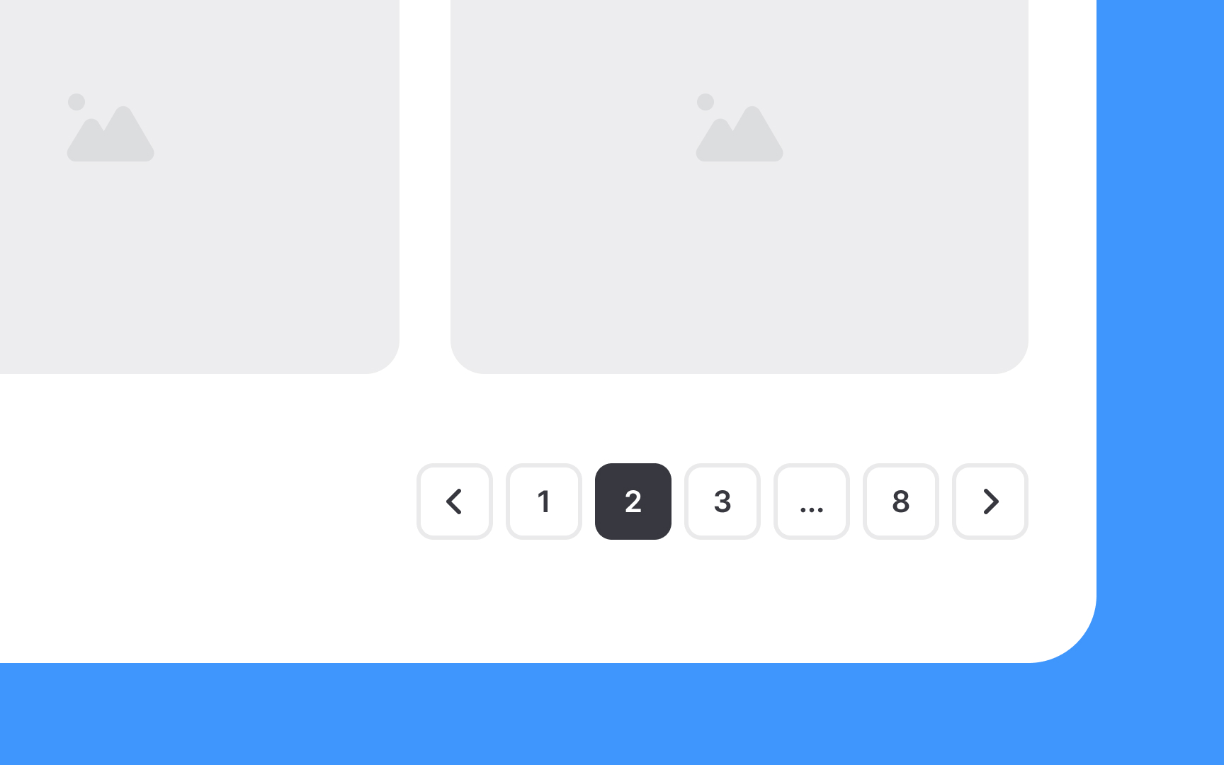
A common approach is to always show the first page, the last page, and the page the user is currently on. Intermediate pages may be hidden to reduce clutter. Another method is to display the first 3 pages, the last 3 pages, and the current page, along with 3 additional page links on either side of the current page. To access pages hidden in this range, users can interact with a three-dot icon, typically by clicking or hovering over it, revealing the concealed pages.
In
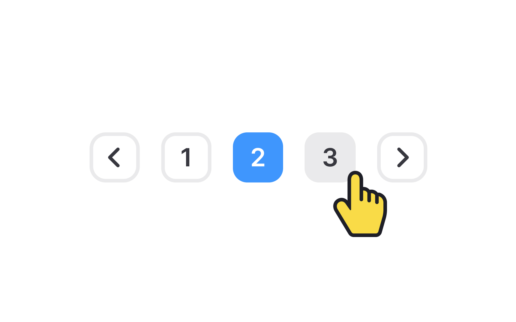
The clickable target for each page link must be adequately sized, allowing users to quickly and effortlessly click the link without struggling to precisely position their cursor. The Web Content Accessibility Guidelines (WCAG) suggest a minimum target size of 44×44 pixels.[1]

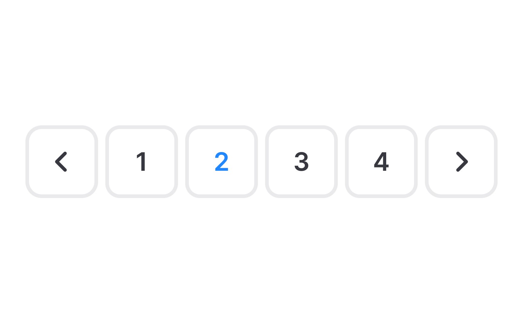
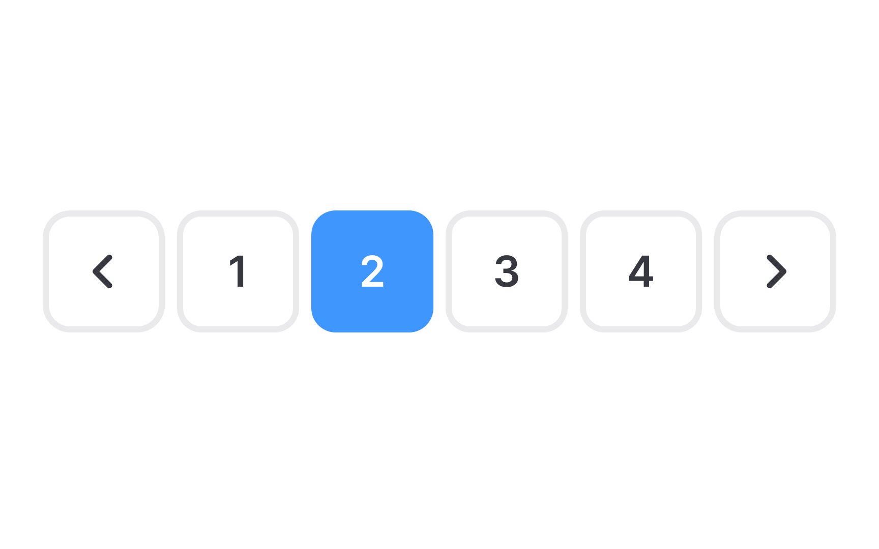
Selecting colors that stand out against the background for
High contrast makes it easier for users to distinguish the elements, particularly for those with visual challenges like color blindness or reduced vision. By achieving this balance, you ensure that your website is not only visually appealing and aligned with your brand identity but also accessible and user-friendly for a broad audience.
In
This visual cue quickly directs users to their current location within the sequence of pages, making it easier for them to understand their position in the
For effective website navigation, it's crucial to provide users with intuitive ways to flip through pages. A well-designed navigation panel offers comfortable and efficient browsing. While having a feature for manual
Keep in mind the design of these buttons should be clear and easily recognizable. The most commonly used designs for these controls are single chevrons like (>) for next and (<) for previous or explicitly labeled "Next" and "Previous" buttons. These familiar symbols and terms quickly convey their function to users, making the browsing experience more straightforward and user-friendly.
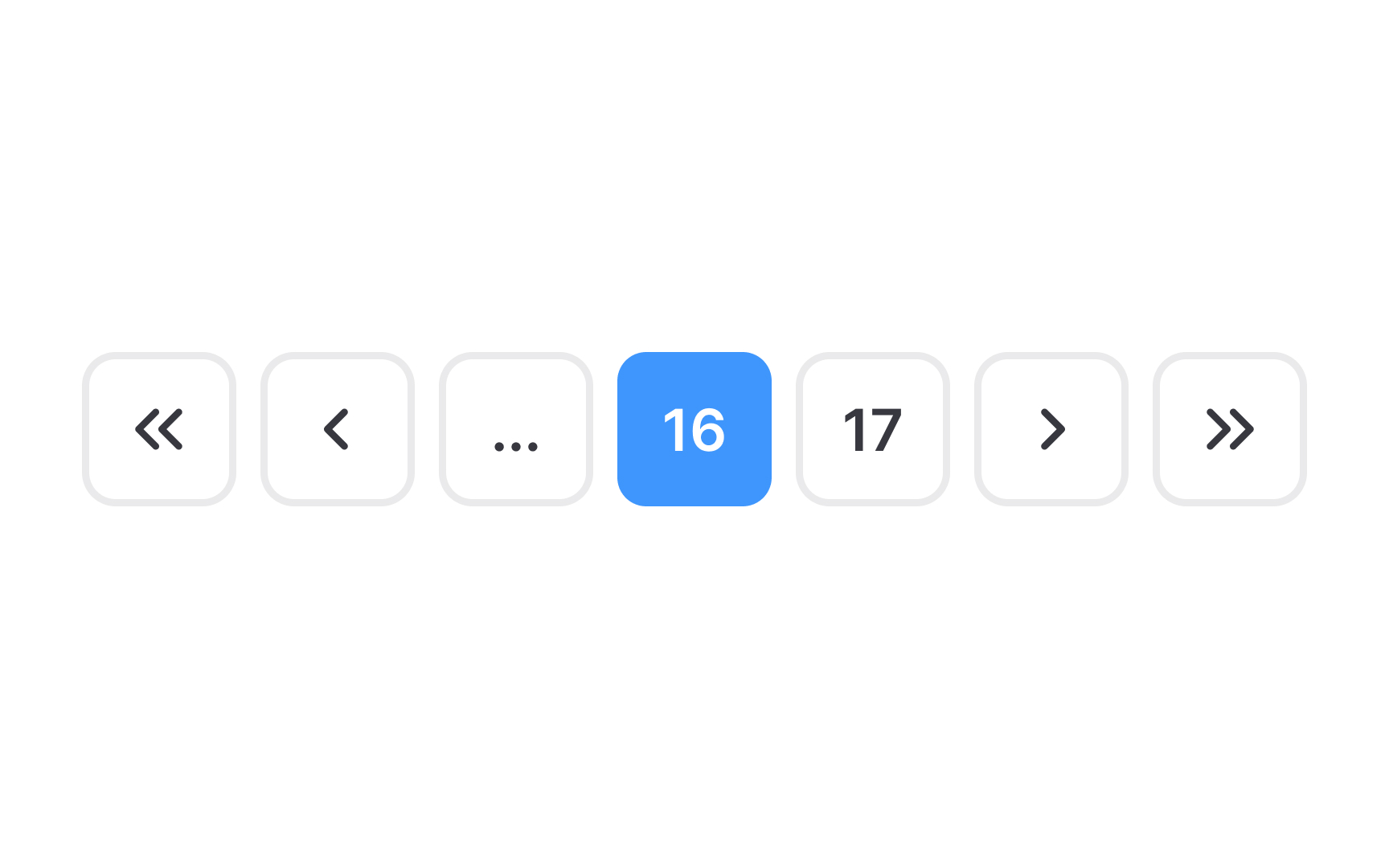
Double rightward (>>) and leftward (<<) chevrons in
This functionality not only saves time but also enhances the overall user experience, especially in scenarios where users need to access the beginning or end of a long list of products or information.
The
For mobile users, consider the size of clickable areas. These should be large enough to comfortably tap with a finger, with a recommended minimum size of 44 × 44px. This size consideration enhances
To increase conversions using
With pagination, users encounter a finite set of options, which psychologically encourages decision-making and purchasing. Unlike infinite scrolling, which often leads to aimless browsing, pagination's defined limits help users focus and make choices more easily.
Therefore, to increase conversions, design your website's pagination to showcase a clear beginning and end to the list of products or
References
- 5 Visual Treatments that Improve Accessibility | Nielsen Norman Group
Top contributors
Topics
From Course

Share


Similar lessons

Intro to Information Architecture

How to Design Good Search Experiences in UIs
