Hyperlink
A hyperlink is a clickable element that connects users to another location, resource, or action, serving as the foundation of navigation on the web.


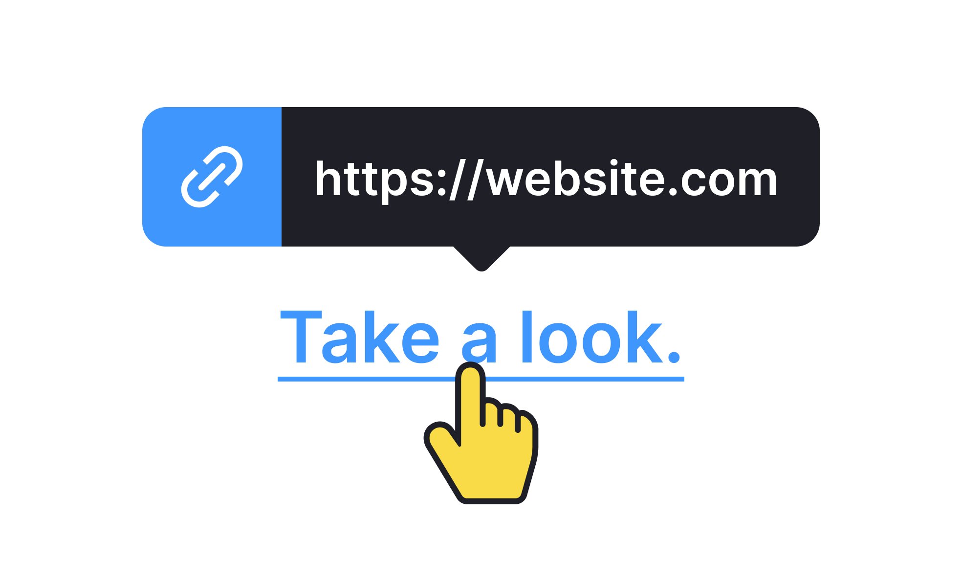
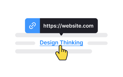
A hyperlink, often shortened to “link,” is a clickable text, image, or button that directs users to another location. This location may be another webpage, a section within the same page, a downloadable file, or even an external application. In HTML, hyperlinks are created using the <a> tag, paired with an href attribute that defines the destination. Hyperlinks are one of the earliest and most defining features of the web, enabling the interconnected structure that gave rise to the term “World Wide Web.”
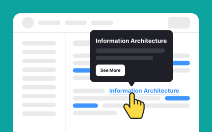
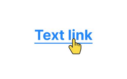
For UX designers, hyperlinks are fundamental navigation tools. The way a link is styled, through color, underlining, or hover effects, affects whether users recognize it as interactive. Designers also consider clarity of link labels, as vague labels like “Click here” provide little context, while descriptive labels like “View pricing details” give users confidence about the destination. Placement, visual hierarchy, and accessibility all shape how effectively hyperlinks guide user journeys.
Accessibility is a critical part of hyperlink design. Links must be distinguishable not only by color but also through additional cues like underlining, since some users cannot perceive color differences. Screen readers rely on descriptive link text to announce destinations, making labels like “Learn more about accessibility features” far more useful than generic “Read more.” Proper focus states also ensure that keyboard users can navigate links efficiently.
Real-world examples show how hyperlink practices shape user behavior. Wikipedia relies heavily on inline hyperlinks to connect articles, encouraging exploration of related topics. E-commerce sites use hyperlinks to drive users from product descriptions to checkout processes. SaaS platforms often include contextual links within dashboards, directing users toward documentation or support resources. Across contexts, effective hyperlinks reduce friction and create confidence in navigation.
Hyperlinks have also evolved with technology. Beyond simple text links, modern interfaces use interactive buttons, icons, and even voice-activated links in smart devices.
Learn more about this in the Hyperlinks Exercise, taken from the Common UI Components Lesson, a part of the Design Terminology Course.
Key Takeaways
- A hyperlink is a clickable element that connects to another location.
- Designers style and label links for clarity and recognition.
- Accessibility requires descriptive text, underlining, and focus states.
- Examples include Wikipedia, e-commerce flows, and SaaS dashboards.
- Hyperlinks evolve across forms but retain their core function.
An effective hyperlink is clear, consistent, and predictable. Users should understand what will happen when they click it, whether they will be taken to a new page, a file, or an app section. Labels must describe destinations clearly, avoiding vague phrases that leave users guessing.
Styling also plays a role. Links must look interactive, whether through color contrast, underlining, or hover states. When users can easily recognize and trust links, navigation flows more smoothly.
Hyperlinks that rely only on color can create barriers for users with vision challenges. By adding underlines and descriptive text, teams make links accessible to broader audiences. Screen readers also depend on context-rich link text, which prevents confusion for users navigating non-visually.
Accessibility testing ensures that links are usable with keyboards, screen readers, and different color-contrast scenarios. This guarantees inclusion without sacrificing usability.
Poor hyperlink practices include vague text labels like “Click here,” broken links that lead to errors, and unexpected behaviors such as opening new windows without warning. Overloading content with too many hyperlinks can also distract users or dilute focus.
These issues undermine trust and reduce efficiency. By keeping links purposeful, descriptive, and reliable, teams avoid these pitfalls and create stronger user experiences.
Recommended resources
Courses

Enhancing UX Workflow with AI


HTML Foundations


Mentorship Mastery