Mobile Navigation & Input Components
Understand how to design input and navigation components that help users interact with an app in the most logical and intuitive way
Generally, mobile interfaces use the same navigation and input components as desktops. Navigation components help users navigate an app in the most logical and intuitive way. In turn, input components focus on collecting data without any extra interaction cost and guesswork.
What makes designing these components for mobile so challenging? People tend to use their phones for multiple tasks like browsing news, typing messages, or paying bills when they're on the go and not using both their hands. Plus, mobile devices lack screen space. So designers should know how to present the main features of the app with minimum space while not compromising on clarity.
Having a clear understanding of the anatomy of navigation, input components, and their most common uses can help designers anticipate technical and contextual constraints and design using the best practices.
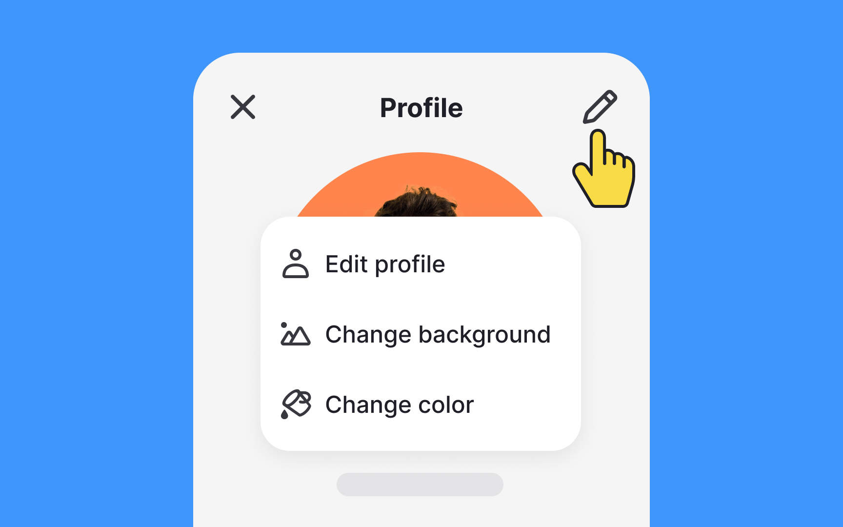
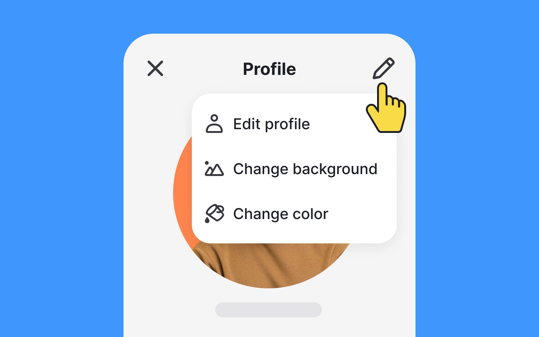
On mobile, menus are navigational components showing option lists on tap. They efficiently provide multiple actions while conserving screen space.
Different menu types exist. Basic menus appear when users tap a button or icon (like the hamburger menu), optionally including icons with labels for faster action recognition.
Contextual menus appear on touch-and-hold gestures, offering common actions relevant to the selected element.
- Position strategically: Place menus near trigger elements. If cut off by screen edges, reposition above or to the opposite edge
- Prioritize choices: List frequently used items at the top to minimize user effort
- Enhance visibility: Use shadows and elevation to distinguish menus from background content
- Separate items: Add dividers for better scannability
- Set proper height: Keep the maximum height at least one row shorter than the interface height.[1]
- Provide adequate touch targets: Minimum size should be 44x44px (iOS) or 48x48dp (Android). Consider larger targets (around 54px) to accommodate users with varying motor skills[2]
- Space elements properly: Maintain at least 8dp/16px between interactive elements to prevent accidental taps
- Write clear labels: Use short, direct verbs that instantly convey the action. When needed, add explanatory text below for context. Example: On registration pages, explain that users can shop now and register later
- Maintain hierarchy: Distinguish between primary, secondary, and tertiary actions through visual styling. Use filled buttons for primary actions, and text buttons for secondary ones.
Icons can support faster action recognition[3]
Action
On Android, the bottom app bar serves a similar purpose but offers more flexibility:
- Holds up to 4
icon buttons - Includes a floating action button (FAB) for primary actions
- Can change the layout and contents between screens
Both components help users access key actions while conserving screen space, though
Pro Tip: When designing toolbars, make sure to use a legible title and provide enough touch target space for each action.
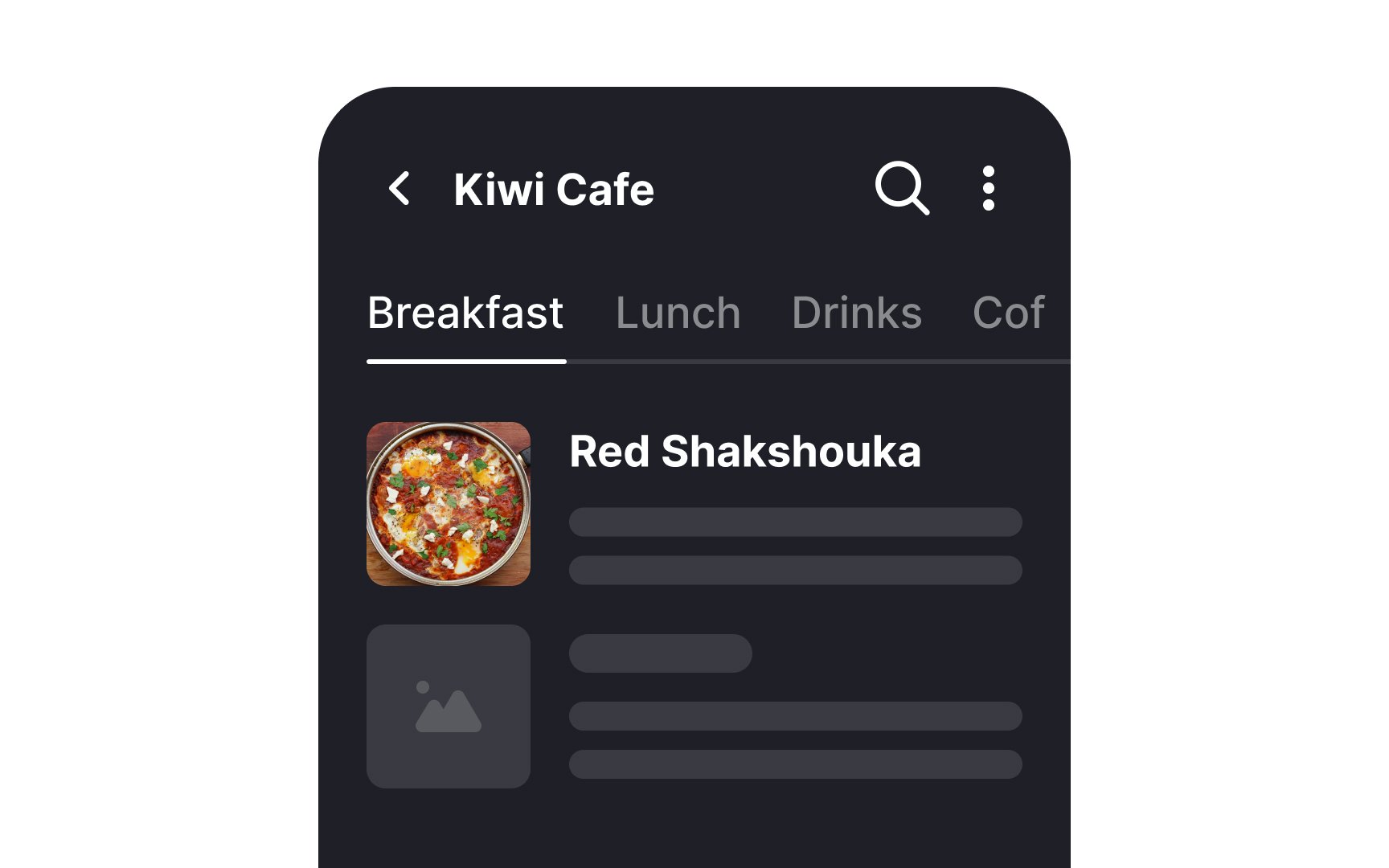
Tabs are navigational components that organize related
Best practices for tab design:
- Present closely related areas of content to maintain the contextual connection
- Distinguish selected tabs through contrast, overlays, or vertical lines, while keeping unselected tabs visible
- Include
icons to aid group recognition - Enable both tap and swipe
navigation between tabs - Prevent swipeable elements within tab content to avoid accidental actions
- Use clear labels that indicate a content type


The
Key FAB design principles:
- Use one FAB per screen
- Choose
icons that clearly communicate the button's purpose - Reserve for positive actions, avoiding destructive ones like archive or delete
FAB can transition in three ways after tapping:
- Speed dial: Reveals a stack of up to 6 related actions
- Menu: Transforms into a
menu with 3-6 items, disabling outsidecontent - Transform: Morphs into larger surfaces that can span part or all of the screen.[6]
Pro Tip: Design FABs with a text label when the icon's meaning is not clear on its own.
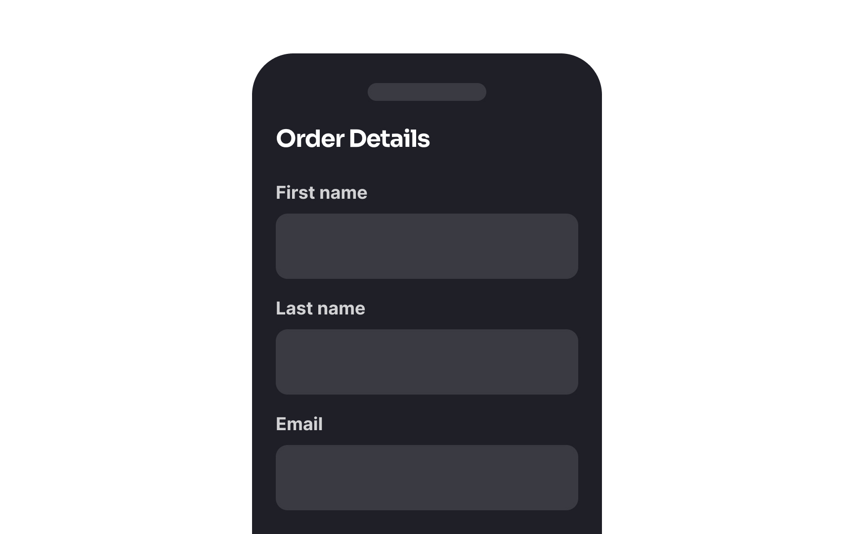
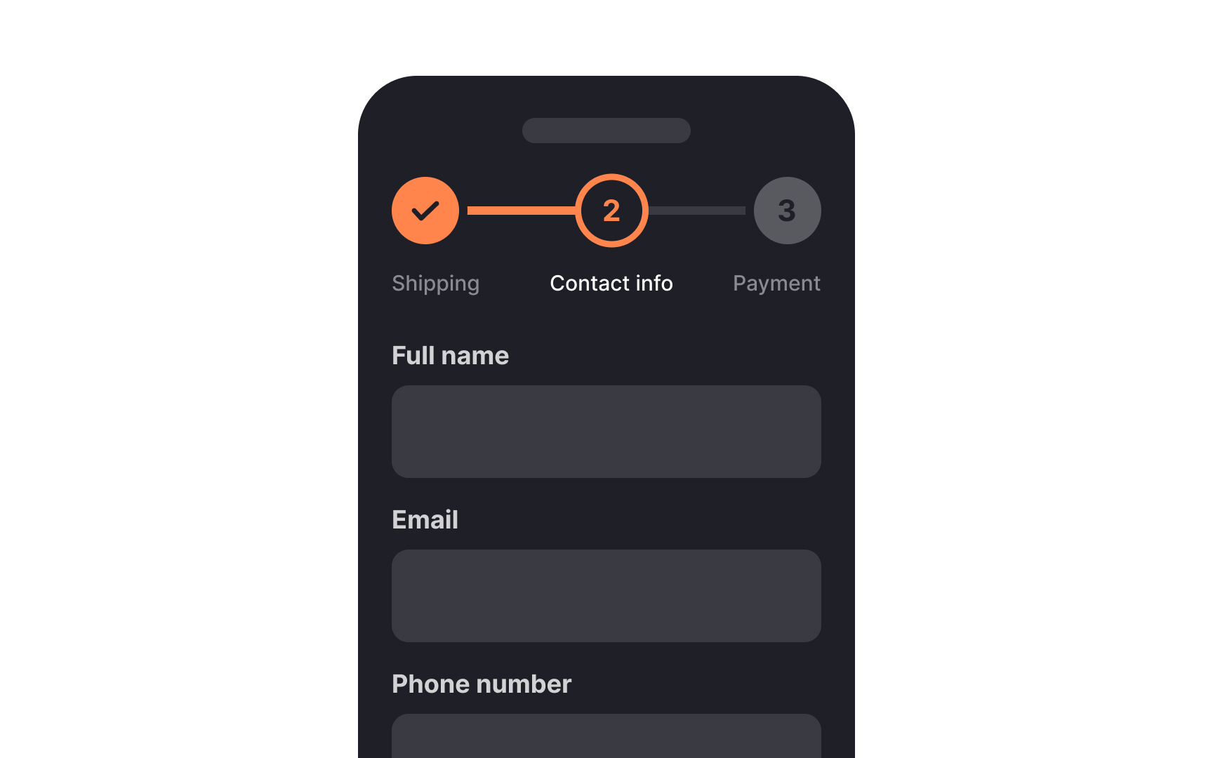
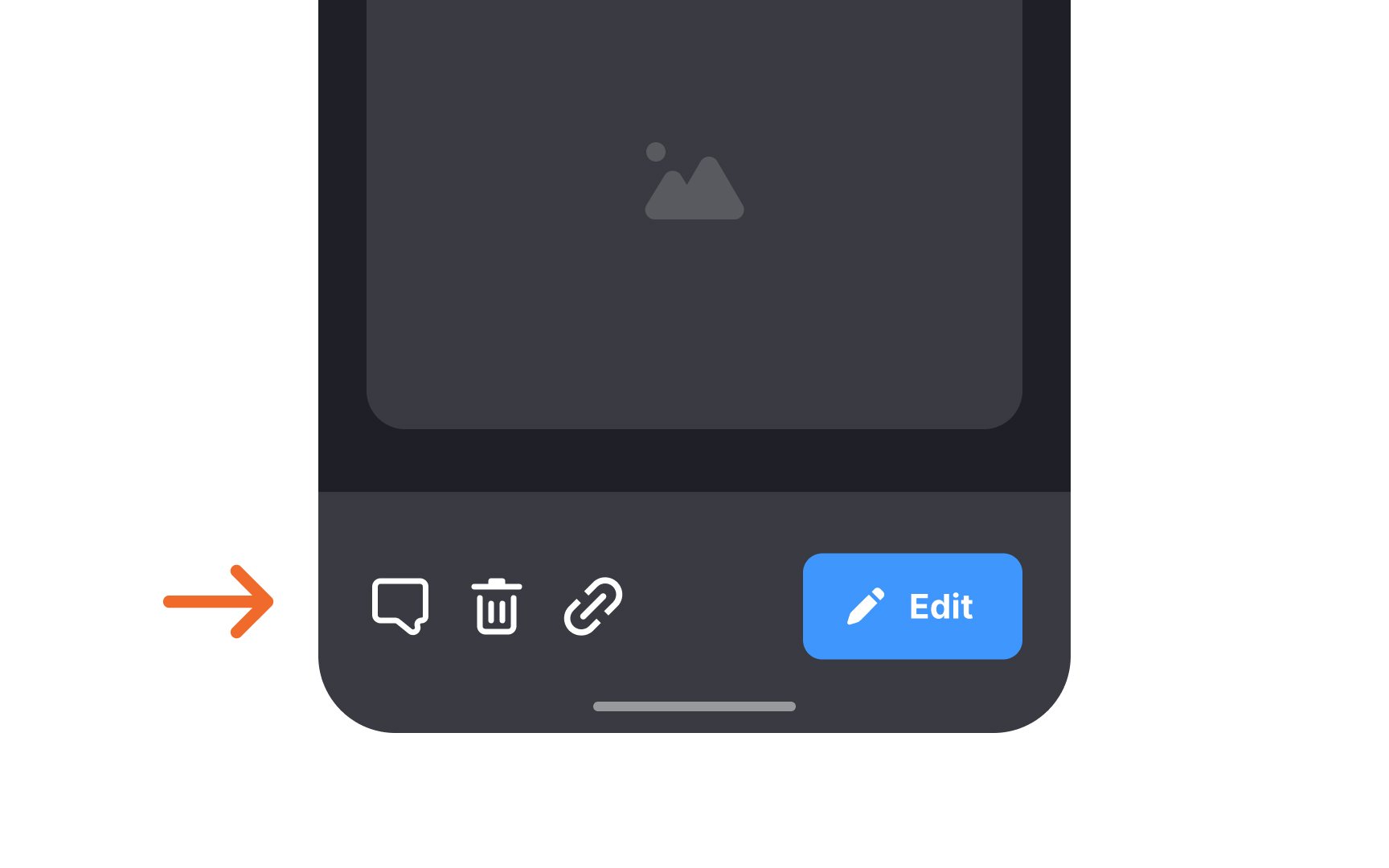
No one likes filling out forms on mobile, yet they remain the most reliable way to collect user data.
How to make mobile forms more user-friendly:
- Minimize inputs: When possible, combine fields to reduce
interaction . Example: Use "Full Name" instead of separate first/last name fields, considering cultural naming conventions - Use natural language: Replace interrogative tone with conversational language. Include linking verbs, personal pronouns, and simple vocabulary
- Prefill when possible: Reduce effort with smart defaults and autofill using previously provided data
- Save personal questions for last: Users share sensitive information more willingly after building trust
- Ensure accessibility: Meet
contrast ratio requirements and support voiceinput and screen readers - Break down complex forms: Divide lengthy forms into logical steps and add progress indicators to maintain user engagement.[7]
Pro Tip: Mobile forms become more effective when you provide inline validation as it allows people to fix errors faster.

While seemingly simple, poorly designed inputs can be hard to notice, lack feedback, or have unclear commands that slow users down.
Key design recommendations for mobile inputs:
- Ensure discoverability: Make inputs clearly visible. Use colored strokes around containers or bottom edges to show active states.
- Write clear labels: Keep
labels always visible — never hide them in placeholders. Use specific, concise text (4 words max) without unnecessary modifiers. - Show clear errors: Don't rely solely on red color for errors. Include icons and brief explanations of the problem and solution.
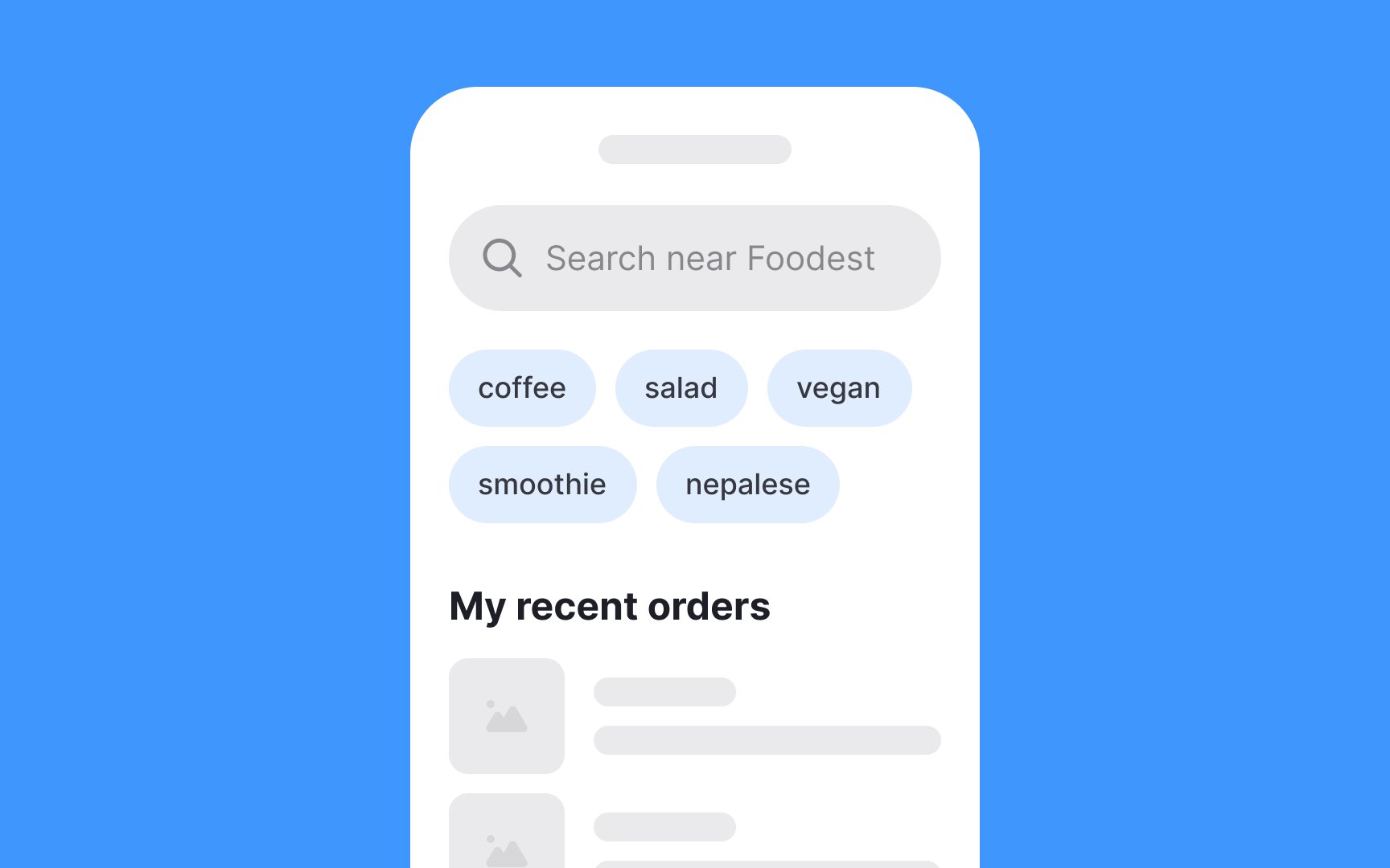
Key design principles for effective mobile search:
- Make the search bar discoverable: Place it prominently, typically at the screen top or in the bottom
navigation bar (though bottom placement reduces findability) - Include magnifying glass icon: Use this universal symbol to help users quickly identify the search function
- Display recent searches: Show users' previous queries before they start typing for quick access
- Offer alternatives: Instead of empty "No results"
pages , show trending searches or relevant categories based on user history - Implement auto-suggest: Provide real-time suggestions to help users form better queries, prevent
errors , and find results faster - Show search progress: When results take time to load, use animations to reduce confusion and maintain user engagement
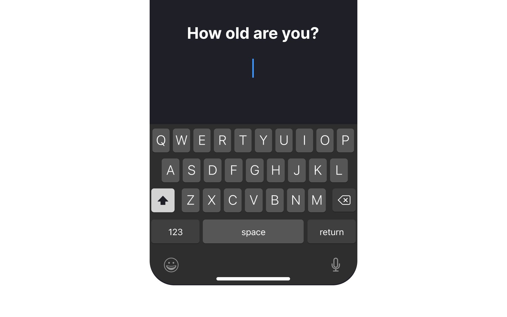
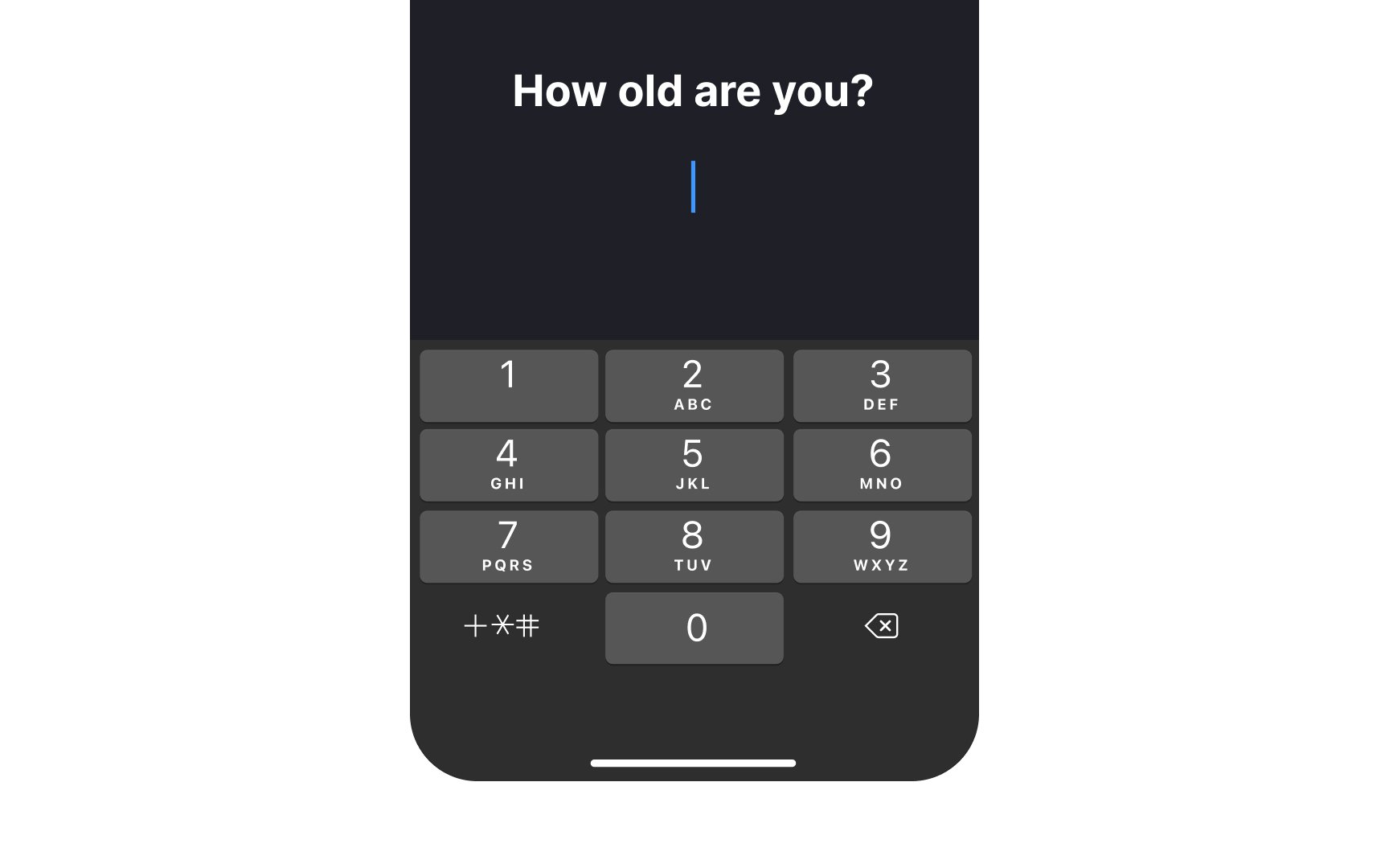
Typing is one of the most challenging tasks for mobile users as they usually do it on the go. Thus, matching the onscreen keyboard to the type of
The
Providing relevant screen keyboards minimizes
References
- Material Design | Material Design
- Toolbars | Apple Developer Documentation | Apple Developer Documentation
- Bottom app bar – Material Design 3 | Material Design
- Material Design | Material Design
Top contributors


Topics
From Course

Share


Similar lessons

Designing for Mobile Interfaces

Responsive vs. Adaptive Design
