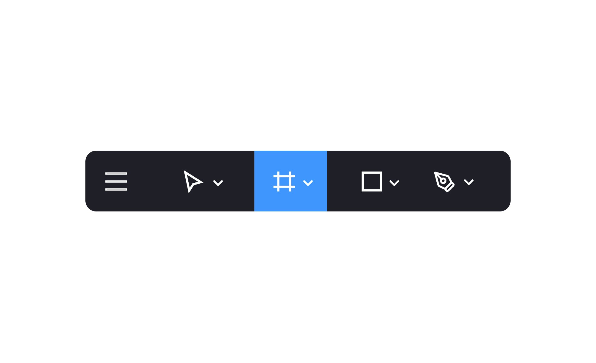
Toolbars
A toolbar is a row or panel of controls within a user interface that provides quick access to frequently used actions, tools, or settings in an application.


TL;DR
- A row or panel of grouped controls.
- Provides shortcuts to key actions or tools.
- Reduces navigation effort for users.
- Common in productivity apps and design tools.
Definition
A toolbar is a UI component that organizes commonly used functions, such as icons, buttons, or dropdowns, into a single row or panel for fast access.
Detailed Overview
Toolbars are central to usability in many software applications, from word processors to design platforms. They reduce friction by grouping frequently used commands into a single, visible panel, allowing users to act quickly without digging into menus. This efficiency is why toolbars remain one of the most consistent UI elements across desktop, web, and mobile software.
A frequent question is how toolbars differ from menus. Menus organize a wide range of options, often hidden behind dropdowns, while toolbars focus only on the most common or critical actions. For example, a word processor menu may list dozens of formatting options, but the toolbar prioritizes bold, italic, and alignment buttons because they are used most often.
Another common query relates to customization. Many modern applications allow users to personalize toolbars by adding, removing, or rearranging controls. This flexibility helps power users optimize their workflows while still keeping interfaces approachable for beginners.
Without customization, toolbars risk becoming cluttered or irrelevant to different audiences.
Design clarity is another important consideration. Overloaded toolbars can overwhelm users and create decision fatigue. A well-structured toolbar limits the number of items, organizes them by function, and uses clear icons supported by tooltips. This balance ensures efficiency without sacrificing clarity.
Accessibility plays a role in toolbar design as well. Controls must be large enough to interact with, offer sufficient contrast, and be fully navigable by keyboard and assistive technologies. Tooltips and labels provide additional guidance for users who may not immediately recognize icons. This inclusivity ensures that toolbars serve the widest range of users effectively.
Finally, toolbars contribute to overall workflow speed and user confidence. By making high-frequency actions visible and accessible, they reduce the cognitive load of searching for commands. Well-designed toolbars reinforce product usability and create a sense of control and efficiency.
Learn more about this in the Toolbars Exercise, taken from the Mobile Navigation & Input Components Lesson, a part of the Mobile Design Course.
Toolbars display commonly used functions directly, while menus contain broader sets of options that may be hidden under dropdowns.
Toolbars prioritize efficiency, while menus provide depth and organization.
Customization lets users adapt toolbars to their workflows by adding or removing controls. This ensures both beginners and advanced users get interfaces tailored to their needs.
It increases satisfaction by balancing simplicity and power.
Toolbars should focus on high-frequency actions and organize them logically. Grouping related functions and using concise icons with tooltips prevents confusion.
Avoiding overload ensures clarity and efficiency.
Controls must meet size and contrast standards, support keyboard navigation, and include text labels or tooltips. These practices ensure usability for people with different needs.
Accessibility makes toolbars inclusive and dependable.
Toolbars reduce the need to search through menus by keeping high-priority functions visible. This speeds up task completion and boosts confidence.
Quick access to tools directly impacts user satisfaction and productivity.
Recommended resources
Courses

UX Design Foundations


Core UI Components


Design Terminology

Lessons

When & How to Use Tables in UIs

Mobile Navigation & Input Components