How to Use Text in Wireframes
Discover best practices for using text strategically in wireframes
The words and labels in a wireframe communicate hierarchy, guide user attention, and clarify functionality long before visual design begins. Real content reveals layout problems that lorem ipsum hides, such as text that overflows buttons or headlines that break awkwardly across lines. Using actual or realistic text helps teams identify content gaps, test information architecture, and validate that the interface makes sense to users. Labels, microcopy, and headings shape how people understand and navigate a product.
When text is treated as an afterthought, teams often face costly redesigns later. Strategic text placement in wireframes also helps stakeholders understand the product vision without getting distracted by visual details. Whether working with placeholder text or real content, the approach to text in wireframes directly impacts how effectively a design communicates its intended message and functionality.
Text blocks serve as the foundation for
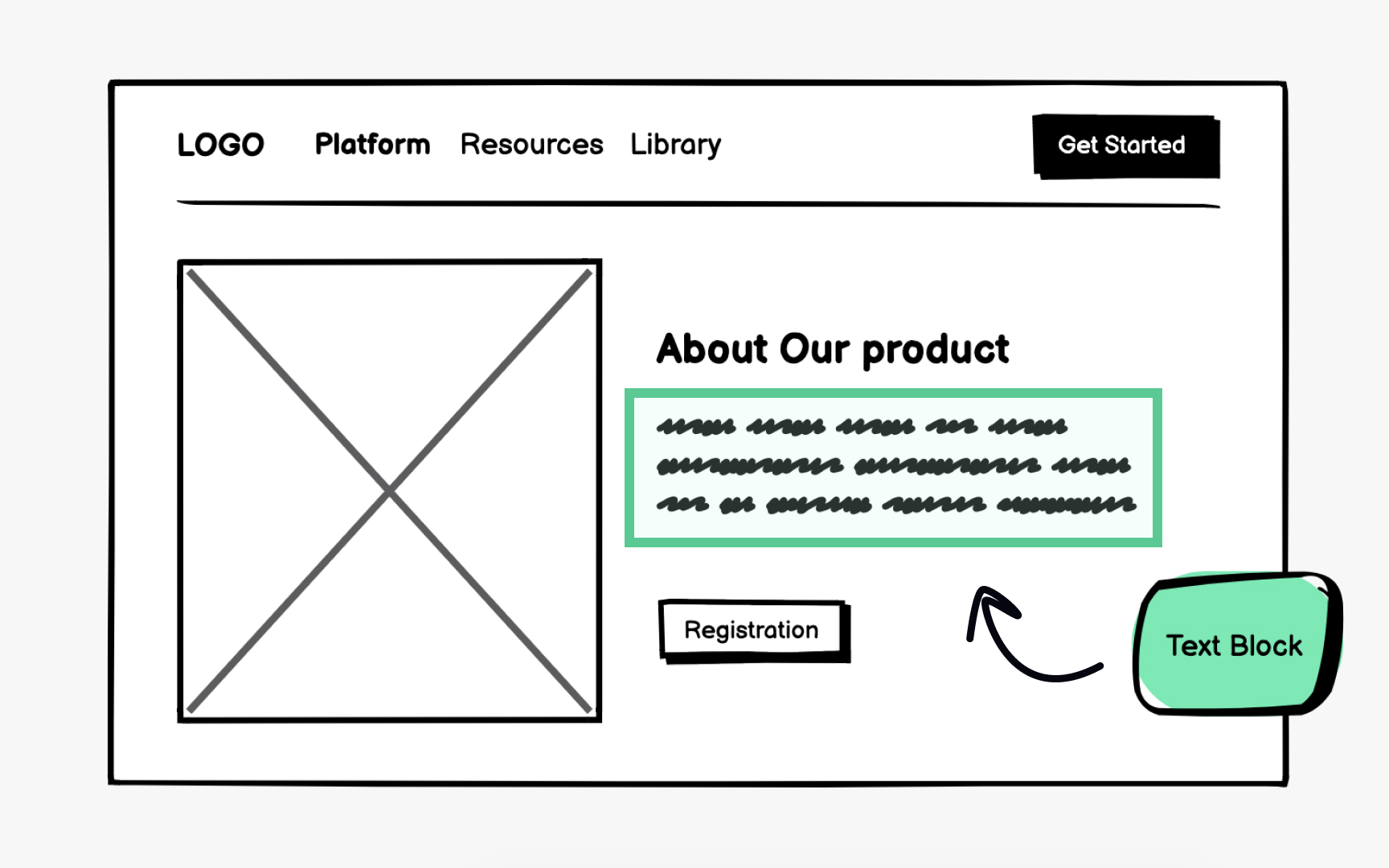
Using text blocks allows designers to define container dimensions and establish visual hierarchy. A block with larger text signals a headline, while smaller text blocks indicate body content. This approach keeps early discussions focused on
Text blocks work best during initial brainstorming when the content strategy is still evolving. They communicate the general idea of how information flows through a page. As the project progresses, these
Pro Tip: Size text blocks proportionally to expected content length so stakeholders can evaluate layout balance accurately.
While text blocks represent where
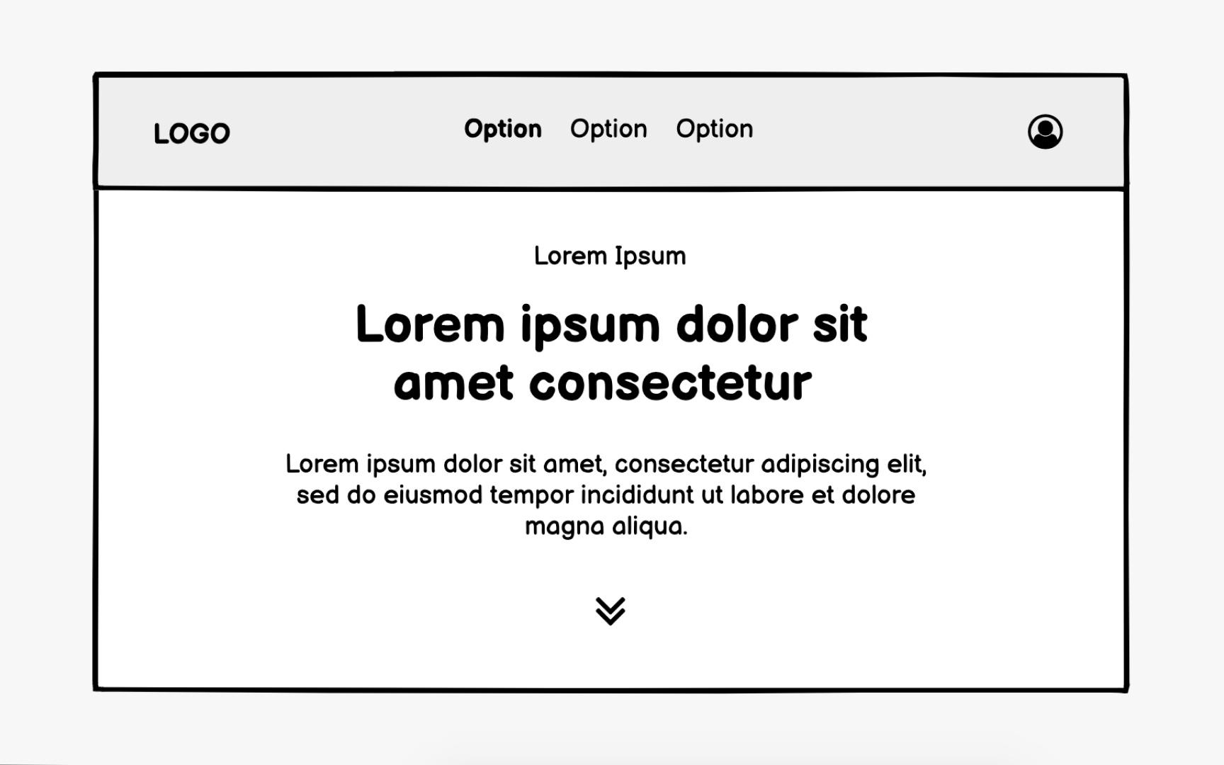
Dummy text helps teams evaluate line breaks, paragraph spacing, and how words interact with surrounding elements. Unlike abstract text blocks, dummy text reveals whether a paragraph feels too dense or a text area appears too empty. Stakeholders can better assess the reading experience even without the finalized copy.
The downside is that dummy text lacks real-world accuracy. Lorem ipsum cannot reveal if a headline is too long for its
Pro Tip: If real content is unavailable, borrow text of similar length and tone from competitor products as temporary placeholders.
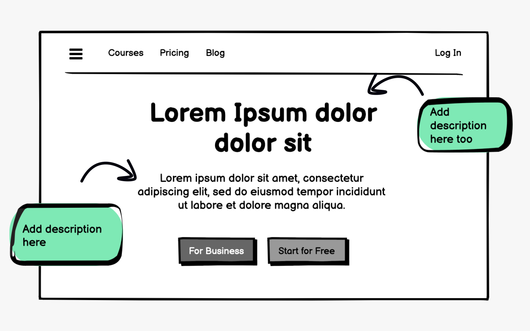
Dummy text should be temporary. Transitioning to real
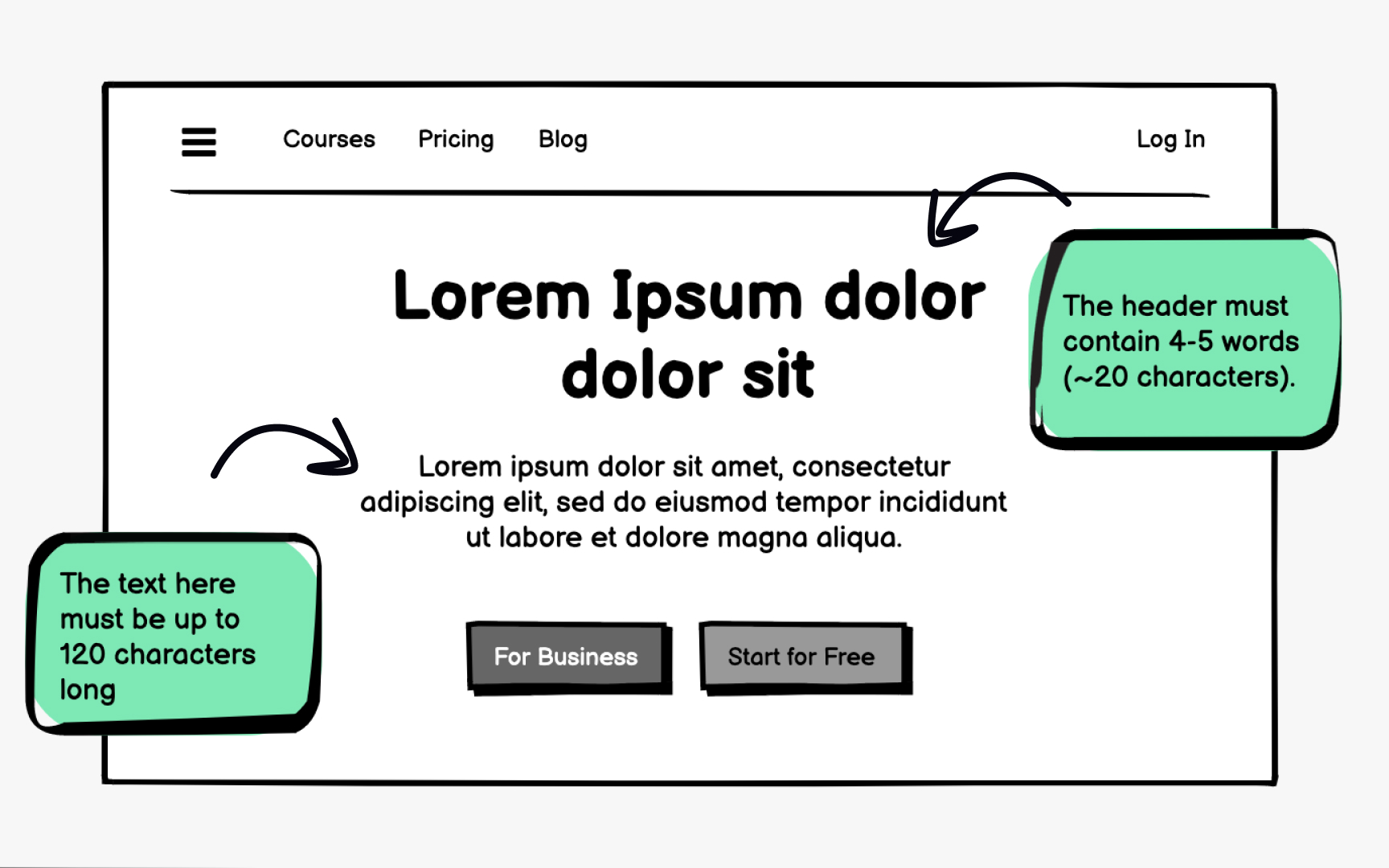
Character count awareness helps writers and designers collaborate effectively. Many wireframing tools display character limits for text blocks, showing exactly how much space is available. This visibility helps UX writers craft content that fits and helps developers understand text
Working within character constraints early prevents last-minute content edits that disrupt
Text hierarchy in
Primary elements like
Wireframes communicate hierarchy through relative differences rather than exact specifications. A heading does not need precise pixel values to appear important. It simply needs to be noticeably larger than the surrounding text. Maintaining consistent hierarchy patterns across screens helps users predict where to find information throughout the product.
Pro Tip: Limit wireframes to 3 or 4 distinct text sizes to maintain a clear hierarchy without overcomplicating the system.
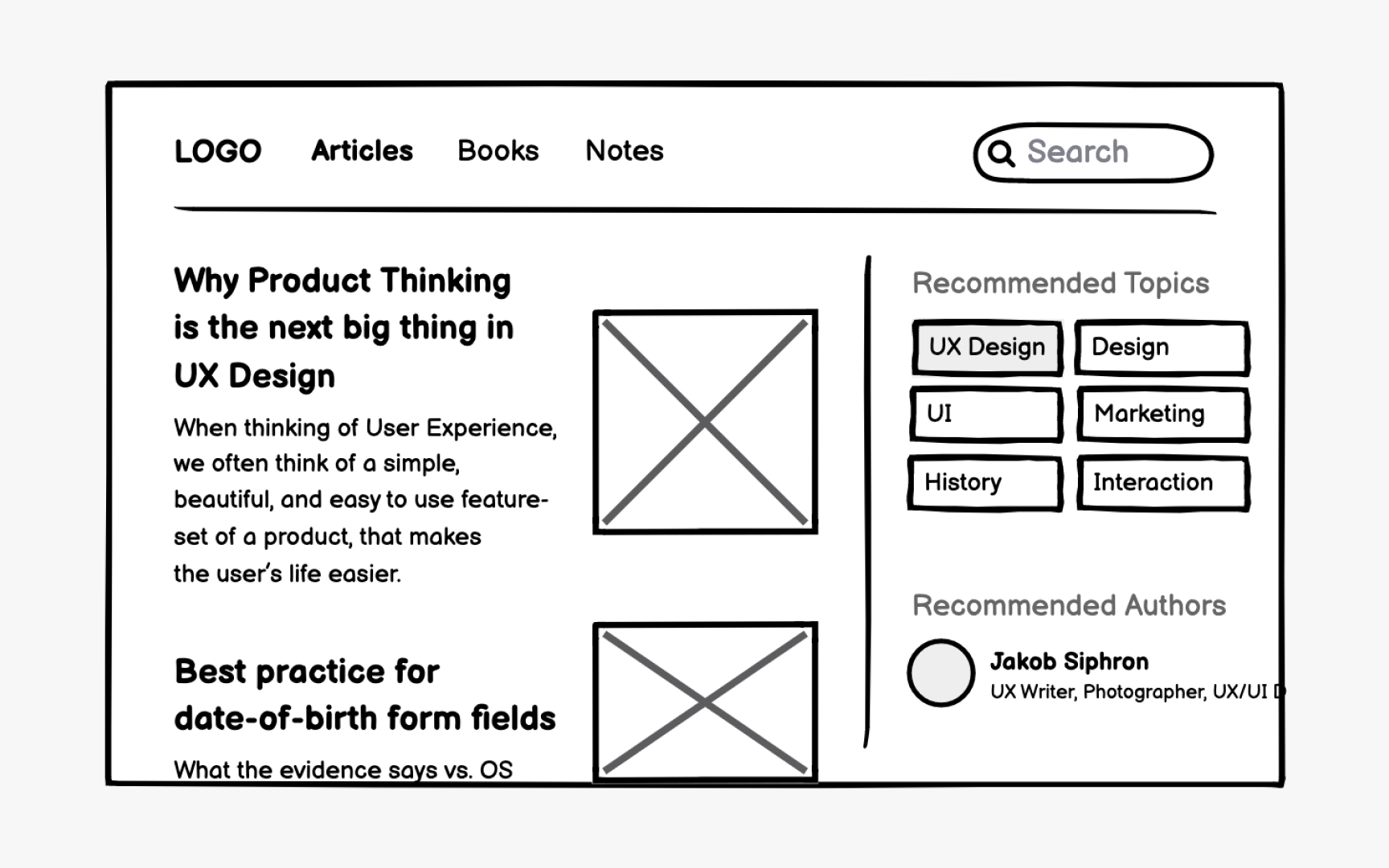
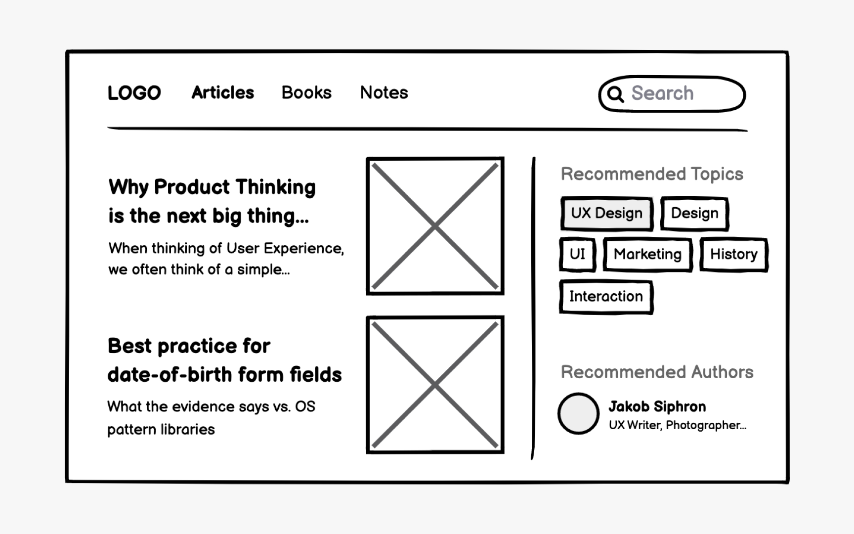
Headlines often use truncation with an ellipsis when space is constrained. Users should still access full titles through hover states or tooltips. Include at least a few visible characters before truncation begins, giving users enough context to understand the content.
Text blocks in constrained spaces benefit from "Show more" patterns that indicate additional content exists below the fold or on another
Pro Tip: Apply truncation patterns consistently to breadcrumbs, pagination, and long URLs throughout the product.
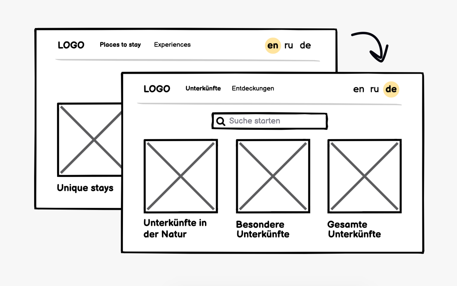
Products intended for global audiences require localization planning during wireframing. This process involves more than translation and extends to:
- Layout: If your product targets countries with right-to-left languages like Arabic or Hebrew, display mirrored layouts in
wireframes to validate that the design works bidirectionally. - Space: German and Russian typically require 30% more space than English, while some Asian languages may need less horizontal space but more vertical room.
- Date formats: Americans use MM-DD-YYYY, Europeans prefer DD-MM-YYYY, and many Asian countries use YYYY-MM-DD.
- Other formats: Phone numbers, currencies, addresses, and measurement units all follow regional conventions that affect text length and
layout .
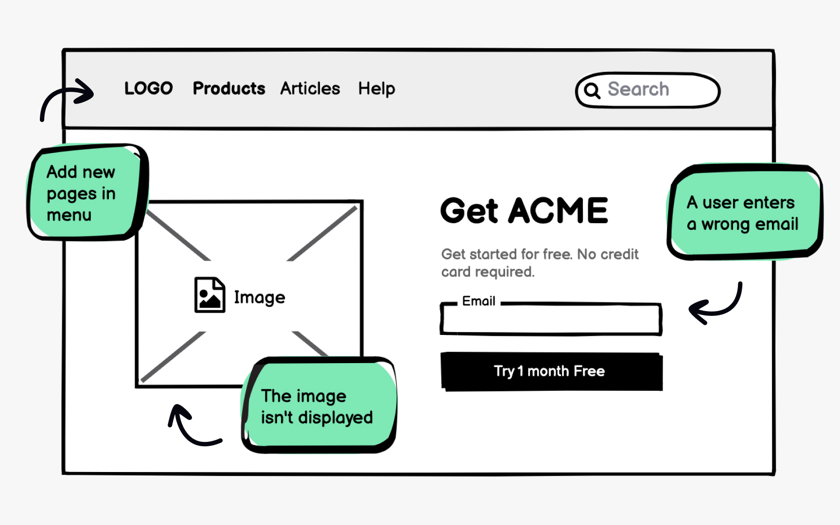
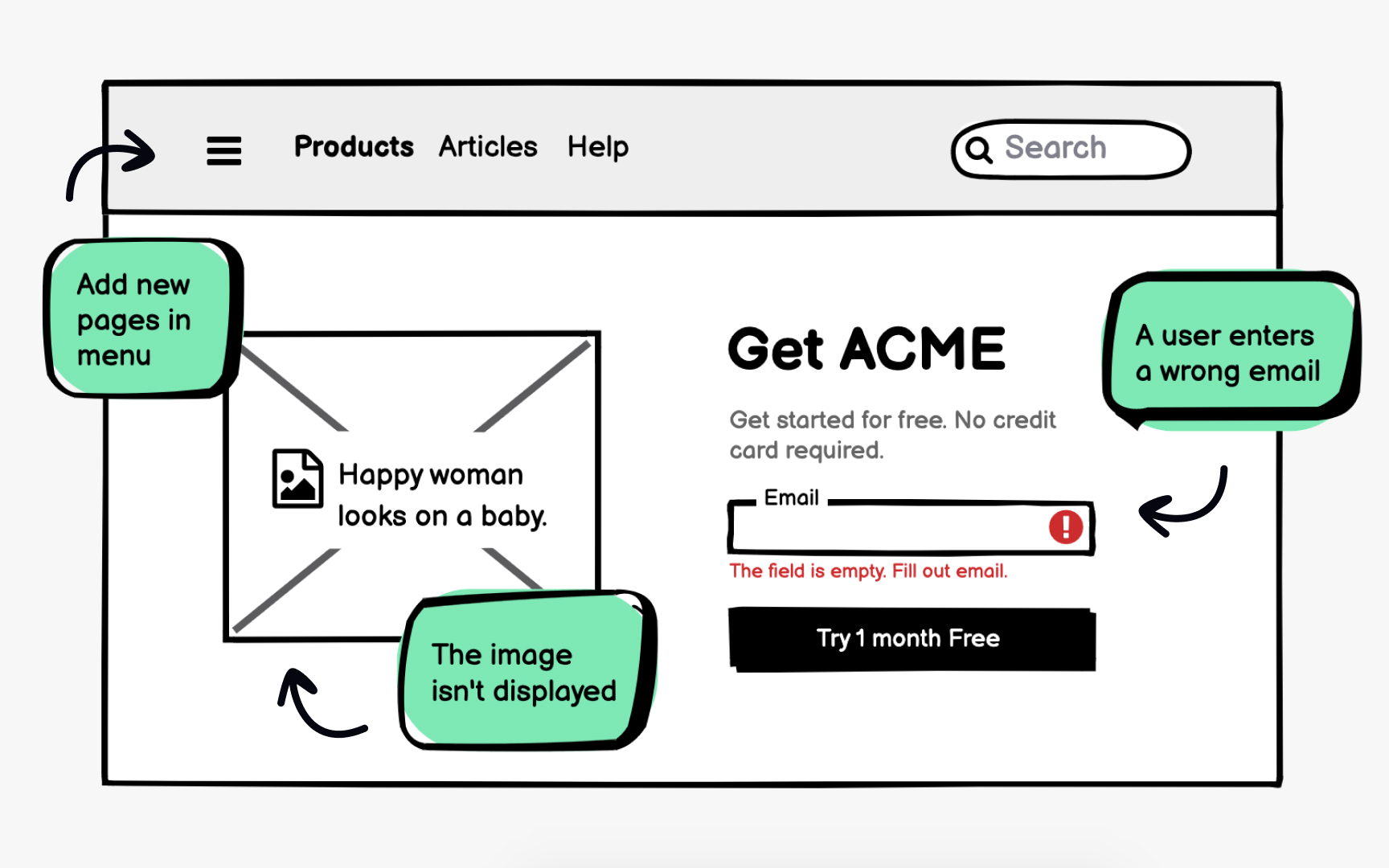
Edge cases represent scenarios that fall outside typical use but will inevitably occur. Empty states, error messages, and unusual
Error text placement deserves specific attention in
Accessibility considerations should also be part of edge case planning. Alt text for images, proper link descriptions, and
References
Top contributors


Topics
From Course

Share


Similar lessons

Intro to Wireframing

Wireframe Fidelity
