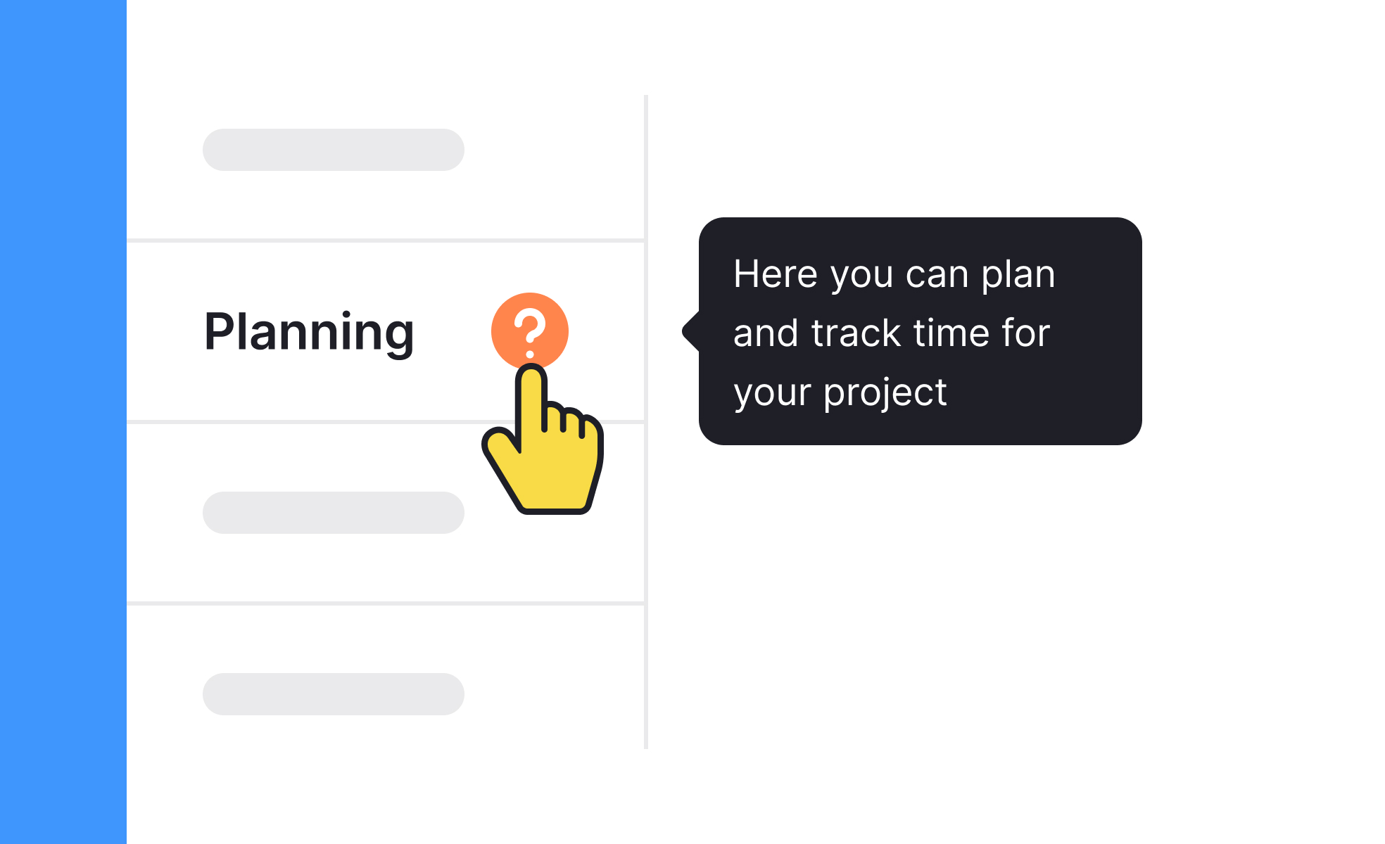
Tooltips
Tooltips are small, contextual overlays that appear when users hover, tap, or focus on an element, providing extra information without cluttering the interface.


TL;DR
- Small overlays that explain or clarify elements.
- Triggered by hover, tap, or keyboard focus.
- Reduce visual clutter while offering guidance.
- Common in icons, forms, and data-heavy UIs.
Definition
A tooltip is a lightweight UI element that provides additional information when a user interacts with an item, such as hovering over an icon or focusing with a keyboard.
Detailed Overview
Tooltips are designed to balance clarity with simplicity. Instead of overloading interfaces with constant explanations, tooltips appear only when needed, giving users contextual support without distracting from the main experience. This makes them particularly effective in interfaces with icons, data points, or controls that may not be self-explanatory.
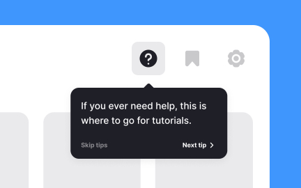
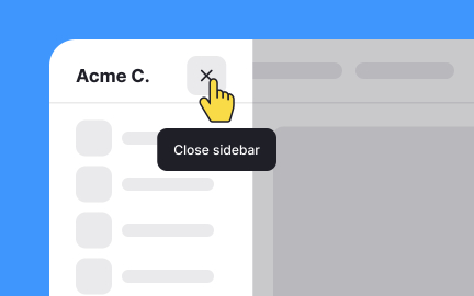
A frequent question is when tooltips should be used. They work best for secondary information, such as clarifying icons, abbreviations, or advanced options. For critical instructions, inline text is more appropriate since tooltips may go unnoticed. For example, an unfamiliar settings icon can have a tooltip saying “Manage preferences,” while important warnings should be visible without extra action.
Another common query is about triggering behavior. In desktop environments, tooltips are often shown when a user hovers with a mouse. On touchscreens, tap-and-hold or focus events replace hover since there is no cursor. Designers must adapt tooltip behavior to different input methods, ensuring consistency across devices.
Accessibility is another major concern. Poorly designed tooltips can exclude users if they disappear too quickly, are not keyboard-accessible, or cannot be read by screen readers. Accessible tooltips remain visible long enough, can be dismissed manually, and provide proper ARIA attributes for assistive technology.
Performance is also a consideration. Tooltips should appear instantly and align visually with the element they describe. Delayed or misplaced tooltips frustrate users and reduce trust in the interface. Smooth performance and clear positioning are critical to their effectiveness.
Finally, tooltips play a role in onboarding and continuous learning. They guide new users without cluttering the screen permanently and allow experienced users to explore advanced features at their own pace. When implemented thoughtfully, tooltips improve discoverability, reduce friction, and support user confidence.
Learn more about this in the Tooltips Exercise, taken from the Common UI Component Definitions Lesson, a part of the UI Components I Course.
Tooltips are best for secondary details or clarifications, like explaining icons or abbreviations. Inline text is better for critical instructions that users must see immediately.
Using tooltips only for supplementary information prevents confusion and ensures vital details are not overlooked.
Since mobile devices lack hover states, tooltips are usually triggered by tap-and-hold or focus. They must be adapted carefully to avoid blocking other interactions.
Designers often choose alternatives, like inline help or expandable panels, when tooltips are not practical on touchscreens.
Accessible tooltips can be triggered by keyboard navigation, remain visible long enough for users to read, and are announced by screen readers. They should also avoid vanishing on small cursor movements.
These practices ensure tooltips help rather than frustrate users.
Tooltips can support onboarding but should not replace structured tutorials. They are effective for explaining specific elements but less effective for guiding users through entire workflows.
Combining onboarding flows with contextual tooltips provides the best learning experience.
Common issues include making them too wordy, showing them too slowly, placing them in awkward positions, or relying on them for critical information. These errors reduce clarity and usability.
Effective tooltips are concise, well-placed, and enhance user confidence without clutter.
Recommended resources
Courses

UX Design Foundations


Core UI Components


Design Terminology