Tooltips & When to Use Them
Learn the essentials of creating tooltips that clarify without cluttering your interface
A small pop-up with a few words might seem like the easiest thing to design. But tooltips carry more weight than their size suggests. When done right, they answer questions before users even ask them. When done wrong, they block content, state the obvious, or simply go unnoticed. The trick is knowing when tooltips actually help. A button labeled "Submit" doesn't need a tooltip repeating that information. But an ambiguous icon? That's where a well-crafted tooltip prevents confusion and keeps users moving. Good tooltip design comes down to restraint and precision. Say only what's necessary, position it where it won't interfere, and style it so users can read it at a glance. These small details add up to interfaces that feel intuitive rather than frustrating.
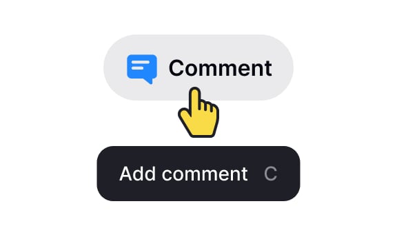
Good design should be self-explanatory. If an element already contains a descriptive label, then there's no reason to duplicate this information in a tooltip. For instance, if a
Also, keep in mind that
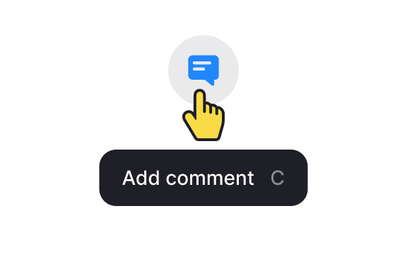
The meaning and context of tooltip usage matter. Not all elements are self-evident by themselves. If there isn't any close relationship between an
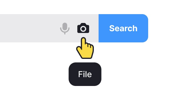
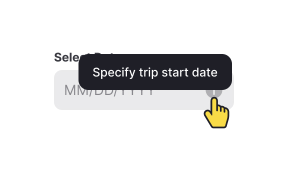
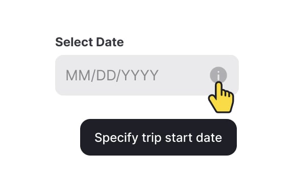
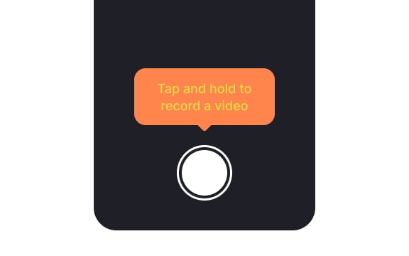
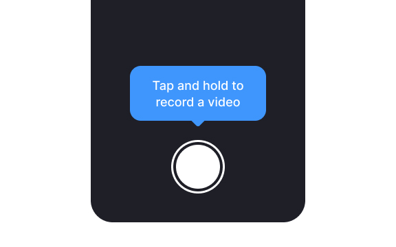
For example, imagine you have a photo-sharing application, and within the interface, there's a camera icon. If the camera icon is used without a tooltip, some users may assume it's for taking photos, while others might think it's for accessing a gallery or uploading images.
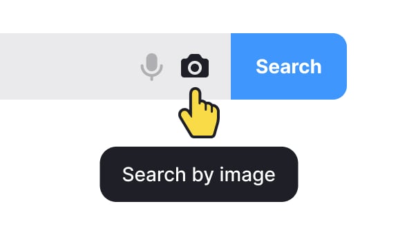
In this case, adding a tooltip like "Capture Photo" or "Take a Picture" provides explicit clarity about the function of the camera icon. This extra information helps users understand the purpose of the icon, especially when its meaning may not be immediately obvious.
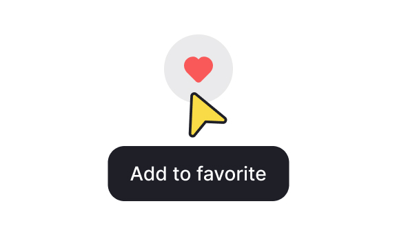
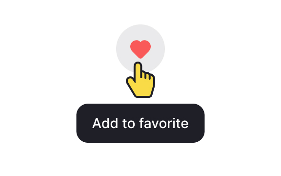
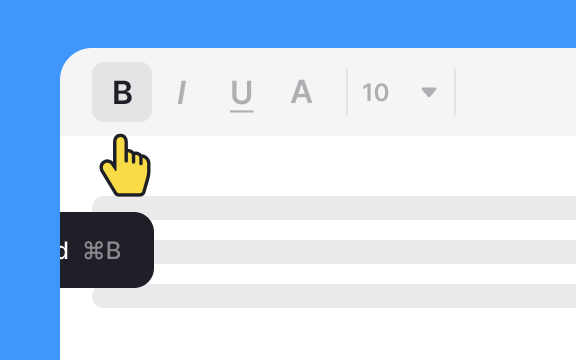
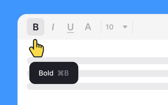
Change the cursor appearance from the default arrow to a pointer cursor when users hover over elements with
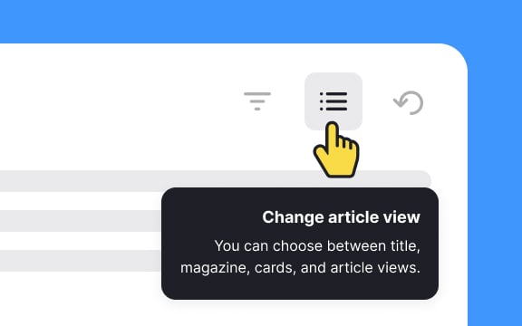
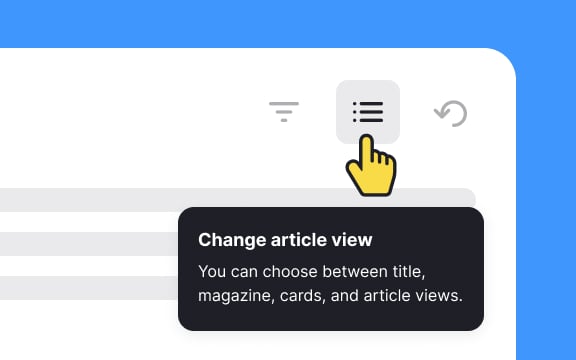
Use a left alignment for text, especially in languages read from left to right. This enhances the overall visual coherence and ensures users can easily absorb and comprehend the information presented within tooltips.
When parking, responsible drivers make sure that their car doesn't block other cars and expect other drivers to do the same. Apply the same rules to
When designing
Since tooltips are meant to be concise, avoid unnecessary details that might force users to strain their eyes. Keep the content easily graspable, steering clear of redundancy.


Similar lessons

Common UI Components Part I

Image Terminology
