Best Practices for Onboarding UX
Learn how to create seamless, user-focused onboarding experiences that drive engagement and reduce drop-offs.
Onboarding is the first big step users take when interacting with a product, and it’s crucial to make it as smooth and engaging as possible. A well-designed onboarding experience helps users understand the value of a product quickly, without feeling overwhelmed. By breaking down key actions into simple steps, using clear visuals, and offering help at the right moments, businesses can make users feel confident and empowered from the start.
Personalization is another important factor in modern onboarding. When the experience is tailored to users' needs and goals, it feels more relevant and helps them connect with the product on a deeper level. Features like progress indicators, interactive tutorials, and dynamic content ensure that users are guided without being overloaded. Tracking their progress and knowing when to stop showing tips creates a more seamless, enjoyable experience. In the end, effective onboarding leads to happier users, faster product adoption, and reduced churn.
A seamless
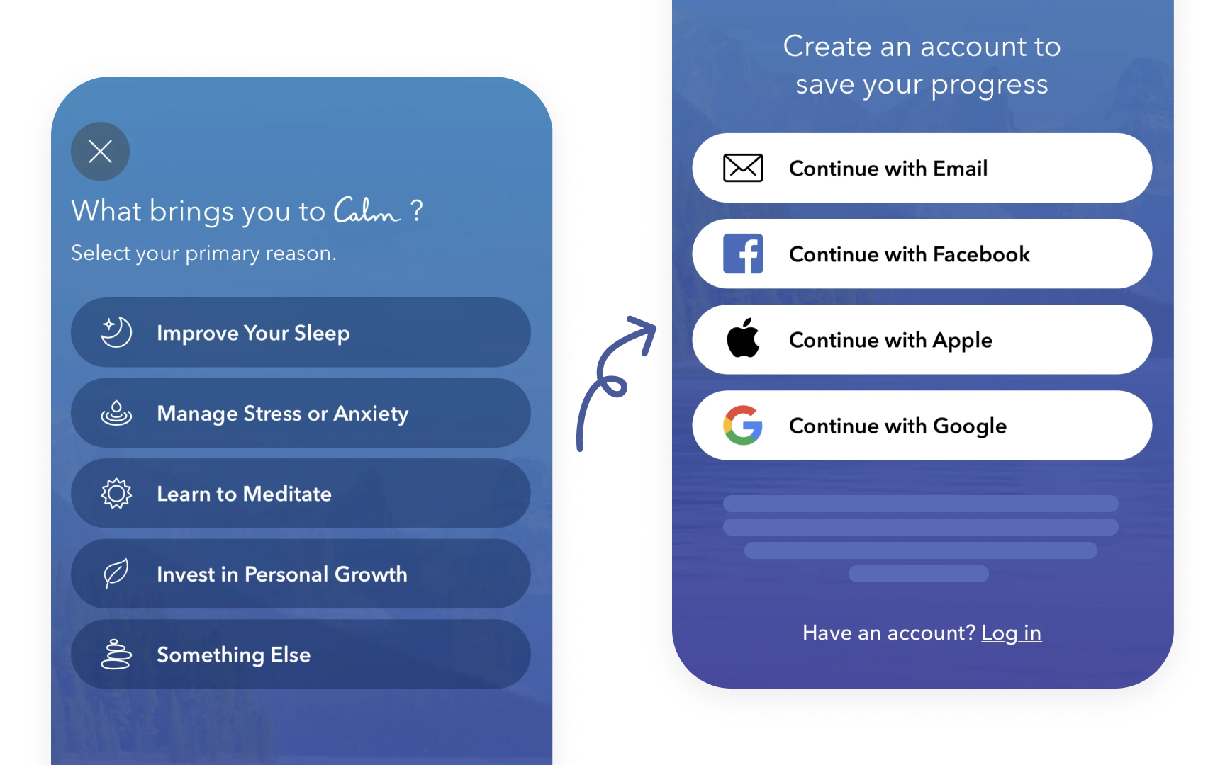
The Calm app demonstrates this balance perfectly. It starts with asking users about their goals to customize
Pro Tip: Ask yourself: "Is this step essential for users to experience the core value?" Remove or postpone steps that don't pass this test.

During
MyFitnessPal demonstrates effective feature highlighting through its food logging tooltip. The app immediately draws attention to its core functionality with a clear, numbered guide that emphasizes both the what ("Log food fast") and the how ("Search or scan food right from your home screen"). This focused approach helps new users quickly grasp the most essential action for achieving their goals.
Designers should decide which features need tooltips by identifying which steps users are most likely to overlook or struggle with. Features critical to
Pro Tip: Aim for 1-2 short sentences for a tooltip, such as "Add your first project here" to keep the copy clear and focused on action.

Effective
Step-by-step guidance can be delivered through a series of pop-ups, progress bars, or interactive tutorials. The goal is to walk users through essential actions without interrupting their flow, helping them accomplish tasks with clarity and confidence. By offering clear, progressive instructions, businesses can ensure that users stay engaged and are more likely to complete the onboarding process.
Pro Tip: Use progress indicators to show users how far along they are in the process and break complex tasks into simple, digestible steps.

Personalizing the
TikTok presents a clear, visually appealing set of
This approach not only makes users feel understood but also helps them quickly engage with the parts of the product that deliver the most value. Personalized onboarding flows can also reduce frustration by avoiding irrelevant information and focusing on what matters most to each individual.
Pro Tip: Ask users about their goals or preferences, and tailor their experience by introducing features that align with their answers.


A streamlined user interface is essential during
Otter.ai exemplifies clean interface design through its onboarding carousel. The app uses simple dot indicators to show progress and the number of tips, while providing clear, concise prompts that guide users through their first recording without overwhelming them with information.
To streamline the onboarding UI, use whitespace to create a visually clean layout, limit the number of calls to action on each screen, and ensure that navigation is intuitive. Organizing information logically allows users to understand the process at a glance, keeping them engaged and progressing smoothly through onboarding.


During
The goal is to help users understand the product's core features first and save more advanced information for later stages. The app offering water filtration setup instructions demonstrates excellent information presentation by using clear, everyday language that avoids technical jargon. The steps are broken down into simple actions with specific timing, making it easy for users to understand and follow the setup process without feeling overwhelmed.[2]

Offering timely support during
Support doesn’t have to be intrusive — simple elements like a persistent "Need help?" button or a well-placed tooltip offering assistance can reassure users that help is available if needed. Notion demonstrates effective support accessibility by clearly highlighting its "Help & feedback" option with a friendly prompt and pointing gesture emoji. The app proactively shows users where to find help while keeping the interface clean and the message concise, ensuring assistance is obvious but not intrusive.
Measuring the success of the
For example, if many users drop off at a specific step, it might indicate a confusing or overly complex process. Similarly, tracking how quickly users engage with key features after onboarding can show whether the onboarding experience is setting them up for success.
Pro Tip: Run A/B tests on different onboarding flows to identify which steps drive the most engagement and lead to higher completion rates.

An effective
Tracking whether users have completed specific actions or seen certain onboarding content allows the product to adjust the experience dynamically. By tracking interactions — such as whether users have seen a feature tutorial or completed an essential task — the product can adapt.
For example, if users repeatedly dismiss a
The Airtime app demonstrates thoughtful feature education by including a clear "Don't show me this again" option for its room setup instructions. This simple checkbox respects user preferences and prevents tip fatigue, particularly valuable for returning users who are already familiar with these features.
References
- Plain Language Is for Everyone, Even Experts | Nielsen Norman Group
Top contributors

Topics
From Course

Images provided by

Share


Similar lessons

Text & Media as Layers

Why Gamify?
