Common UI Components Part II
Identify the UI components that organize content, provide feedback, and help users navigate
Some components don't get as much attention as buttons or forms, but they're just as essential. These are the pieces that help users understand where they are, what's happening, and how to get through content without feeling lost or overwhelmed. They organize information, signal progress, provide feedback, and make complex interactions feel manageable. Without them, even a well-designed interface starts to feel incomplete.
Think about how frustrating it is when a page loads with no indication that anything is happening. Or when you're deep in a website with no sense of how to get back to where you started. Or when you're looking at a wall of text with no visual breaks to help you scan. Components like loaders, breadcrumbs, and dividers solve those problems quietly and effectively. Recognizing them and understanding when to reach for each one rounds out your UI vocabulary and gives you the full toolkit to design interfaces that actually work for people.
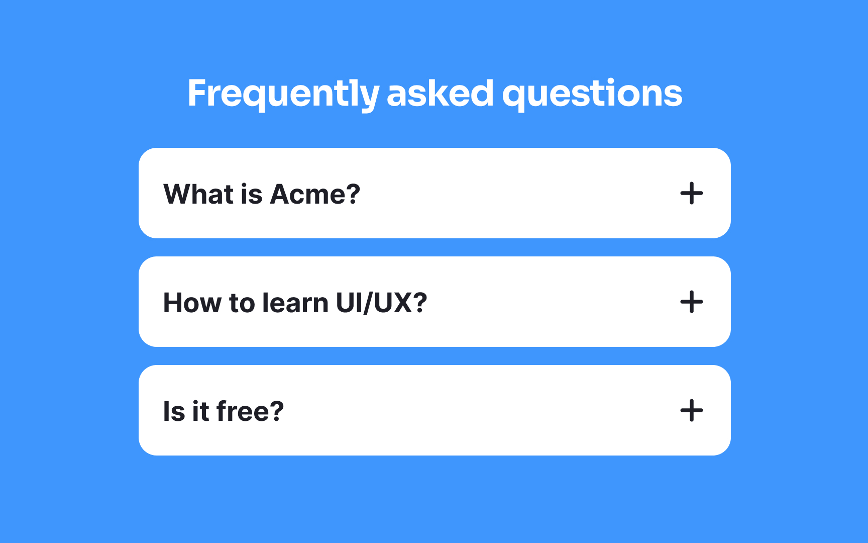
Accordions are interactive design elements that help manage
Accordions are especially useful for displaying FAQs or structured data. They offer a balance between information accessibility and screen real estate, promoting a cleaner and more user-friendly interface.
Pro Tip: Use different icons to indicate open and closed sections.
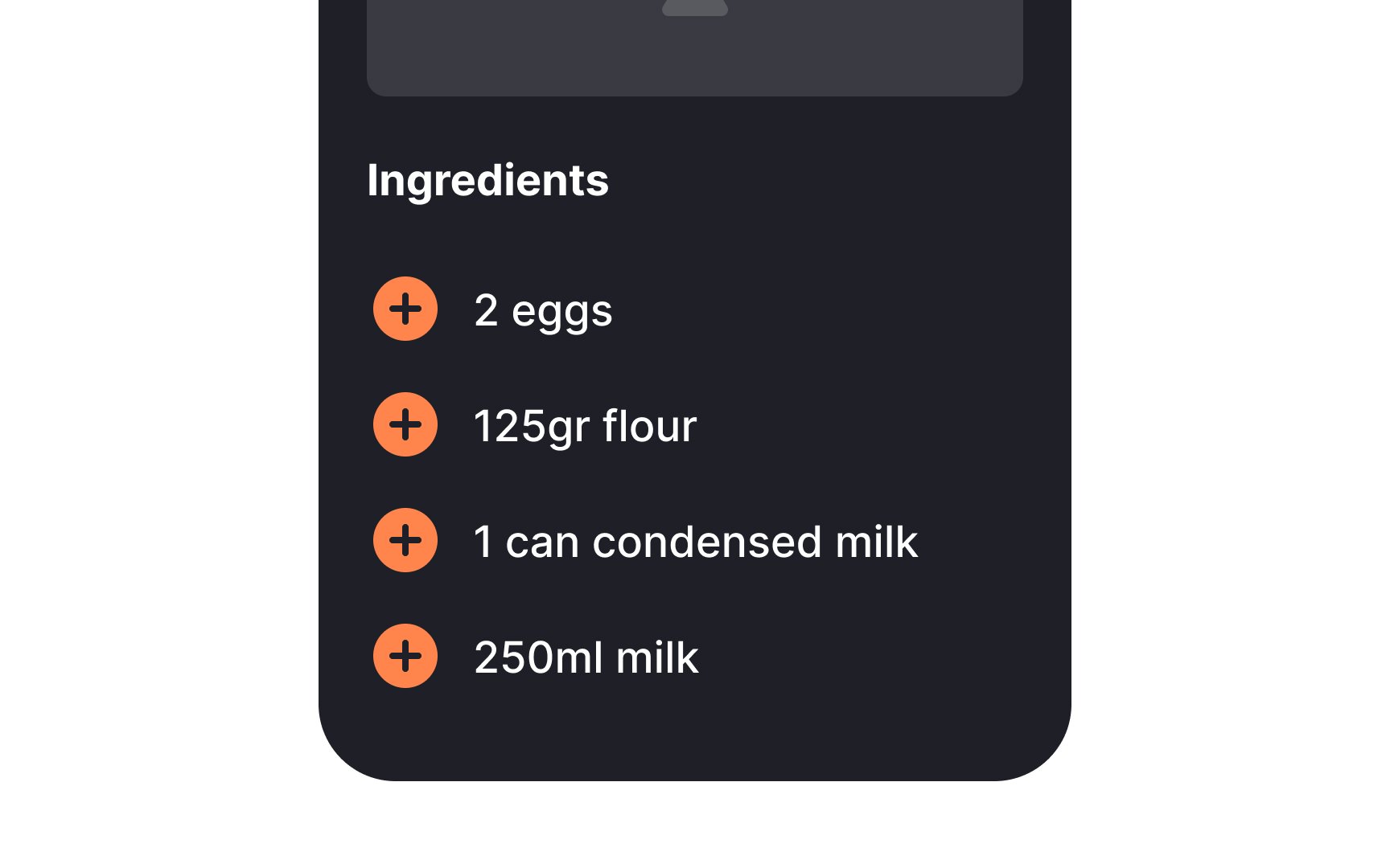
Lists in
Lists enhance readability and navigation, allowing users to scan and comprehend information quickly. They can be simple like unordered bulleted lists, or structured like numbered or nested lists.
Lists help present options, menu items, product features, or any data that requires clear visual separation. By breaking down complex content into manageable, digestible chunks, they contribute to a cohesive and organized
Pro Tip: Align lists and add enough white space between options for legibility.
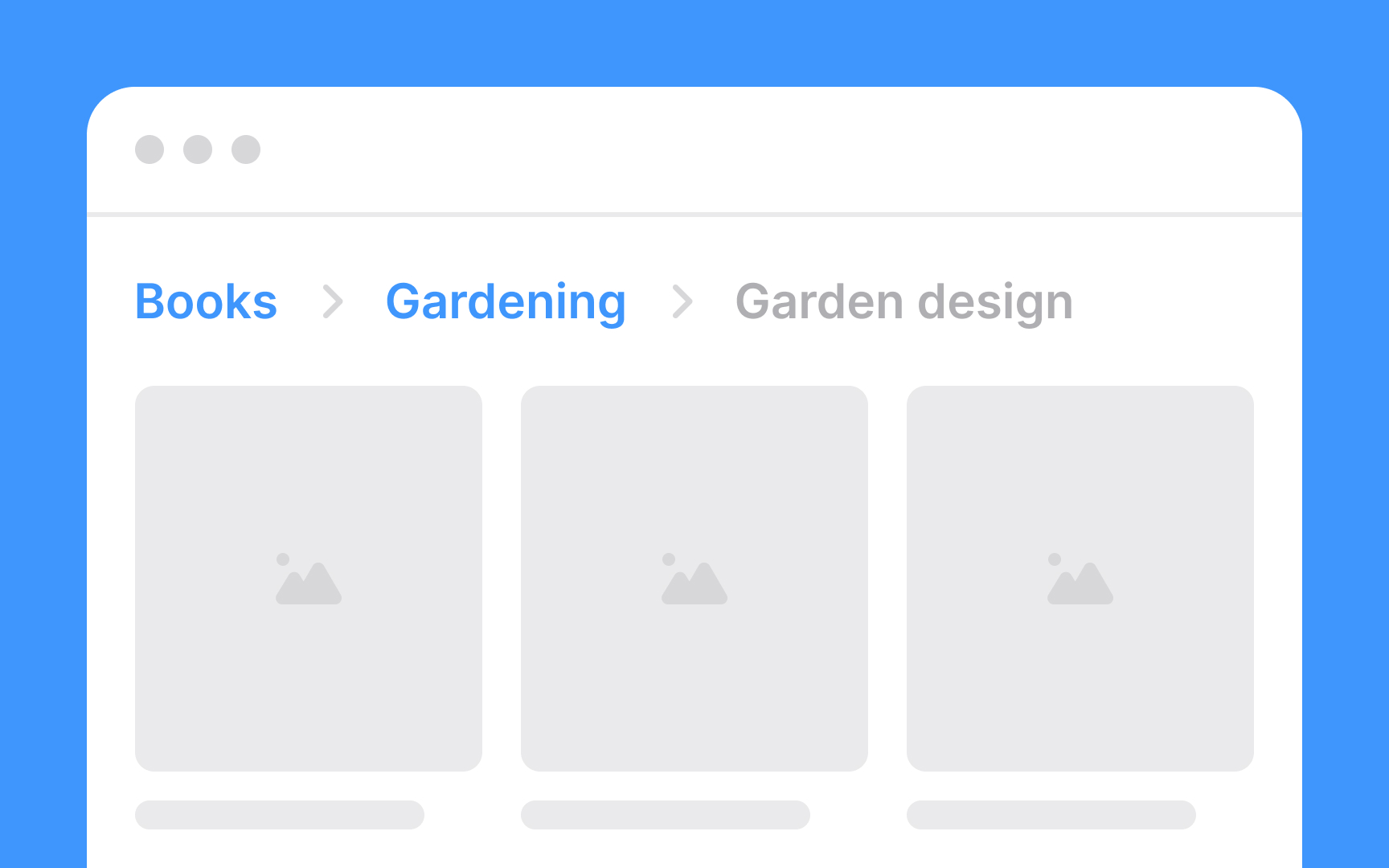
Breadcrumbs provide context, allowing users to understand where they are in relation to the overall structure and easily backtrack if needed. This is particularly useful in complex websites or apps with multiple levels of
Breadcrumbs improve user orientation, reduce the likelihood of getting lost, and enhance the overall
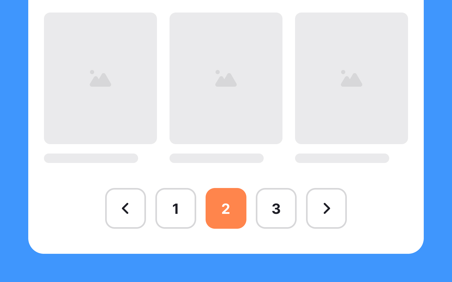
Pagination refers to the practice of dividing a large set of
Pagination typically involves displaying a limited number of items on each
By creating visual breaks, dividers aid in improving readability,
Color, white space,
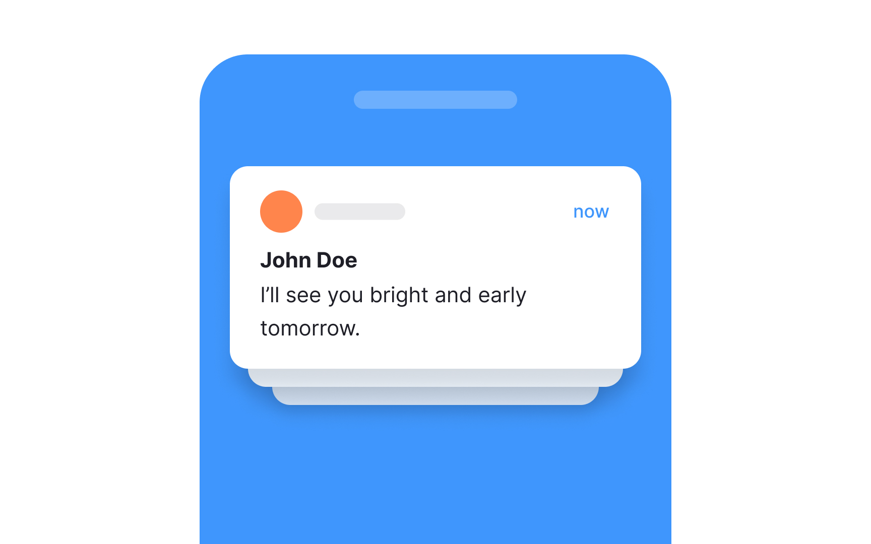
Notifications are alerts or messages that inform users about important events, updates, or actions within an application, website, or system. They serve to grab a user's attention and provide timely information without requiring them to actively seek it out.[1]
Notifications can come in various forms, including pop-up windows, banners, badges, sounds, or vibration alerts on mobile devices. They cover a wide range of purposes, such as notifying users about new messages, system updates, friend requests, reminders, or transaction confirmations.
Effective notification design considers the user's context and preferences, ensuring that notifications are relevant, non-intrusive, and actionable.

Tags are descriptive labels or keywords assigned to
For example, in a blogging platform, articles can be tagged with keywords related to their topics, such as "technology," "health," or "travel." This allows users to click on a tag and see a collection of articles that share that tag. Tags also help improve discoverability, as users can find relevant content more efficiently.
Google's Material Design introduced the term "chips" which is now used interchangeably with the word "tags" (although "chips" can refer to elements beyond tags as well).[2]
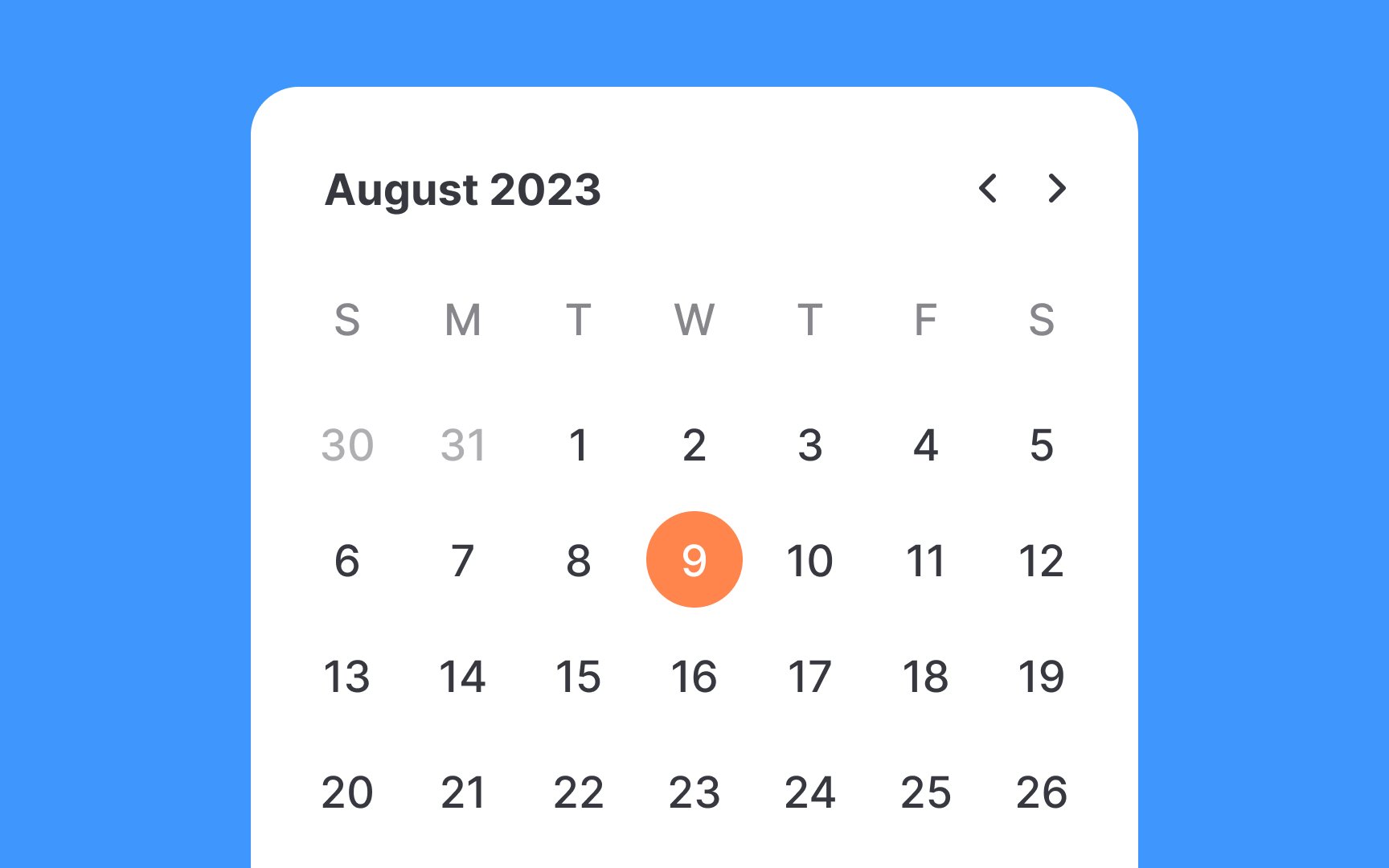
A date picker is a tool for selecting a date range, a time slot, or both. When clicked, they expand into a modal or dialog and present users with a set of options to pick from.
The current and the selected dates should be apparent at a user's first glance. Also, don't restrict users' options — allow them to type the date instead of scrolling and picking. Sometimes, typing is much easier.
Pro Tip: Disable unavailable options — for example, past or unavailable dates — to prevent user errors and friction.
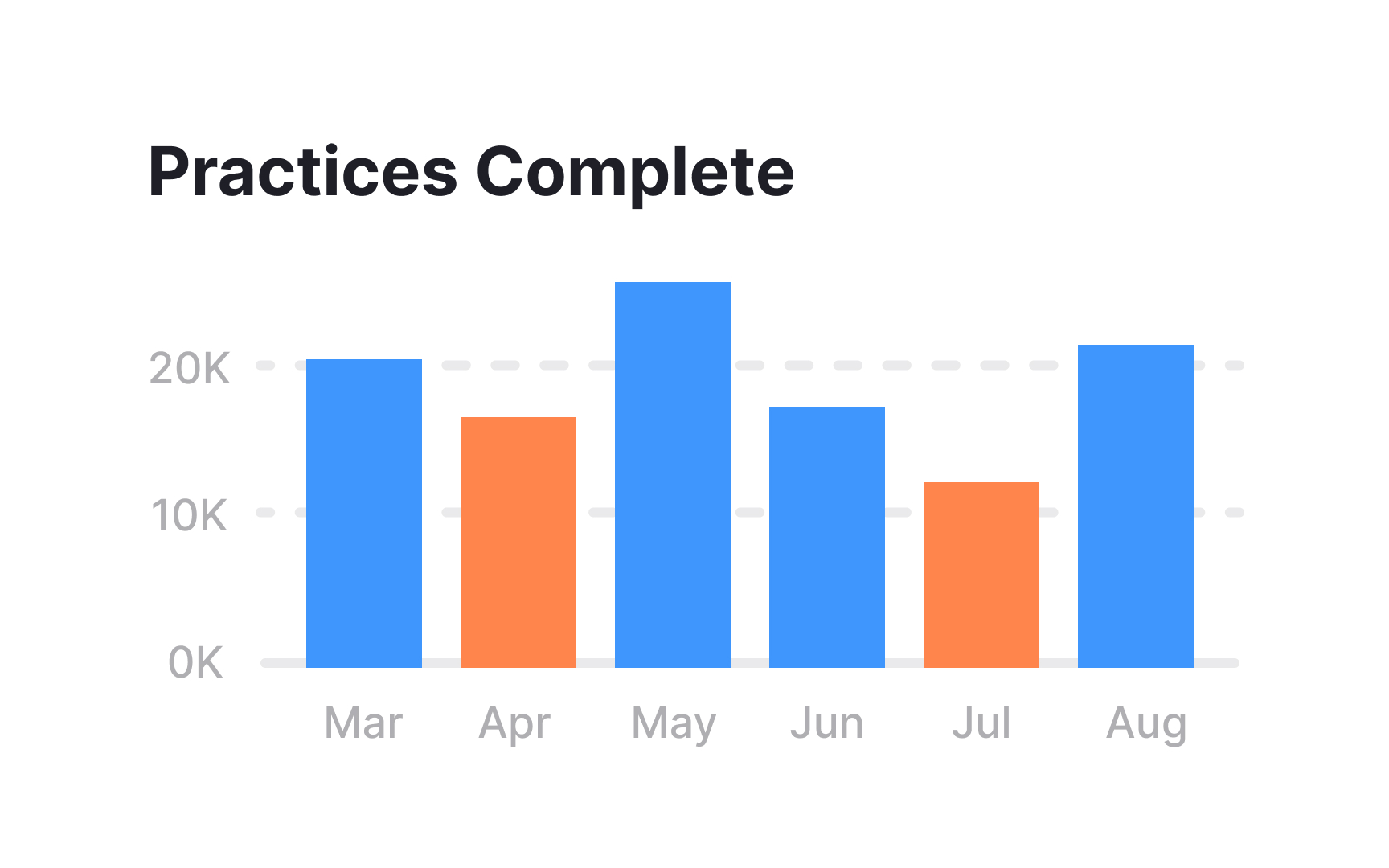
Charts are an essential part of any dashboard, as they allow us to visualize and compare data. Common types of charts include bar charts, line charts, pie charts, and scatter plots. Choosing the right chart type isn't just a matter of taste. It depends on how many data categories you have and the chart's purpose. For example, pie charts aren't a good fit for comparing more than 5 slices. It gets too crowded and hard to read for users.
Charts often accompany textual
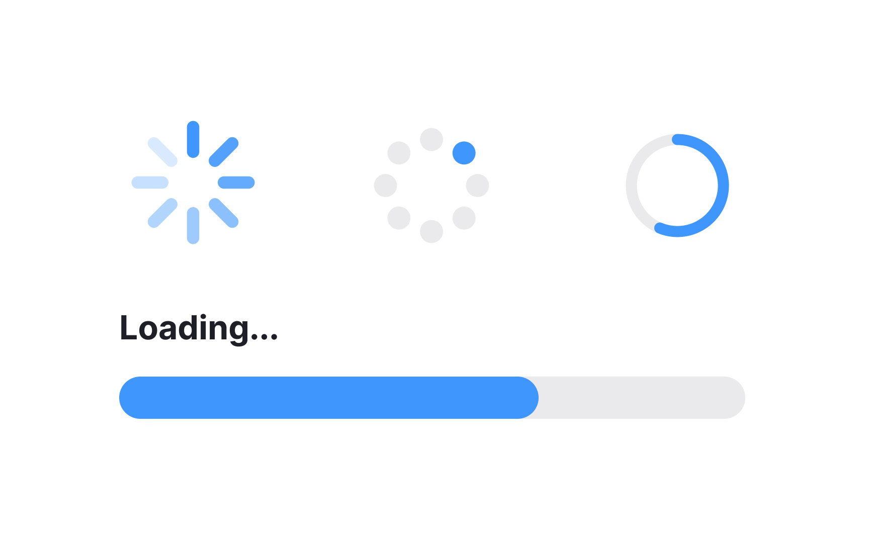
They prevent user frustration by providing immediate feedback that the system is working and content is on its way. Loaders vary in design and can include rotating icons, progress bars, or animations that convey activity.
A well-designed loader contributes to a positive
Pro Tip: To reduce frustration, add an explanation of why users need to wait and indicate how long it may take.
A tooltip in
Tooltips are used to offer concise guidance without cluttering the main interface, making them particularly helpful for
Don't turn tooltips into the only source of explanation. They are good companions to give an extra hand and provide additional information, but users should ideally be able to complete a task without them.
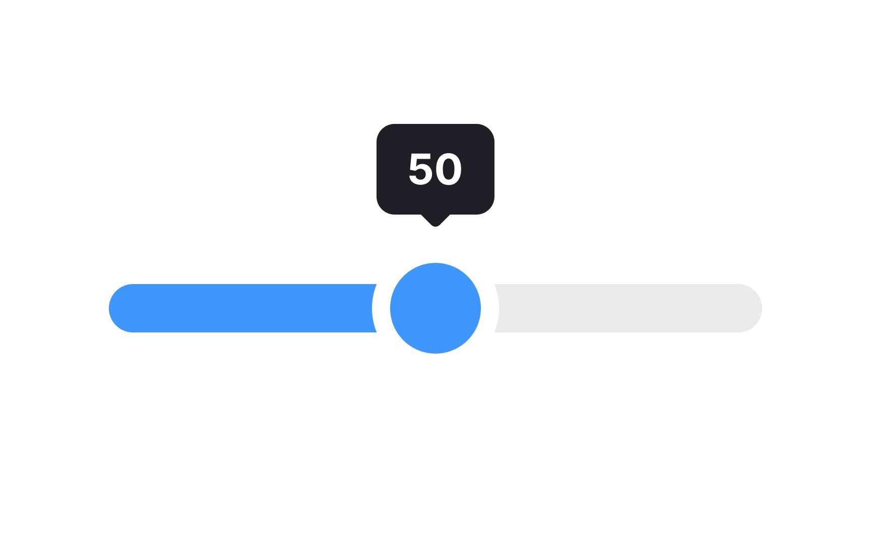
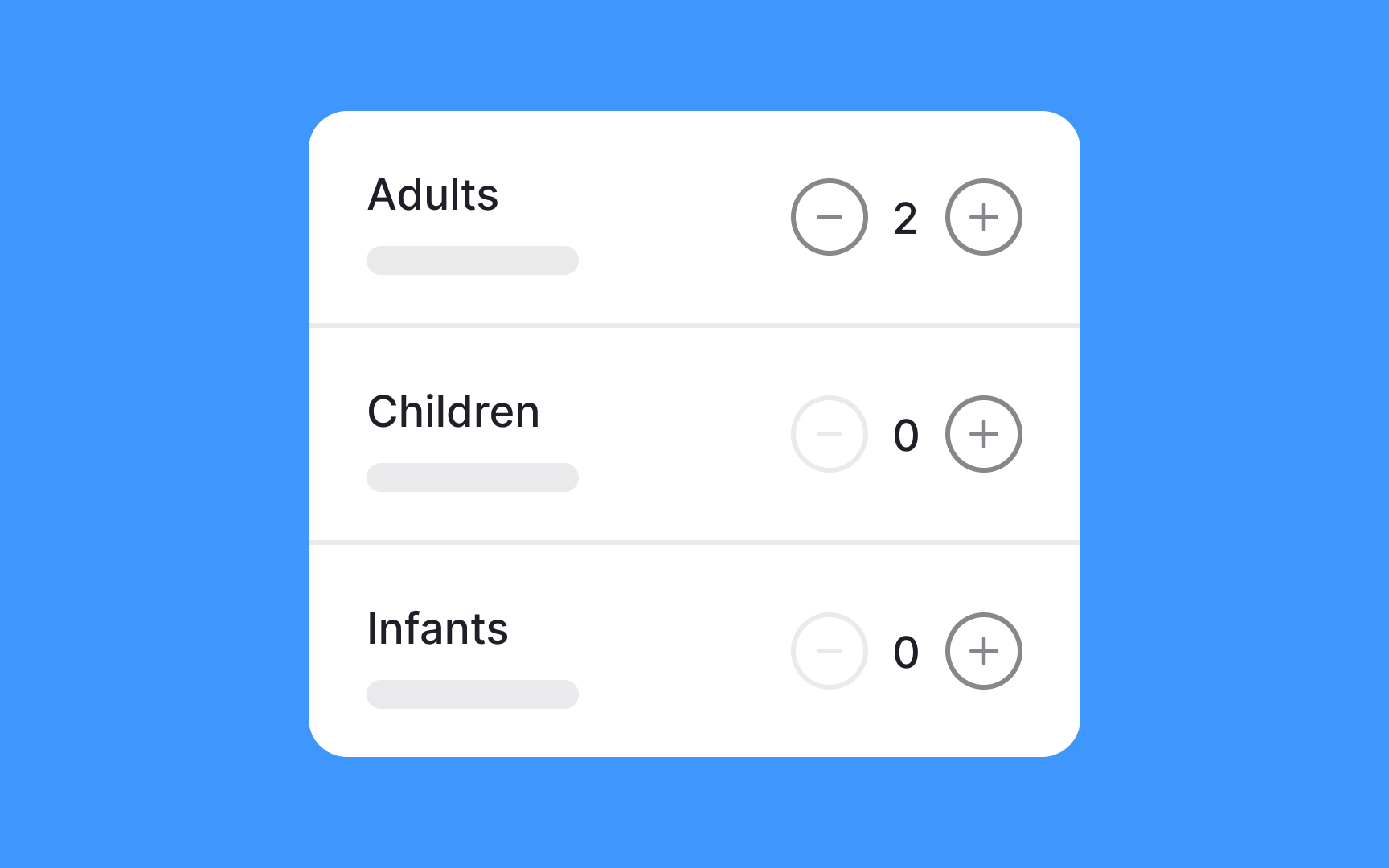
A slider allows users to manipulate a value or a range of values by sliding a handle along a track. This
Sliders are typically composed of a track, representing the value range, and a movable handle that users can drag to a desired position. The handle's position corresponds to the selected value, providing immediate visual feedback.
When using sliders on mobile, make sure the thumb is large enough and easy to target and drag. Keep in mind that sliders might be considerably hard to control for people with motor disabilities. Additionally, they make it difficult to fine-tune very wide ranges of values, e.g., 100 to 30k.
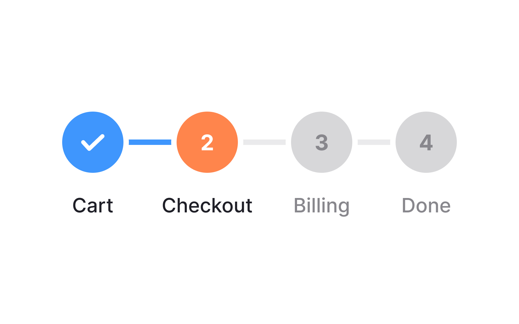
A progress tracker guides users through a series of steps or stages in a process, often presenting their current position and the overall completion status. It is commonly used to enhance
As users complete each step, the progress tracker visually updates, showing their advancement and the remaining steps. This provides users with a clear sense of their progress and a roadmap of what lies ahead. Additionally, progress trackers often allow users to navigate directly to previous steps, providing flexibility in case they need to make changes.
Adding text to the progress tracker to indicate what each step in the process includes is helpful to users and encourages them to continue on the journey.
Pro Tip: Avoid task journeys with more than 5 steps.


Similar lessons

Common UI Components Part I

Image Terminology
