Accordions
Accordions are interactive UI components that expand and collapse content sections, managing space and reducing visual overload on a page.


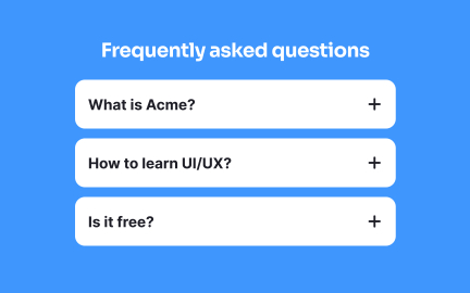
Accordions are UI components used to show and hide related content in collapsible panels. They help organize large amounts of information into manageable sections, improving content hierarchy and reducing on-screen clutter. Users can expand one or more sections to view details while keeping others collapsed.
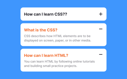
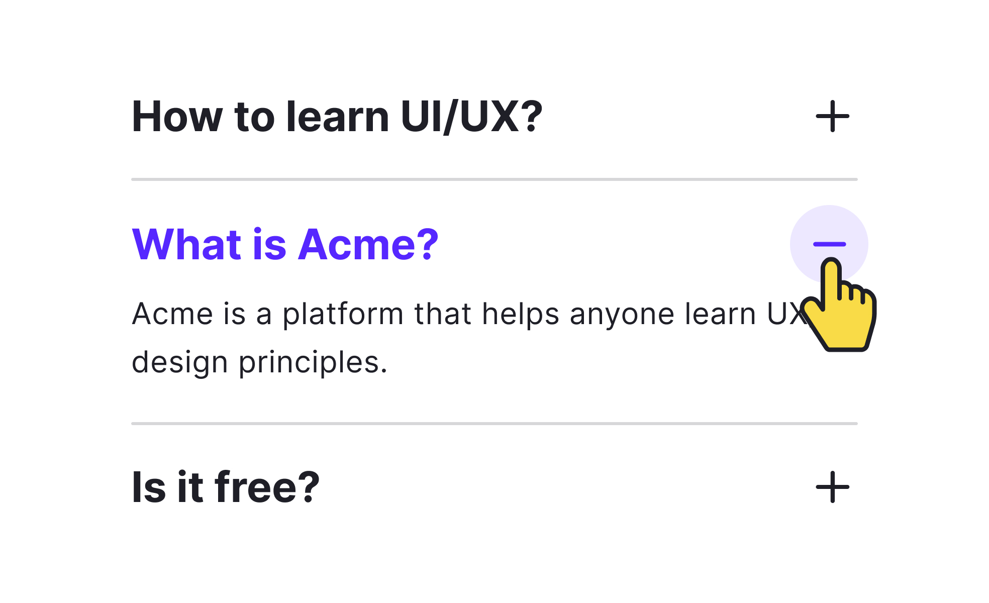
An accordion typically includes a header (or trigger) and a content area. Clicking or tapping the header toggles visibility of the content. Accordions can be single-expand (only one open at a time) or multi-expand (multiple sections open simultaneously), depending on the use case.
These components are commonly used in FAQs, settings panels, menus, or anywhere vertical space is limited. Accordions reduce cognitive load by allowing users to focus on one section at a time instead of being overwhelmed by all the information at once.
Effective accordion design relies on clear labeling, intuitive icons (such as carets or plus/minus signs), and smooth transitions. Content should be grouped logically, and interaction states (open, closed, focused) must be easily distinguishable. Accordion headers should indicate what type of content is inside.
From an accessibility perspective, accordions must support keyboard navigation and screen readers. ARIA roles such as aria-expanded and proper semantic HTML structure (buttons, headings) ensure that all users can interact with the component.
Accordions are especially useful in mobile interfaces, where screen space is constrained. They allow designers to present content progressively without compromising on information density or user control.
Learn more about this in our UI Accordions: Basics & Best Practices Lesson, a part of the UI Components II Course.
Key features of Accordions
- Collapse and expand content sections interactively
- Help manage space and reduce information overload
- Can allow single or multiple sections open at once
- Require clear labels and visual affordances
- Used in FAQs, settings, and mobile UI layouts
- Support smooth transitions and state feedback
- Must be accessible via keyboard and screen readers
Avoid them when users need to compare multiple sections at once—tabs or a full-page layout may be better.
Yes, if implemented properly. Hidden content in accordions is still indexed by search engines.
Yes, they’re particularly helpful on mobile to organize and hide content that would otherwise be overwhelming.
Recommended resources
Courses

UX Design Foundations


UI Components I


Design Terminology