How to Use Accordions for Progressive Disclosure
Organize dense content into expandable sections with functional, aesthetic, and accessible accordions
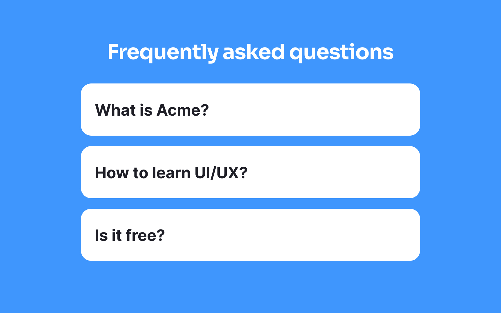
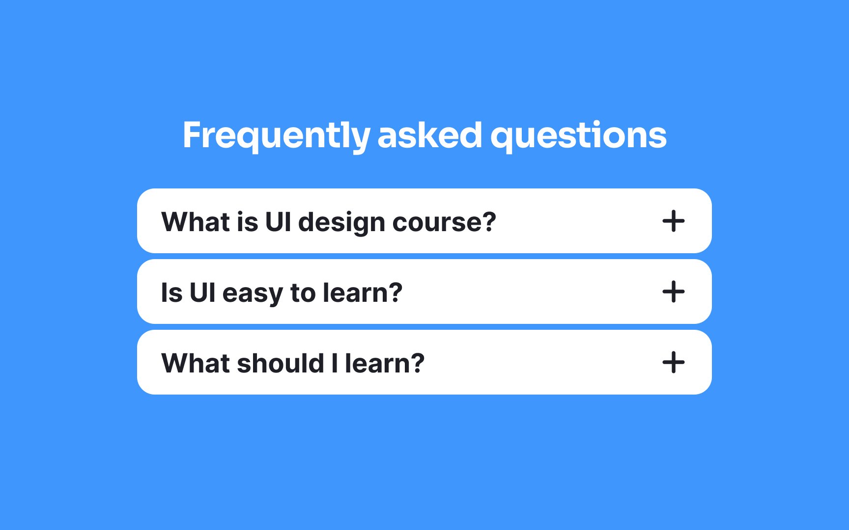
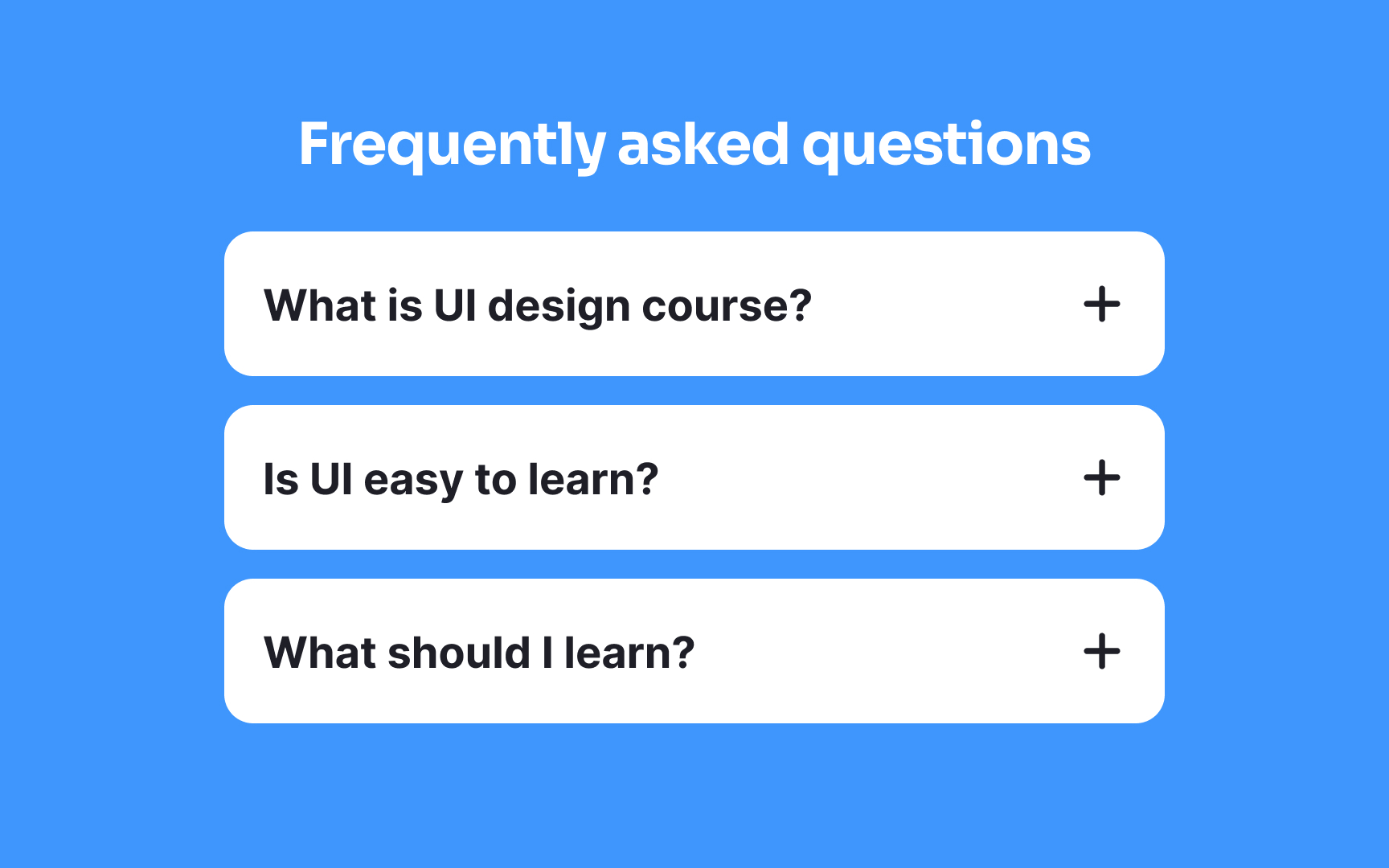
Some content is too extensive to display all at once. FAQs, product specifications, form sections, and nested menus can overwhelm users when presented as a single long scroll. Accordions solve this by letting users reveal information progressively, expanding only the sections they care about.
The interaction is intuitive. A header signals that more content exists beneath it. A click or tap expands the section. Another interaction collapses it. Users stay in control of how much information they see at any moment. But accordions introduce complexity too. Users can't scan collapsed content, which means important information might stay hidden. If every section requires expansion to find anything useful, the accordion creates more friction than it removes.
The decision to use an accordion should weigh the benefits of reduced visual clutter against the cost of extra interactions. Design details matter as well. Users need clear signals about which sections are expanded, how to interact with headers, and what to expect when they click. Ambiguity at any point breaks the experience.
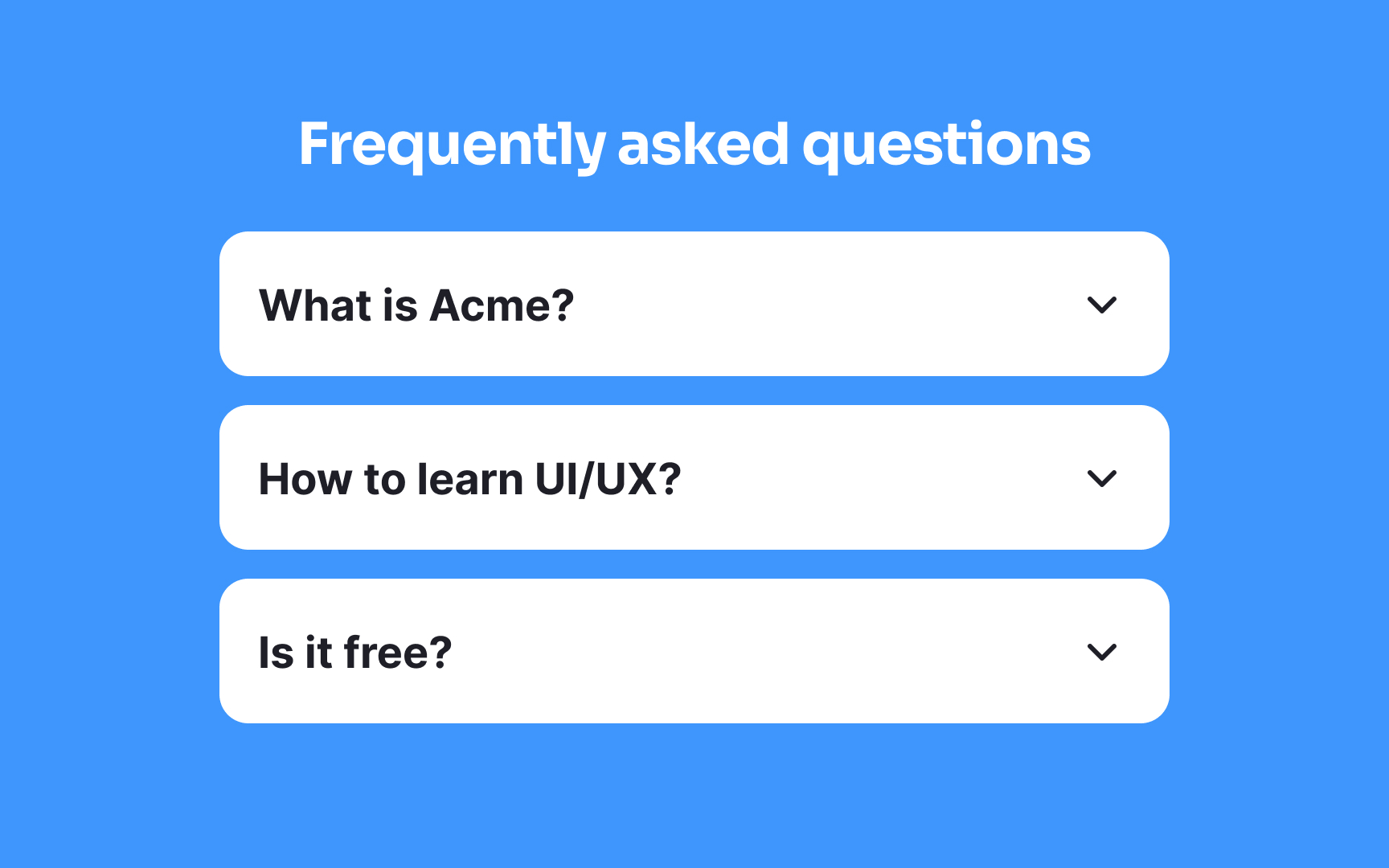
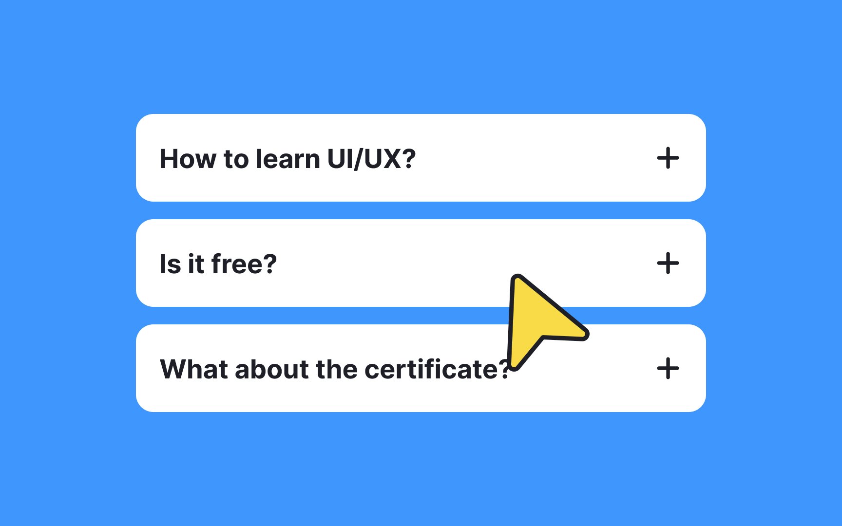
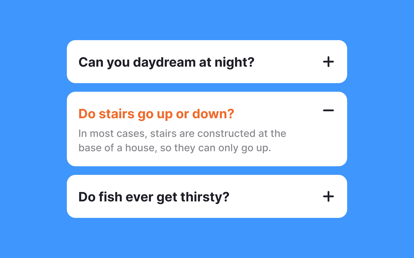
An
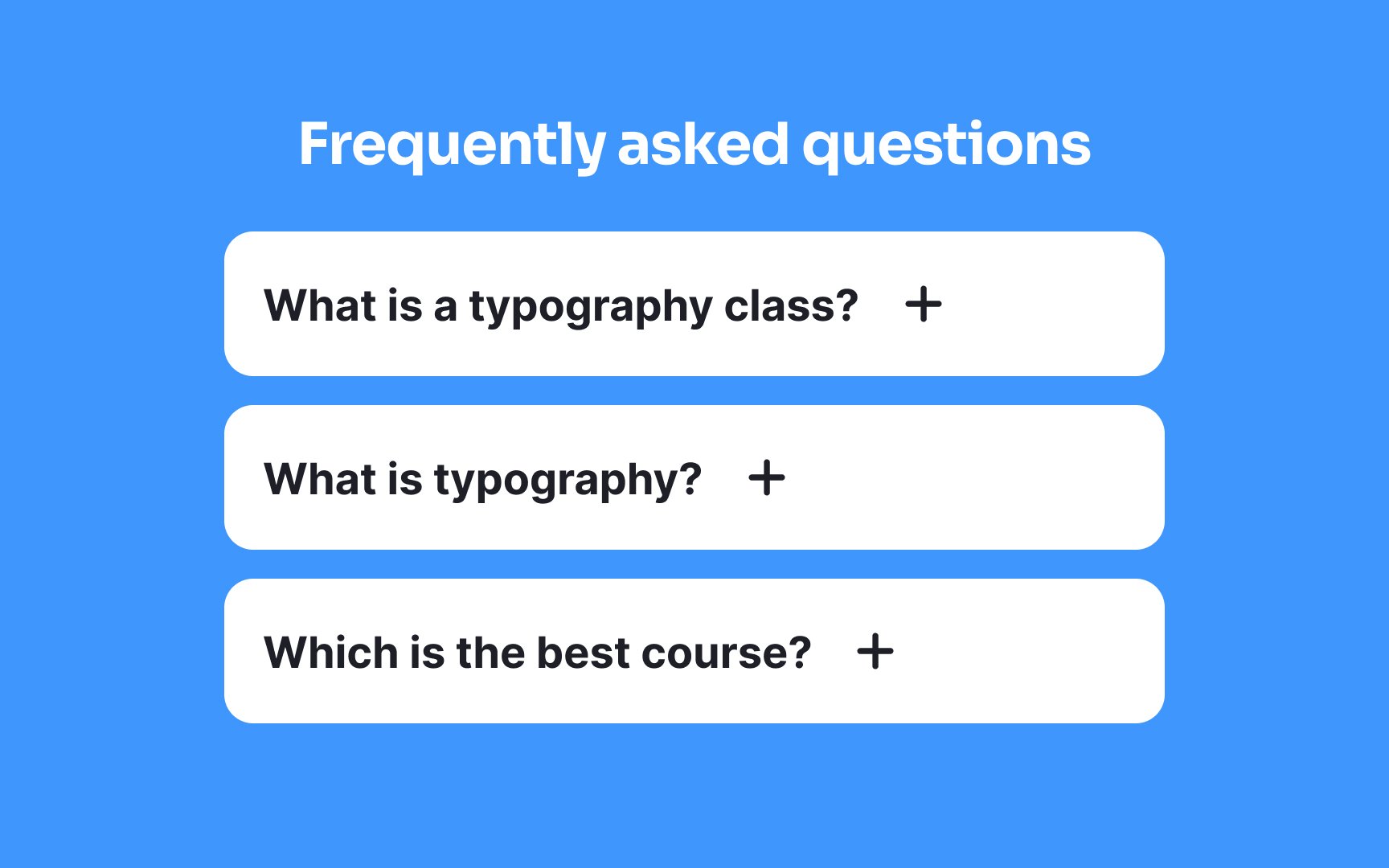
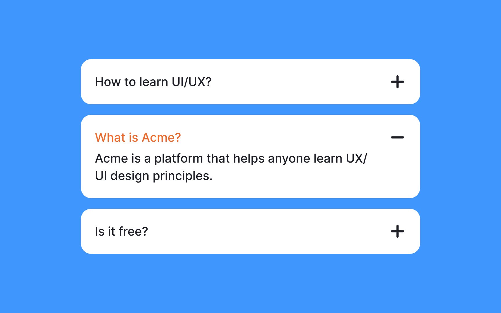
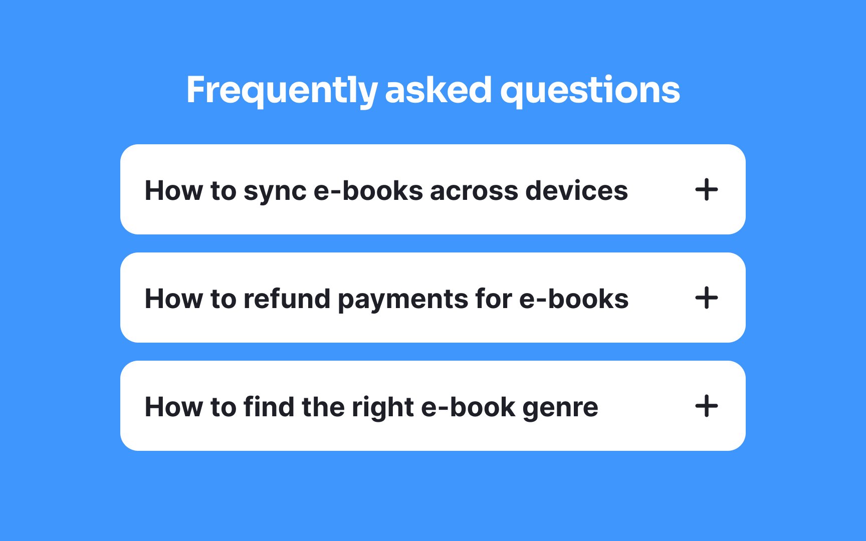
Conventionally, arrows (→) or plus icons (+) are used as well, but a study by the NN Group found that only the caret stands out to users in a clear way.[1]
Think of a collapsed
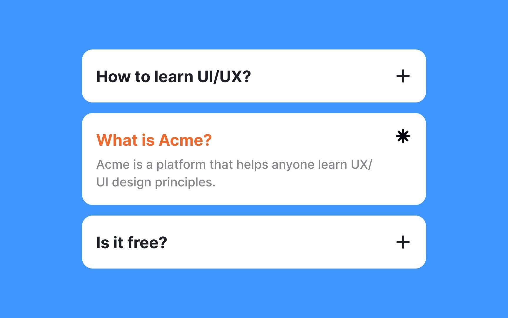
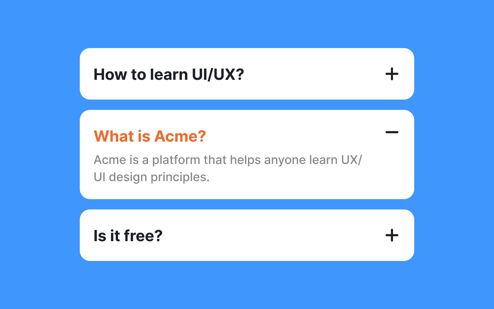
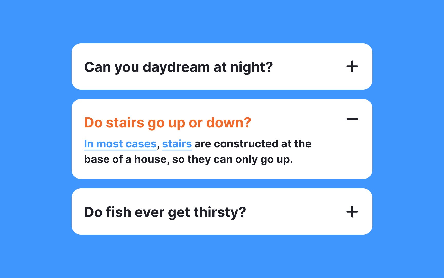
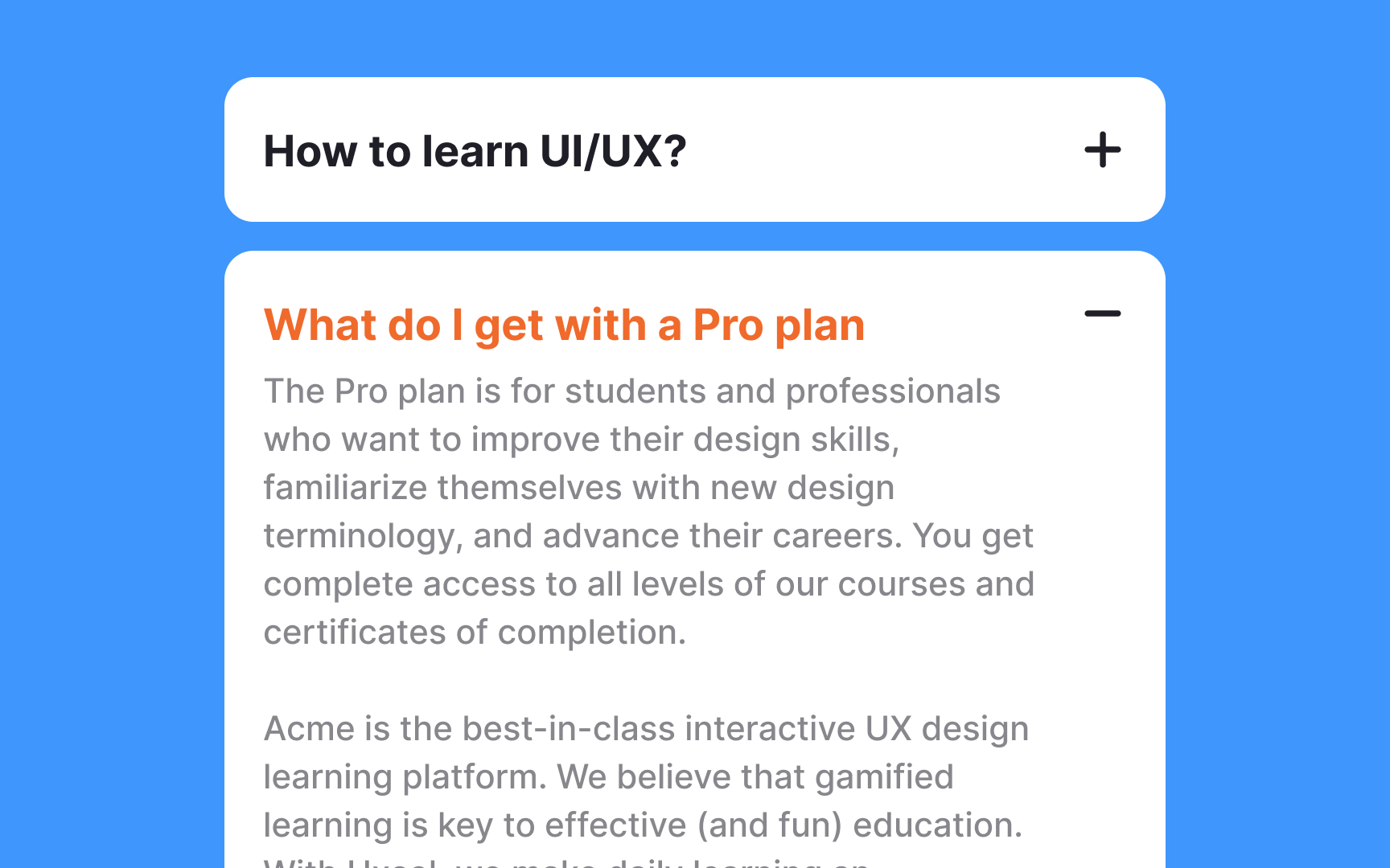
Use a plus sign (+) or down arrow (⌄ or ▼) to show a collapsed section. When the section is expanded, switch to a minus sign (−) or up arrow (⌃ or ▲). This tells users that the content is visible and can now be collapsed.
Pro Tip: Deviating from familiar icons can confuse users about the menu's expandability, leading to frustration, so stick to widely recognized ones.

The hover state is activated when users move their cursor over an interactive element, effectively signaling, "This is clickable!" To ensure clarity, provide at least two visual cues indicating the component's hover state. A combination of a pointer cursor and a color change, for example, is sufficient to convey the element's interactivity.
Each
On mobile devices, ensure touch targets are especially user-friendly with a recommended minimum height of 44 pixels, adhering to accessibility standards.[2]
Styling the
Avoid cluttering with non-essential links, buttons, or additional subsections inside the content area, as this can make the interface complicated and challenging to navigate.
The best approach depends on your users' needs. Allow multiple sections to stay open when users need to compare information or when sections contain related content. This works well for accordions with fewer than 10 sections, as scrolling is easier and requires less cognitive load than repeatedly clicking to reopen sections. Auto-collapse only makes sense in specific situations: when sections contain unrelated content, when you have very few sections (3-5), or when screen space is severely limited.
As a general rule, default to allowing multiple open sections unless you have a compelling reason to auto-collapse. Remember that users find scrolling through expanded content far easier than clicking to constantly reveal information they need to reference.
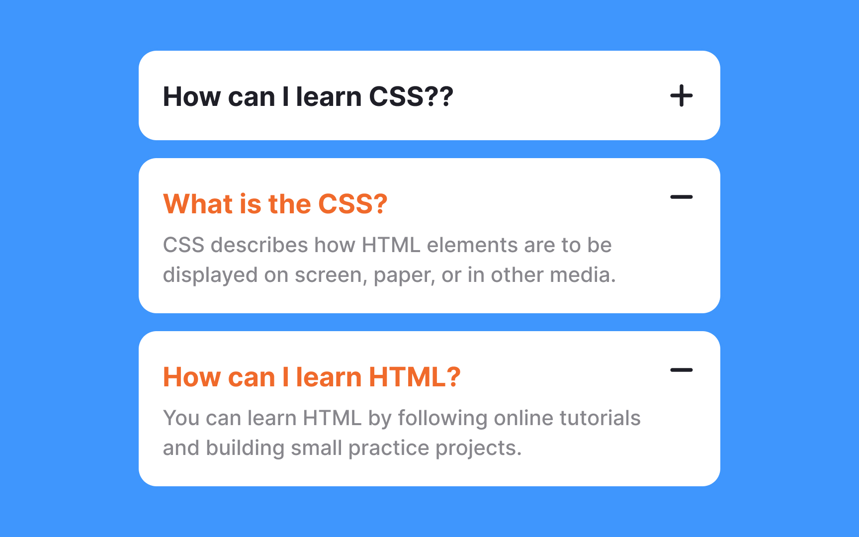
Upon expanding an
Additionally, stylistic alterations such as bolder text or more pronounced borders can draw attention to the active
The placement of
By positioning the icons uniformly — either all on the left or all on the right — across each section, users can scan the
Pro Tip: Make sure the whole section is clickable/tappable and not just icons.

Properly styled headings are vital in creating a clear type hierarchy within
To optimize their effectiveness, headings should distinctly stand out from the body text. Employ strategies like using a larger font size, a different typeface, capitalization, or a bolder font-weight to make them noticeable.
However, balance is key — ensure these titles are eye-catching without dominating the
Headings in
- Keep them concise and to the point.
- Use language that speaks directly to users' needs.
- Incorporate keywords for easy scanning.
- Ensure they accurately reflect the content within.
Research plays a crucial role here. By understanding what matters to your users, you can tailor headings to their preferences and questions, making your accordions not just a design element, but a valuable, user-focused tool.
For extremely lengthy pages, accordions may not be ideal. Consider alternative
If accordions are used, ensure they allow multiple sections to be open simultaneously for easy access to various content parts. The state of each section (open or closed) should persist based on user
References
- Accordion Icons: Which Signifiers Work Best? | Nielsen Norman Group
Top contributors


Topics
From Course

Share


Similar lessons

Common UI Components Part I

Image Terminology
