Progress Trackers
Progress trackers are visual indicators that show users their current position within a multi-step process, such as forms, checkouts, or onboarding flows.


TL;DR
- Visual indicators of task or process completion.
- Improve clarity by showing steps and current status.
- Reduce confusion in multi-step workflows.
- Increase user motivation and task completion rates.
Definition
Progress trackers are UI components that display a user’s current stage in a task or process, showing completed steps, the current position, and what remains to be done.
Detailed Overview
Progress trackers are commonly used in digital products to help users understand where they are in a process and what comes next. Whether it is an online checkout, account setup, or survey, these trackers provide context and reassurance by breaking the process into steps. Without such cues, users often feel lost or uncertain about how long a task will take.
A frequent question is why progress trackers are effective. The answer lies in human psychology. People are more likely to complete tasks when they can see their progress. By visually dividing a process into clear stages, trackers make the task feel manageable and predictable. This increases motivation and reduces abandonment, especially in longer or more complex workflows.
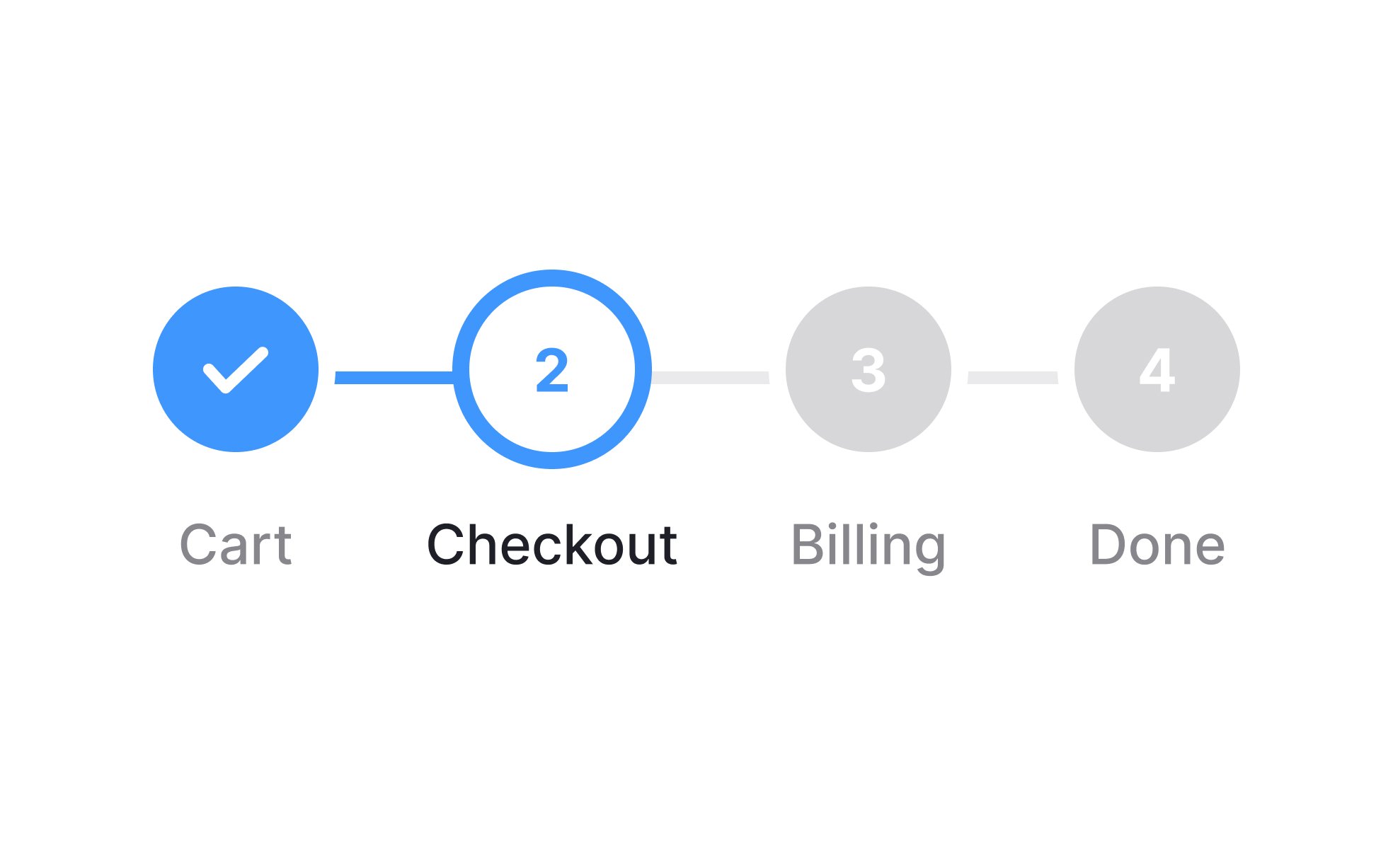
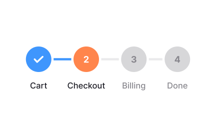
Another common query is about design styles. Progress trackers can take the form of linear step indicators, percentage completion bars, or checklists. Linear trackers are ideal for structured processes with defined stages, such as onboarding. Percentage trackers work well for open-ended tasks like profile completion. The choice of style depends on the nature of the task and the level of detail required.
Teams also ask how progress trackers fit into product strategy. They are not just visual elements but drivers of completion and retention. For example, e-commerce checkouts with clear progress indicators often see higher conversion rates because customers feel more confident about how many steps remain. Similarly, onboarding flows with trackers encourage users to finish setup, improving activation rates.
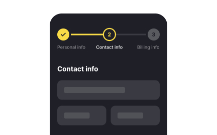
Another important aspect is accessibility. Progress trackers should use clear labels, icons, or text alongside visuals to ensure they are understandable to all users, including those relying on screen readers. Without proper accessibility design, progress trackers risk excluding users and reducing clarity rather than improving it.
Finally, progress trackers must remain honest. Inflating progress or skipping steps can backfire, eroding trust. The best trackers provide accurate signals about where users are in the process and avoid surprises.
Learn more about this in our Intro to Progress Trackers in UI Lesson, a part of the UI Components I Course.
Progress trackers break complex tasks into smaller, visible steps, which makes the overall process feel more achievable. Users are more likely to stay engaged when they can see what they have completed and what remains. This visual reassurance reduces anxiety about the unknown length of a process.
The sense of progress itself motivates users. Even small signals, like a bar filling up, can encourage persistence and lead to higher completion rates.
The two most common types are linear step indicators and percentage completion bars. Linear indicators are useful for processes with a clear sequence, such as onboarding or checkouts. Percentage bars work best for tasks with variable content, like completing a profile.
Checklists are another variation, where users can see specific items they need to complete. Each style has its place depending on the workflow. Typically, progress trackers are placed at the top of the screen or form area for immediate visibility.
In workflows like e-commerce checkout or account setup, trackers reduce abandonment by showing users exactly how many steps remain. This clarity builds confidence and lowers the perceived effort needed to complete the process.
When users understand the path ahead, they are less likely to drop off mid-process, directly improving conversion rates.
Accessible trackers use text labels, icons, or alternative descriptions to ensure clarity for all users, including those with visual impairments. For example, screen readers must be able to announce progress in a meaningful way.
Ignoring accessibility risks alienating users and making trackers ineffective for large portions of the audience.
Yes. Inflating progress or hiding steps can frustrate users and damage trust. For instance, showing “Step 3 of 3” but then adding extra steps feels deceptive.
Honest, accurate trackers build credibility and ensure users feel guided rather than misled.
Recommended resources
Courses

UX Design Foundations


UI Components I


Design Terminology

Lessons
Intro to Progress Trackers in UI

Intro to UI Loaders

Showing Progress
Exercises
Projects

SkySync : Sign Up Page with Accessibility


2024 | Credit Card Management App - UI/UX Design Challenge