How & When to Use Progress Trackers in UIs
Help users complete long tasks by showing where they are and how much is left
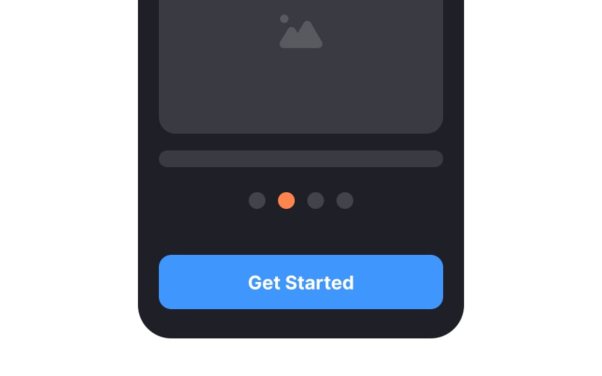
Long forms and multi-step processes lose users. Progress trackers help prevent that by showing exactly where someone is, what they've finished, and how much remains. That visibility changes the psychology of the task. Instead of facing an unknown amount of work, users see a clear path with a defined end. It feels manageable. Trackers come in different forms: horizontal steps for checkout flows, vertical layouts for order tracking, carousel dots for onboarding screens. Each serves the same core purpose. When users understand the scope of a task upfront and can see themselves moving through it, they're far more likely to finish.
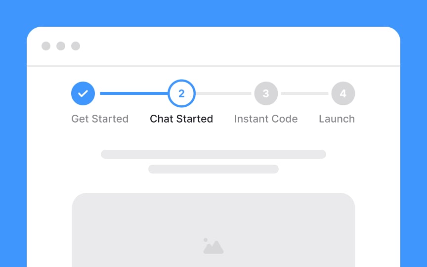
Having a clear understanding of where users are is one of the fundamental rules of successful navigation. Like a pin on a tourist city map saying, "You are here," the current step on a
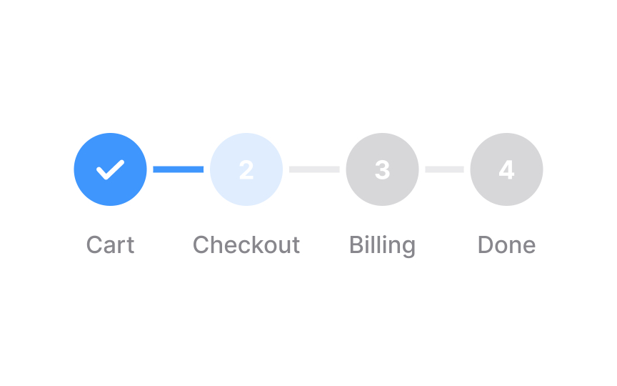
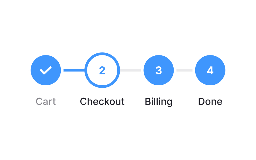
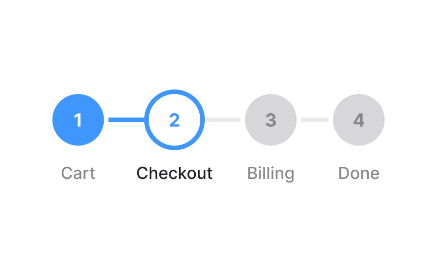
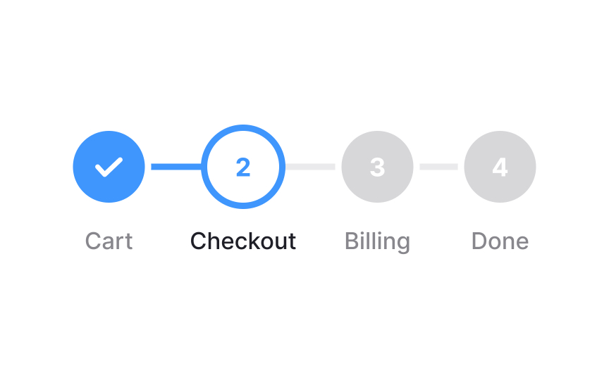
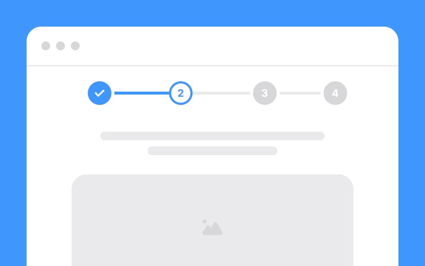
The current step should visually differ from the steps users have already finished and those remaining. One effective way to achieve this is through color differentiation. Using a distinctive color for the current step sets it apart from completed and remaining steps.
The remaining steps on a
Pro Tip: Make sure inactive steps have enough contrast and are legible.
Highlighting the completed steps on a
Use different visuals to differentiate completed steps. Checkmarks and the
Carousel
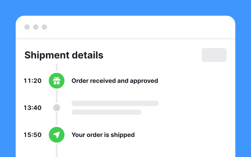
Vertical trackers are a way of organizing steps or stages in a process from top to bottom, rather than from left to right like most trackers. They're not as commonly used, but they can be helpful for certain tasks, like keeping tabs on the delivery of a product or service.
When you use a vertical tracker, you'll see the latest updates and status information listed in a straight line from the top of the page to the bottom. This makes it easy to follow the process in a clear and straightforward manner.
Pro Tip: Make sure the vertical tracker is always visible when users scroll.
It's nearly impossible to make forms sound fun or exciting. And the more steps a form has, the more likely users are to abandon the process. Keep it short — a set of up to 5-7 steps is usually more than enough to complete a task. Simply seeing on the
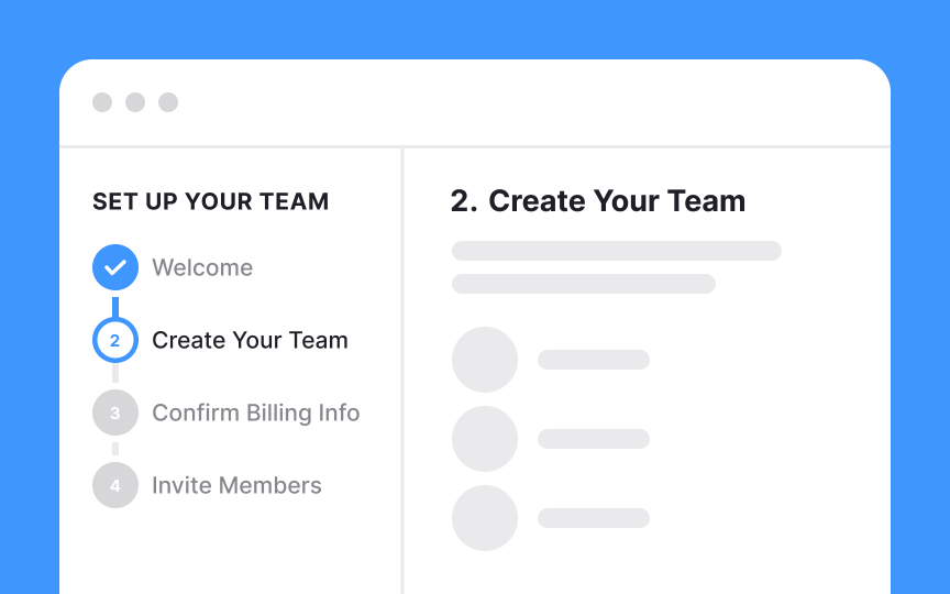
Make an effort to label the steps on your
Plus, titles add to scannability, helping users quickly understand where they are and what they are expected to do there.
Topics
From Course
Share
Similar lessons

Common UI Components Part I

Image Terminology

