Carousels
Carousels are rotating containers of images or content, often used in digital design to showcase multiple items, highlight promotions, or guide user attention.


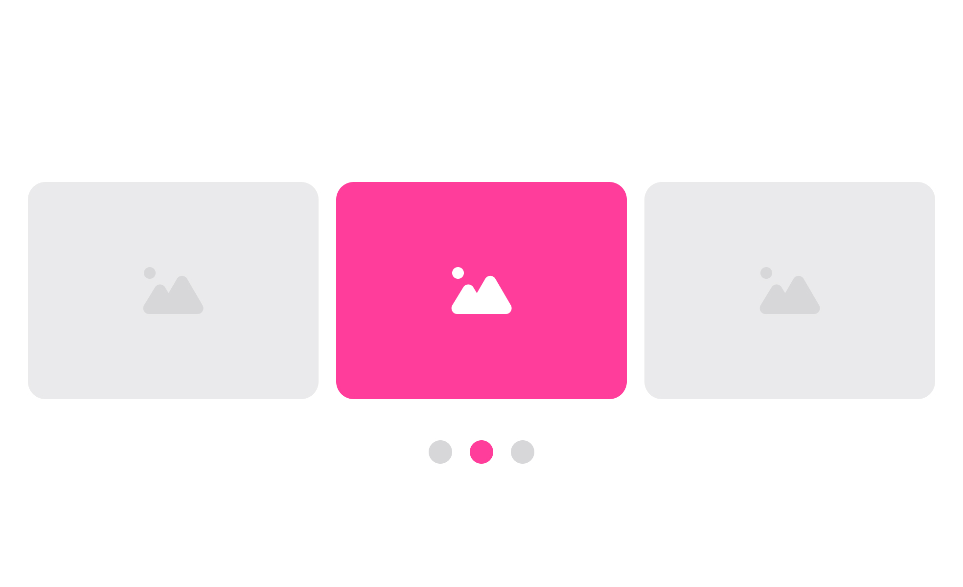
Carousels are interactive design elements that display a set of content, such as images, cards, or text, within a rotating or sliding frame. They are commonly used on websites and apps to feature multiple items in the same space, offering a way to save screen real estate while still highlighting diverse content. Designers often use them for promotions, featured products, or storytelling sequences that users can swipe or click through.
In UX and UI design, carousels are a double-edged tool. When designed well, they allow for efficient storytelling or product showcasing without overwhelming the user with too much information at once. For example, an e-commerce homepage might use a carousel to cycle through seasonal offers, new arrivals, and bestsellers, ensuring users see a variety of content without requiring long scrolling.
Real-world examples highlight both the strengths and weaknesses of carousels. Amazon uses them extensively to display product recommendations, while Netflix applies horizontal carousels to organize categories like trending shows or personalized lists. In contrast, many corporate websites abandoned autoplay carousels after usability studies showed that users often ignored rotating slides or struggled to control them.
Accessibility is another crucial factor. Carousels that auto-rotate without pause controls can make navigation difficult for users with mobility or cognitive challenges. Screen readers may also struggle with dynamically changing content. Designers must provide manual controls, ensure proper labeling, and allow users enough time to interact with each element for carousels to remain inclusive.
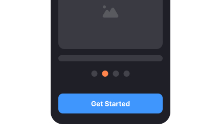
Mobile design brings additional considerations. Swiping gestures on smartphones make carousels more natural, but they also require clear indicators, such as dots or arrows, to show how many slides remain. Without these signals, users may feel lost or fail to engage with the full content. This makes careful balance between aesthetics and usability essential.
Learn more about this in the Carousels Exercise from the Mobile Information & Container Components Course, a part of the Mobile Design Course.
Key Takeaways
- Carousels display multiple items in a limited space through rotation or sliding.
- Effective in storytelling, promotions, or product showcases.
- Poorly designed carousels can frustrate or confuse users.
- Accessibility requires manual controls and screen reader support.
- Alternatives like grids often outperform carousels in usability.
Research shows users often ignore carousels because they resemble banner ads or change too quickly, breaking attention. Autoplay versions, in particular, can create frustration, as users miss information before they have time to react.
When carousels provide clear manual controls, logical sequencing, and engaging content, they perform better. The key is giving users control and ensuring each slide communicates value quickly.
Accessible carousels provide pause, stop, or navigation controls and avoid rapid auto-rotation. They should include clear indicators like arrows or dots and proper ARIA labeling for screen readers.
Testing carousels with diverse user groups helps confirm that controls and interactions are intuitive. Accessibility improvements not only support inclusivity but also increase usability for everyone.
Carousels should be avoided when users need quick access to multiple items, such as in navigation-heavy interfaces. In those cases, static grids, lists, or search tools provide faster clarity.
Carousels are most effective for storytelling, highlighting visuals, or surfacing promotions where exploration is encouraged. Teams should assess the goal of the content before deciding on this pattern.
Recommended resources
Courses

UX Design Foundations


UI Components I


Design Terminology

Lessons
Intro to Progress Trackers in UI

Mobile Information & Container Components

11 Real-World Design Examples that Prioritize Accessibility
Exercises

Projects

Travel Carousel (Prototype Included)


Craftify - E-commerce App Case Study


Streaming App