Showing Progress
Learn how to correctly use progress trackers to enhance user experience
Progress trackers are determinate indicators used to represent where users are in a journey. They inform them what they have completed, where they are currently, and what's left to complete. "Visibility of system status" is one of the most important usability heuristics, which helps reduce users' tension and uncertainty.
The power of showing progress is that it provides ongoing feedback to users. It also carves a clear path to completion for them, which increases the likelihood of them making it to the end of the journey.
On the other hand, ambiguous and confusing forms can create roadblocks, impede progress, and cause frustration for users. Therefore, using progress trackers can improve the user experience and increase the likelihood of successful form completion.[1]
In addition to tracking progress, progress trackers provide users with information about how many steps they have completed, their current position, and the remaining steps. However, it's important to note that not all forms require progress trackers. Overcomplicating the flow of a form can be counterproductive, and progress trackers should only be used when the process is long and takes more than three steps.
Forms such as checkout processes, tax forms, flight bookings, scholarship applications, and other complex forms that require multiple steps can benefit from progress trackers. By providing users with a clear sense of their progress, progress trackers can encourage users to continue and ultimately lead to a more positive user experience.
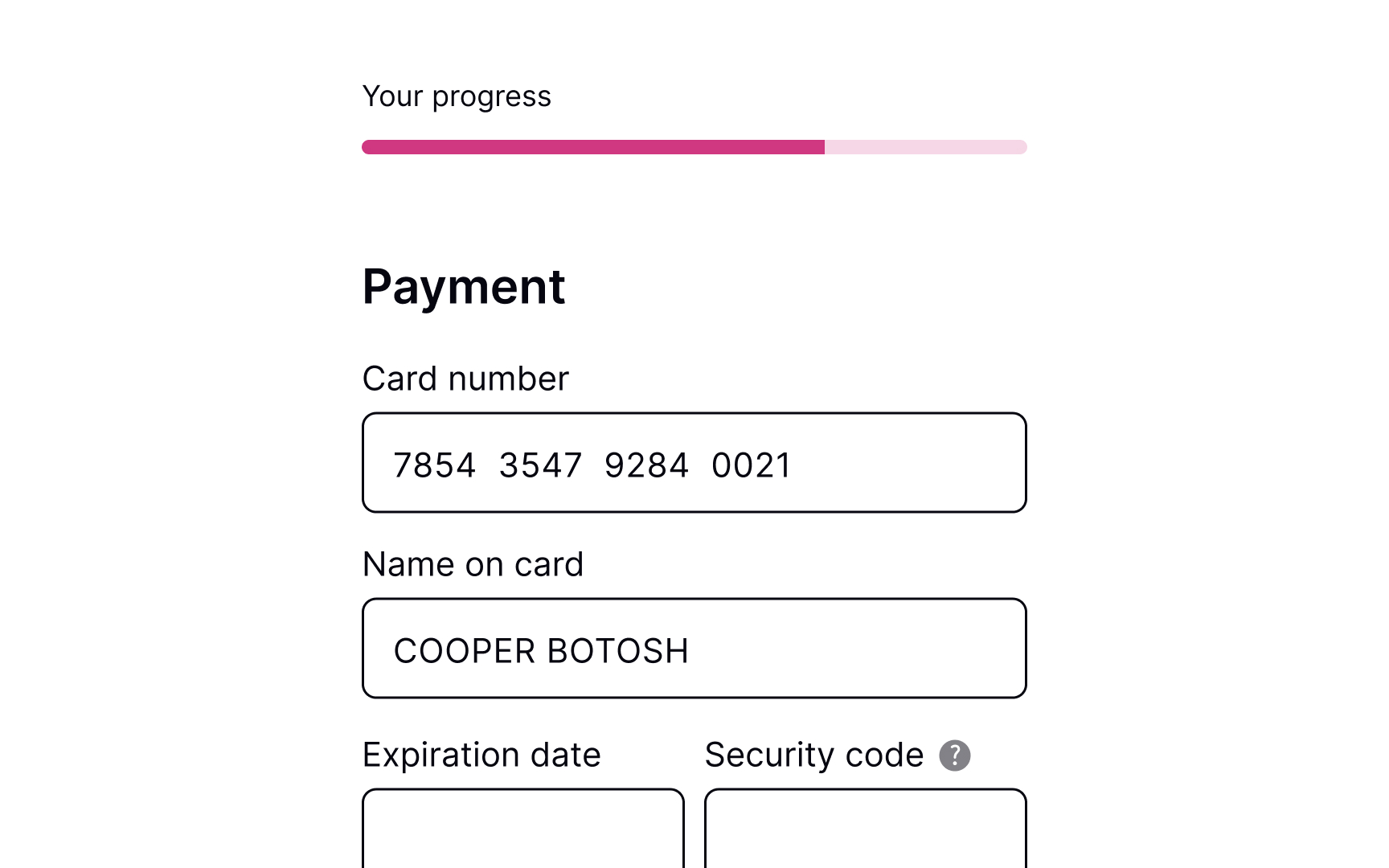
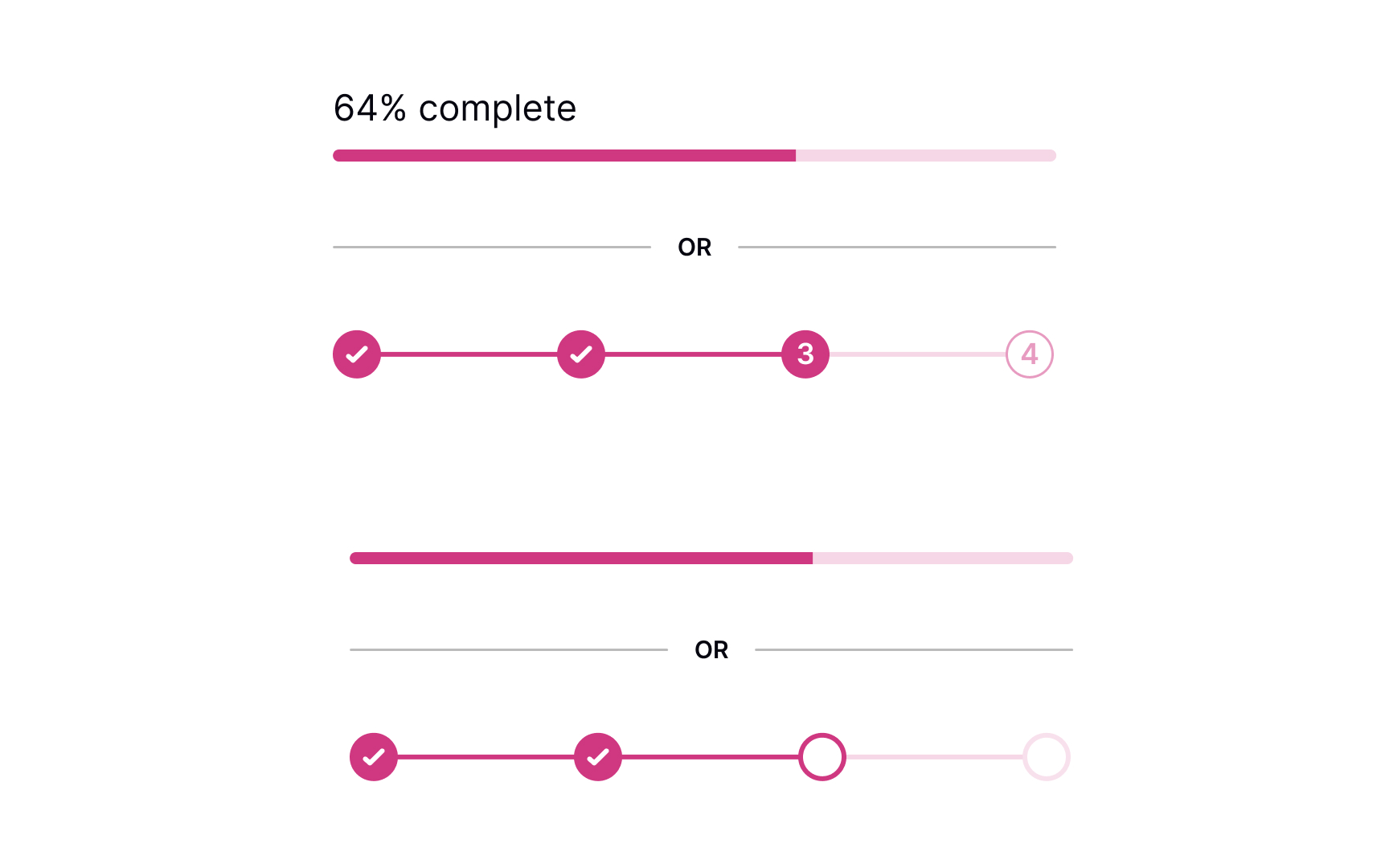
The tracker can exist as determinate progress bars or numbered steps. Their main goal is to show users the current progress, how many steps are ahead, and how many have been completed.
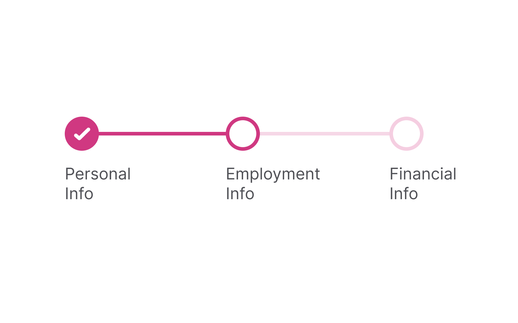
When the form is large and includes at least 3 stages, numbered steps are more helpful for setting milestones. Simply seeing the last step can motivate users to go through each step and complete a form. When the journey isn't long, like in the case of a signup form, it can be enough to show the incremental filling of a bar as users progress.
Pro Tip: You can encounter progress trackers when purchasing online, filling in a multistep form (like booking a flight), or taking an onboarding tour.
One of the primary goals of using
Progress trackers support Nielsen's "visibility of system status" heuristic. When users know what's going on in the system, they feel in control and don't experience any fear of the unknown.[2] Plus, people will be more likely to complete the process if they know what's ahead of them and have a sense of completion along the way.
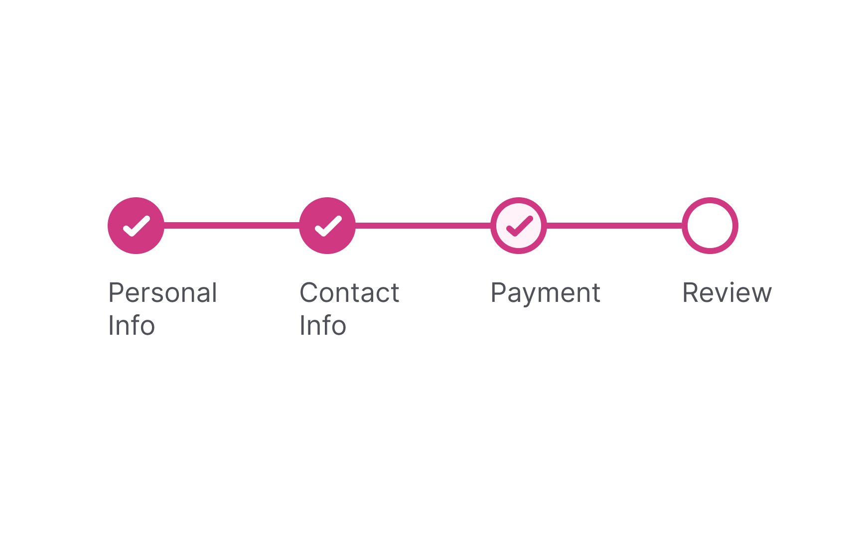
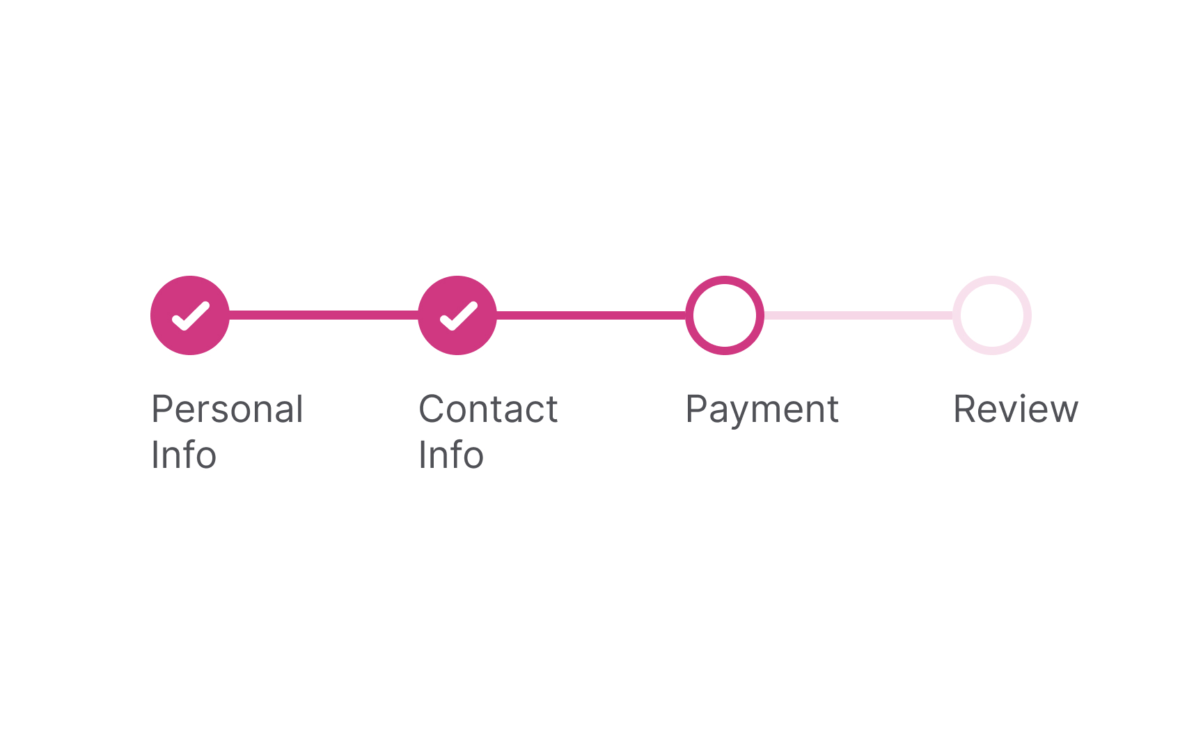
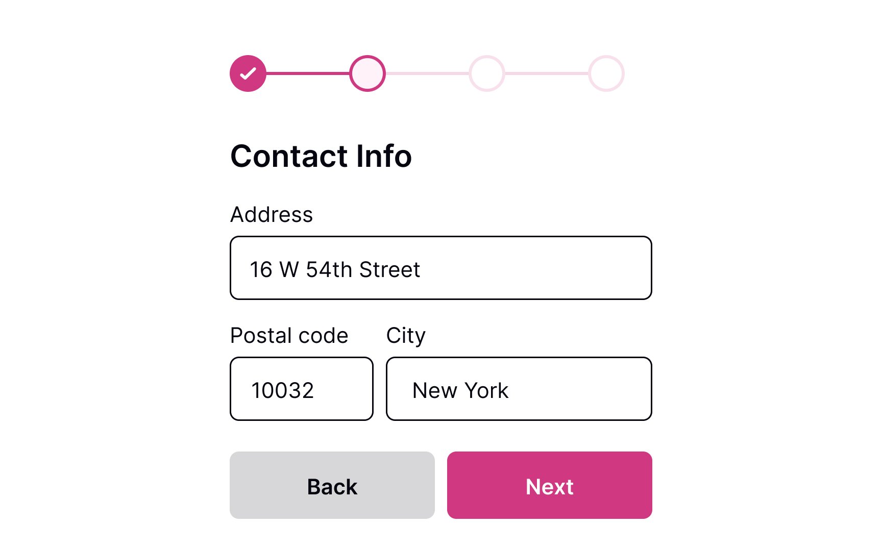
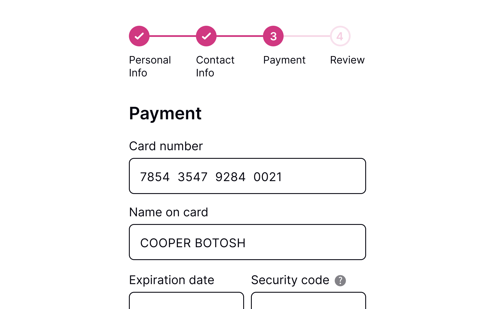
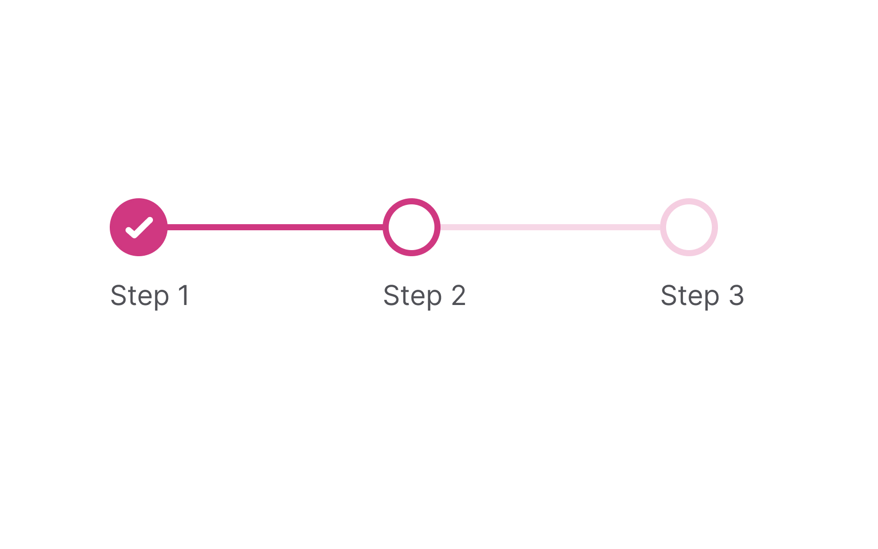
A progress tracker with milestones should always show 3 states:
- Steps that have been completed
- Current steps
- Steps that haven't been completed yet
You can use color and unfilled circles to indicate steps that users haven't reached yet and checkmarks to signify completion.
Unfortunately, if the form is long,
Another option is to autosave users' progress, so even if they navigate away from a page or close the window, they are able to return to the last step they were on without losing the data they've already entered.
As a final touch, you should decide how to label each milestone — by numbers, percentages, or titles. Titles add to scannability, helping users understand what they are expected to do here. Numbers and percentages motivate users to keep going, informing them about their current status and how many steps are to follow.
Depending on the complexity of your form, decide which
Pro Tip: In right-to-left languages, progress trackers should go from right to left instead of the standard left to right.
References
- Principle of Closure in Visual Design | Nielsen Norman Group
- Visibility of System Status | Nielsen Norman Group
Top contributors
Topics
From Course

Share


Similar lessons

Login & Signup Flows

User Onboarding
