SkySync : Sign Up Page with Accessibility

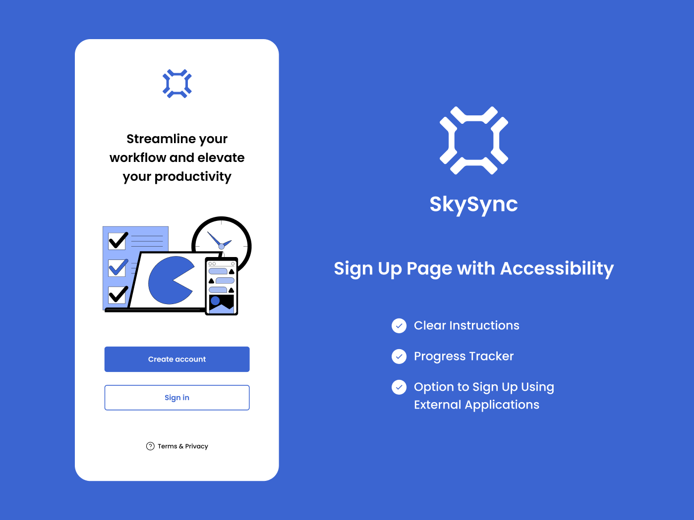
I've been considering the journey a user takes from the beginning to the completion of the signup process. As we all know, signing up involves inputting a lot of information, which can be both tedious and exhausting. The best thing we can do is to assist users with clear instructions to prevent errors, while also keeping them updated on their progress and informing them how much longer it will take to complete their signup.
From brief

Topics
Share
Reviews
1 review

Thank you for your work Nutcha! I like the colors and user flow. It would be nice if you increase the contrast on placeholders and forgot password text for more readability. Plus there is a person icon on the mail input, in my opinion if you used the mail icon it would be more appropriate.
Best, Fedir)
22 Claps
Average 4.4 by 5 people
You might also like
Project
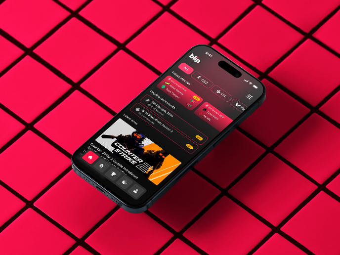
Blip - Esport app design (Light & Dark UI)

Bonjour, comrades! Today I present the case of Blip - an esports hub app for gamers where you can check esports news, learn about upcoming t

Project
Customer Journey Map for a Co-Working Space

In this project, I made a Customer Journey Map (CJM) for a co-working space. The goal of this project is to understand how customers feel an

Project
Reimagining Asana's Color System

I created a color system based on Asana's current project management tool. Accessibility and the emotions the colors evoke were the primary
Project
Responsive Main Screen


Project
Latios - Free Portfolio Template for UX/UI Designers

Overview I built Latios because I kept seeing the same problem: designers with solid experience getting stuck trying to launch their portfol
Project
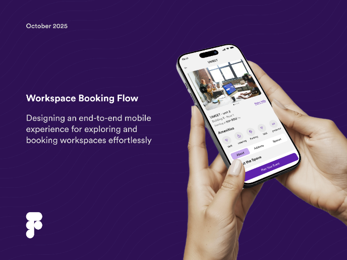
Workspace Booking Flow - UI/UX Design

Visual Design Courses

Course
UX Design Foundations

Learn the essentials of UX design to build a strong foundation in core principles. Gain practical skills to support product development and create better user experiences.

Course
Introduction to Figma
Learn essential Figma tools like layers, styling, typography, and images. Master the basics to create clean, user-friendly designs

Course
Design Terminology

Learn UX terminology and key UX/UI terms that boost collaboration between designers, developers, and stakeholders for smoother, clearer communication.