

Reviews
4 reviews

I’m definitely curious about this. What was the main goal behind this design? Do you have a bit more background you could share?
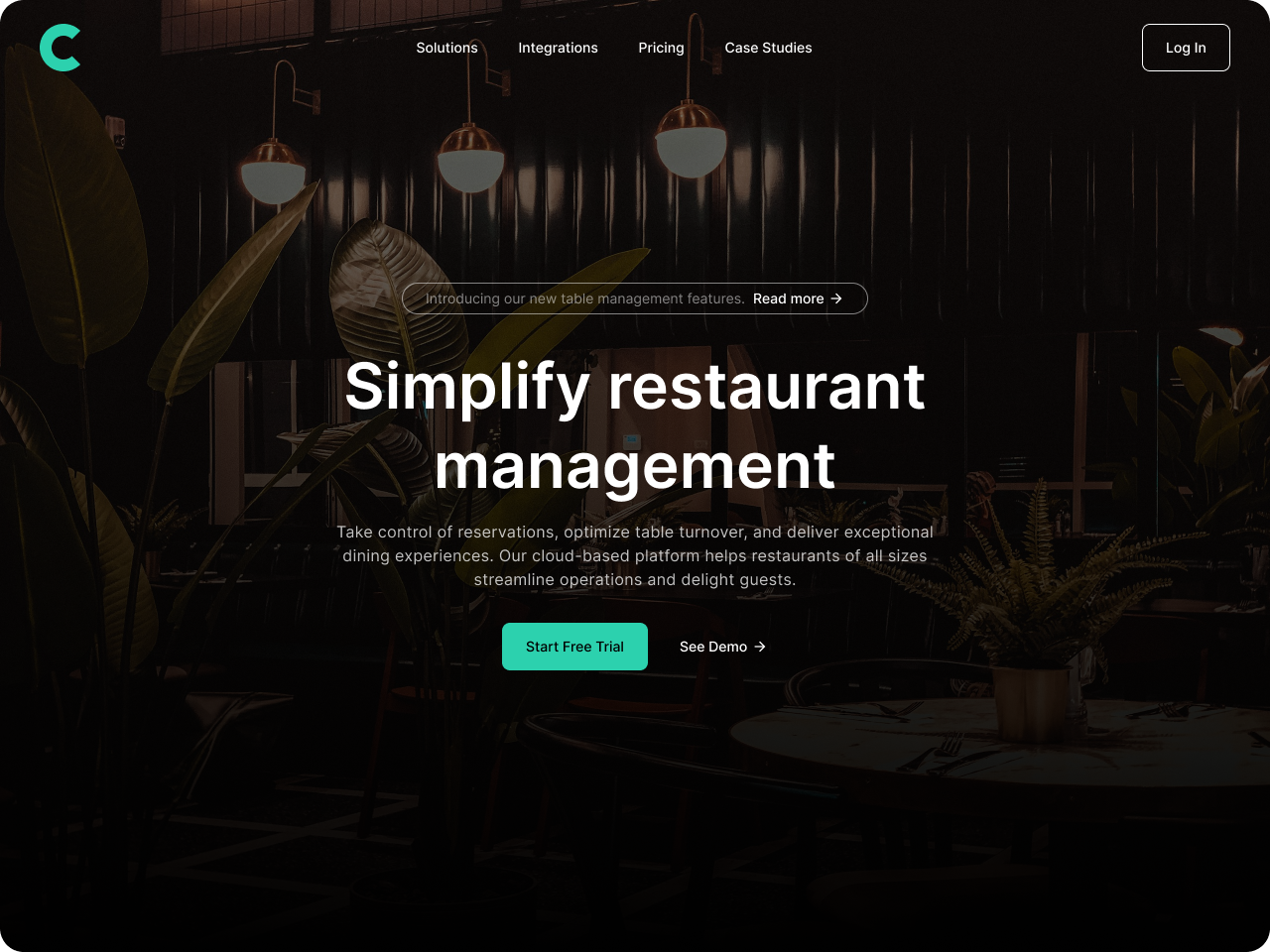
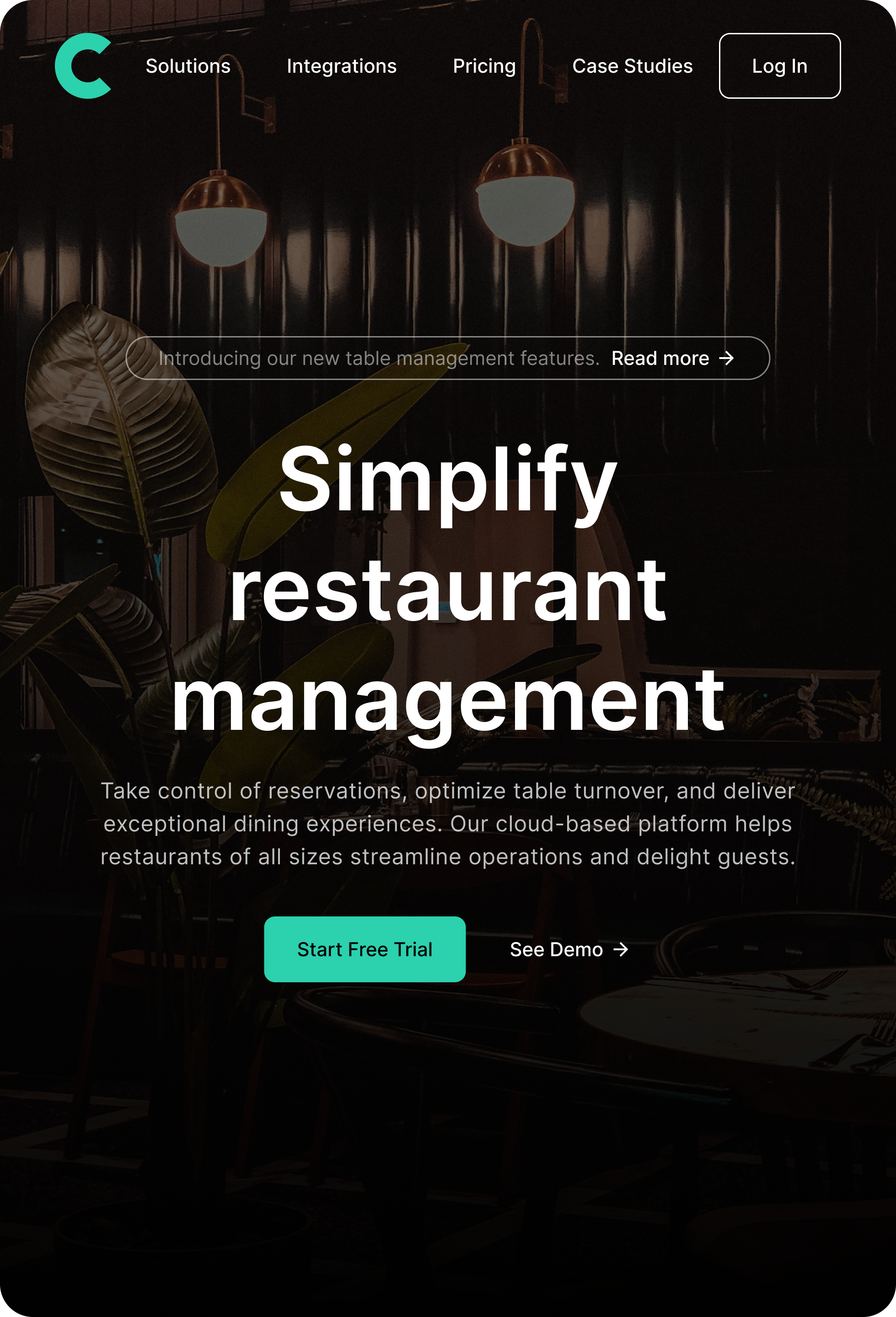
With only three images and no description, it’s hard to understand what the core focus should be. The visuals themselves look fine, and I prefer the first variation over the second because it gives a clearer idea of what the product is trying to communicate.
If you want to expand your case study, here are some questions you could answer to make the project easier to understand:
• What problem were you trying to solve?
• What was your design process from start to finish?
• Why did you choose these visuals and this layout?
• What challenges came up and how did you handle them?
• What are the main takeaways or lessons from this project?

While there are desktop and tablet breakpoints and the visual design here is heading in a good direction, I don't think this counts as a responsive screen without a mobile version.
I also would have liked to see sketches, process, design rationale, etc. and the link to the project file to fill this out as a professional case study.
Keep going!

Good exploration. As I read your title "Responsive Main Screen", it would be better if you show 1 hero section design with 3 screens display (Desktop, Tab and Mobile). Focusing to 1 design to make it responsive and no need to put others different design when showcasing the project.
Good first step. Waiting for your next exploration.

Hi Saya,
There is more to a responsive design than just squeezing existing elements into a smaller frame. If anything, I would at least like to see a mobile version as well. The design looks fine but we don't have your thought process behind the work; What the goal was, the challenges you faced, why you decided on X or Y, etc.
Finally, there is no need for two versions of the page if the focus of the project is on creating a responsive design.
This is a good start but you still have some ground to cover. Start with sharing a bit about your process and expand into a mobile version for full responsiveness.
You might also like
SiteScope - Progress Tracking App


FlexPay


Mobile Button System


CJM for Co-Working Space - WeWork


Ubani Design System


Accessible Signup Form for SaaS Platform
Popular Courses

Apple Human Interface Guidelines


Accessibility Foundations


CSS Foundations