Latios - Free Portfolio Template for UX/UI Designers
Overview
I built Latios because I kept seeing the same problem: designers with solid experience getting stuck trying to launch their portfolios. They'd spend weeks (sometimes months) tweaking every detail, paralyzed by the pressure to make everything "perfect."
The template is designed for mid-level UX/UI designers in tech/fintech who need something “that works for now”. Something minimal and tech-focused that actually stands out instead of blending into the sea of gradient-heavy, over-animated portfolio clones.
The core challenge: How do you create a portfolio template that helps designers differentiate themselves while keeping the focus on their work?
The Problem
What I Observed
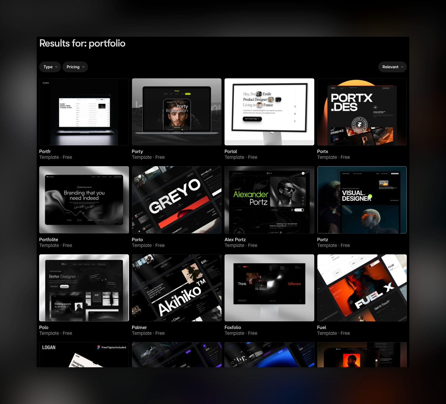
Spending time on Framer Marketplace and analyzing designer portfolios, I noticed several recurring issues:
- Everything looks the same. The market is flooded with templates that are basically variations of each other. Hiring managers must get tired of seeing the same layouts and styles on repeat.
- The "Dribbble effect" is real. There's this widespread belief, especially among newer designers, that more visual complexity = better design. This leads to portfolios packed with excessive gradients, unnecessary illustrations, and animations that ultimately distract from what matters.
- Perfectionism becomes paralysis. Designers treat their portfolio as an extension of their identity (because, let's be honest, it kind of is). This creates massive anxiety. I saw people constantly postponing launches, endlessly tweaking, never feeling ready to hit publish.
Who I Built This For
Mid-level designers (2-5 years in) working in tech/fintech who need to:
- Get their portfolio live quickly without building from scratch
- Project technical competence and professionalism
- Stand out without resorting to gimmicks
- Have room to expand over time as their work evolves
How I Approached It
Research Phase
I analyzed what exists on Framer Marketplace and studied real designer portfolios. The gap became obvious: lots of generic minimalist templates, but nothing with a strong tech identity.
The key insight: people were anxious about creating portfolios because they felt it represented their entire professional identity. This led to my main design decision make it deliberately lean. Include just enough structure that someone can publish quickly, but leave room for personalization. Remove the pressure of "having everything perfect on day one."
Exploration
I looked at what performed well in the Marketplace and mapped that against standard design patterns in tech. Since Framer lets you design and prototype simultaneously, I jumped straight into the platform for a much faster iteration.
My guiding principle: every element needs to earn its place.
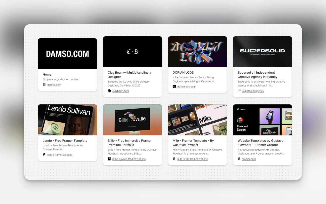
References:
Finding the Visual Direction
First attempt: Clean minimal with some typographic variation. Too generic. It didn't have the tech personality I was after.
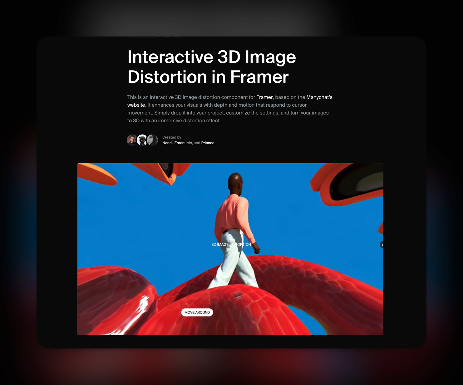
The breakthrough came from exploring components in Framer University. I found some interesting parallax effects that sparked an
idea: what if I created depth without being heavy-handed?
From there, I developed:
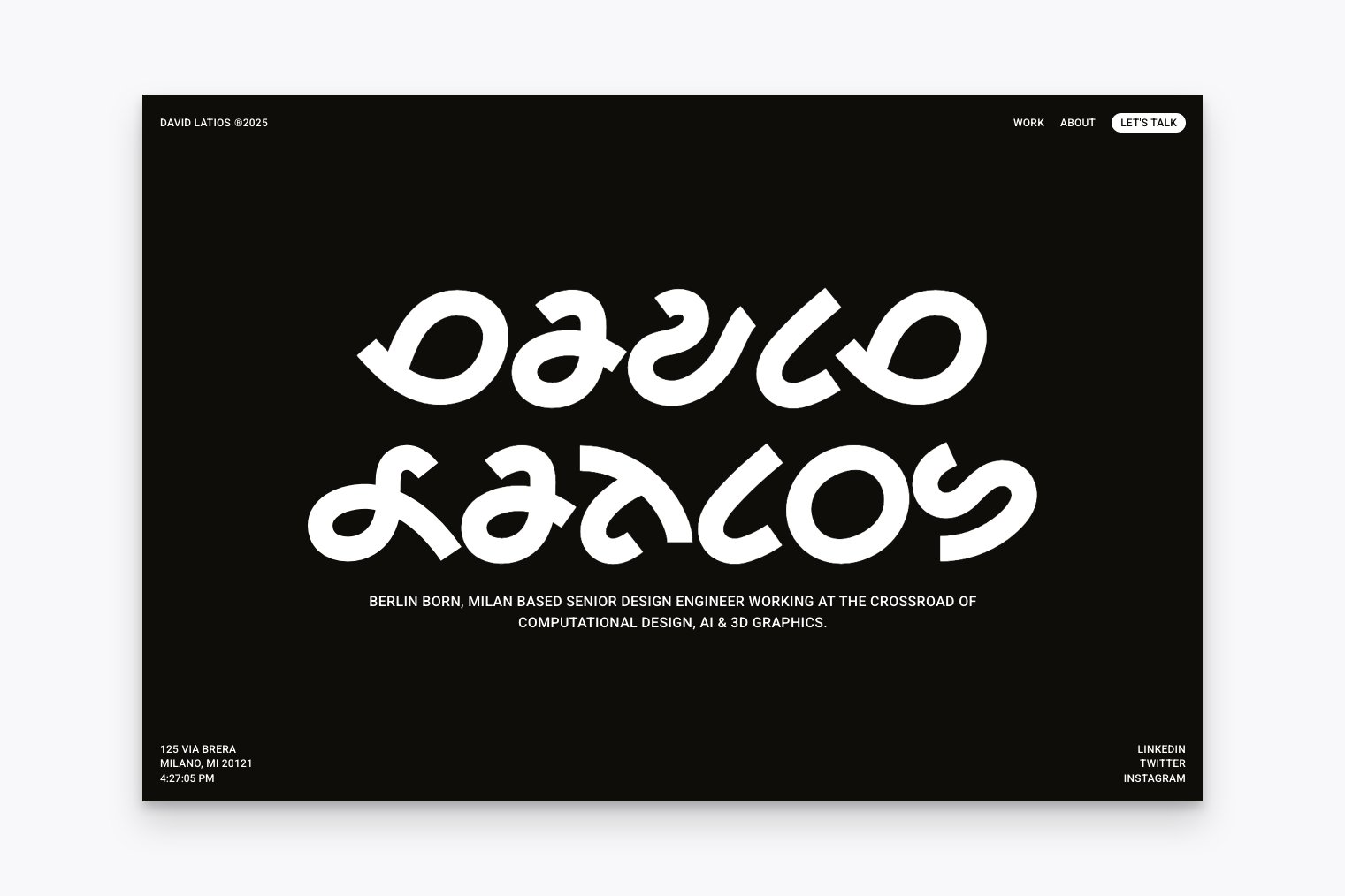
- Parallax effect in the hero that creates immediate visual interest
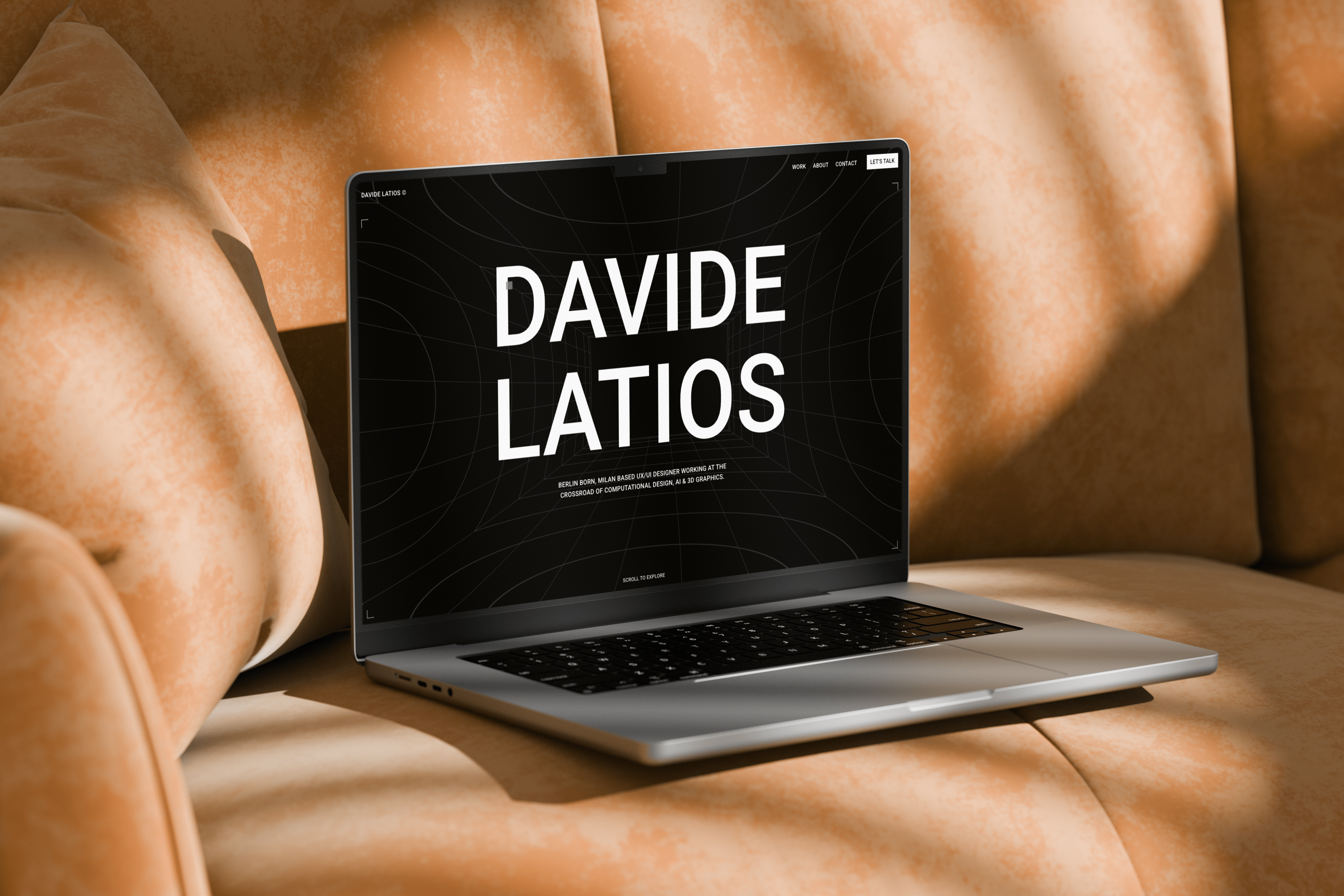
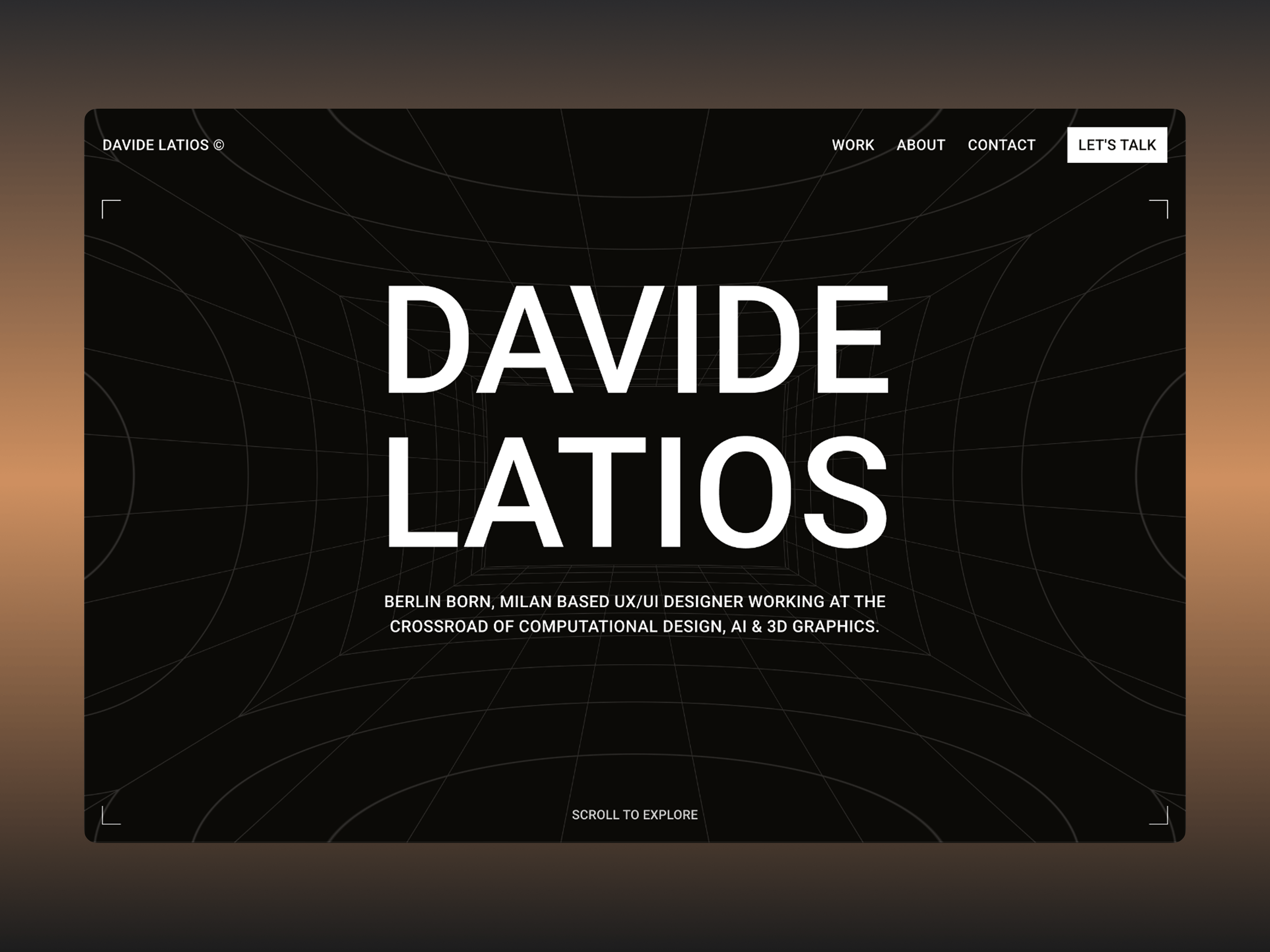
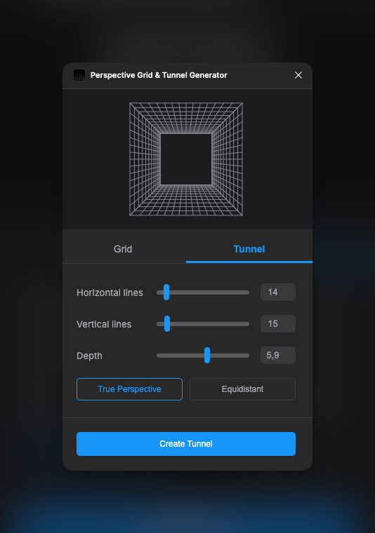
- Pseudo-3D background (built in Figma) that gives depth right when you land
- Tech-inspired visual language: angular elements, perspective grids, corner brackets
- High-contrast monochrome palette with white accents for maximum readability
The Solution
Hero section that makes an impression
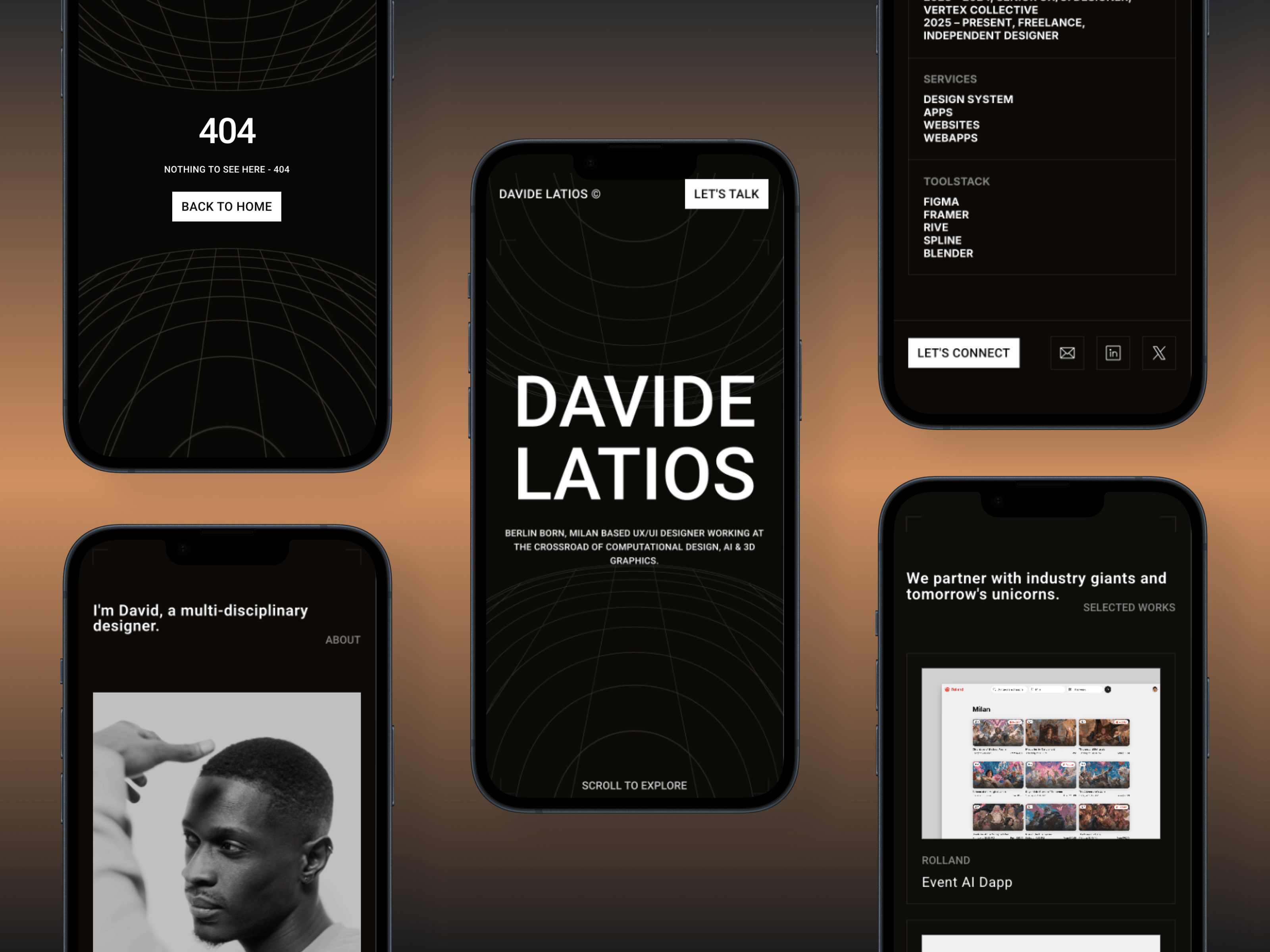
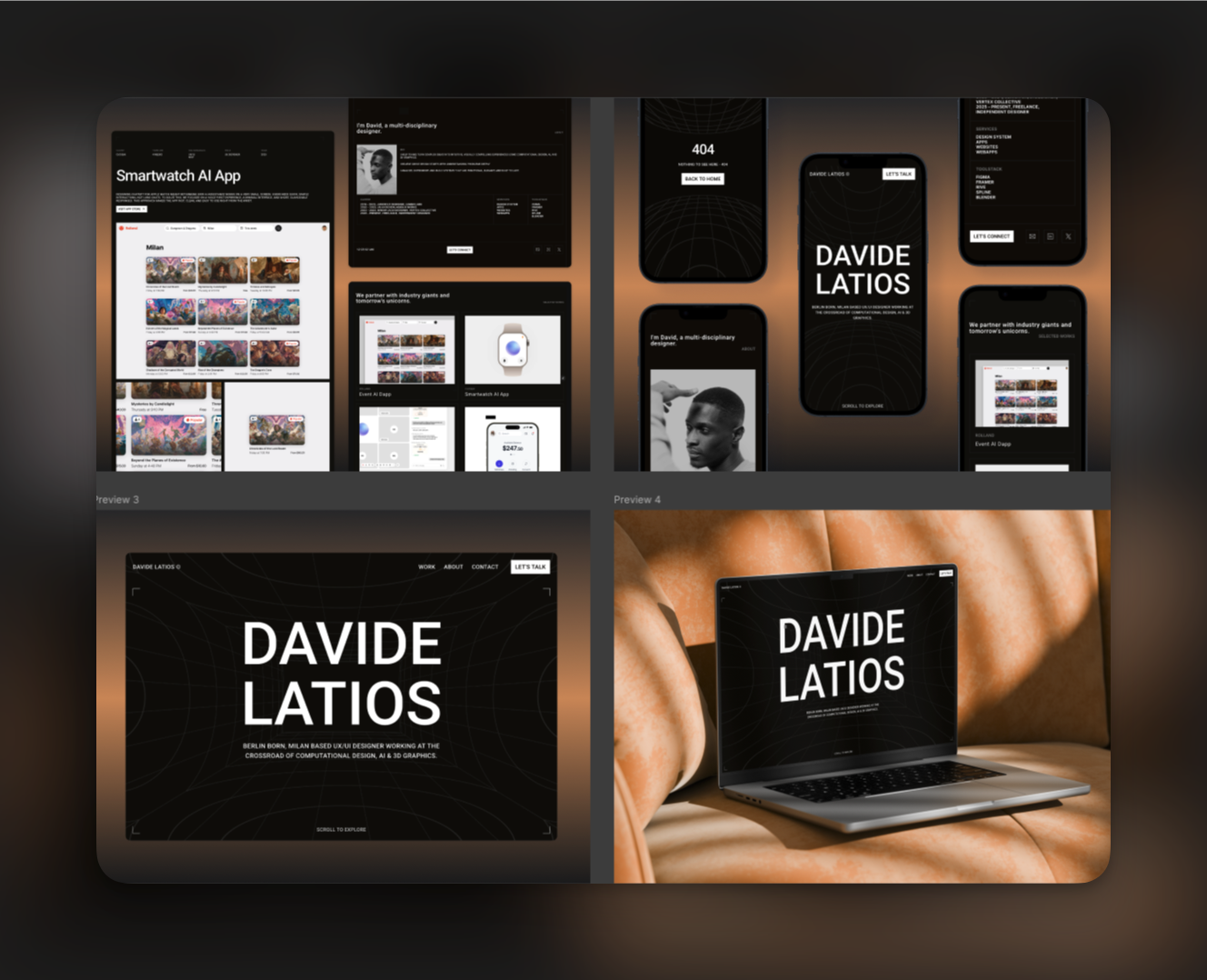
Large, bold typography with your name, a 3D grid background that establishes the tech vibe, a clear tagline, and prominent CTA placement. (Full custom and responsive)
Streamlined information architecture
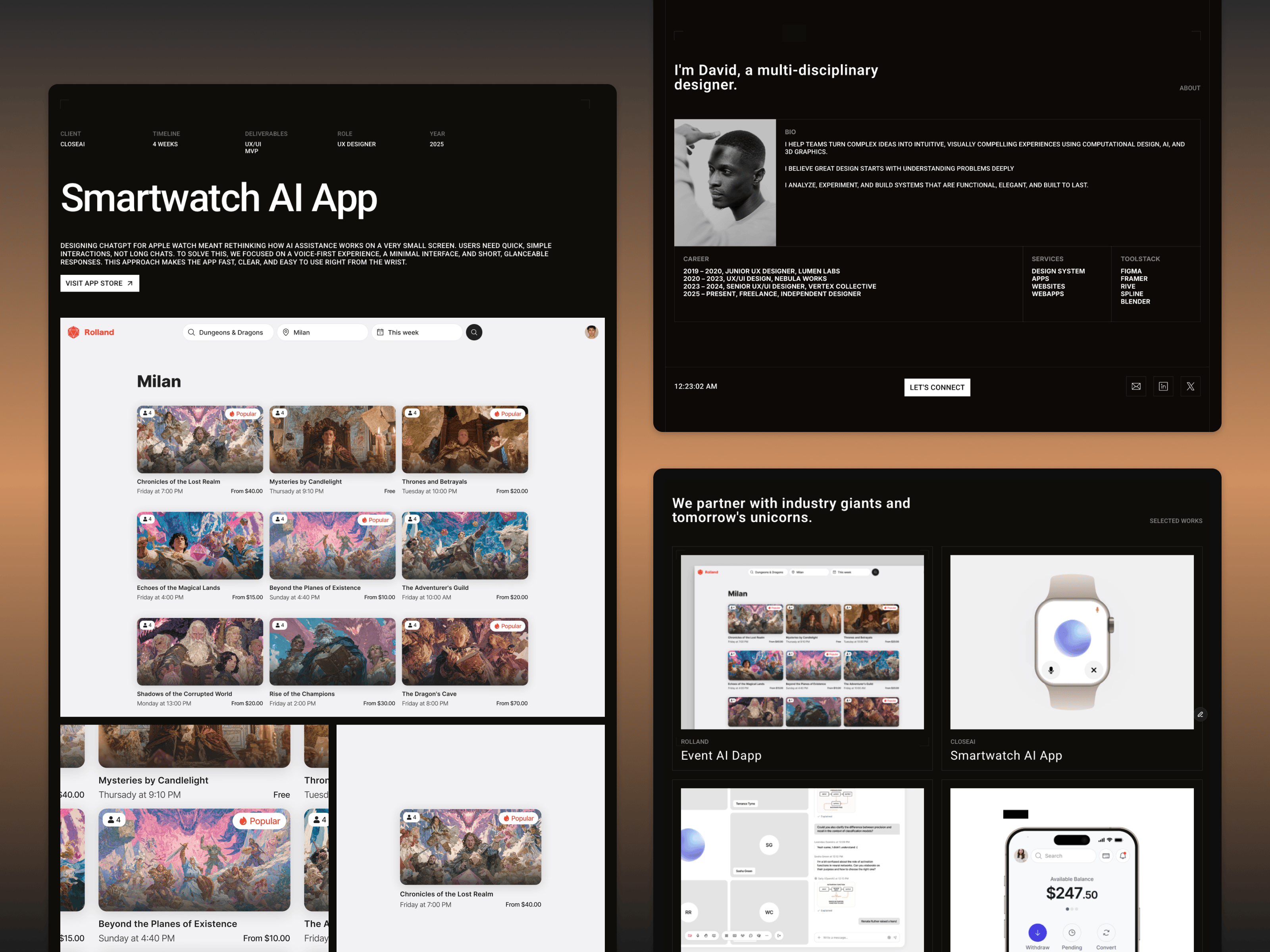
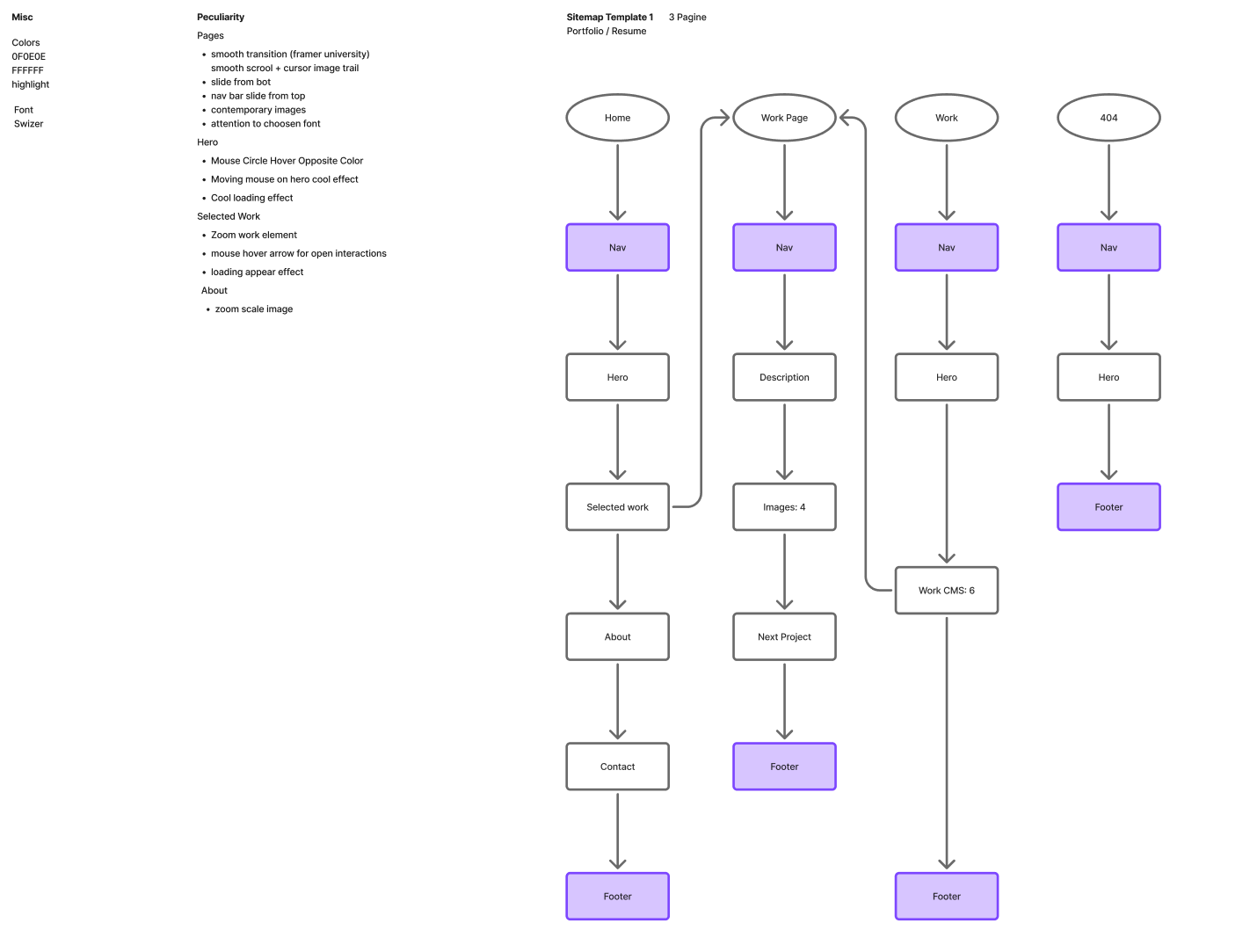
Minimal navigation (Work, About), projects with immediate visual previews, and a concise About section, bio, services, toolstack.
Built for growth
Modular structure for progressive content addition, reusable components for consistency, and a system that scales without breaking visual coherence.
Optimized for hiring managers
Fast loading, clear path to key information, multiple contact points.
Results & What I Learned
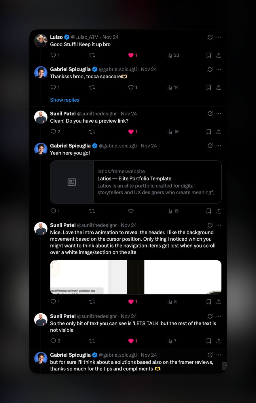
Initial Feedback
- Some poeple liked it some where concern with some design decisions
- Some were happy to be able to publish a professional portfolio in hours instead of weeks
- From Framer Support feedback, I still had to fix some minor issues related to their templates standards which I'm working on right now, so that I can publish it in their marketplace, in the end I decided to remove contacts btn on top and mix it with about, since they are really close, this will reduce the cognitive load a bit.
- About the navbar... I know it's not perfectly accessibility-friendly because the text on it isn't visible while scrolling. However, I noticed this pattern is common in most templates. I think it's because designers want users to focus primarily on the content on screen, with just a subtle emphasis on the CTA in the top right. Idk but it is customisable now, so that everyone can decide how they want it.
Reflection
When you're designing for designers, you're working with the most critical audience imaginable. We notice everything.
The solution wasn't trying to make the "perfect portfolio template." It was recognizing that perfection kills momentum. The best design is the one that actually gets used and published, not the one that sits unpublished in Figma because it's "not quite ready yet."
Sometimes the most helpful thing you can do is lower the barrier to action. That's what Latios does.
I'll try to improve it as much as I can and also make it for customisable.
Thank you
Press here to remix it
Or: https://framer.com/remix/m5aEXJNqfHw7U9nyibIl
Reviews
7 reviews
Hello Gabriel,
your work on this portfolio template is truly impressive!
The design system is exceptionally well-crafted with clean typography, consistent spacing, and a professional aesthetic.
Great work! You've created a valuable and thoughtful resource for designers.
Great job on the template Gabriel.
And honestly, kudos for making it free. Not only can people use it right away, but it also works as a nice learning example for anyone trying to understand how to structure their own projects.
If I can suggest one thing, it would be adding another project type. Maybe a case study layout with more text. Right now most examples are just descriptions and images, and it could be helpful to show how the template handles a text-heavy project. Of course, users can customize it themselves, but having that option built in would make the template even more complete.
The only detail that caught my eye is the project description section. The text is a bit long and goes past a comfortable line length. If someone wants to write a more detailed description, readability might suffer. Keeping lines around 50-75 characters makes the content much easier to read.
You created a really solid template.
Well done Gabriel, beautiful minimal style. Thank you for your comprehensive explanation of the process to create the template as well as what you've been learning while building in public and from the feedback of others. This is what growth is about.
Incredible job, Gabriel! I really like this approach. Your research phase feels very thoughtful and well-grounded in real observations. The idea of “just enough structure” works very well here.
Visually, the portfolio feels modern, minimalistic, and focused on what really matters. You highlighted the work in a very clean way, without unnecessary elements, which supports your core idea instead of distracting from it. It feels calm and confident, not generic.
Gabriel, looking at this template, I see a solid foundation with strong visual character. That dark wireframe background really captures the "computational design" vibe mentioned in the brief. The minimalism and readability are on point.
Responsiveness looks okay, mobile screens are legible, CTAs are well exposed. Typography works too, though that very large name in the hero might be challenging with longer names (if it's customizable). The about section could use more breathing room between elements.
Overall, this is a professional, cleanly designed template that presents projects well. Maybe not an "elite experience", but a solid foundation that can actually be used. 💪😊❤️
This is a really nice portfolio template, great work!
For a case study I personally would want to see more information / research about the persona, Davide Latios. I would also have liked to see more of the process in making this template (ideations, wireframes, design rationale, etc.)
Keep up the good work!
Nice Portfolio Gabriel 👍
You might also like

Improving Dating App Onboarding: A/B Test Design

FORM Checkout Flow - Mobile

A/B Test for Hinge's Onboarding Flow

Accessibility Asse

The Fitness Growth Engine
Uxcel Halloween Icon Pack
Popular Courses

UX Design Foundations

Introduction to Figma


