🖥 Desktop Checkout Flow Design


Designing a friction-free checkout experience to reduce cart abandonment
1️⃣ Project Context
As part of the product design team for an e-commerce platform, we identified a high cart abandonment rate during checkout.
The challenge was to design a desktop checkout flow that:
- Reduces friction
- Improves scannability
- Builds trust
- Supports fast and confident purchase completion
2️⃣ Design Goal
Create an intuitive, structured, and conversion-focused desktop checkout experience that enables users to complete their purchase safely, effectively, and efficiently.
3️⃣ Key Design Principles
To achieve this, I focused on:
- Minimizing cognitive load
- Structuring information clearly
- Providing helpful microcopy
- Ensuring transparent pricing
- Reinforcing trust during payment
- Supporting guest checkout
4️⃣ User Flow
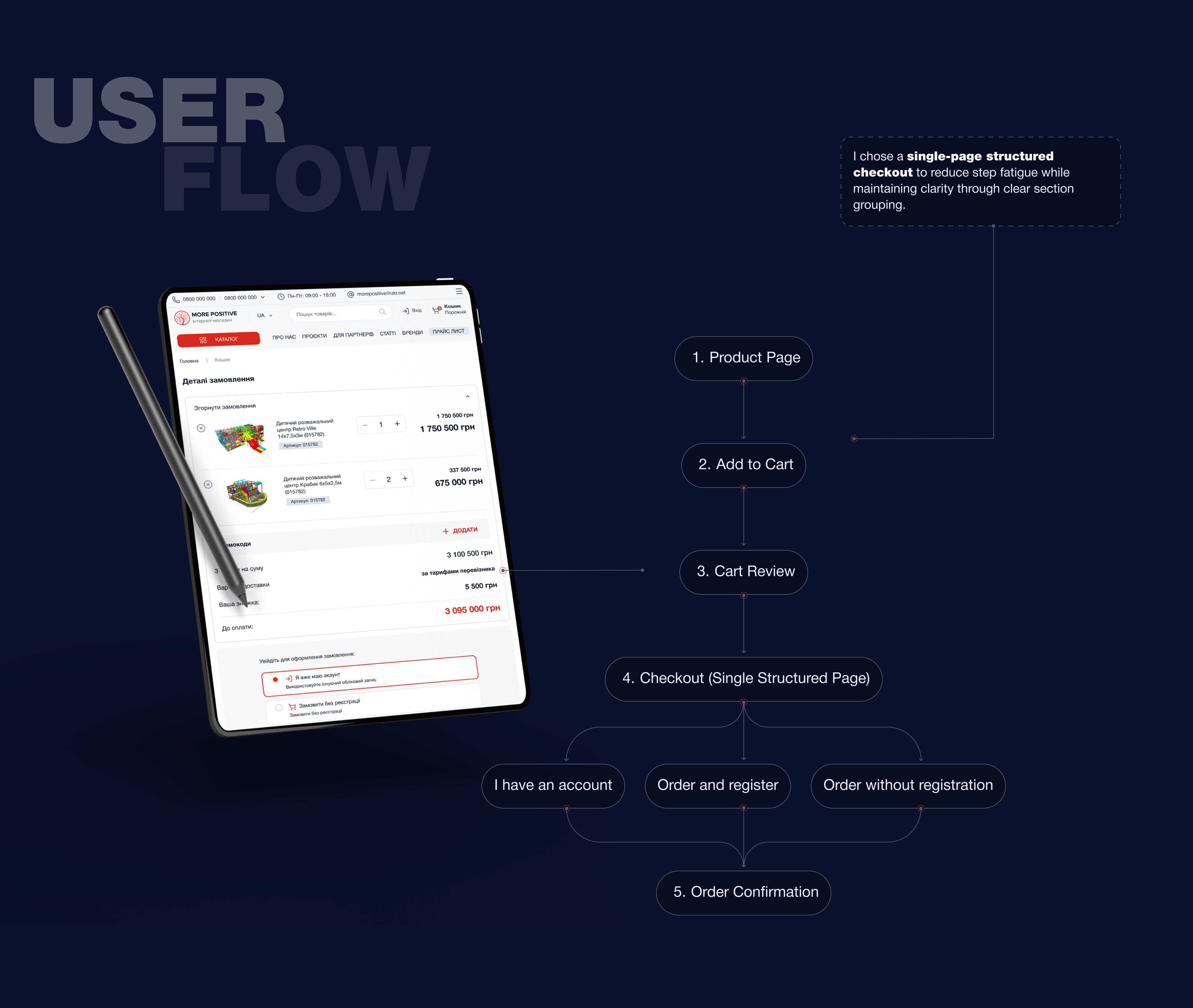
5️⃣ Layout Strategy (Desktop)
The checkout uses a two-column layout:

Left Column (Primary Interaction Area)
- Contact Information
- Shipping Address
- Delivery Method
- Payment Details


Light Column (Sticky Order Summary)
- Product preview
- Editable quantity
- Price breakdown
- Estimated delivery
- Promo code field
- Total amount
- Primary CTA
Keeping the order summary visible at all times increases transparency and reduces uncertainty.

6️⃣ Form Optimization Decisions
Reduced Field Complexity
Only essential information is requested.
- Optional fields clearly marked
- Address line 2 optional
- Smart defaults applied
7️⃣ Responsive Design
The checkout page was designed with responsive behavior in mind to ensure a smooth experience across different screen sizes.


8️⃣ Order Confirmation Screen
After completing the checkout process, users are redirected to an Order Confirmation screen that clearly communicates that the purchase was successful.
A prominent confirmation message (“Thank you! Your order has been received and is being processed”) reassures users that their transaction was completed successfully.
The screen also displays all key order details, allowing users to quickly review the information they submitted during checkout.

9️⃣ Accessibility Considerations
The checkout page was designed with accessibility principles in mind to ensure that the interface is usable for a wide range of users, including those with visual or motor impairments.
Several accessibility practices were considered:
Clear labels and form structure
Each input field includes clear labels so users understand what information is required.
Readable typography
Font sizes and spacing are designed to improve readability and reduce visual fatigue.
Color contrast
Important elements such as buttons, prices, and error messages use sufficient contrast to remain visible and accessible.
Logical content hierarchy
Information is grouped into meaningful sections, making it easier for users to scan and understand the page.
Assistive technology support
The structured layout helps screen readers navigate the page more efficiently.
These considerations help make the checkout process inclusive, accessible, and easier to use for all users.
🔟 Components


Reviews
2 reviews

Hey Anastasia,
I’m glad to see that you invested time in writing and documenting your project. Having everything clearly explained makes it much easier to understand your thinking and the decisions behind the design.
While exploring the prototype, I noticed that at one point the language switched between Ukrainian and English. I’m not sure if I might have clicked something by accident, but it could be worth checking if the flows got mixed or if different language versions are overlapping somewhere in the prototype.
Since you mentioned that the previous flow was causing users to abandon their carts, I’m also curious if you have any results or metrics from the new flow. It would be really interesting to see whether the changes improved completion rates or reduced drop-offs.

Great job, Anastasia! This is a very complete work and documentation of the checkout page design and flow.
I'd suggest a few tweaks in the UI:
- Use the same border radius on the search bar to keep consistency. As it's the only component with full rounded corners, it feels a little off.
- Red buttons are alarming and can overwhelm users, especially when all letters are in caps/uppercase. I know it's the brand color, but what if you add another strong color for the primary buttons (I like the dark blue/navy you used in the background) while keeping the red in other components and icons?
- In the "Subscribe to the Newsletter" section, try switching the title and subtitle. I mean, "Receive offers and discounts first" should be the title because it is more appealing to the user. And "Subscribe to the Newsletter" the subtitle.
These are just suggestions, fell free to try it out. And good luck in your projects!
You might also like

SONZ - Entertainment platform


Camp & Travel Explorer - App Design


Solar system Dashboard Utility


Signup page for a SaaS website

Uxcel Halloween Icon Pack


PLANTIST

Interaction Design Courses

UX Design Foundations


Introduction to Figma

Design Terminology
