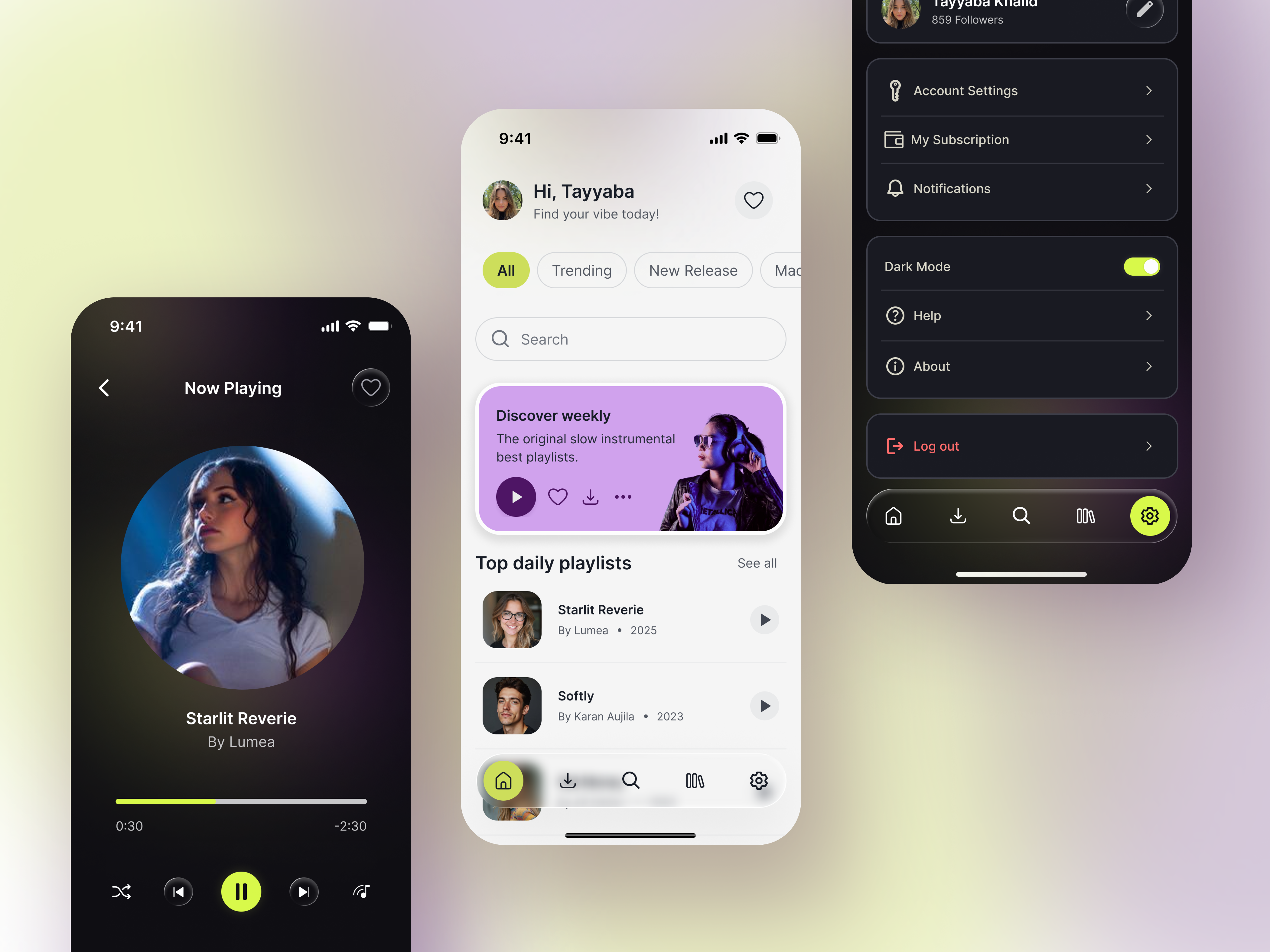
Music Player UI - Light & Dark Mode

Open Full Project
Understanding the Context
Music streaming is a long-session behavior, often used during evening hours, commuting, or in low-light environments. Prolonged exposure to bright interfaces in these situations can lead to visual fatigue and discomfort.
To address this challenge, I designed a dual-theme interface (Light & Dark Mode) that prioritizes both accessibility and visual comfort.
Goal: The goal was to allow users to transition seamlessly between daytime browsing and low-strain nighttime listening without compromising readability or brand identity.
Design Approach
To maintain consistency and scalability, I followed a Bottom-Up Design Methodology.
Instead of starting with full screens, I began by defining the foundational design elements:
• Design System
• Iconography style
• Button components
• Color Palette
• Spacing system
Once these smaller components were established, I used them to build the larger interface structures such as the Home screen, Music Library, and Settings.
This approach ensured that every screen feels cohesive and system driven, whether the user is browsing playlists on the Home screen or adjusting preferences in Settings.
Key Focus Areas
- Visual Hierarchy
Clear hierarchy was essential to guide users through content-heavy music interfaces.
I used size, weight, and spacing to direct the user's attention.
For example:
• The greeting “Hi, Tayyaba” is visually prominent to create a personal connection.
• The supporting text “Find your vibe today!” appears lighter and smaller, establishing a secondary level of information.
This hierarchy allows users to scan the interface quickly without cognitive overload.
2. Touch Targets
Mobile usability was prioritized by ensuring all interactive elements maintain a minimum touch target of 48 × 48 dp, following Material Design accessibility guidelines.
This improves usability for:
• One-handed interaction
• Users with motor impairments
• Faster navigation without precision tapping
Placement of the Theme Toggle
The theme switch is located in the Settings → Appearance section.
This placement aligns with the mental models users already have from modern operating systems (iOS and Android), where appearance settings are grouped under system preferences.
By following this established pattern, the feature becomes intuitive and easy to discover.
Dark Mode Design Strategy
Designing for dark mode is not simply about inverting the light interface. It requires careful adjustments to maintain depth, readability, and visual comfort.
1. Avoiding Pure Black
Instead of using pure black (#000000), I selected deep neutral tones for background layers.
Pure black often creates harsh contrast with bright text and vibrant accents, which can lead to eye strain during long sessions.
Using slightly lighter dark tones allows for:
• Softer contrast transitions
• Better separation between interface layers
• More comfortable long-term viewing
2. Controlled Accent Colors
In light mode, accent colors can be vibrant. However, in dark environments overly saturated colors may create “color vibration”, where bright hues visually compete against dark backgrounds.
To address this, I slightly desaturated the accent tones in dark mode while maintaining their recognizability.This keeps the interface visually balanced and reduces eye fatigue.
3. Depth and immersion
To enhance the emotional quality of music playback, I introduced subtle glow effects around album artwork in dark mode.
This creates an ambient lighting effect similar to “Ambilight”, making the music feel more immersive while subtly reinforcing the active content.
Accessibility Considerations
Accessibility was treated as a core design principle, not an afterthought.
- WCAG 2.1 Compliance
All primary text-to-background combinations were tested to meet or exceed the WCAG 2.1 recommended contrast ratio of 4.5:1 for body text.
This ensures readability for a wide range of users, including those with visual impairments.
2. Non-Color Indicators
Color alone was not used to communicate interaction states.
For example:
• The Home icon in the navigation bar uses a filled icon state combined with a lime-green highlight to indicate selection.
This provides additional clarity for users with color vision deficiencies.
3. Typography Legibility
A modern sans-serif typeface was used to maintain clarity across different screen sizes.
Additional attention was given to:
• Adequate letter spacing
• Clear line height
• Balanced font weights
These adjustments ensure text remains legible even in dark mode where letters can sometimes visually blend into the background.
Final Design
The final interface delivers a balanced dual-theme music experience that supports both aesthetics and usability.
The design system ensures:
• Smooth theme transitions
• Accessible contrast levels
• Comfortable long-session usage
• Strong visual hierarchy
• Consistent component behavior across screens
By combining thoughtful color strategy, accessibility standards, and system-driven design, the interface creates a modern and immersive music listening experience.
Tools used
From brief

Topics
Share
Reviews
6 reviews

Great work Tayyaba. I really appreciate your effort and attention to detail. The dual theme design is thoughtful and easy to use. The light and dark modes are comfortable for the eyes. The interface is consistent and looks organized.
You can improve the bottom navigation in light mode so active items are easier to see. Make sure all icons in dark mode are visible. Also, check that all interactions in the prototype are useful and add scrolling where needed.
Overall this is very good work. Keep it up, fixing these small points will make it even better.

The project shows solid foundations. The visual hierarchy on the Home Screen works well, the user greeting draws attention naturally, while secondary elements recede into the background. The dark mode is thoughtful, the background isn't pure black, which is a conscious and correct design decision aligned with WCAG guidelines. The lime-green accent consistently returns across both themes, tying the whole thing together visually.
What could be refined?
The bottom navigation in light mode has quite subtle active states. The Home icon with fill and background is readable, but the remaining states may be difficult to distinguish for users with low vision. It's also worth checking the contrast of secondary text (e.g. "By Lumea • 2025") against the background in dark mode.
A few interaction states and empty views are missing, but that's natural at this stage. Overall, this is very promising work. There's a clear sensitivity to accessibility and consistency, which is rare to see. Keep it up, polishing the details is just a matter of time! 😊❤️

I like it so much! The UI is modern, pleasant, and very polished. I love how you’ve combined a sophisticated color palette with a clear commitment to accessibility standards.
However, I’d recommend a deeper look at the UX, especially on the Home page:
- While the greeting is nice, the home page feels like it lacks a bit of true personalization. Users will stay longer if they see something special for them.
- The "Discover Weekly" card has a lot of actions (Play, Like, Download, More). I’d recommend prioritizing the most common action (Play) and hiding the others under the three dots. This reduces cognitive load and prevents "over-choice" for the user.
- I noticed you have a Search bar at the top of the Home screen and also a Search icon in the bottom navigation bar. Usually, if it's in the bottom bar, it shouldn't be on the main screen to avoid wasting valuable space.
- There is a heart icon right next to the User Profile at the top. This is a bit confusing, is it to "Like" the profile, or is it a shortcut to Favorites? Since you already have a "Library" or "Favorites" section in the bottom bar, this placement feels out of context.
- You mentioned WCAG 2.1 compliance, which is great! However, please double-check the font size and contrast of the secondary text (like "859 Followers" or the year in "Top daily playlists"). It looks quite small and thin, which might be hard to read on a mobile screen.
Great job, I like the design!

Hey Tayyaba,
This is such an incredible work. Kudos for taking the time to design prototype this music player UI. I love the modern look and color usage. There are few things I would pay attention to and make it even more refined:
- Take of the hover states from components since this is a mobile UI
- Some of the interactions aren't adding any value to this current flow so either you get rid of them or explore them further. It makes the prototype feel unfinished
- I will add some vertical and horizontal scrolls to the appropriate sections. This is pretty easy to achieve in the prototype tab. It adds to the fidelity of your work.
- Lastly, when you switch to dark mode the navigation icons don't switch to white making them basically invisible.
Nonetheless, great job with this!

Hi Tayyaba,
I love how you've laid out your project!
The screens are clean and modern, and you've used the yellow/green colour sparingly and just for important actions, which works really well. I have noticed the screens are quite close to some references on Pinterest. It's great to draw inspiration from references, but it's important to acknowledge them in your process and show how you've made the design your own.
A couple of improvements:
- The nav bar is a little hard to see in light mode, I'd recommend turning the effect down a little.
- The Discovery Weekly card feels a bit overwhelming with too many competing actions. I'd recommend keeping the play button and potentially the heart visible, with the download tucked under the menu. Alternatively, if the user wants to view the playlist first, no play button is needed at all.
Hope this helps!
Great work Tayyaba!
I noticed the menu icons on dark mode are not visible enough, you might want to check that.
You might also like

Improving Dating App Onboarding: A/B Test Design

FORM Checkout Flow - Mobile


A/B Test for Hinge's Onboarding Flow


Accessibility Asse


The Fitness Growth Engine

Uxcel Halloween Icon Pack

Visual Design Courses

UX Design Foundations


Introduction to Figma

Design Terminology
