Pebble Accessible SAAS Signup Flow

Pebble
Pebble is a mental health SaaS concept designed as part of the UXCEL UX Design career path. The brief was to design an accessible sign-up and sign-in flow.
Approach
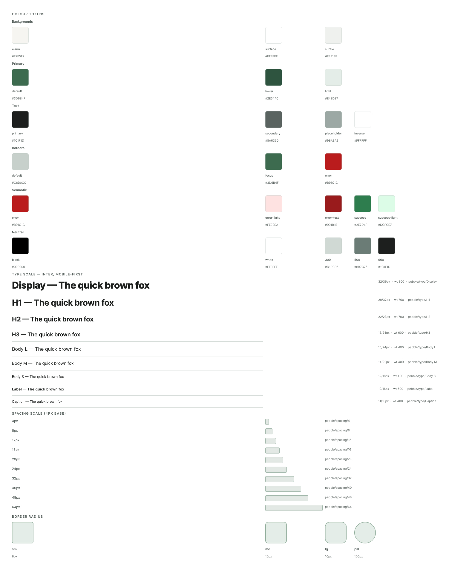
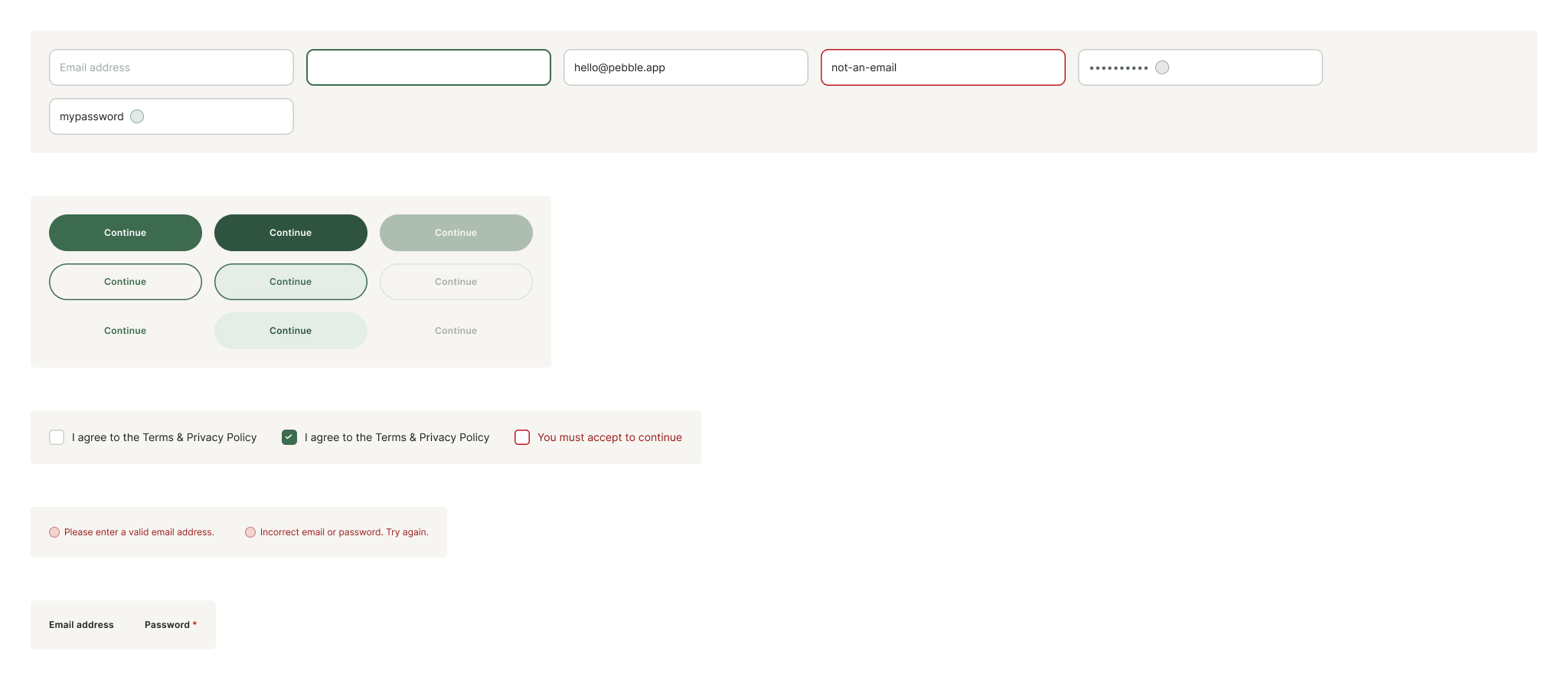
I built the project in three layers: foundations first (colour tokens, type scale, spacing, radius), then components (five variant sets covering inputs, buttons, labels, errors and checkboxes), then screens assembled from those components.
Key decisions
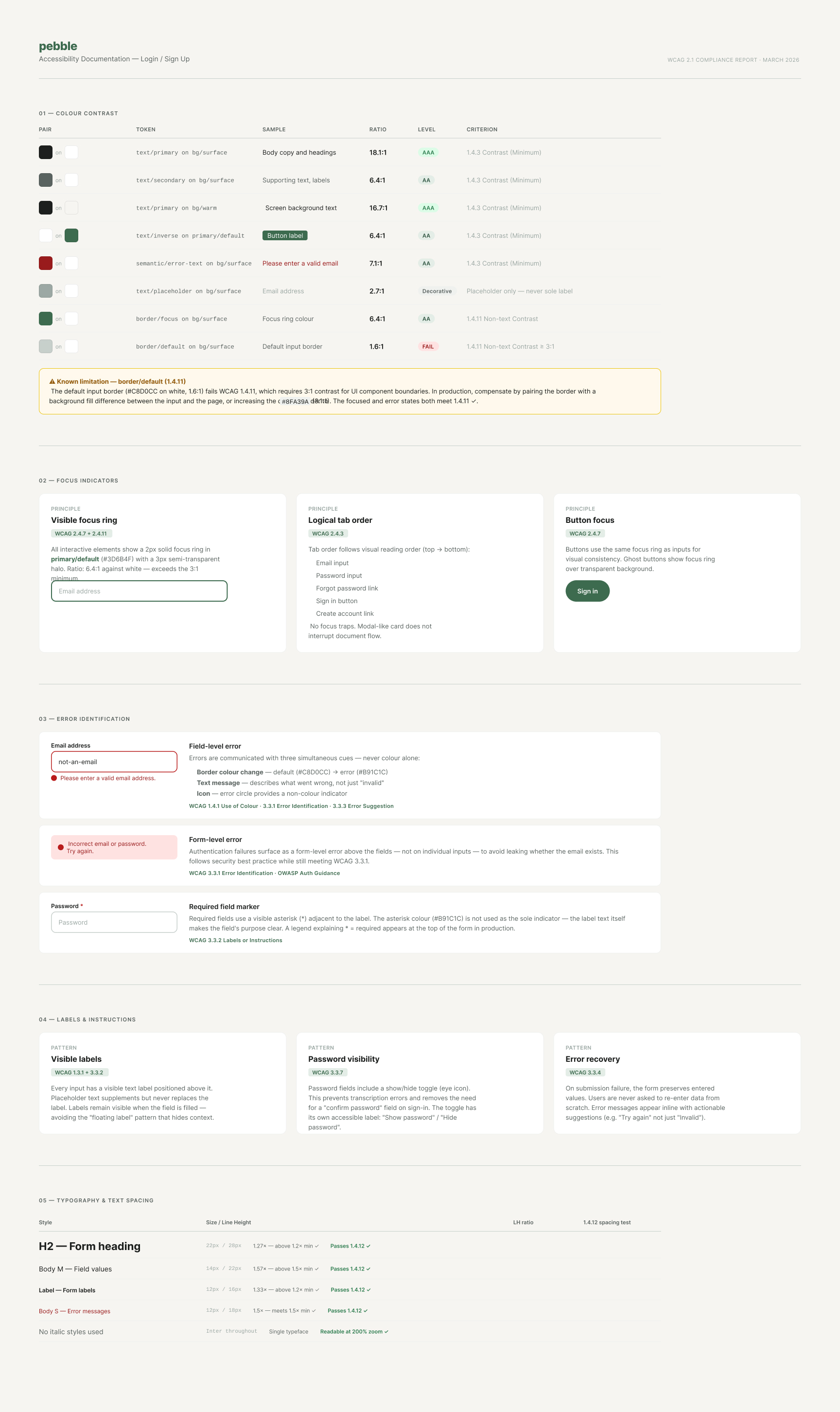
The palette centres on a desaturated sage green paired with a warm off-white ground. All text and interactive colours were checked against WCAG 2.1 AA (4.5:1 for text, 3:1 for UI elements).
Typography uses Inter throughout with a mobile-first scale; line heights follow WCAG 1.4.12 text spacing guidelines.
Components were built as Figma variant sets with a single-property naming convention to avoid sparse variant matrices.
Screens use instances exclusively, no detached overrides.
Outcome
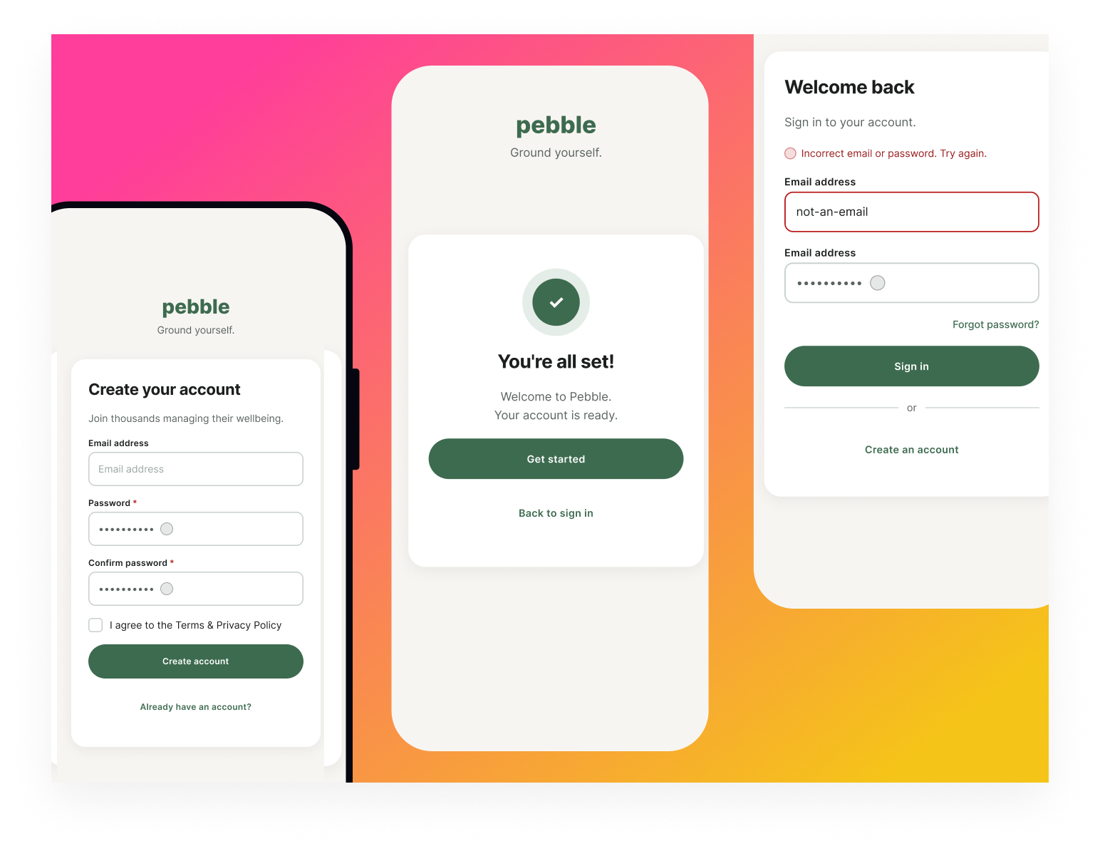
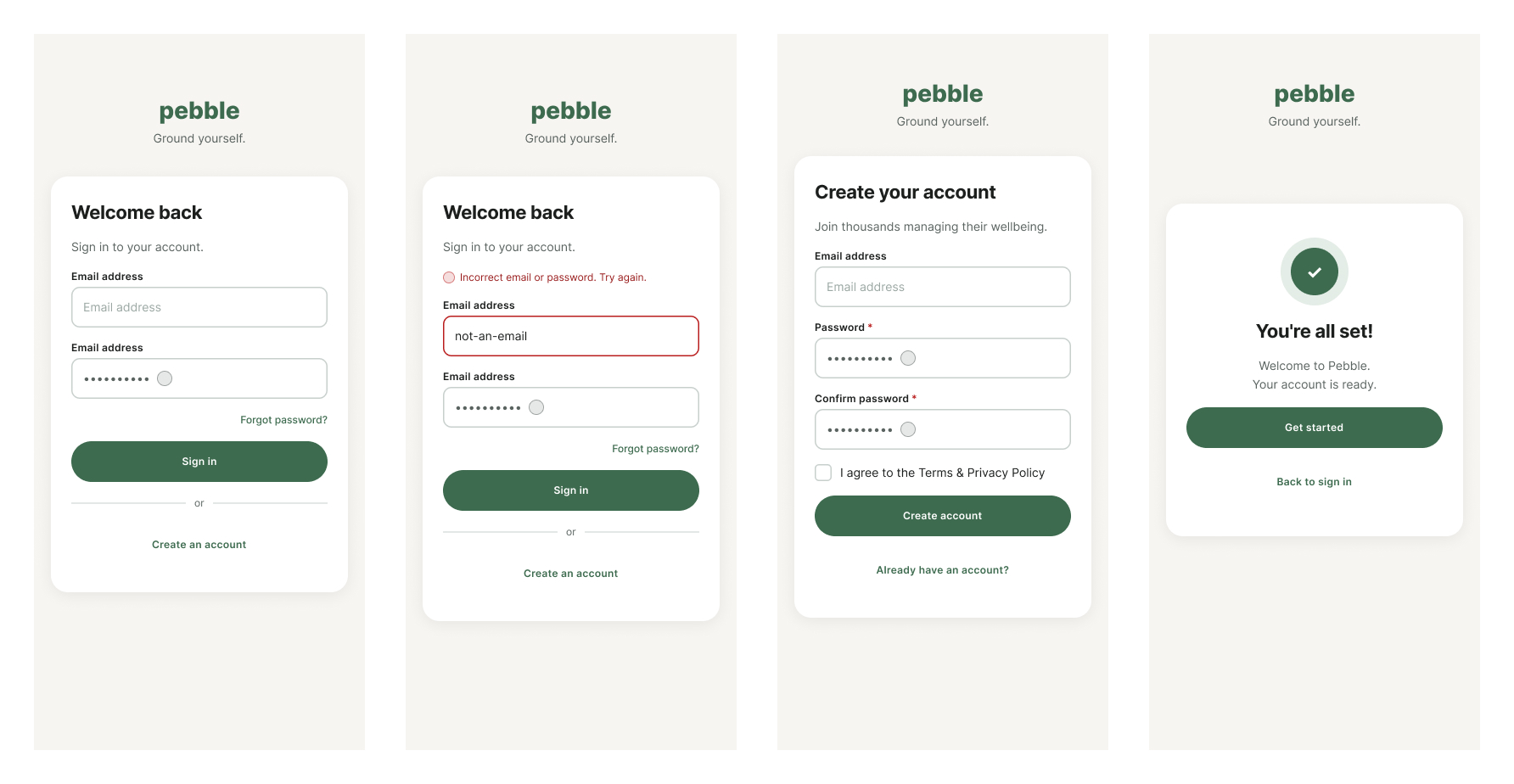
Four screens (sign-in default, sign-in error, sign-up, success state), five component sets, a full token library, and a WCAG compliance reference ready to hand off.
Prototype
https://www.figma.com/proto/Lev4foP57QwAQgjPRJGngR/Accessible-Signup-Form-for-SaaS-Platform?page-id=9%3A60&node-id=11-33&viewport=144%2C387%2C0.04&t=ITsSGwzZIuzojDBH-1&scaling=scale-down&content-scaling=fixed&starting-point-node-id=11%3A33
Screens
Foundations
Accessibility
Components
Tools used
From brief

Topics
Share
Reviews
5 reviews

Wow, it's seriously impressive to see the amount of work you've put into this project. Amazing job! I love that you've used auto layout to keep spacing consistent, and seeing your colour tokens and type scale is super helpful!
How to improve the project:
- Watch out for small errors like the double email title. It always helps to step away from your designs and come back with fresh eyes, you'd be surprised what you catch!
- On the success screen, the "back to sign up" CTA feels unnecessary. One clear action to move users forward is great here.
- For the show/hide password icon, I'd recommend the Figma plugin Iconify, it has loads of free icons you can use. If you can't find something that your happy with, a quick annotation explaining what the placeholder is for would go a long way.
Overall, fab job! Looking forward to seeing more from you :)

Honestly? It was a pleasure to review this project, because it's clear you started from the foundations rather than jumping straight into drawing screens. A token library with colors, typography and spacing is rare at this stage of learning. It's a great habit that pays off in team work.
The screens are clean and consistent. The hierarchy works, my eye naturally moved from the heading, through the fields, to the button. I also really like the decision to display the login error at the form level rather than on a specific field. That's correct practice aligned with OWASP, and it doesn't reveal whether an account exists.
The WCAG documentation is, for me, the standout feature of this project. Contrast checked, focus ring documented, tab order considered. I don't often see this even in more experienced work.
Overall, I see a genuinely mature, systems-driven approach to design here. Keep pushing forward with the next projects! 💪❤️

Hey Christopher,
You’ve put together a really interesting project. Kudos for the approach you took by starting with color tokens and building things from there. That kind of foundation usually makes a system easier to scale and maintain later on.
My favorite part is the color contrast table on the accessibility page. It has a great level of detail and it’s clearly structured, so it’s easy to understand how the colors perform across different combinations.
On that same page I also noticed the Error Identification section where you defined different error levels and their visual treatment. However, I didn’t notice those same patterns being used on the main screens. You did mark the required field indicator, but it’s not applied to the email field. Does that mean users could submit the form without entering an email?
A couple of smaller questions as well. On the sign-in screens there are two inputs labeled Email address, even though the second one is clearly meant for the password. It would probably be good to update that label so the intent is clearer.
I was also curious about the small circles at the end of the password inputs. What exactly do they represent? Are they meant to toggle password visibility, or do they serve another purpose?
I’d also be interested in hearing your reasoning for including a confirm password field instead of allowing users to enter the password just once.
One small visual nitpick as well: on the mockup screens the card with the content is slightly cut off. Since it’s being used as a cover image, it might be worth adjusting it so the full card is visible.

Awesome execution!
I love the clean and minimal look. Keeps users focus on the task at hand. The form validation screen is a nice touch as well. The only thing missing is a social sign up option with either Google, Facebook or Apple ID for an even seamless flow.
Great work Christopher. Love your detailed foundations! I noticed a circle next to the password, what would that mean?
You might also like

Improving Dating App Onboarding: A/B Test Design

FORM Checkout Flow - Mobile


A/B Test for Hinge's Onboarding Flow


Accessibility Asse


The Fitness Growth Engine


The Relational Workspace

Visual Design Courses

UX Design Foundations


Introduction to Figma

Design Terminology
