Blip - Esport app design (Light & Dark UI)

Bonjour, comrades! Today I present the case of Blip - an esports hub app for gamers where you can check esports news, learn about upcoming tournaments, and watch live matches.
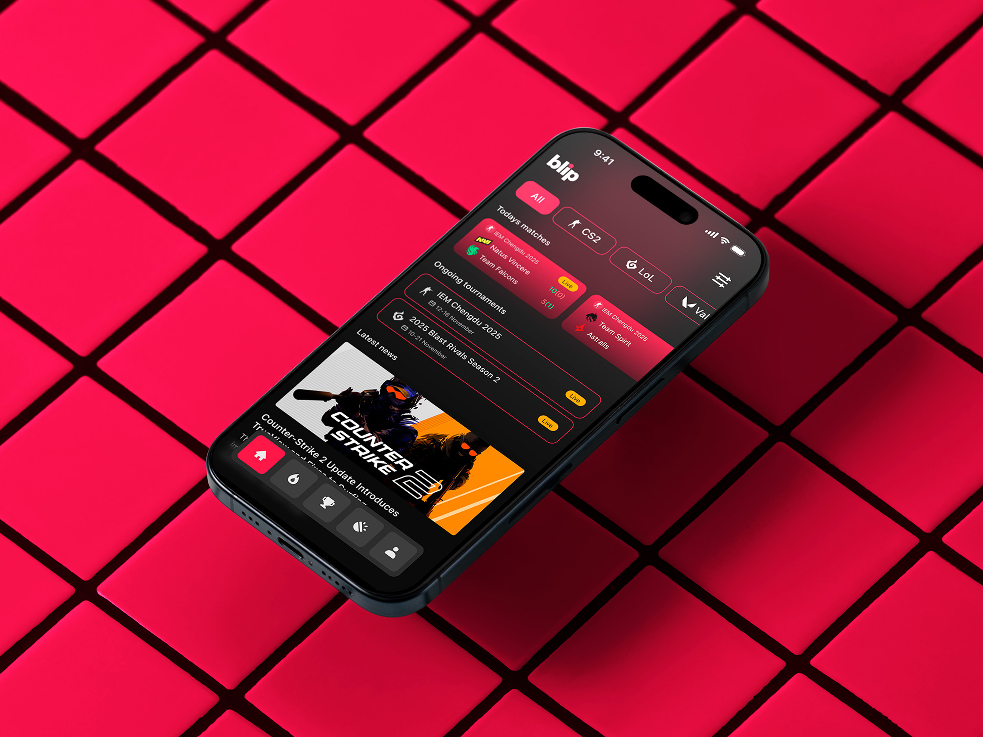
The challenge was to create a light version of an app that users didn’t really like. Gamers are a picky bunch - they usually prefer dark mode. But the problem was that Blip only had a light version. It was informative, but it didn’t feel like an app for a gaming audience, despite its bright colors and gradients.
With a flick of the wrist, I added a theme switcher to the profile settings so users can switch to dark mode - and it didn’t cost developers anything. Essentially, everything stayed the same on the front end; now it just looks much cooler, and gamers’ eyes aren’t strained anymore.
A few words about the actual app. For this challenge, I created three screens (though there are more).
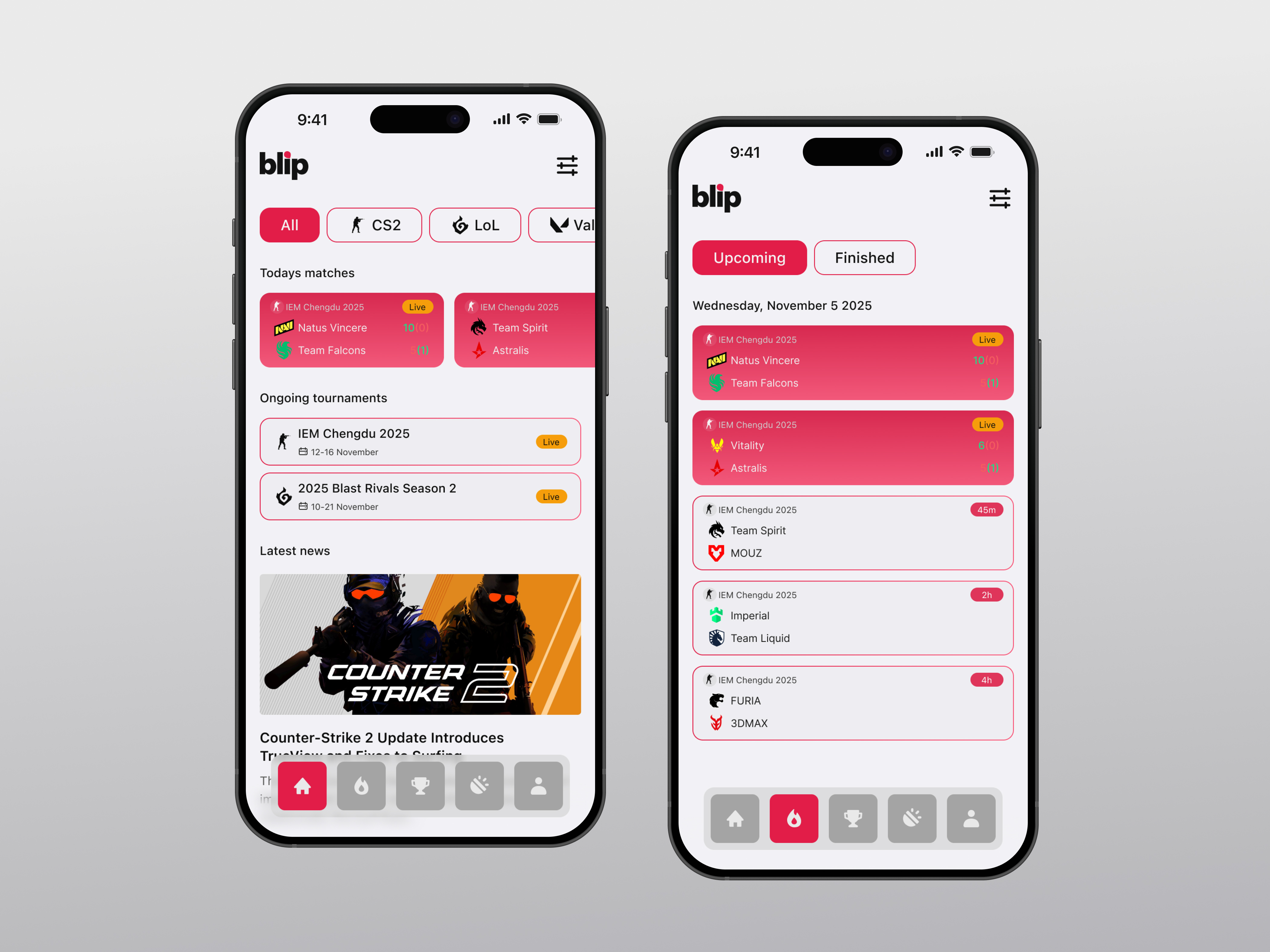
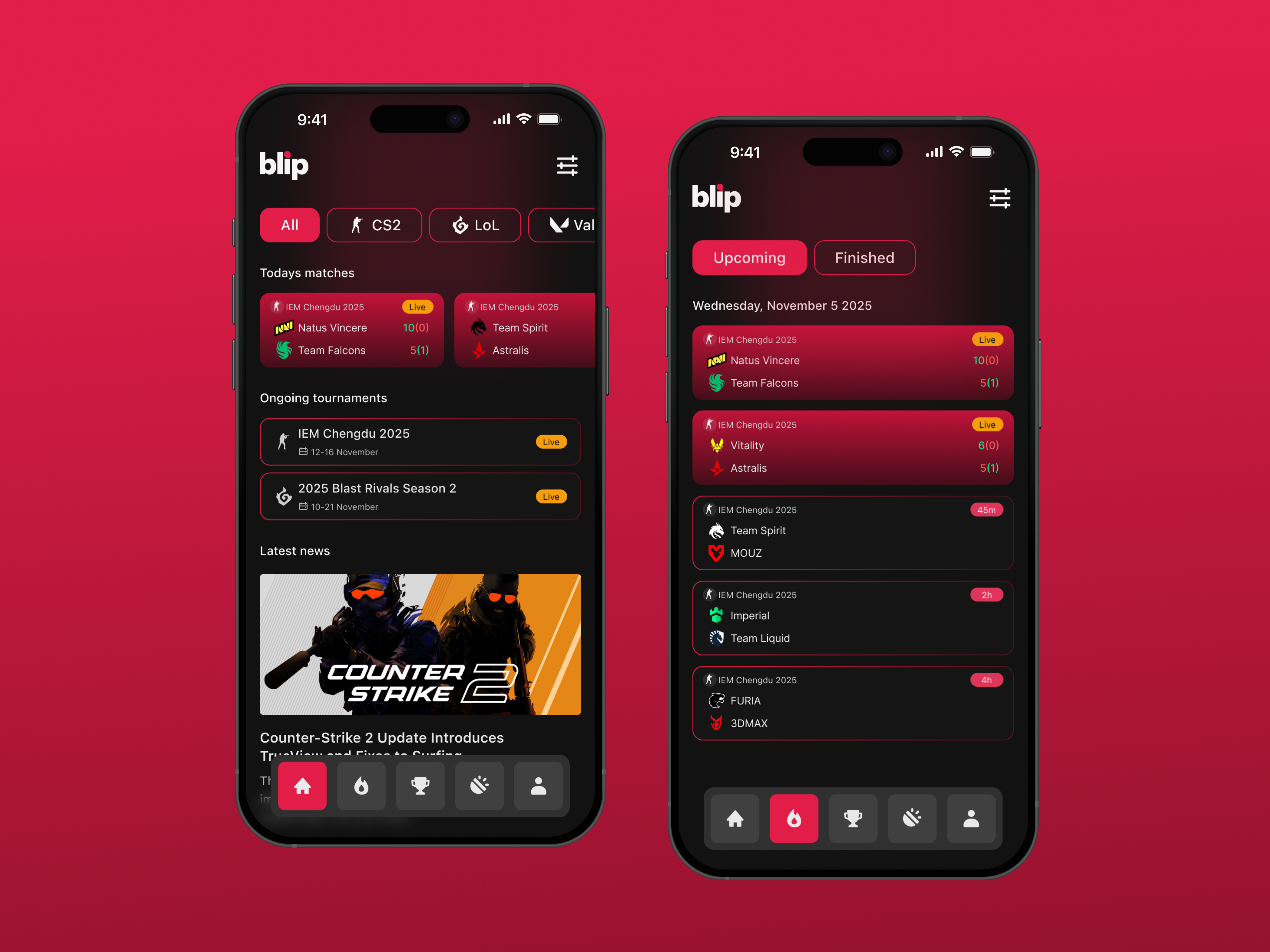
The Home screen shows current matches, tournaments, and a news feed. At the top, there are filters where you can choose the game you’re interested in.
The Matches screen displays current, upcoming, and recently finished games. If you selected a filter on the Home screen, it will show only matches for that particular game. If a game is live, the app displays the current score.
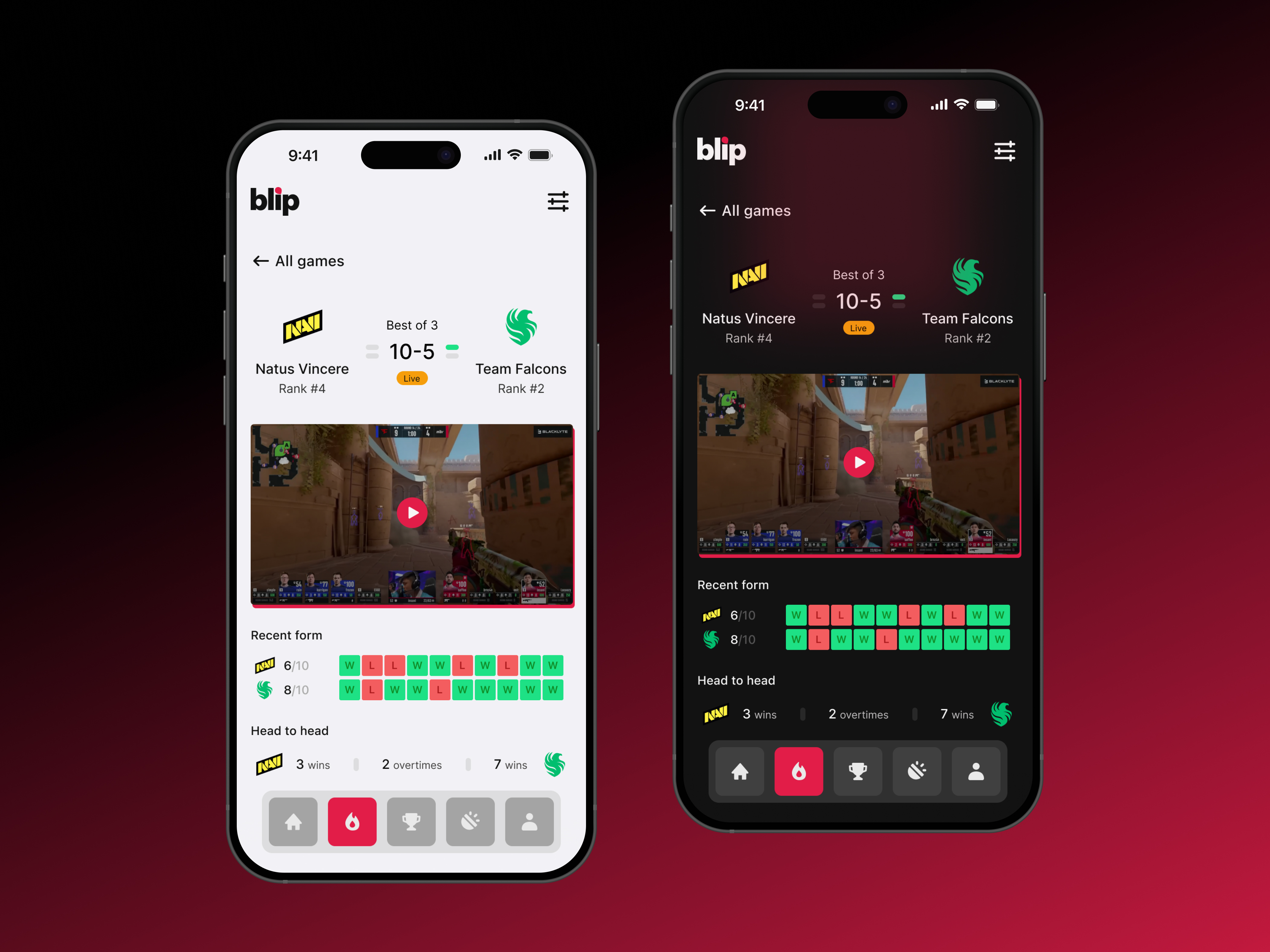
The third screen (Match screen) provides detailed match information. The screen becomes more expanded, you can check some stats about the teams and also watch the game via live stream.
That’s basically it. I made several small iterations, so there may be minor bugs, but the general idea is there.
Thanks for reading!
Tools used
From brief

Topics
Share
Reviews
5 reviews

Congrats on the dark mode, Henke!
I really like the navigation in the app. It feels clickable, the shape is interesting, and overall it looks intuitive to use. Adding labels to icons is usually a good practice so users know what’s behind each one, but I wouldn’t say it’s a major issue here since people usually learn them over time.
I did notice some inconsistency in how card states are shown. On the home screen, live events don’t have a background, while on the matches screen they’re highlighted with the primary color. It’s the same type of element but presented in two different ways. Personally, I like when live events stand out, but it might be worth double-checking the text contrast on that background.
Regarding the dark mode itself, I’m curious whether you used variables or mapped the colors manually. A nice next step could be introducing design tokens and showing your color palette with names. It would help strengthen the story behind your color system and process.
The dark mode background gradients look awesome, creating "immersive feeling" for a gaming app.
Great if you would check the contrast ratio of the text vs background and see if they comply with WCAG requirements.
All in all, the dark mode you design is beautiful.

Great job!

This looks really good! Very clean and modern UI and the dark mode version looks very professionally done.
Personally I would have liked to see a bit more of the process in the case study (any research you did, ideation, design rationale, etc.) and I have a bit of concern for accessibility with some of the text (the white on pink looks a bit jarring at times and some of the text is thin / hard to read).
Keep up the good work!

I see you've tackled an interesting challenge - adding dark mode to an esports app. The project looks really solid visually, especially the dark version has that "gaming" vibe that was missing in the original.
I agree with Mindy about readability. White text on pink background is indeed problematic in places (especially visible on match cards). It's worth checking the contrast according to WCAG to make sure everything's okay.
I have a similar concern as Mindy. I'm missing some context about the process. How do we know users didn't like the light mode? Were there any research, data, or is this an assumption from the brief? This would give the whole story more credibility. I'd also understand better why dark mode specifically was the solution.
Design-wise, I see consistency and attention to detail - the "Live" status, score formatting, colorful team form indicators. It all works. The theme switcher is a simple but effective move. I think with improved contrasts and added process details, the case would have a really strong message. Good work! 💪❤️
You might also like

Improving Dating App Onboarding: A/B Test Design

FORM Checkout Flow - Mobile


A/B Test for Hinge's Onboarding Flow


Accessibility Asse


The Fitness Growth Engine

Uxcel Halloween Icon Pack

Visual Design Courses

UX Design Foundations


Introduction to Figma

Design Terminology
