Reimagining Asana's Color System


I created a color system based on Asana's current project management tool. Accessibility and the emotions the colors evoke were the primary drivers around my decisions in building a calm but vibrant color palette.
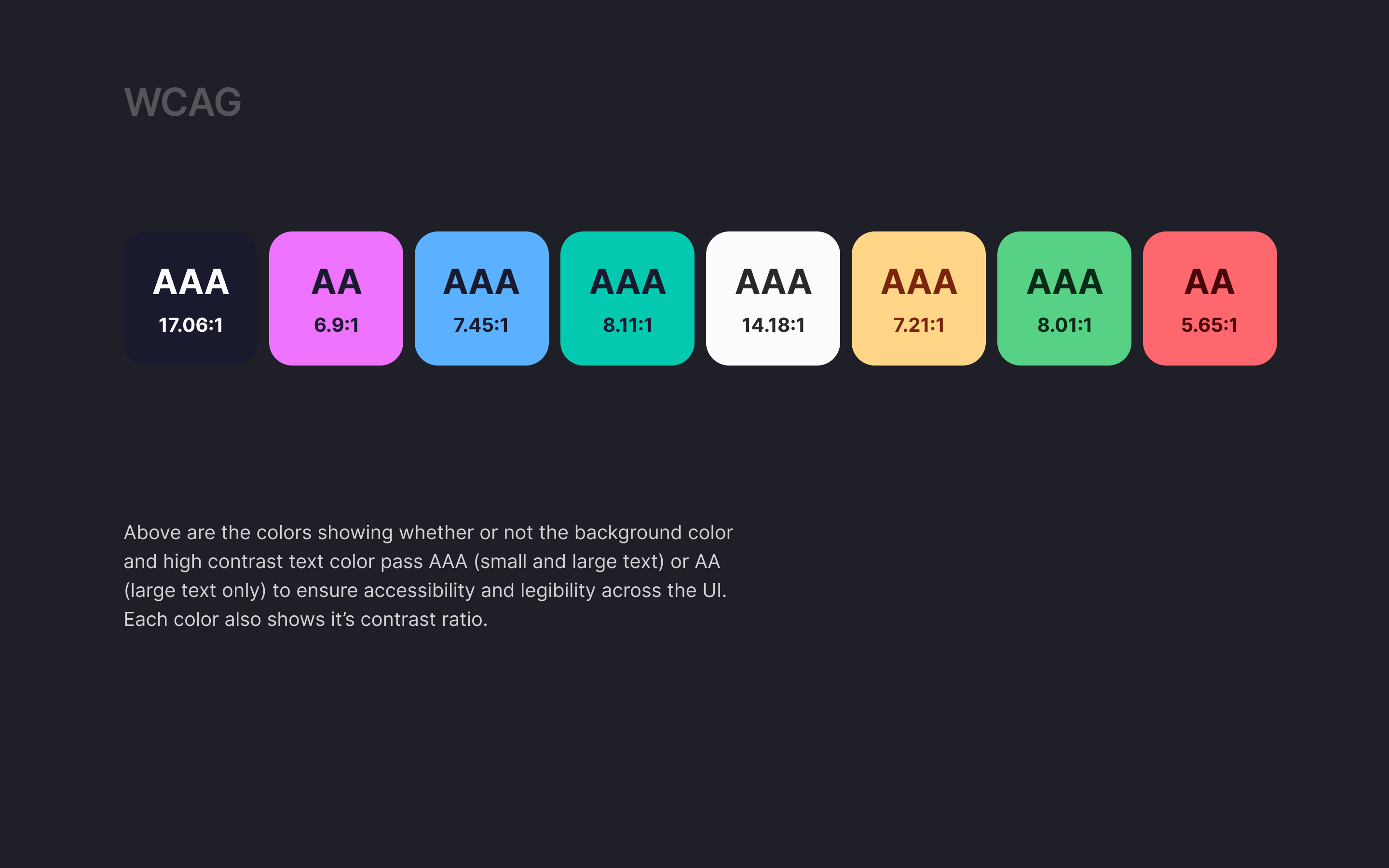
Primary Colors - Midnight Blue. chosen for it's functional purpose and accessibility as well as its foundational strength
Secondary Colors - Heliotrope Purple, Dodger Blue and Neon Ocean. chosen for vibrancy and to theme the projects in the UI to help with user recall on overall status of not started, in progress or completed
Neutral Colors - Alabaster. chosen for functionality for it's primary role as building blocks in the UI, accessible text, and for neutral messaging
System Colors - Golden Rod Yellow, Slytherin Green, and Rocket Red. chosen for necessary alerts + it's specific role in prioritization tagging of tasks (high, medium and low)

Reviews
4 reviews

Hey Kristen 👋
You've built a thoughtful color system with clear structure and strong accessibility foundations. The categorization into Primary, Secondary, Neutral, and System colors is well explained, and WCAG compliance was clearly a priority.
To me it looks like there is an overlap between Secondary and System Colors that needs clarification. Both handle status indication, which could create confusion about when to use which. Your WCAG testing only covers 400 shades but you could document safe foreground/background pairings across all shades. Components like switches or buttons need hover, active, disabled, and focus states, and your palette might need additional shades to support these without breaking accessibility.
The UI example is helpful, but showing the system across different component states, mobile views, or dark mode would demonstrate its real flexibility.
🚀 Quick win: Create a component state matrix for one interactive element showing how your colors handle hover, active, and disabled states. This proves how well your palette scales in practice.

Good job, Kristen! You presented the rationale behind your color choices, and it's evident that accessibility was a priority for you – that's really important when designing systems. Nice work thinking about system colors and showing how the palette works in the context of actual UI.
Personally, I'd love to see the colors applied across more screens. Maybe mobile, different component states, or dark mode? That would demonstrate how the system behaves in various scenarios.
You can see the systematic approach and attention to detail. With this foundation, it'll be easy to expand the project with additional use cases and deeper business rationale. Solid work! 💪❤️

Hello Kristen, your reimagined color system for Asana is thoughtful and well-executed. I appreciate how you've clearly articulated the reasoning behind each color choice - from Midnight Blue for functionality and accessibility, to the vibrant secondary colors for status recall, to Alabaster for neutral messaging, and system colors for task prioritization. The focus on both accessibility and emotional impact shows strong design thinking. Including AAA accessibility ratings demonstrates attention to inclusive design. The presentation is clean and professional. This is solid, purposeful color system work!

Great job! You explained your design rationale well, thought about accessibility, system colors, and incorporated the colors into some UI.
I personally would've liked to see the colors incorporated into more UI and some more of the high level / most important slides viewable as part of the case study without the user having to click in to the full presentation.
Keep it up!
You might also like

Improving Dating App Onboarding: A/B Test Design

FORM Checkout Flow - Mobile


A/B Test for Hinge's Onboarding Flow


Accessibility Asse


The Fitness Growth Engine

Uxcel Halloween Icon Pack

Visual Design Courses

UX Design Foundations


Introduction to Figma

Design Terminology
