Step 4: Set up a mobile frame
After testing low-fidelity sketches, move to medium-fidelity wireframes in a digital tool. Your validated sketches become the foundation for this stage.
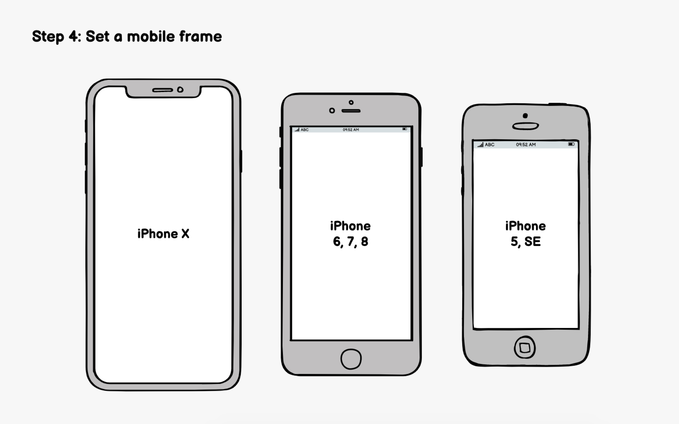
Start by setting up an appropriately sized mobile frame. This creates realistic constraints and prevents you from cramming too many elements onto screens. But which dimensions should you use when designing for multiple devices? The best practice is to design for the smallest device first.[1]
If your analytics show a dominant device, prioritize that. But avoid designing exclusively for flagship phones with massive screens, as your layouts may feel cramped on the smaller devices many users actually own.
Modern tools like Figma, Sketch, and Adobe XD offer device-specific frames. AI features in these tools can also suggest responsive adjustments, though you'll still need to verify layouts across sizes manually.
References
- What is Mobile First? — updated 2025 | The Interaction Design Foundation
