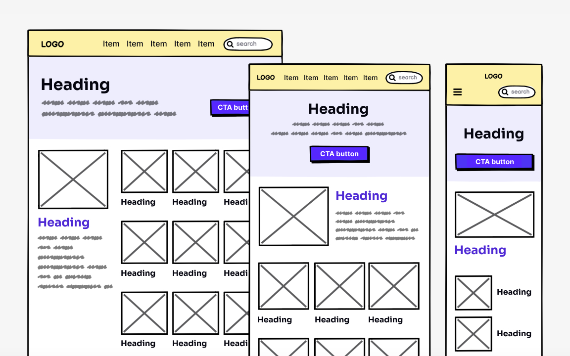
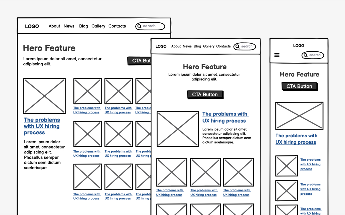
Add content and UI elements
When you're happy with the visual hierarchy, start filling zones with content and UI elements. The goal is to arrange elements in design formats that allow fast scanning. Put a strong focus on the order of information you want to present to your users. People scan web pages from top to bottom, from left to right. The F-shaped pattern works both for desktop and mobile screens.[1] So, you can improve the scanning by rearranging boxes in both size and placement.
Avoid adding colors and choosing typefaces at this point. The goal is to see if the layout is the best fit for the content. After adding real text and images, you might find that the layout isn't working well. Don't hesitate to change it and look for a better way to present the information. Also, remember to check how your UI looks on different screen sizes and adjust it if needed. Follow a mobile-first mindset and start with the mobile version of your design. After you have created a good visual hierarchy there, move on to another screen dimension.
References
- F-Shaped Pattern of Reading on the Web: Misunderstood, But Still Relevant (Even on Mobile) | Nielsen Norman Group


