What is responsive design
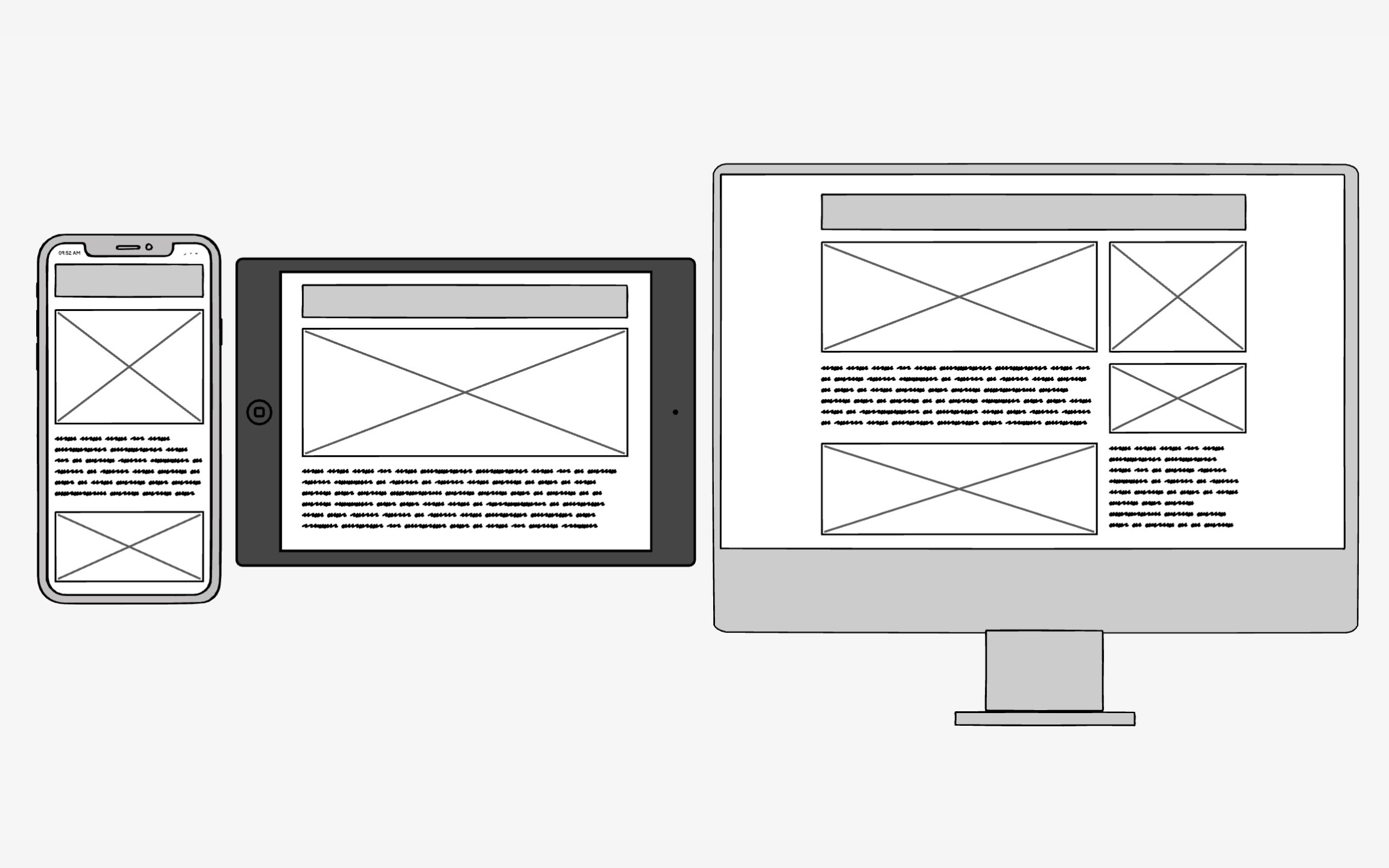
Responsive design solves a modern problem: users expect websites to work perfectly whether they're on a 27-inch desktop or a 5-inch phone. Before smartphones, designers created fixed-width layouts for standard monitors. Now, with thousands of device sizes and new ones launching constantly, fixed designs break the user experience.
The magic happens through 3 technical ingredients working together:
- Fluid grids stretch and compress based on screen width
- Flexible images scale without breaking layouts
- Media queries detect screen characteristics and apply appropriate styles
Together, they create one codebase that serves all devices intelligently. This approach beats building separate mobile sites because it maintains consistency while adapting to context. Users get optimal experiences without maintaining multiple codebases. With mobile users now exceeding desktop users globally[1], responsive design has shifted from nice-to-have to an absolute necessity.
Pro Tip: Test your responsive designs on actual devices, not just browser resizers. Real devices reveal touch target issues and performance problems.
References
- Desktop vs Mobile vs Tablet Market Share Worldwide | Statcounter Global Stats | StatCounter Global Stats
